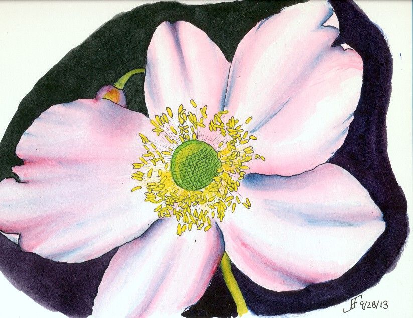
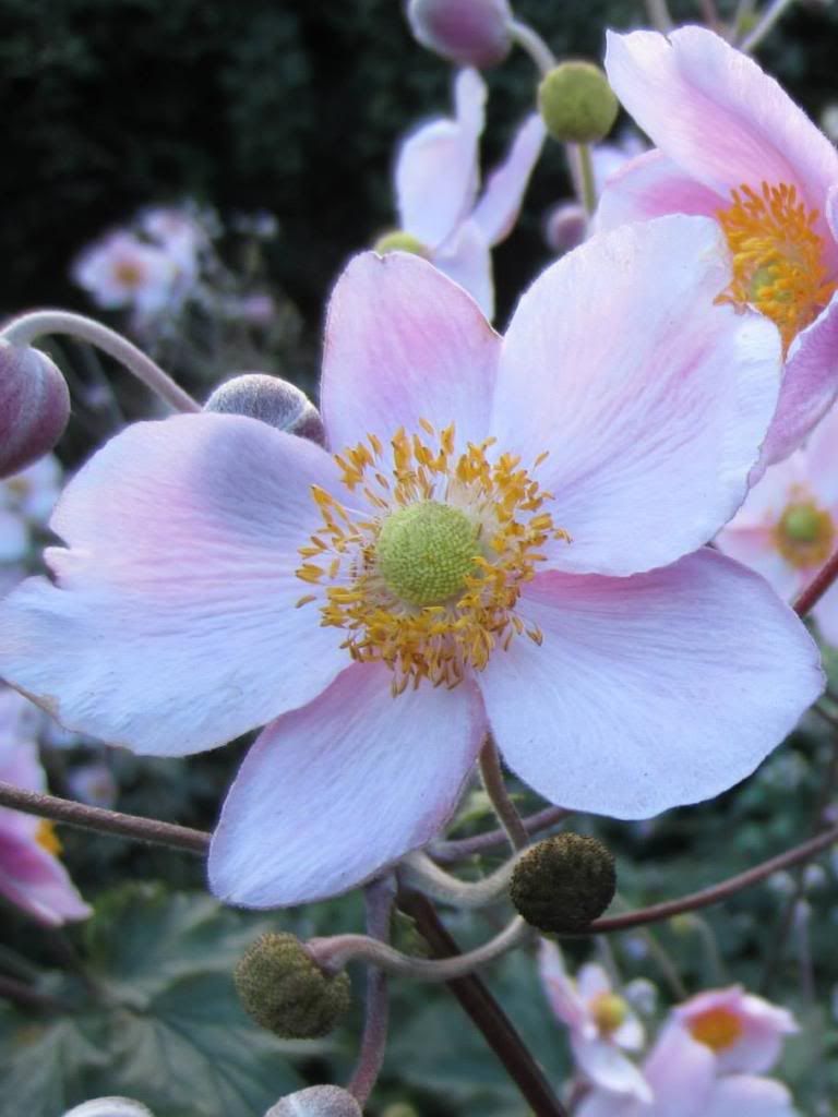
 So, as I mentioned, I thought I would try another shot at that painting of a flower. This rendition of a photograph of a flower from her trip to Scotland. I think you will agree the results this time around are much clearer and more enjoyable.
This time, I decided the orientation of the flower to the sheet of paper should be flipped and it be painted in "landscape" mode. And of course, I also used a whiter paper and smoother paper (hot press). That tends to make the color transitions smoother.
 I also used blue ink for the petal outline, which gave me the blue highlights within the petals. This under painting is known as a "grisaille". It provides the value of light to dark within the painting subject (though the dark background is done only with watercolor). Additionally, I used three colors of ink. The anthers (the part of the flower that contains the yellow pollen) were drawn with black ink. And the center portion (where the seeds form) the pollen is deposited was drawn with green ink. It probably did not need such differences, but it seems to have made the picture less "muddy". (The colors are more vibrant).
And of course, in keeping with my lessons learned, I used the masking fluid to block off the anthers, so that once everything else was done, I could paint them a yellow color. As you can see, this time around, the painting is closer to the photograph.
Clearly doing art is something that improves with practice. But it's rare to see someone work through what works and what does not. Hopefully you find this type of post interesting. It helps me to "talk through" my own process of learning. I'm enjoying it. I sure hope you are as well.
No comments:
Post a Comment