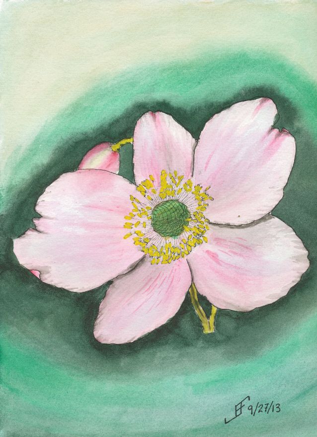
 Today's subject is based on a photograph of a flower that a friend took in Scotland. This is a pen & ink with watercolor rendition of the photograph. While the flower itself is not bad, the background needs some work. I suspect it would look better if I used the three primary colors to add interest around the flower.
The color of the paper is a bit browner than some of the other watercolor paper that I have. I'll need to remember that when I do a light colored painting in the future. This is Strathmore 400 paper, which normally is fine for most of my paintings. But it does a poor job of scanning as a white paper. The Daler-Rowney The Langton Prestige and the Arches watercolor paper have a brighter white than this paper.
 I also should have used masking fluid (also known as "frisket") to preserve the white of the center portion of the flower. Without it, the colors are not as true to life as I would like.
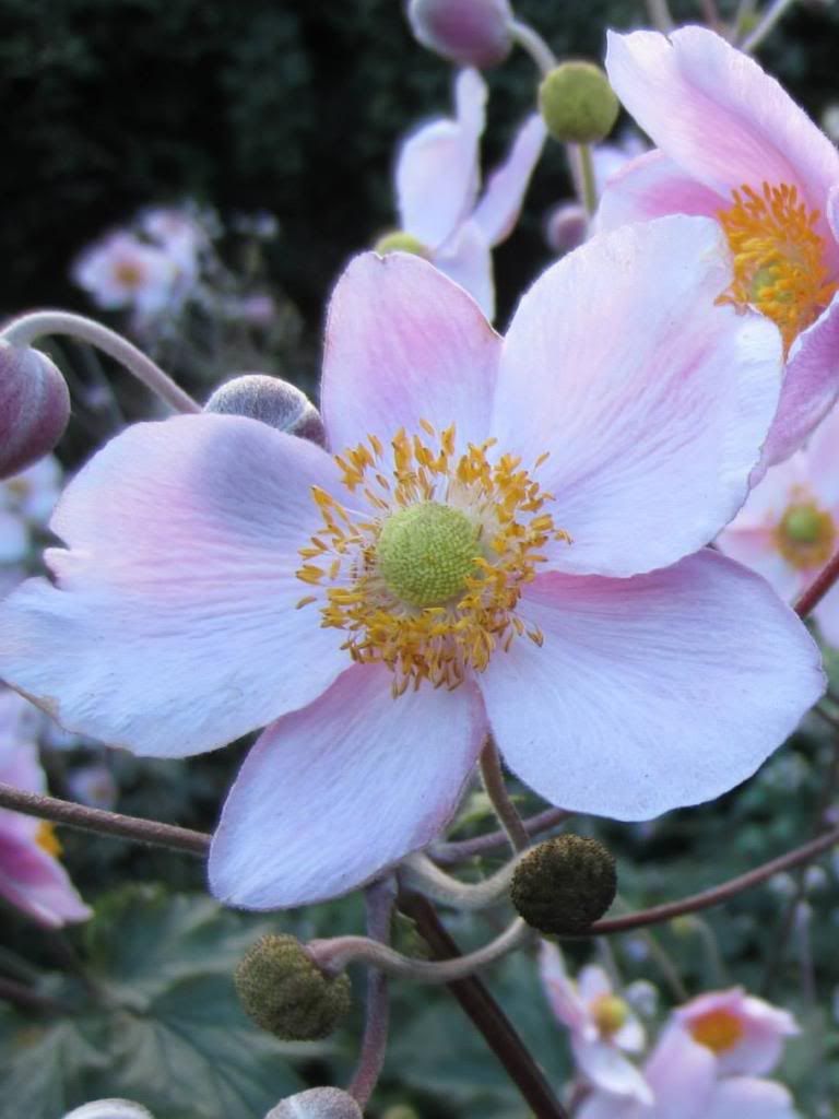
Oh, and so you can compare, here is a cropped original photograph (cropped to focus on one flower).
Once again, I hope you enjoy seeing the process I go through with each painting and what I learn from working on them. I know I find it enjoyable.
No comments:
Post a Comment