Showing posts with label Water. Show all posts

Friday, April 4, 2014

20140404 - Sunset

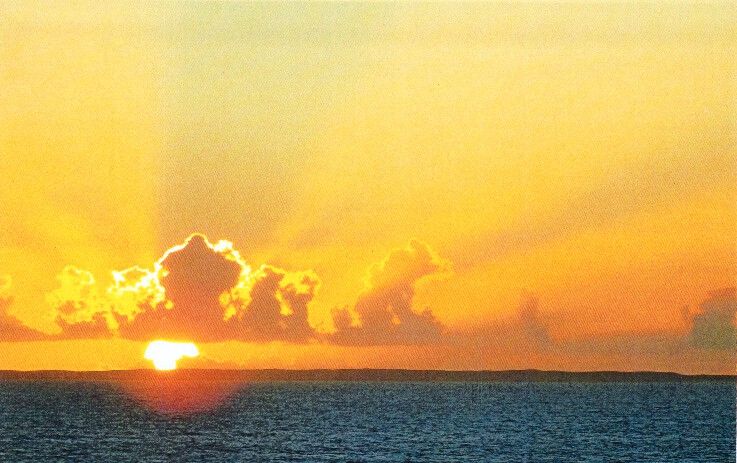
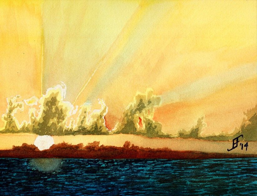
Another day, another painting. Today in my painting class we used another student's photograph (with his permission) to create a sunset picture with rays of light radiating out from the clouds that were farther in the foreground. This sunset (or sunrise) picture includes a lot of oranges and reds deep into the yellowish color. Plus, there are barrier islands an a deep turquoise sea in the foreground.

Here's the original photograph


Here's my attempt at an interpretation of the photograph.


As you can see, the clouds have a greenish cast. I've not worked much with that turquoise blue, but as you can see, a little bit goes a LONG way. It needed more red and less of that blue. Ah, well, lesson learned.

Hope you enjoy!

Friday, September 27, 2013

20130926 - Fall Foliage

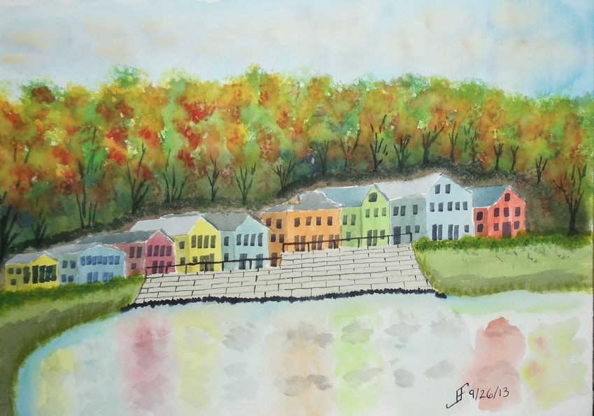
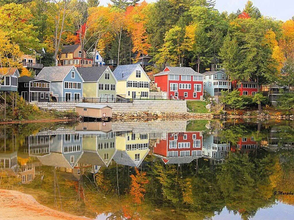
Here's a quick sketch of a fall foliage around a vacation spot in the New England area. It's roughly based on an image I saw in the news yesterday.

This one did not turn out as well as I hoped. I'm tired, so I did not put as much into this as I should have. Lesson learned.


As you can see from the original photograph, it's well worth taking time to enjoy it. And indeed, I hope you enjoy both the photograph and this sketch.


Wednesday, September 25, 2013

20130925 - Pacific Sunset

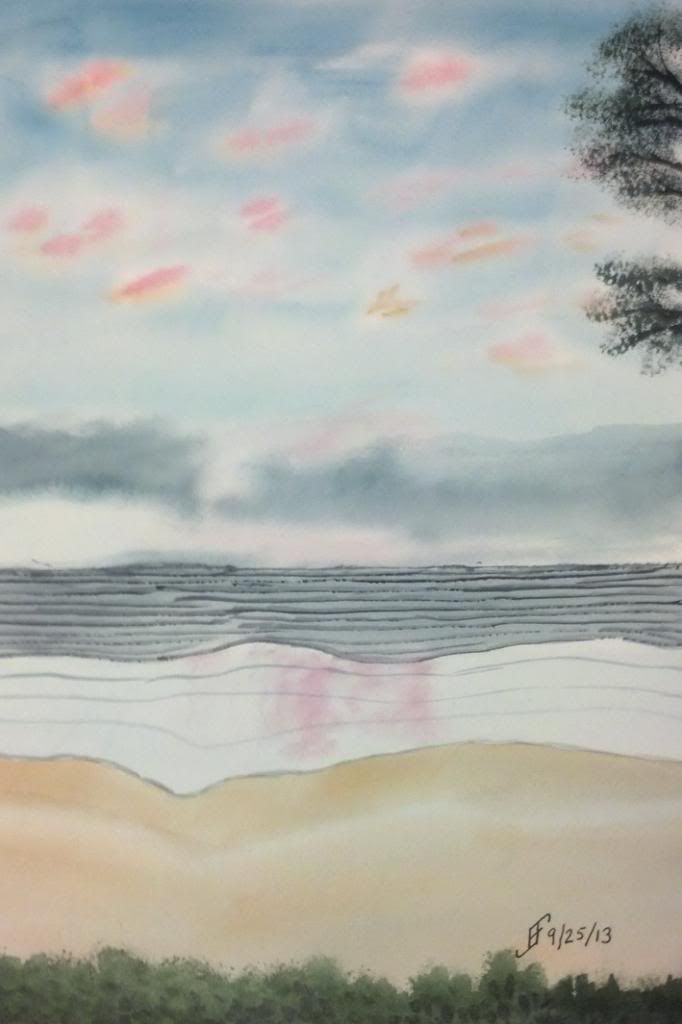
Some of the most attractive settings to paint are sunsets. This painting is based on a photograph a friend took while on vacation.

I can't say that I spent a lot of time on this painting. However, I was trying to capture the different layers that you see in a sunset over the pacific ocean. You of course start with a darker sky the farther it is from the horizon. You often have light clouds reflecting the sunset. And of course there are often clouds closer toward the horizon line. Then the ocean line has several layers. The first is a deeper zone where the waves show a darker color. Then you have a lighter zone which typically reflects the sunset. Finally you have a wet beach before you reach the vegetation at the beach line.

And if you frame it just right, you'll have the edge of a tree in the upper left or right corner.

Here's hoping you enjoy this painting. If you hear the breakers rolling into the shore, don't blame me! It just seems to come with this type of setting! :-)

Monday, September 23, 2013

20130923 - Setting a Mood

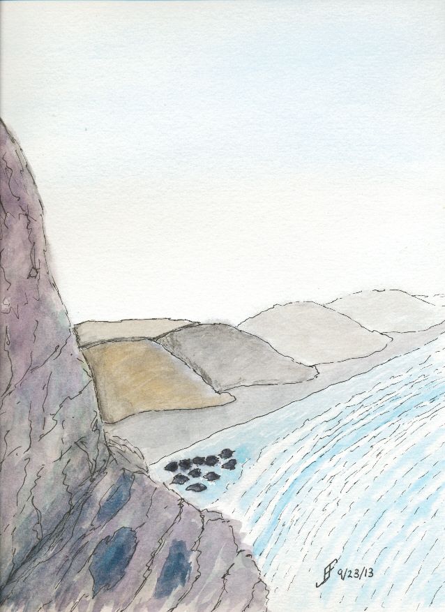
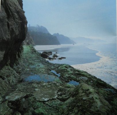
This week the lesson for art class is how to create a mood for a painting. For example, a misty coastline in Oregon provides a great example of how you need to create a unified painting that expresses a mood more than just "capturing" the setting.

While I think I accomplished that in this painting, the scan does not convey the subtle misty blue sky. Oh, and as you can see from the reference photograph, I decided to emphasize the misty, lonely mood of the original setting.

While this is nothing to write home about, it definitely is better than my first attempt, which while it captured more of the detail of the setting, failed miserably at capturing the mood I wanted to convey. It was hard edged and did not have that misty, lonely feel. This one does capture that feeling.

Of course my wife wondered if those were boy scouts camped along the shore. Next one that I do like this, I will need to try to incorporate that idea into it. Hmmm....

Anyway, I hope you enjoy my ramblings as much as I enjoy creating these paintings.


Monday, September 16, 2013

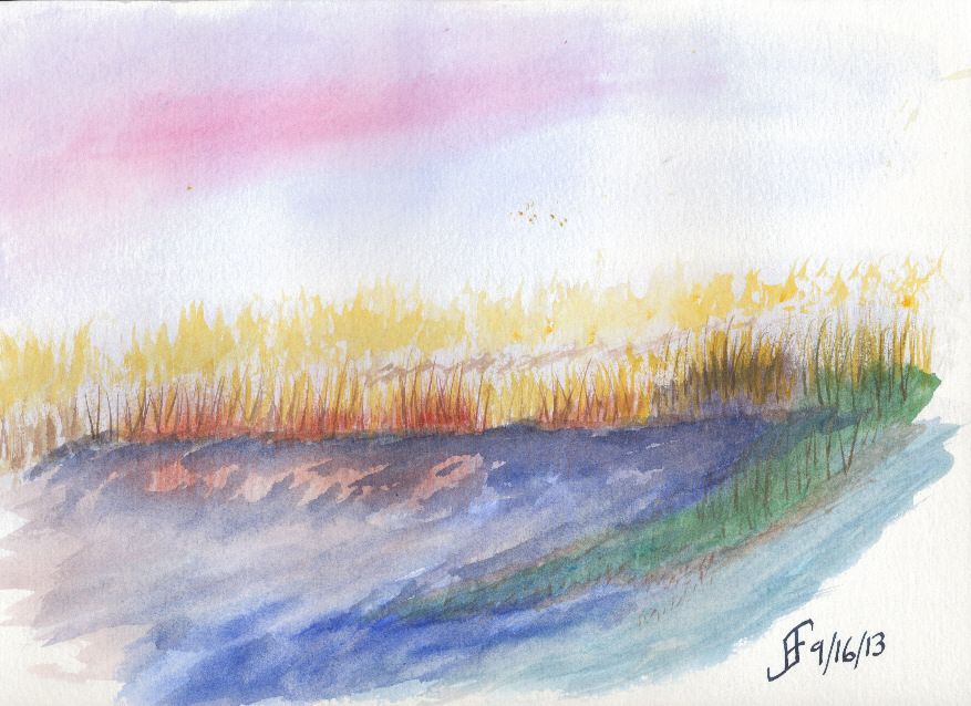
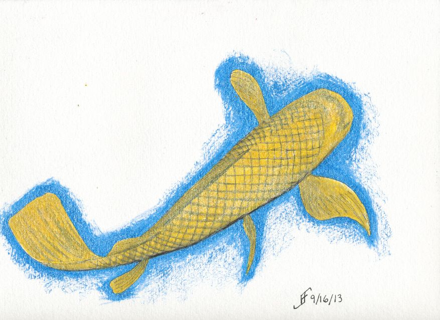
20130916 - Misty Marsh and Golden Koi

First of all, our objective today in the art class (Pen & Ink with Watercolor) was to create a misty marsh scene. As I've noted, I'm not very comfortable creating a very loose painting. This was my third or fourth attempt. I was doing wet into wet. Perhaps if I try a wet onto dry painting technique, I will have better success. I'm not completely upset with this one. But it's clearly not one of my better paintings. A clear sign that I have a lot still to learn. I knew it, but this clearly demonstrates that.


Of course, when I go to a more structured pen & ink with watercolor painting technique, I am much happier with the results. It's the engineer in me that wants the structure of a detailed drawing before I just start painting. I am not sure I will ever get past that completely.

Additionally, today Brian (my son) gave me a three bottles of Daler-Rowney FW Pearlescent Acrylic ink. So, I had to try it out. The result was a combination of pen & ink with the Pearlescent Acrylic Ink. The three inks were Galactic Blue, Mazuma Gold and Silver Pearl. So, I also decided to do a golden koi. As you can see, the pearlescent inks my son gave me work very well with pen & ink. I am much happier with this painting. You will no doubt see more of this type of painting in the future.

Saturday, September 14, 2013

20130914 - Dragonfly

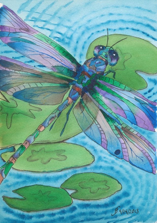
Well, the dragonfly painting is done. There are some things that I would correct. But overall, I'm pretty pleased with this one.

Want to know what I should improve? Here goes. They are not "nit picky", but they don't absolutely spoil it either. But it is a chance to learn more as I work on a piece.

Here's the first item. The upper right lily pad is not oval enough. Thus, it suddenly feels as if the perspective of the painting warps. You go from looking down and sideways toward the lily pads to down onto that upper right one. Lesson learned.

The second item is that the color of the purple in the lower two wings (toward the body of the dragonfly) was created rather than selected from my palette. The purple works better when it's from the palette.

The third issue is that the wings are a bit darker than I would like. They would appear to appear to "shine" more if there was more of the white of the paper showing.

There are other minor things. But as I noted. For the most part, I'm pretty pleased with this one.

There are some things that are right. I got the right gossamer wing effect. You can see through the wing to the lily pad in the center. And I tinted (using a glaze) the wings to make them slightly green in that area. That worked well.

But the most important thin is that I hope you enjoy seeing this as much as I enjoyed making it.

Friday, September 13, 2013

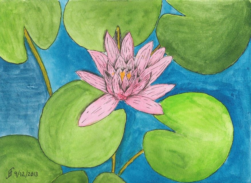
20130912 - Water Lily (A Happy Accident)

Today's painting is not any sort of masterpiece. In fact, I might normally have trashed it due to problems I had when painting it. But I decided to "stick with it" and try to rescue the painting. The result was a bit of a "happy accident".

This started as an attempt to render the photograph of the water lily I had taken at the JC Raulston Arboretum. Unfortunately, when I went to add a little pink into the water lilly, it exploded out of the brush and filled the water lilly. No smooth transitions.

As I noted, normally this would qualify as an unmitigated disaster. Time to take the paper off the pad of watercolor paper, crumple it, and throw it away. But for some reason, I decided to see what I could do with the painting anyway. I figured that I could still continue to hone techniques, even if I didn't want to hang the painting.
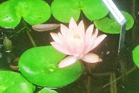
Of course, being careful about the amount of paint on the paint brush was my first lesson in this painting. If you take the time, you learn as much or more from your mistakes. Lesson one .. Brilliantly demonstrated!

Part of the problem with this painting is that I have a ceiling fan right over where I paint. If it is running, the flow of air tends to dry the paper too quickly. As a result, "washes" (or large areas of paint that should appear uniform) tend to dry way too quickly. The result is that you can see the brush marks in the painting. Notice the blue water to the left of the lily? See how uniform it appears? The other areas of water show the brush marks. Yuck! Lesson Two .. Sigh! I should have known better!!

So, I finished the painting, but the water lily was a blob of color. What could I do to "rescue it". I decided to add pen & ink to the mix. While it helped, it seemed to make it appear a little "cartoonish". Compare the water lily to a cartoon (such as the Red and Rover cartoon). So, I decided to try to play up that sense of cartoon and added more pen & ink lines to the drawing. And suddenly the painting went from disaster to whimsical. Ta-da! Lesson Three .. By adding lines to a painting with vibrant colors, you and end up with a whimsical painting.

It's still not a painting I would give as a gift. But instead of a failure, I ended up with a painting that taught me more than I knew before I painted it. A "happy accident". Though like all things in life, such "happy accidents" occur to those who are prepared to learn from mistakes and take advantage of those "opportunities".

From failure to "happy accident". Is it all just our perspective? The answer is, of course, a resounding "Yes!!".
Monday, September 9, 2013

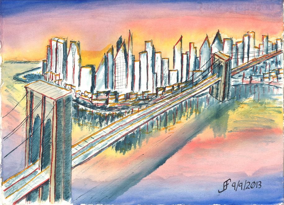
20130909 - New Class / New Style

Today I started a new class at the Senior Center. This is a Pen, Ink & Watercolor class. While I really like the class, the content and the instructor, he emphasizes a more creative style of painting than I normally use. Yes, I was an engineer. I see the detail. I can also see the whole. But ignoring detail is so counter to my normal style that I find it grating.

But that's the style of painting that this instructor emphasizes.

While we attempted a certain style in class, I was not at all happy with the outcome. So, when I came home, I attempted something similar to that style. I can NOT completely ignore lines and shape. I need SOME of the detail. So, I decided to do a Brooklyn Bridge sunset scene.

I was VERY loose with the drawing style. Nowhere near as much of the detail as I normally convey. I did the basic drawing with a dark blue / black ink. Then I added color.

It's much more fanciful / impressionistic than what I normally do. Let me know what you think. I will continue to try to do this type of painting from time to time.


Monday, August 19, 2013

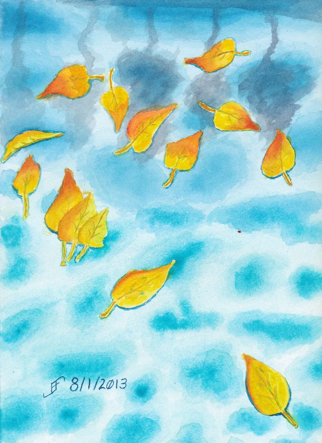
20130801 - Leaves on Water

Here's an attempt to show leaves floating on water. The water is of course a pool. Though I need to improve the technique, I am very happy with my new paints, since they are so very vibrant. Enjoy!