Showing posts with label Local/State/National Park. Show all posts

Monday, December 30, 2013

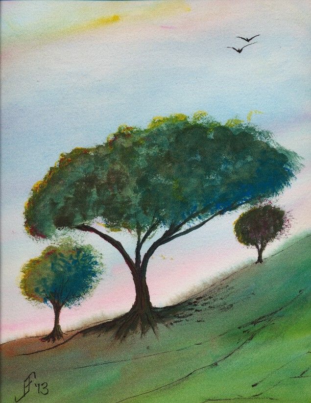
20131229 - Tree

Well, it's time to get back to painting. As I may have mentioned, I had a partial vitreous detachment in my one good eye. Though it's not a problem and did not lead to a retina detachment, as I first worried, it did leave a "big honkin' floater" (per the senior ophthalmologist, who examined me) in the MIDDLE of my field of vision. But they are right. Eventually your brain mostly ignores it. And after several weeks of playing various computer games, I mostly don't notice it, or can rather automatically flick my eye to move it out of my way.

So, let the paintings begin. I went to the Art of the Carolinas during the beginning of November. While there I received a sample of Sennelier watercolor paint. Like my M. Graham watercolor paint, it uses honey as one of the binders. This allows the paint to retain a moist quality. Surprisingly, the prices are similar to the M. Graham. And the colors are wonderfully vibrant. I might add some of them to my palette. I'm happy. I now have two paint lines from which I can get the type of watercolor paint that I like.

This 10" x 14" painting is done on a Daler-Rowney The Langston Prestige watercolor block. I only used three paints to create this painting. It includes a yellow, red and blue. The yellow is Sennelier Yellow Light. The red is Opera Rose. And the blue is Cinereous Blue.

The yellow and red are transparent watercolor paints. But the blue is opaque. So, I laid down the sky before anything else. Likewise with the green (blue and yellow), I assumed (correctly) that it would cover any other paint.

Unlike most of my pen & ink paintings, I added the ink to this painting after painting the subject. I usually add it before as an underpainting. There were two reasons I did not do it this time. First, and foremost, I wanted to try this paint without the confinement of the pen & ink underpainting. Second, I decided that just a touch of details to the landscape and trees would help.

This painting is not based on any reference photograph. It's solely pulled from my imagination. My intent is to portray a bit of a windswept hill in the area of transition between grassland and woodland areas. The time of year is early summer. It is past the yellow/green of spring, but not into the deep greens and dried browns of summer. Additionally, this is an early morning or early evening sky, with the sun just starting to set and casting a pink and yellow glow. I've seen a few of those sunrise / sunsets to know that when that happens it tends to dramatically increase the color vibrancy. It's almost as if we suddenly see a new color in the world.

Here's hoping this painting helps brighten your day, offering both warmth and hope for your day.

Sunday, September 29, 2013

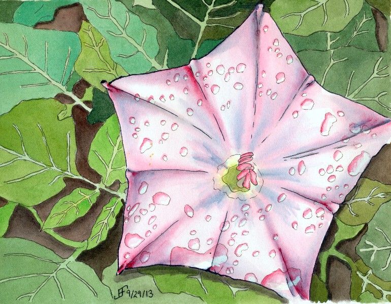
20130929 - Flower Power - Star Flower

Why not continue a great theme. Here's a pen & ink with watercolor painting that does just that. Flowers can be amazingly difficult, but also wonderful as a painting subject. Nature tends to create some very subtle (at least to our eyes) shading. Of course, if we could see in the spectrum that bees see, we would not think their shading all that subtle! By the way, see the video toward the end of this blog post for more information on that. Painting that subtle shading can be formidable. But I think I'm starting to get the hang of it. So, what do you think?

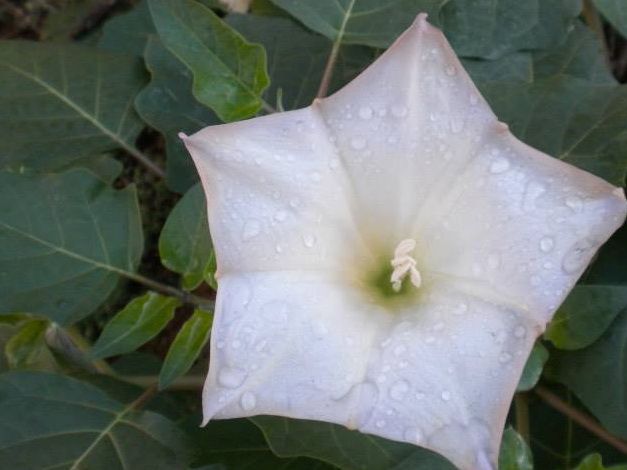
This particular flower is a rendition of a photograph that my cousin took during her travels in the US Southwest. I'm not certain the type of flower, but it was pretty remarkable. And I decided it would make a lovely painting.

As you can see from the photograph, it's an unusual flower shape. The coloring is in fact very subtle. I decided to punch up the color a bit. I also decided to add a little trick that I've seen .. adding water drops to a painting.

You might be wondering how I did this one. Well, it starts with the pen & ink drawing of the painting. Once again, I used the blue ink to create the outline of the petals and the blue shadow areas. The leaves and water drops I created with black ink. I added the shadows with a water brush and the black ink. Then I added the color onto the flower and the background. By varying the green, I made the leaves feel "right". There is a fairly natural change of colors. Otherwise the outlining of the veins of the leaves would tend to make them appear is if they were a cartoon.

Anyway, I hope you enjoy this painting as much as I enjoyed making it.

Oh, don't forget to watch the science video:


Tuesday, September 24, 2013

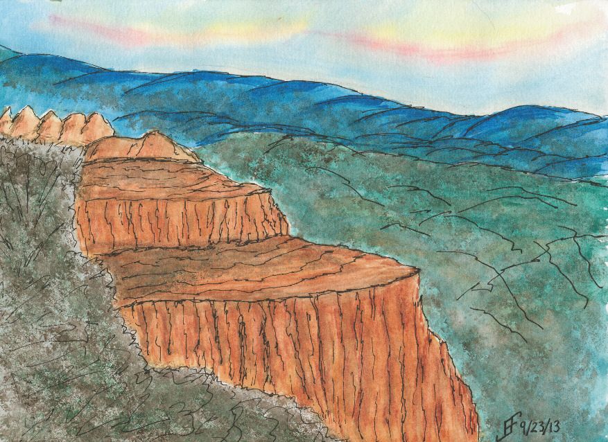
20130924 - Moody once again

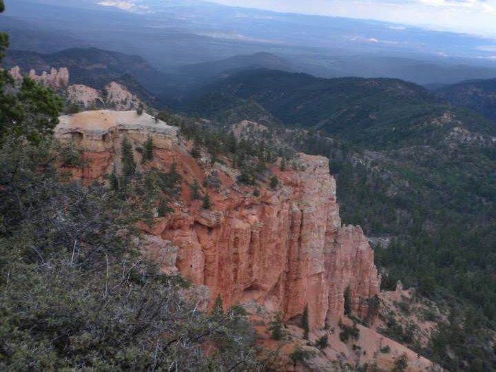
Once again I attempted to capture a mood from a picture. The original of Bryce Canyon shows a stark outcrop of mesa from the side of a canyon wall. It's that out thrust in stark contrast that I wanted to try to capture.  I was not terribly worried about the actual detail, as much as that stark out thrust. Thus, the painting does not slavishly try to reproduce the original photography.

Yes, the sky is not right. This was just a sketch and I was playing with it a bit. Additionally, I realize that the colors are not quite the same. Nor was I worried about getting all the details of the scrub land below.

What I do like is the strong contrast between the colors (reds vs. greens .. a complimentary color pair) and values (light orange color versus dark green blue .. both a color compliment and light versus dark value). These contrasts help capture that sense of stark out thrust in the landscape.

Sunday, September 22, 2013

20130922 - Playing with color

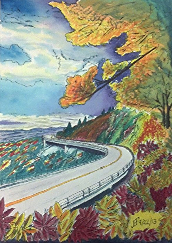
Using some of the lessons that I learned during the past couple months, I decided to tackle a larger version of the Blue Ridge Parkway painting. You might remember that was one of my first pen & ink with watercolor wash paintings. While I liked it, it just lacked the vibrancy that I see in various landscape paintings.

So, my thought was to accentuate the color compliments (opposite colors on the color wheel) as well as accentuating the difference in light versus dark.

First I started with a pen & ink with waterbrush wash. That provided the outline for the painting. It also provides the "under-painting", which helps determine how light and dark portions of the painting should be.

Then I added the watercolor. I decided to change it to a later afternoon / evening and change some of the colors. Until I can get it copied, the following photo using my phone should show you the difference in my color choices.

While it's still "not there" yet, it's interesting seeing the difference in the way that I see and portray a scene. The sky is much more dynamic and the color choices are much more vibrant. It just pops with color.

Sure, there remain some problems. The red of the leaves below is too cool (too blue). It should have been a warmer (scarlet) color. And I got a muddy side of the hill. But the color choices are much more vibrant than in the past.


Saturday, September 14, 2013

20130914 - Dragonfly

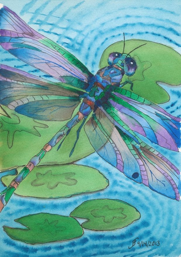
Well, the dragonfly painting is done. There are some things that I would correct. But overall, I'm pretty pleased with this one.

Want to know what I should improve? Here goes. They are not "nit picky", but they don't absolutely spoil it either. But it is a chance to learn more as I work on a piece.

Here's the first item. The upper right lily pad is not oval enough. Thus, it suddenly feels as if the perspective of the painting warps. You go from looking down and sideways toward the lily pads to down onto that upper right one. Lesson learned.

The second item is that the color of the purple in the lower two wings (toward the body of the dragonfly) was created rather than selected from my palette. The purple works better when it's from the palette.

The third issue is that the wings are a bit darker than I would like. They would appear to appear to "shine" more if there was more of the white of the paper showing.

There are other minor things. But as I noted. For the most part, I'm pretty pleased with this one.

There are some things that are right. I got the right gossamer wing effect. You can see through the wing to the lily pad in the center. And I tinted (using a glaze) the wings to make them slightly green in that area. That worked well.

But the most important thin is that I hope you enjoy seeing this as much as I enjoyed making it.

Friday, September 13, 2013

20130912 - Water Lily (A Happy Accident)

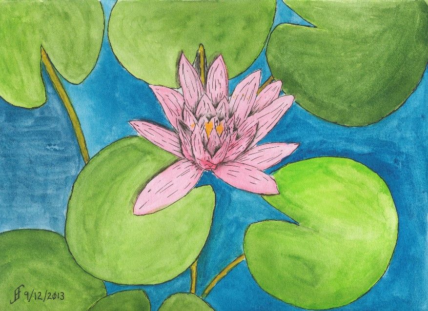
Today's painting is not any sort of masterpiece. In fact, I might normally have trashed it due to problems I had when painting it. But I decided to "stick with it" and try to rescue the painting. The result was a bit of a "happy accident".

This started as an attempt to render the photograph of the water lily I had taken at the JC Raulston Arboretum. Unfortunately, when I went to add a little pink into the water lilly, it exploded out of the brush and filled the water lilly. No smooth transitions.

As I noted, normally this would qualify as an unmitigated disaster. Time to take the paper off the pad of watercolor paper, crumple it, and throw it away. But for some reason, I decided to see what I could do with the painting anyway. I figured that I could still continue to hone techniques, even if I didn't want to hang the painting.

Of course, being careful about the amount of paint on the paint brush was my first lesson in this painting. If you take the time, you learn as much or more from your mistakes. Lesson one .. Brilliantly demonstrated!

Part of the problem with this painting is that I have a ceiling fan right over where I paint. If it is running, the flow of air tends to dry the paper too quickly. As a result, "washes" (or large areas of paint that should appear uniform) tend to dry way too quickly. The result is that you can see the brush marks in the painting. Notice the blue water to the left of the lily? See how uniform it appears? The other areas of water show the brush marks. Yuck! Lesson Two .. Sigh! I should have known better!!

So, I finished the painting, but the water lily was a blob of color. What could I do to "rescue it". I decided to add pen & ink to the mix. While it helped, it seemed to make it appear a little "cartoonish". Compare the water lily to a cartoon (such as the Red and Rover cartoon). So, I decided to try to play up that sense of cartoon and added more pen & ink lines to the drawing. And suddenly the painting went from disaster to whimsical. Ta-da! Lesson Three .. By adding lines to a painting with vibrant colors, you and end up with a whimsical painting.

It's still not a painting I would give as a gift. But instead of a failure, I ended up with a painting that taught me more than I knew before I painted it. A "happy accident". Though like all things in life, such "happy accidents" occur to those who are prepared to learn from mistakes and take advantage of those "opportunities".

From failure to "happy accident". Is it all just our perspective? The answer is, of course, a resounding "Yes!!".

Thursday, September 12, 2013

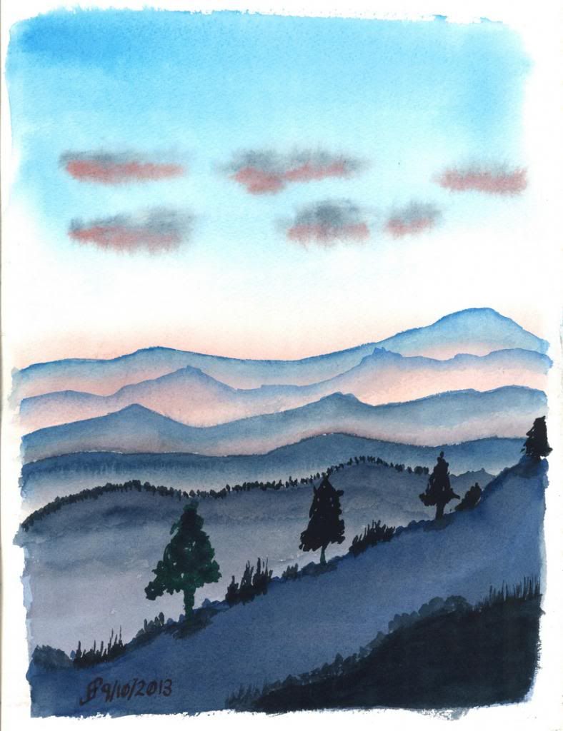
20130911 - Blue Ridge Mountains


Living along the Appalachian mountain range most of my life left me with a clear image of mountains. They are rolling hills that go as far as the eye can see.

Here's a painting that tries to capture that sense of rolling hills at sunset. You get a slight orange/pink hue tinging the mist and highlighting any remaining clouds.

It's very restful and I highly recommend this to anyone who visits the area.

Hope you enjoy!

Sunday, September 8, 2013

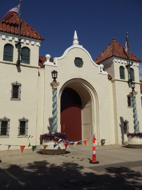
20130908 - Urban Sketching

NC State Fairgrounds (Source Photo)
In addition to courtroom sketchers, there are many artists that try to capture life as it is lived. They capture the "urban landscape". These are the Urban Sketchers. They provide a great example of what pen & ink drawing / painting can do.

The Urban Sketchers manifesto states:

  • We draw on location, indoors or out, capturing what we see from direct observation.
  • Our drawings tell the story of our surroundings, the places we live and where we travel.
  • Our drawings are a record of time and place.
  • We are truthful to the scenes we witness.
  • We use any kind of media and cherish our individual styles.
  • We support each other and draw together.
  • We share our drawings online.
  • We show the world, one drawing at a time.
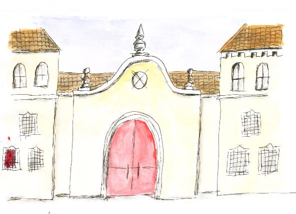
NC State Fairgrounds (Canson)

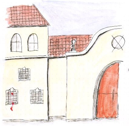
So, I decided to try my hand at this style of sketching / painting. To do this, I will use various photographs that my wife and I took over the years. These source photographs will teach me how to sketch and capture the essence of a scene. For example, the drawing above of the NC State Fairgrounds provides a good reference photograph. Understand that for a while, I will simplify the scenes that I wish to sketch. But as my skill progresses, I will try to accurately represent what I see in the photographs in my sketches.

One thing to note is that it is important to use the right sketchbook for this type of sketching. It requires the ability of the material to handle both pen & ink and watercolor. It needs to not absorb the watercolor too quickly. It needs to be able to handle scrubbing and not dissolve into a pulpy mess.

NC State Fairgrounds (Rhodia)
I have a Canson Universal Sketchbook that I've been using. While it does quite well for pen & ink, it tends to buckle severely when I add water. Plus, color that I place onto the paper seems to be pretty muted. It is not ideal. I will continue to use it. But I probably won't use it for urban sketching.

I also have Rhodia paper. It's a great paper for jotting notes and even capturing some simple sketches. Unlike the Canson paper, it does a better job of presenting the colors. Colors are fairly vibrant. The Rhodia paper does not absorb water as quickly. But it still tends to buckle when water is added. I will continue to use it for jotting notes and some quick sketches.

NC State Fairgrounds
(Stillman & Birn Zeta Series)
Another sketch book that I have is the Strathmore Visual Journal. Since this particular one is designed primarily for watercolor (and uses 140lb, cold press paper), it's not ideal for pen & ink. The paper will tend to absorb the ink too quickly. So, I'll use it for watercolor sketches (without the pen & ink portion).

Finally, I decided to purchase a Stillman & Birn Zeta Series Sketchbook. This sketchbook is 180lb natural white with a smooth surface. It's ideal for mixed media, including pen & ink and watercolor. The paper tends to buckle a little if you really saturate it. But the color it presents is very vibrant. This is the sketchbook that I will use for urban sketching.

Saturday, September 7, 2013

20130907 - Rose

It's classic: "A rose by any other name would smell as sweet" .. Shakespeare realized the essence of a thing is not its name. It is the characteristics of the thing that define it. This is true of roses. It is true of people.

This is particularly true of how the world often views "christians". Why is that? Well, for those who follow Christ, it's important to sometimes hold up a mirror and really look at ourselves. Do we endorse folks like Westboro Baptist Church? They claim to be "Christian". Yet, they spout hate speech whenever they get the chance. Is that the message of Christ? Is it fair to then say "All Christians are fanatics"?

Is our society any different when we turn and claim all Muslims clearly are violent and preach violence? Are we not lumping all adherents of Islam into the same boat as the extremists? Are we doing anything different than when someone claims "All Christians are fanatics"?

Ah, well. See what happens when I contemplate a rose for a day. Interestingly, I find that on my journey to develop my skill with watercolor, I find time to contemplate the world around me. It's a chance to learn some perspective .. in many different ways.

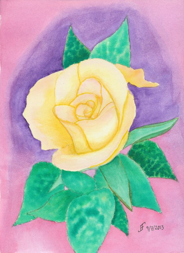
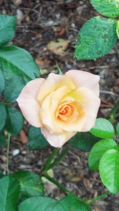
Back to a Rose .. This rose is based on a rose that I found at the JC Raulston Arboretum. The color is a wonderful cream / coral color with a blush of rose pink toward the edges and a light orange color inside the blossom. Getting that transition of colors is very hard to accomplish .. at least for me at my level.

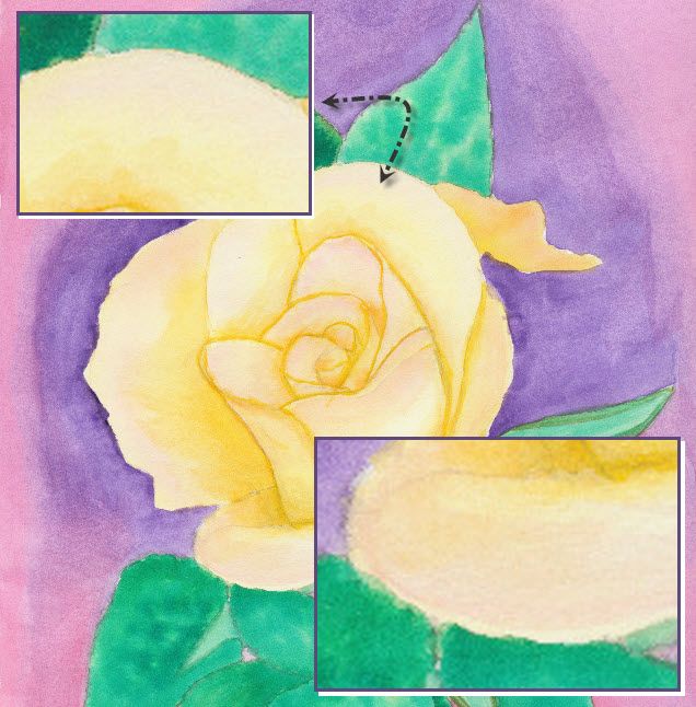
But I learned a trick yesterday in class that I wanted to apply. It involves wetting the area to paint with plain water. Then painting the base color (unless you are leaving a little bit unpainted to have some white show). Then you drop a touch of color in the area you want to blend together. It takes practice. As you can see (just barely) from the detail in some areas of the rose (top left highlighted area) the blending went just right. But if you have too much water then you get some distinct water marks when the water evaporates. It looks for all the world like a "high tide" mark on the painting.

Ah well, it's a process of learning the techniques to accurately portray what I see. The important thing for me is that I enjoy learning and trying. Hopefully you also find the process enlightening.

Thursday, September 5, 2013

20130905 - Bracklinn Falls Bridge

Well, it's finished. During odd moments yesterday and this morning, I was able to finish the pen & ink (with a dab of watercolor) drawing. Of course, I can see the mistakes. But the good news is that my ability to see a scene and capture it on paper continues to improve. I need to continue to work more on foliage and landscapes.

If you are interested in learning more about the falls and the bridge, see the Bracklinn Falls website. You can see from the side photo that the bridge is quite unique. It replaced an old iron bridge that was washed away in a flood in 2005. The photo above appears to have been taken shortly after the new bridge was installed. Since the wood has weathered to a gray color. All except for the four larger timbers that hold up the roof and truss system.

Based on this drawing/painting, I will do more work on bridges. It's important to get the perspective right with bridge. They also have incredibly interesting lines. There are all sorts of bridges in all sorts of locations. Plus, I can use many different stylistic approaches to rendering the bridge. And of course, it doesn't hurt that I've always loved bridges.

Shout if you have a favorite bridge.

In the mean time, remember to take a little bit of time to really see the world around you. It's an amazing place that we all too often take for granted.


Wednesday, September 4, 2013

20130904 - Bracklinn Falls Bridge continued


Yesterday was a busy day. Jennifer and I take Tuesdays as a day to go out and enjoy movies, a dinner out, and time together. We also give Rosco the chance to run and play at least part of the day at Furry Feet Retreat (a dog daycare) in our area. Since he's not just our pet, but also my service dog, and acts as a therapy dog, it is important to allow him to have some play time throughout the week. Though he is an adult dog at this point, he still has plenty of puppy zest in him. And if we had any doubt about that watching him sproing up in the air (as a gazelle does) several times with sheer joy and twirl around a few times .. just with the thought of going to "camp". Well, if you don't find that sheer joy infectious, nothing would move you!

But as a result, I did not finish the pen & ink drawing last night. I hope to finish it today. I've made some progress, but it will take several more hours of work to complete.

Let me know if you find this type of post interesting. Is it interesting to see the progress on a work as I am working on it? I am thinking about doing a series of pen & ink drawings of bridges of various types. Would anyone else find that interesting? Let me know.

By the way, I found a video of the new bridge, which was posted to YouTube shortly after it opened:


Tuesday, September 3, 2013

20130902 - Callander Bracklinn Falls Bridge

My friends in Callandar, Scotland took a picture that will make a great pen & ink drawing. I'm thinking I'll just do this as a pen & ink with a water wash. No watercolors.

Yup. You guessed it. It's that wonderful perspective that's so interesting for me. Since this is almost monochromatic (just different intensities of one color), I think this will be perfect for a pen & ink. I'll use green to help highlight the foliage. But otherwise, black ink should do.

Here's the start of the drawing. What do you think? Should be fun. Hopefully, I will be able to remain patient while doing all the detail.

I hope you enjoy seeing a drawing in progress. It's not magic. It just takes time and patience.

Sunday, September 1, 2013

20130901 - Completed Garden Path

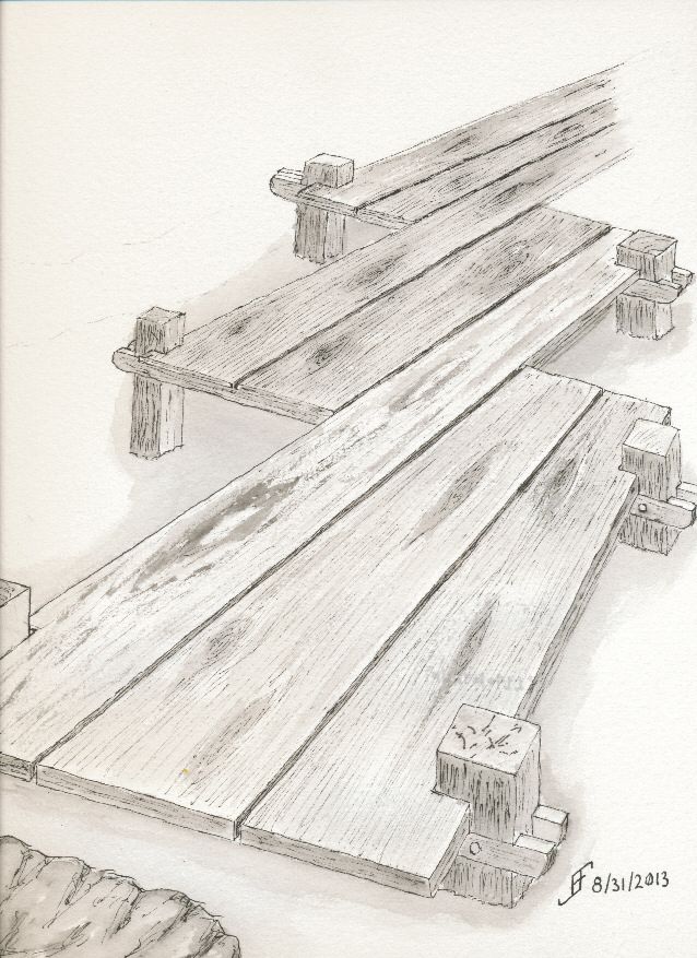
Here is the completed Garden Path painting. As you can see, the color added a great deal to this picture. I managed to capture the face that boards on a boardwalk are often replaced. I have a mossy/algae stained area on the boardwalk.


As I mentioned, I forced the perspective a little bit so it feels as if the boardwalk if wending it's way through the bushes. Even in the original picture the angles are odd. I just accentuated that a bit.

Overall, I find that I really enjoy doing the pen and ink drawing and then adding the watercolor to build onto the drawing. It's a fascinating process. One I hope to enjoy many more times!

I hope you enjoy this as much as I enjoyed making it.

20130901 - Garden Path Pen & Ink Drawing Completed

Well, I changed my mind and decided to add more detail in pen & ink. As you can see, the boardwalk no longer floats in space. So, the tonal sketch is complete. Now to add the color.


Saturday, August 31, 2013

20130831 - Down the Garden Path

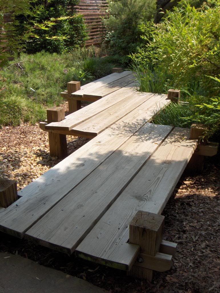
I remembered a photograph I had taken many moons ago at the JC Raulston Arboretum. It was a wonderful garden path wending its way through the garden. Here is the original reference photograph:


I particularly enjoy the shape of the walk way. So, I decided to use this as the reference and create a pen & ink with watercolor painting. I've not completed the painting. But I've done the pen & ink portion of the painting.


As you can see, I intentionally accentuated the perspective. I just love that shape and thought a little bit of emphasis would help others see how unique it is. But I'm pretty pleased with the plank of wood effect that I was able to create.

In addition to that change, I will change some of the background. For example I will probably add a phlox bed in front of some ornamental grass. I will use watercolors to create the impression of wood chips and pebbles. I should finish it some time tomorrow evening.

Sunday, August 18, 2013

20130809 - Yates Mill

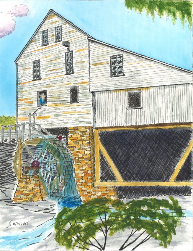
Well, I was able to finish my pen & ink of Yates Mill. Yates Mill is a Wake Country park. They also have a website, which is titled "Escape the Daily Grind". You have to love a sense of humor!

This pen & ink was does using Sakura Pigma Micron pens:


Then I added a watercolor wash to the drawing. The result is:


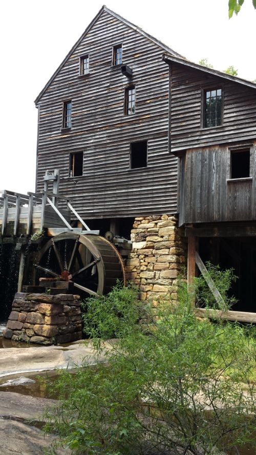
This particular scene is based on the following photograph. However, I merged together several different views of the mill to create this one.


As you can see, I changed several angles and emphasized the building and the miller (which I added).