Sunday, September 29, 2013

20130929 - Flower Power - Star Flower

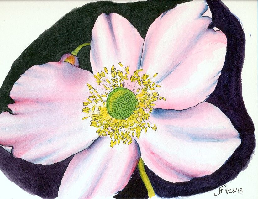
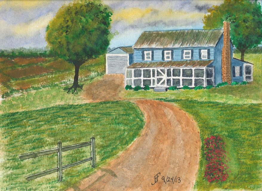
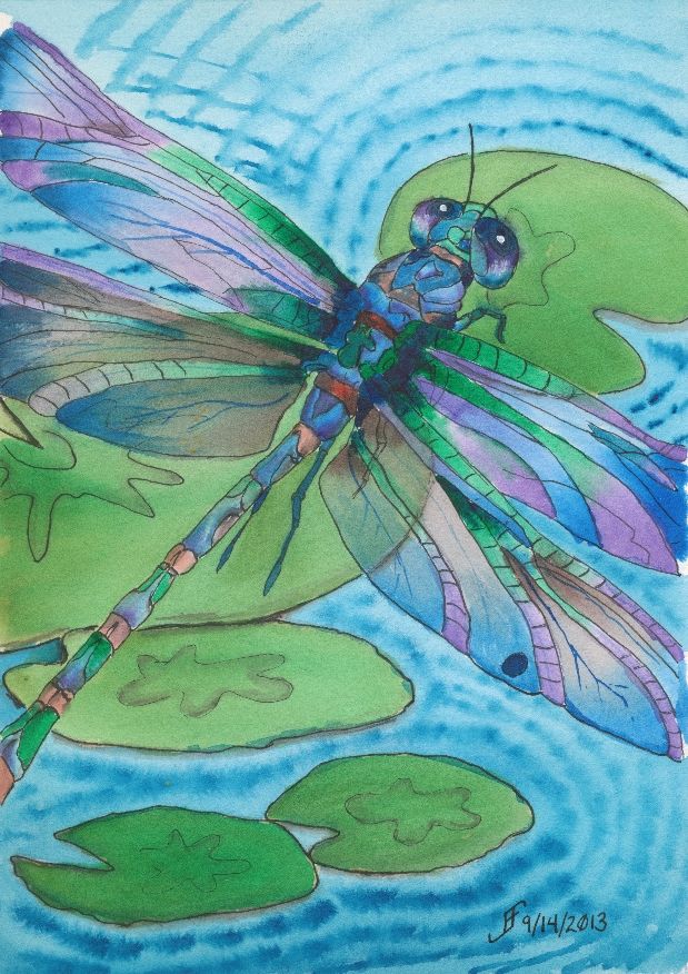
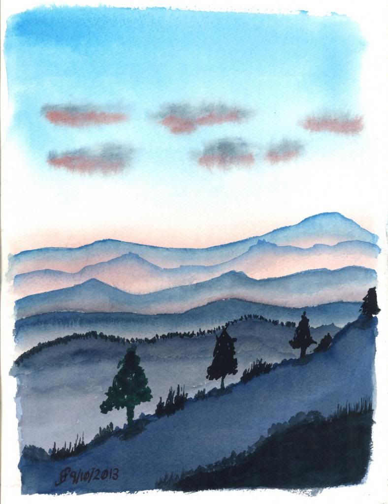
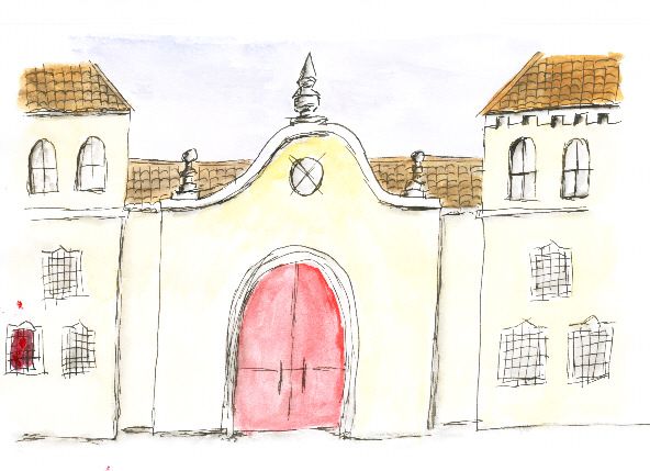
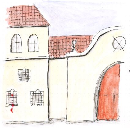
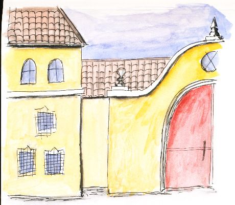
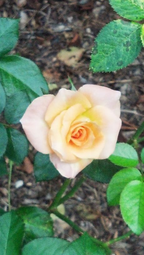
Why not continue a great theme. Here's a pen & ink with watercolor painting that does just that. Flowers can be amazingly difficult, but also wonderful as a painting subject. Nature tends to create some very subtle (at least to our eyes) shading. Of course, if we could see in the spectrum that bees see, we would not think their shading all that subtle! By the way, see the video toward the end of this blog post for more information on that. Painting that subtle shading can be formidable. But I think I'm starting to get the hang of it. So, what do you think?

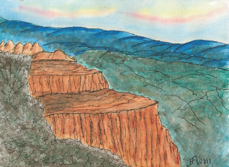
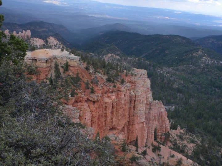
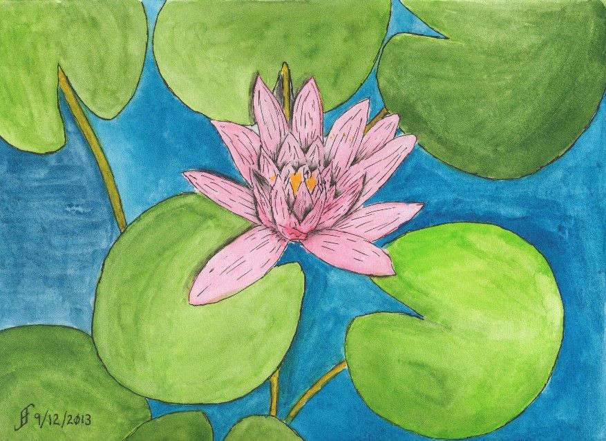
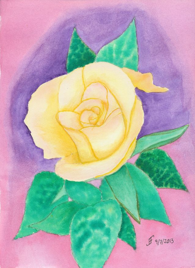
This particular flower is a rendition of a photograph that my cousin took during her travels in the US Southwest. I'm not certain the type of flower, but it was pretty remarkable. And I decided it would make a lovely painting.

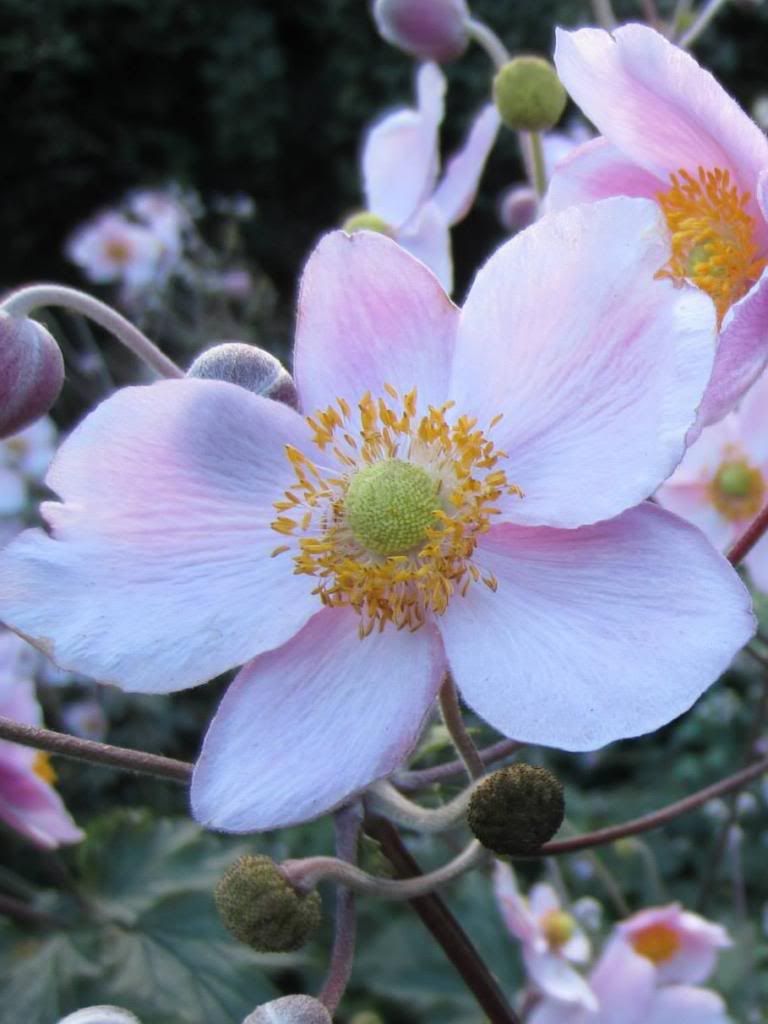
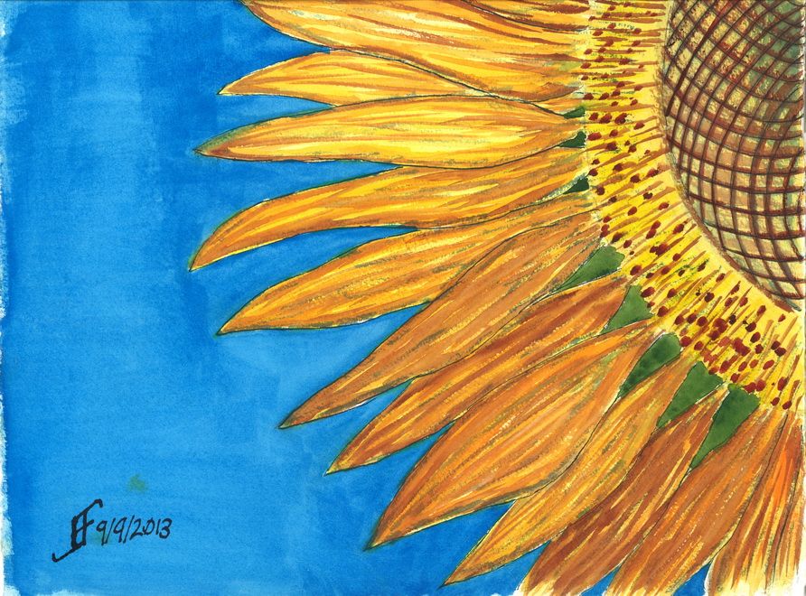
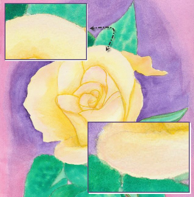
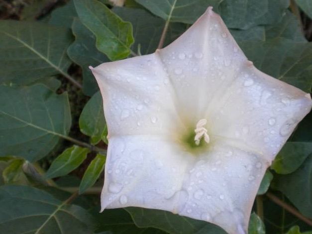
As you can see from the photograph, it's an unusual flower shape. The coloring is in fact very subtle. I decided to punch up the color a bit. I also decided to add a little trick that I've seen .. adding water drops to a painting.

You might be wondering how I did this one. Well, it starts with the pen & ink drawing of the painting. Once again, I used the blue ink to create the outline of the petals and the blue shadow areas. The leaves and water drops I created with black ink. I added the shadows with a water brush and the black ink. Then I added the color onto the flower and the background. By varying the green, I made the leaves feel "right". There is a fairly natural change of colors. Otherwise the outlining of the veins of the leaves would tend to make them appear is if they were a cartoon.

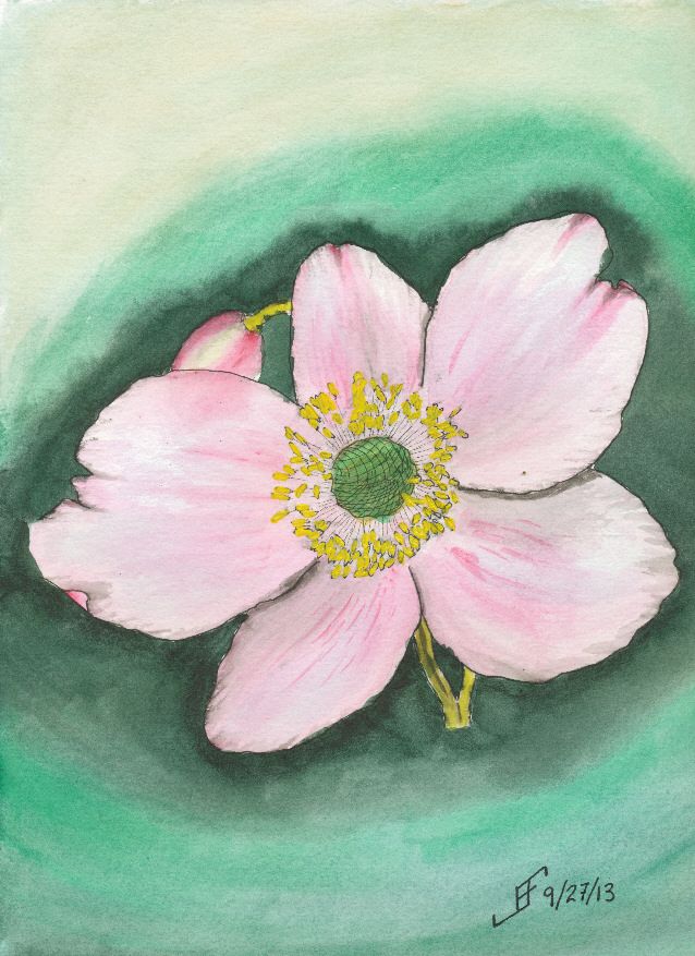
Anyway, I hope you enjoy this painting as much as I enjoyed making it.

Oh, don't forget to watch the science video:


20130929 - Flower Power Take Two

So, as I mentioned, I thought I would try another shot at that painting of a flower. This rendition of a photograph of a flower from her trip to Scotland. I think you will agree the results this time around are much clearer and more enjoyable.

This time, I decided the orientation of the flower to the sheet of paper should be flipped and it be painted in "landscape" mode. And of course, I also used a whiter paper and smoother paper (hot press). That tends to make the color transitions smoother.

I also used blue ink for the petal outline, which gave me the blue highlights within the petals. This under painting is known as a "grisaille". It provides the value of light to dark within the painting subject (though the dark background is done only with watercolor). Additionally, I used three colors of ink. The anthers (the part of the flower that contains the yellow pollen) were drawn with black ink. And the center portion (where the seeds form) the pollen is deposited was drawn with green ink. It probably did not need such differences, but it seems to have made the picture less "muddy". (The colors are more vibrant).

And of course, in keeping with my lessons learned, I used the masking fluid to block off the anthers, so that once everything else was done, I could paint them a yellow color. As you can see, this time around, the painting is closer to the photograph.

Clearly doing art is something that improves with practice. But it's rare to see someone work through what works and what does not. Hopefully you find this type of post interesting. It helps me to "talk through" my own process of learning. I'm enjoying it. I sure hope you are as well.


Saturday, September 28, 2013

20130928 - Flower Power

Today's subject is based on a photograph of a flower that a friend took in Scotland. This is a pen & ink with watercolor rendition of the photograph. While the flower itself is not bad, the background needs some work. I suspect it would look better if I used the three primary colors to add interest around the flower.

The color of the paper is a bit browner than some of the other watercolor paper that I have. I'll need to remember that when I do a light colored painting in the future. This is Strathmore 400 paper, which normally is fine for most of my paintings. But it does a poor job of scanning as a white paper. The Daler-Rowney The Langton Prestige and the Arches watercolor paper have a brighter white than this paper.

I also should have used masking fluid (also known as "frisket") to preserve the white of the center portion of the flower. Without it, the colors are not as true to life as I would like.

Oh, and so you can compare, here is a cropped original photograph (cropped to focus on one flower).

Once again, I hope you enjoy seeing the process I go through with each painting and what I learn from working on them. I know I find it enjoyable.

Friday, September 27, 2013

20130926 - Fall Foliage

Here's a quick sketch of a fall foliage around a vacation spot in the New England area. It's roughly based on an image I saw in the news yesterday.

This one did not turn out as well as I hoped. I'm tired, so I did not put as much into this as I should have. Lesson learned.


As you can see from the original photograph, it's well worth taking time to enjoy it. And indeed, I hope you enjoy both the photograph and this sketch.


Thursday, September 26, 2013

20130926 - Garden

In a word ... YES!! I am very happy with this painting. I have been looking at courses offered during the Art of the Carolinas show. One of the instructors is Tom Lynch, an internationally known watercolorist. One of his courses is titled "The Magic of Leaving White Paper". The sample photo (which you can see below) intrigued me and made me want to try something along that line. I know I'm not as good at watercolor painting as he is, so I simplified the painting quite a bit. And I added some flowers behind the picket fence. And VoilĂ !


For the first time, I feel as if I've crossed the boundary from primitive watercolor painting to more artistic watercolor painting. Not that I could (since it's a copy of Tom's painting), but for the first time, I would not be embarrassed to sell this painting.

Hopefully you enjoy this adventure as much as I enjoy the process.


20130925 - NC Farm House Take Two!

Sometimes it takes more than one time before you get it "right". I'm not all the way "there" yet. But I am definitely learning what works for me and my own personal style of painting. This afternoon, I decided to give another shot to the North Carolina Farm House theme.

As you can see, it's not the same as the previous farm house. In fact, this is more of a run down mansion compared to many farm steads in North Carolina.

As with my previous painting, I decided to try something different with this painting. I decided to have a rain cloud off in the distance. There are great swaths of the state where .. if you can see beyond the tree line .. you can see such rain clouds. So, here we have a cloudy sky with rain in the distance. This mutes all the normal colors that I would tend to choose.

The trees are getting better. The grass is not quite so crass. And the shrubs look as if they might have Knights who say "Nee" looking for them:


By the way, here's the original photograph I used as a reference.


Oh, if you were wondering, since I use this only as a painting exercise and not to create a painting to sell, I can copy use a photograph like this.

Well, I hope you enjoy this. I definitely enjoyed working on it. But it's getting late and I need to crash for the night. Enjoy!

Wednesday, September 25, 2013

20130925 - Pacific Sunset

Some of the most attractive settings to paint are sunsets. This painting is based on a photograph a friend took while on vacation.

I can't say that I spent a lot of time on this painting. However, I was trying to capture the different layers that you see in a sunset over the pacific ocean. You of course start with a darker sky the farther it is from the horizon. You often have light clouds reflecting the sunset. And of course there are often clouds closer toward the horizon line. Then the ocean line has several layers. The first is a deeper zone where the waves show a darker color. Then you have a lighter zone which typically reflects the sunset. Finally you have a wet beach before you reach the vegetation at the beach line.

And if you frame it just right, you'll have the edge of a tree in the upper left or right corner.

Here's hoping you enjoy this painting. If you hear the breakers rolling into the shore, don't blame me! It just seems to come with this type of setting! :-)

20130924 - NC Farm

Today's painting is of a North Carolina farm, you can tell by the red clay and the tin roof with the screened porch. It is the result of using the a teaching video and modifying the subject a little to make it a unique painting for the area where I live.

The original video was made by Mike Keal. It is a teaching video by Terry Harrison, which shows him creating an English farm landscape. I enjoy doing is watching videos of artists to take the time to help show others what you can accomplish with a watercolor painting. The advantage of using example videos is that it provides me both with techniques and a target for my own painting.

I varied the scene quite a bit. The sky is a stormy sky later in the day. You will sometimes see a yellowish / greenish sky in advance of a severe thunderstorm in this area. Such a sky is never a good one to see, since it can lead to tornadoes in the area. Oddly, you will note the Carolina blue in the sky. We often see such skies in this area .. even ahead of a severe storm.

Hopefully you will enjoy this one. This took longer than many of my paintings. There are many things I like about this one. Some that I will improve next time. One thing is that this may have been easier with a larger paint surface. This is a 9x12 inch watercolor paper block. The detail work is a bit hard at this scale.


Tuesday, September 24, 2013

20130924 - Moody once again

Once again I attempted to capture a mood from a picture. The original of Bryce Canyon shows a stark outcrop of mesa from the side of a canyon wall. It's that out thrust in stark contrast that I wanted to try to capture.  I was not terribly worried about the actual detail, as much as that stark out thrust. Thus, the painting does not slavishly try to reproduce the original photography.

Yes, the sky is not right. This was just a sketch and I was playing with it a bit. Additionally, I realize that the colors are not quite the same. Nor was I worried about getting all the details of the scrub land below.

What I do like is the strong contrast between the colors (reds vs. greens .. a complimentary color pair) and values (light orange color versus dark green blue .. both a color compliment and light versus dark value). These contrasts help capture that sense of stark out thrust in the landscape.

Monday, September 23, 2013

20130923 - Setting a Mood

This week the lesson for art class is how to create a mood for a painting. For example, a misty coastline in Oregon provides a great example of how you need to create a unified painting that expresses a mood more than just "capturing" the setting.

While I think I accomplished that in this painting, the scan does not convey the subtle misty blue sky. Oh, and as you can see from the reference photograph, I decided to emphasize the misty, lonely mood of the original setting.

While this is nothing to write home about, it definitely is better than my first attempt, which while it captured more of the detail of the setting, failed miserably at capturing the mood I wanted to convey. It was hard edged and did not have that misty, lonely feel. This one does capture that feeling.

Of course my wife wondered if those were boy scouts camped along the shore. Next one that I do like this, I will need to try to incorporate that idea into it. Hmmm....

Anyway, I hope you enjoy my ramblings as much as I enjoy creating these paintings.


Sunday, September 22, 2013

20130922 - Playing with color

Using some of the lessons that I learned during the past couple months, I decided to tackle a larger version of the Blue Ridge Parkway painting. You might remember that was one of my first pen & ink with watercolor wash paintings. While I liked it, it just lacked the vibrancy that I see in various landscape paintings.

So, my thought was to accentuate the color compliments (opposite colors on the color wheel) as well as accentuating the difference in light versus dark.

First I started with a pen & ink with waterbrush wash. That provided the outline for the painting. It also provides the "under-painting", which helps determine how light and dark portions of the painting should be.

Then I added the watercolor. I decided to change it to a later afternoon / evening and change some of the colors. Until I can get it copied, the following photo using my phone should show you the difference in my color choices.

While it's still "not there" yet, it's interesting seeing the difference in the way that I see and portray a scene. The sky is much more dynamic and the color choices are much more vibrant. It just pops with color.

Sure, there remain some problems. The red of the leaves below is too cool (too blue). It should have been a warmer (scarlet) color. And I got a muddy side of the hill. But the color choices are much more vibrant than in the past.


Friday, September 20, 2013

20130920 - Fall Leaves

Well, I'm back from class with a finished painting. This week we were working on fall leaves. I decided that I wanted to mix pen & ink along with watercolors.

I used my Noodler's Ahab pen along with Noodler's Ink Whalman's Sepia. Sepia just seemed to be the perfect color for a fall foliage watercolor. So, along with a Pentel Aquash water brush, I created the basic outline for the watercolor painting.

The painting for the class is based on an old photograph of a painting from an old magazine (or catalog). The original photograph had a fairly muddy background.

While it's colorful, it really lacks definition. It may well be that in person it is more interesting than this photograph presents. That often happens with paintings. The devil is in the detail and in this case a lot of detail is lost in this photograph.

So, I decided to clean it up and make it a little more abstract. Since it is based on another work, I can not claim credit for either the composition or even the work. I won't be selling this. But I do think that my interpretation is less busy and more interesting.


As I've noted before, sometimes our role (in life and art) is to highlight those things that are important. I don't think a slavish adherence to realism is as important as that ability to spotlight things that are important to us and others. So, when you look around take note of what's important and ask yourself if you have highlighted it enough for others. Are you encouraging others to see the world in a new light?

Thursday, September 19, 2013

20130919 - Preparing for Class

Time to get ready for my watercolor class tomorrow morning. Make certain my paper is in the backpack. Make certain the paints are clean and in the backpack. Make certain the pens are ready to go. Make certain the image we are going to work on has been outlined onto one of the paper blocks. Do I want to do this as a combination of pen & ink and watercolor?? .. Or do I want to do it as just a watercolor?? I think I'll probably lean toward pen & ink with watercolor. Those are the most satisfying paintings in my book.

Oh, as you can see, I tinkered around with my sketchbook. I'm really pleased with it. The colors come out so very vibrant. Plus as you can see, a quick 10 minute sketch comes out a lot more as I intend it than it once would appear. I can see the progress I am making. That's reassuring.

Wednesday, September 18, 2013

20130918 - St. Francis Statue in Garden

I finished the painting of the St. Francis statue in a flower garden. This painting came out okay. It's not quite what I wanted. But it's not bad either.

I intended for the statue to be the most detailed object. The rest of the garden was painted to provide the impression of a flower garden. For a reason. It's the saints among us who are the most concrete (pun somewhat intended) individuals. We assume that their positions and beliefs make them less "worldy", when it is they that make the most difference. At once they see the world both as it IS and as it SHOULD BE. Then they go do the impossible. They transform the world in which we live to make it more like what it should be.

Isn't it odd that the saints among us see the world and us as the clay beneath their fingers. As much as we try to venerate them, but hold them at arms length, they wade into life and live it fully. And in so doing, they change our world for the better.

Tuesday, September 17, 2013

20130917 - Starting St Francis in Garden

Well, I've decided my next pen & ink with watercolor painting. I will do a Saint Francis statue in a flower garden. The Saint Francis statue will only be done with pen & ink and the garden will only be done with watercolors.

As you can see, I've already done the Saint Francis statue. Now to add the garden. You might be interested in seeing the reference photograph. What's important to understand is that sometimes the perfect painting is something that's tucked away in a corner and not very conspicuous. Take a look at where the Saint Francis statue was located in the garden. It's very easy to overlook.

The role of the artist is to find that interesting item and highlight it through the painting. And in many ways, that's the role we all have. To highlight those things that are important to us. We highlight them to our children and our friends. Funny how my art is more about learning to live life well than it is about the mechanics of the art.


Monday, September 16, 2013

20130916 - Misty Marsh and Golden Koi

First of all, our objective today in the art class (Pen & Ink with Watercolor) was to create a misty marsh scene. As I've noted, I'm not very comfortable creating a very loose painting. This was my third or fourth attempt. I was doing wet into wet. Perhaps if I try a wet onto dry painting technique, I will have better success. I'm not completely upset with this one. But it's clearly not one of my better paintings. A clear sign that I have a lot still to learn. I knew it, but this clearly demonstrates that.


Of course, when I go to a more structured pen & ink with watercolor painting technique, I am much happier with the results. It's the engineer in me that wants the structure of a detailed drawing before I just start painting. I am not sure I will ever get past that completely.

Additionally, today Brian (my son) gave me a three bottles of Daler-Rowney FW Pearlescent Acrylic ink. So, I had to try it out. The result was a combination of pen & ink with the Pearlescent Acrylic Ink. The three inks were Galactic Blue, Mazuma Gold and Silver Pearl. So, I also decided to do a golden koi. As you can see, the pearlescent inks my son gave me work very well with pen & ink. I am much happier with this painting. You will no doubt see more of this type of painting in the future.

Saturday, September 14, 2013

20130914 - Dragonfly

Well, the dragonfly painting is done. There are some things that I would correct. But overall, I'm pretty pleased with this one.

Want to know what I should improve? Here goes. They are not "nit picky", but they don't absolutely spoil it either. But it is a chance to learn more as I work on a piece.

Here's the first item. The upper right lily pad is not oval enough. Thus, it suddenly feels as if the perspective of the painting warps. You go from looking down and sideways toward the lily pads to down onto that upper right one. Lesson learned.

The second item is that the color of the purple in the lower two wings (toward the body of the dragonfly) was created rather than selected from my palette. The purple works better when it's from the palette.

The third issue is that the wings are a bit darker than I would like. They would appear to appear to "shine" more if there was more of the white of the paper showing.

There are other minor things. But as I noted. For the most part, I'm pretty pleased with this one.

There are some things that are right. I got the right gossamer wing effect. You can see through the wing to the lily pad in the center. And I tinted (using a glaze) the wings to make them slightly green in that area. That worked well.

But the most important thin is that I hope you enjoy seeing this as much as I enjoyed making it.

Friday, September 13, 2013

20130913 - Dragonfly Start

Well, my last painting got me thinking about lily pads and ... dragonflies! .. Yup. I started a new painting. And while doing my research, I found a wonderful video to demonstrate how to paint a dragonfly by Judy Bergsma.


So, I am basing this painting on the style she uses in her demonstration. However, I decided that it should be a pen & ink with watercolor painting. I used her template as a guide. As you can see, the dragonfly is in flight above the lily pads.

I've finished the pen & ink drawing. I've done a little bit of shading work. Now to tackle the painting. I think I will use some of the techniques that she presents. However, I will attempt to show a little more of the background through the wings than she has in her painting, which you can see in the print of her painting.

Also as you can see from her print, there is a lot of detail in her painting. More than I am ready to try to tackle. I want to get a simple painting looking "right" before I attempt to tackle a more difficult background.

20130912 - Water Lily (A Happy Accident)

Today's painting is not any sort of masterpiece. In fact, I might normally have trashed it due to problems I had when painting it. But I decided to "stick with it" and try to rescue the painting. The result was a bit of a "happy accident".

This started as an attempt to render the photograph of the water lily I had taken at the JC Raulston Arboretum. Unfortunately, when I went to add a little pink into the water lilly, it exploded out of the brush and filled the water lilly. No smooth transitions.

As I noted, normally this would qualify as an unmitigated disaster. Time to take the paper off the pad of watercolor paper, crumple it, and throw it away. But for some reason, I decided to see what I could do with the painting anyway. I figured that I could still continue to hone techniques, even if I didn't want to hang the painting.

Of course, being careful about the amount of paint on the paint brush was my first lesson in this painting. If you take the time, you learn as much or more from your mistakes. Lesson one .. Brilliantly demonstrated!

Part of the problem with this painting is that I have a ceiling fan right over where I paint. If it is running, the flow of air tends to dry the paper too quickly. As a result, "washes" (or large areas of paint that should appear uniform) tend to dry way too quickly. The result is that you can see the brush marks in the painting. Notice the blue water to the left of the lily? See how uniform it appears? The other areas of water show the brush marks. Yuck! Lesson Two .. Sigh! I should have known better!!

So, I finished the painting, but the water lily was a blob of color. What could I do to "rescue it". I decided to add pen & ink to the mix. While it helped, it seemed to make it appear a little "cartoonish". Compare the water lily to a cartoon (such as the Red and Rover cartoon). So, I decided to try to play up that sense of cartoon and added more pen & ink lines to the drawing. And suddenly the painting went from disaster to whimsical. Ta-da! Lesson Three .. By adding lines to a painting with vibrant colors, you and end up with a whimsical painting.

It's still not a painting I would give as a gift. But instead of a failure, I ended up with a painting that taught me more than I knew before I painted it. A "happy accident". Though like all things in life, such "happy accidents" occur to those who are prepared to learn from mistakes and take advantage of those "opportunities".

From failure to "happy accident". Is it all just our perspective? The answer is, of course, a resounding "Yes!!".

Thursday, September 12, 2013

20130911 - Blue Ridge Mountains


Living along the Appalachian mountain range most of my life left me with a clear image of mountains. They are rolling hills that go as far as the eye can see.

Here's a painting that tries to capture that sense of rolling hills at sunset. You get a slight orange/pink hue tinging the mist and highlighting any remaining clouds.

It's very restful and I highly recommend this to anyone who visits the area.

Hope you enjoy!

20130909 - Sunflower

Well, they say into every dreary day a little sun must shine. Consider this bright and cheerful sun flower as your sun shine!


Wednesday, September 11, 2013

20130911 - Remembering ...

Regardless of your beliefs, loss of life should always be remembered. Of course, as Americans we proclaimed that we believe we are endowed with certain "unalienable rights, that among these are life, liberty and the pursuit of happiness".


Unfortunately, there are many who wish to try to terrorize others in the hope that it will change our beliefs. And in the mistaken perception that killing innocent civilians will somehow repay harm done to them. No matter the reasoning, such actions against the innocent is always evil.

Sadly on September 11th, we remember the loss of thousands of lives. Take time during your busy day to remember those who lost their lives and the hundreds of thousands that were impacted by such loss. Take time and then try with all your heart to embrace those around you and celebrate life. We sadly remember the 11th. But we proclaim our resistance to such evil. Instead of being terrorized, embrace life. Rejoice with the family you have. Solemnly remember, but refuse to allow terror to dominate your life.

Monday, September 9, 2013

20130909 - New Class / New Style

Today I started a new class at the Senior Center. This is a Pen, Ink & Watercolor class. While I really like the class, the content and the instructor, he emphasizes a more creative style of painting than I normally use. Yes, I was an engineer. I see the detail. I can also see the whole. But ignoring detail is so counter to my normal style that I find it grating.

But that's the style of painting that this instructor emphasizes.

While we attempted a certain style in class, I was not at all happy with the outcome. So, when I came home, I attempted something similar to that style. I can NOT completely ignore lines and shape. I need SOME of the detail. So, I decided to do a Brooklyn Bridge sunset scene.

I was VERY loose with the drawing style. Nowhere near as much of the detail as I normally convey. I did the basic drawing with a dark blue / black ink. Then I added color.

It's much more fanciful / impressionistic than what I normally do. Let me know what you think. I will continue to try to do this type of painting from time to time.


Sunday, September 8, 2013

20130908 - Urban Sketching

NC State Fairgrounds (Source Photo)
In addition to courtroom sketchers, there are many artists that try to capture life as it is lived. They capture the "urban landscape". These are the Urban Sketchers. They provide a great example of what pen & ink drawing / painting can do.

The Urban Sketchers manifesto states:

  • We draw on location, indoors or out, capturing what we see from direct observation.
  • Our drawings tell the story of our surroundings, the places we live and where we travel.
  • Our drawings are a record of time and place.
  • We are truthful to the scenes we witness.
  • We use any kind of media and cherish our individual styles.
  • We support each other and draw together.
  • We share our drawings online.
  • We show the world, one drawing at a time.
NC State Fairgrounds (Canson)

So, I decided to try my hand at this style of sketching / painting. To do this, I will use various photographs that my wife and I took over the years. These source photographs will teach me how to sketch and capture the essence of a scene. For example, the drawing above of the NC State Fairgrounds provides a good reference photograph. Understand that for a while, I will simplify the scenes that I wish to sketch. But as my skill progresses, I will try to accurately represent what I see in the photographs in my sketches.

One thing to note is that it is important to use the right sketchbook for this type of sketching. It requires the ability of the material to handle both pen & ink and watercolor. It needs to not absorb the watercolor too quickly. It needs to be able to handle scrubbing and not dissolve into a pulpy mess.

NC State Fairgrounds (Rhodia)
I have a Canson Universal Sketchbook that I've been using. While it does quite well for pen & ink, it tends to buckle severely when I add water. Plus, color that I place onto the paper seems to be pretty muted. It is not ideal. I will continue to use it. But I probably won't use it for urban sketching.

I also have Rhodia paper. It's a great paper for jotting notes and even capturing some simple sketches. Unlike the Canson paper, it does a better job of presenting the colors. Colors are fairly vibrant. The Rhodia paper does not absorb water as quickly. But it still tends to buckle when water is added. I will continue to use it for jotting notes and some quick sketches.

NC State Fairgrounds
(Stillman & Birn Zeta Series)
Another sketch book that I have is the Strathmore Visual Journal. Since this particular one is designed primarily for watercolor (and uses 140lb, cold press paper), it's not ideal for pen & ink. The paper will tend to absorb the ink too quickly. So, I'll use it for watercolor sketches (without the pen & ink portion).

Finally, I decided to purchase a Stillman & Birn Zeta Series Sketchbook. This sketchbook is 180lb natural white with a smooth surface. It's ideal for mixed media, including pen & ink and watercolor. The paper tends to buckle a little if you really saturate it. But the color it presents is very vibrant. This is the sketchbook that I will use for urban sketching.

Saturday, September 7, 2013

20130907 - Rose

It's classic: "A rose by any other name would smell as sweet" .. Shakespeare realized the essence of a thing is not its name. It is the characteristics of the thing that define it. This is true of roses. It is true of people.

This is particularly true of how the world often views "christians". Why is that? Well, for those who follow Christ, it's important to sometimes hold up a mirror and really look at ourselves. Do we endorse folks like Westboro Baptist Church? They claim to be "Christian". Yet, they spout hate speech whenever they get the chance. Is that the message of Christ? Is it fair to then say "All Christians are fanatics"?

Is our society any different when we turn and claim all Muslims clearly are violent and preach violence? Are we not lumping all adherents of Islam into the same boat as the extremists? Are we doing anything different than when someone claims "All Christians are fanatics"?

Ah, well. See what happens when I contemplate a rose for a day. Interestingly, I find that on my journey to develop my skill with watercolor, I find time to contemplate the world around me. It's a chance to learn some perspective .. in many different ways.

Back to a Rose .. This rose is based on a rose that I found at the JC Raulston Arboretum. The color is a wonderful cream / coral color with a blush of rose pink toward the edges and a light orange color inside the blossom. Getting that transition of colors is very hard to accomplish .. at least for me at my level.

But I learned a trick yesterday in class that I wanted to apply. It involves wetting the area to paint with plain water. Then painting the base color (unless you are leaving a little bit unpainted to have some white show). Then you drop a touch of color in the area you want to blend together. It takes practice. As you can see (just barely) from the detail in some areas of the rose (top left highlighted area) the blending went just right. But if you have too much water then you get some distinct water marks when the water evaporates. It looks for all the world like a "high tide" mark on the painting.

Ah well, it's a process of learning the techniques to accurately portray what I see. The important thing for me is that I enjoy learning and trying. Hopefully you also find the process enlightening.

20130907 - Becoming ...

Someone in a forum in which I participate made the comment that they were fascinated by my journey as I became an "artist". Hnnnn.. Now, that's odd. I don't feel any different. I don't feel as if I'm "becoming" something other than what I am. Rather, it feels as if I discovered a gift I already had .. now I am just nurturing it through practice and study.

In fact, that's one reason I changed my blog subtitle to "... learning perspective". I consider myself on a journey of self discovery. I'm learning things about myself that were always there. And because I am LOOKING, I am learning lessons of life.

But then, isn't that what Discipleship is all about? Taking the time to practice and learn how to live life fully!!

Friday, September 6, 2013

20130906 - Tomatoes

I started a couple of watercolor courses today. One is a watercolor course with fall colors. The second is a pen & ink with watercolor course. The course today was the watercolor only course.

Rocky Alexander is the instructor. Of course, as you would expect, her skill with watercolor is amazing. As I expected, I learn as I watch her work. Seeing her do a rendition of tomatoes was interesting. I learned a new technique to blend together colors. By dropping wet paint into wet paint, you can get a graduated color change. Of course, the round shape of the tomatoes is a good way to exercise that skill.

So, here's the first painting from that class. There are many more to come. Hopefully you will also find my journey with watercolors interesting.

As you look about, remember how wonderful the fall colors are and even in the midst of decline we can see some very spectacular results. While that's true for our gardens, it's particularly true for us. So, take the time and shine out with the radiance that's in your heart.