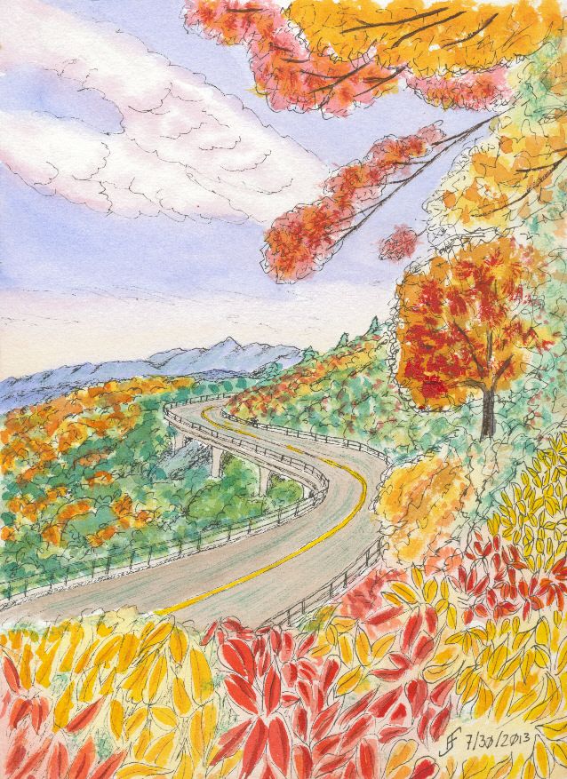
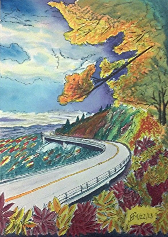
 Using some of the lessons that I learned during the past couple months, I decided to tackle a larger version of the Blue Ridge Parkway painting. You might remember that was one of my first pen & ink with watercolor wash paintings. While I liked it, it just lacked the vibrancy that I see in various landscape paintings.
So, my thought was to accentuate the color compliments (opposite colors on the color wheel) as well as accentuating the difference in light versus dark.
 First I started with a pen & ink with waterbrush wash. That provided the outline for the painting. It also provides the "under-painting", which helps determine how light and dark portions of the painting should be.
Then I added the watercolor. I decided to change it to a later afternoon / evening and change some of the colors. Until I can get it copied, the following photo using my phone should show you the difference in my color choices.
While it's still "not there" yet, it's interesting seeing the difference in the way that I see and portray a scene. The sky is much more dynamic and the color choices are much more vibrant. It just pops with color.
Sure, there remain some problems. The red of the leaves below is too cool (too blue). It should have been a warmer (scarlet) color. And I got a muddy side of the hill. But the color choices are much more vibrant than in the past.
No comments:
Post a Comment