Tuesday, June 28, 2016

20160628 - New Portrait Selection

Spent some time trying to find the "right" reference photograph for my next portrait.

I think I'll do this one "as is". No changes to the background or colors. I'll use a 9" x 12" watercolor block. If it comes out as a striking piece, then I might transfer it to a watercolor canvas panel.

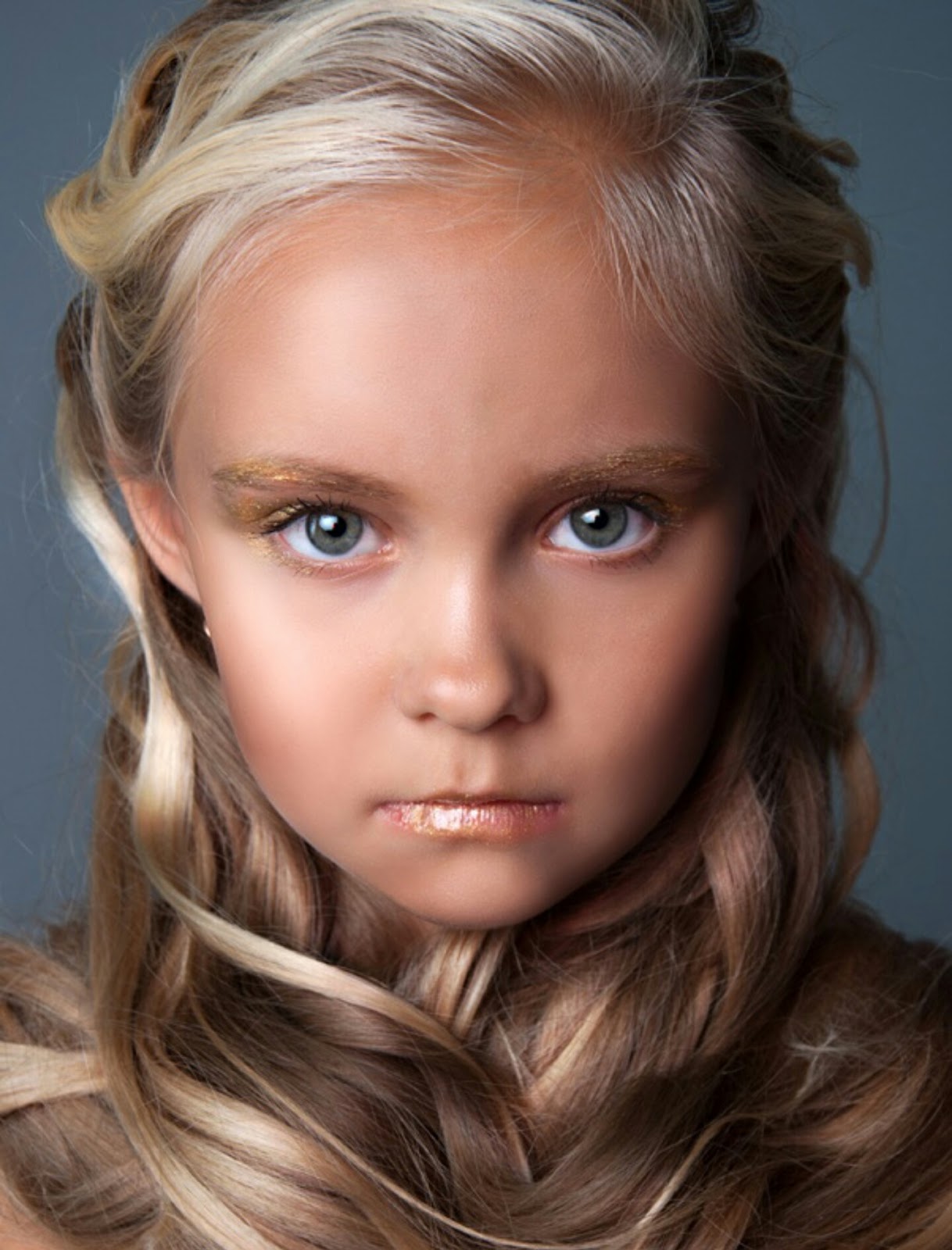
By the way, this would be a good point to highlight how I chose what to paint. It's true that for now o use reference photographs. However, I often decide on a specific feature to paint. For example, my next portrait focuses on just the models face. The original photo had a lot more detail.

Part of my responsibility as the painter is to help you focus. So, part of what I find myself doing is helping you see what I see. On our recent Alaska Cruise, I found that what I see and what is actually in front of me can be completely different. When I take a picture of the scene i discover just how different the two are .. what I see and what's really there.

Our take the example of the painting from the photograph by Julia Voronova. I titled it "Elvin Girl". Again, I found that part of the photograph was visual noise. No need for that. The tighter image is more striking.  Then as you note the hair structure, you note the strong parallel lines. And the illustrative painting was born.


Wednesday, April 30, 2014

20140430 - Deer - Work in Progress

I thought you might like to see how I create the under painting using pen & ink. I've been working on the a deer feeding in winter. This is a "work in progress", so you get to see it before I add the watercolor to the painting.

As you can see, I try to outline my subject, then use a waterbrush to create the texture of the painting.

All of what you see is just pen & ink work. I am using a Noodler's Ink brush pen. The ink is Noodler's Ink Polar Brown. It's a permanent ink that binds with the cellulose in the paper and becomes quite permanent and lightfast. But by using the waterbrush it may not be as lightfast as I would like. So, the watercolor added to the painting solves any problems due to fading.

You can also see that I by using my pen & ink I tend to get an image that feels as if it comes out of an illustrator's guide, rather than a pure watercolor painting guide. But that's okay, since I am really drawn to the pen & ink work with watercolor.

As you can see, I also provide a small copy of the reference photograph that I am using. As you can see, it's a wonderful photograph.

Hopefully you will enjoy seeing the work in process and the resulting painting.

Tuesday, April 29, 2014

20140429 - Deer

Today's painting is an autumn scene. I happened across a delightful wall paper scene of four deer at the edge of a glade beside an autumn forest. I wish I could give credit to the original photographer that took the picture of the deer. Unfortunately these free wall paper sites probably lifted the picture without giving credit or funding to the original artist. I would normally not use such a site or photograph, but it presented two unique challenges.

First, the photograph included four deer. While I've been tackling harder and harder subjects, I have not jumped into painting animals (other than the birds). So, painting for deer was a big new challenge for me.

Second, painting a misty forest scene requires several different techniques. One is that you need to paint an overall wash of the background color. Then you need to add and then immediately dab away trees and limbs in the background.

As you can see, I took the original photograph and cropped it to just the central image. This felt more interesting. Additionally, when working in watercolor, it is sometimes important to get the main object in the painting large enough to paint well. Smaller and it would be much more difficult for me to get the detail of the deer correct.

I did the deer and trees with pen & ink, using Noodler's Ink Polar Brown ink.

Those challenges made this scene an interesting lesson. I'm fairly pleased with my rendition of the original photograph. It's a warm, autumn scene.

What could be better? Well, the foreground is too dark / blue. It should be warmer (redder) and lighter in color. A yellow green would have been a better choice. I should have put more branches / limbs / twigs into the painting. Next time I try something like this I will try to use the ink for the small detailed limbs / twigs. That might feel better and attain the look that I want to see.

Anyway, I hope you enjoy this painting. It was a fun learning process.

Thursday, April 24, 2014

20140424 - Hatteras Lighthouse at Sunset

Well, today I passed another milestone in my painting "career". Isn't it an axiom that anyone that paints somehow feels compelled to paint a lighthouse? Yup. That's exactly what I did! As you can see, I decided on this beautiful day that the Hatteras Lighthouse on the NC Outerbanks would be an excellent subject.

My compliments to Dan Carmichael, who took the photograph on which this painting is based. Please note that I will NOT in anyway sell or make a profit from this rendition of his work. Instead it was intended as a teaching exercise. It's neither legal nor right to just copy the work of another and take credit and/or pay for it. In this case, since I'm only using it as a teaching exercise, it is "fair use". But all rights to the image remain with the original photographer.

While this could be better, I'm fairly pleased with this rendition. It does a pretty good job of capturing the spirit of the original. I changed the sky to make it a little more early / late in it's feel. The scan does not do justice to the subtle shading. The sea oats don't have the glitter that is in the original painting. Capturing and maintaining the highlights in the original sea oats is beyond me at this point. I might try another pass at this painting using Hot press paper and seeing if I can reserve some of the white paper to help preserve the highlights. I also need to work on the foreground vs. background a little more. Well, it's another example of how I learn by doing.

Anyway, I hope you enjoy!


Wednesday, April 16, 2014

20140416 - Bunny

And here's the completed painting of the bunny with his two friends.


As you may know, I took input from comments Google+ and Facebook as input into this painting. I then decided to play with the three primary colors Cyan (Blue), Magenta (Red), and Yellow along with Black. You might be thinking that that's not the set of primary colors you remember from school. Isn't it Yellow, Red, and Blue? Well, you are right.

This particular set of primary colors is used by printers (both print shops and your standard inkjet or laser printers). It is also the color scheme used by some artists in an attempt to obtain very vibrant colors. This color scheme is also known as CYMK.

If you are interested in more about this color scheme, you might be interested in the following video:


It's a fun example of how YouTube can make an a subject such as color theory fun and interesting.

You might notice that each major object in the painting consists of a combination of the three major colors.

First, the curtain consists primarily of magenta (the rose color). However, highlights (where more light hits the curtain, are highlighted with yellow. The color of the shadows are deepened with blue. And of course, black is used to line the curtain folds.

Next the stuffed bunny on the left uses yellow a the primary shadow color. Then to deepen it two different shades of yellow are used. Yellow with Magenta (Red) makes a light orange color. But the deepest shadow has Yellow with Cyan (Blue). This creates several steps of color. And of course, the nose is a pink (Magenta) color.

The second stuffed animal uses a similar approach, but with magenta as the "center" color.

Finally, the bunny itself uses a mix of the three colors to work toward a gray / brown color of the rabbit fur.

How's that for color combinations. This painting only uses the following paints:
  1. Sennieller Opera Rose - Magenta
  2. Sennieller Yellow Light - Yellow
  3. Sennieller Cinereous Blue - Cyan
  4. M. Graham Raw Sienna  - Light Brown
  5. M. Graham Burnt Umber - Dark Brown
  6. M. Graham Payne's Gray - Black
Anyway, I hope you enjoy this painting. It was a lot of fun to do. I learned a great deal going through the two studies and then doing the final painting.

Tuesday, April 15, 2014

20140415 - Bunny Sketch

As I noted in my previous post, I decided to try using blue as the ink for the pen & ink work. This sketch is my sketchbook, rather than on watercolor paper. So, it's not quite what I would expect from the colors. But overall, I'm happier with that color.


However, I may use my water brush to apply the lines rather than a brush pen. I think the lines come out just a bit too strong (in either red or blue). In the final painting, I will use a blue/red color. A "rose" color. Also, I will probably use very light line work with brown ink on all the animals (stuffed and not). The brown of the rabbit is closer to actual brown of the rabbit. I will avoid using the ink as the under painting for this painting. (Note how the ink provides depth to the shadows on the animals. Unfortunately, with these animals it interferes with their coloring. So, in the final painting, I will only use watercolor for adding the shading.

Of course, as you can see, the shading on the stuffed animals is just a quick sketch of what's needed. The shading in the previous study was much better. I hope to attain that (or better) in the final painting.

Now to make my watercolor paper canvas as outlined in the following three posts:
  1. http://bit.ly/1hZka2V
  2. http://bit.ly/1s2O6n2
  3. http://bit.ly/1hZka2V
I hope you are looking forward to the final painting. I know I am.