Showing posts with label Techniques. Show all posts

Wednesday, April 16, 2014

20140416 - Bunny

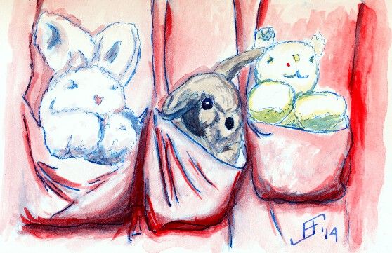
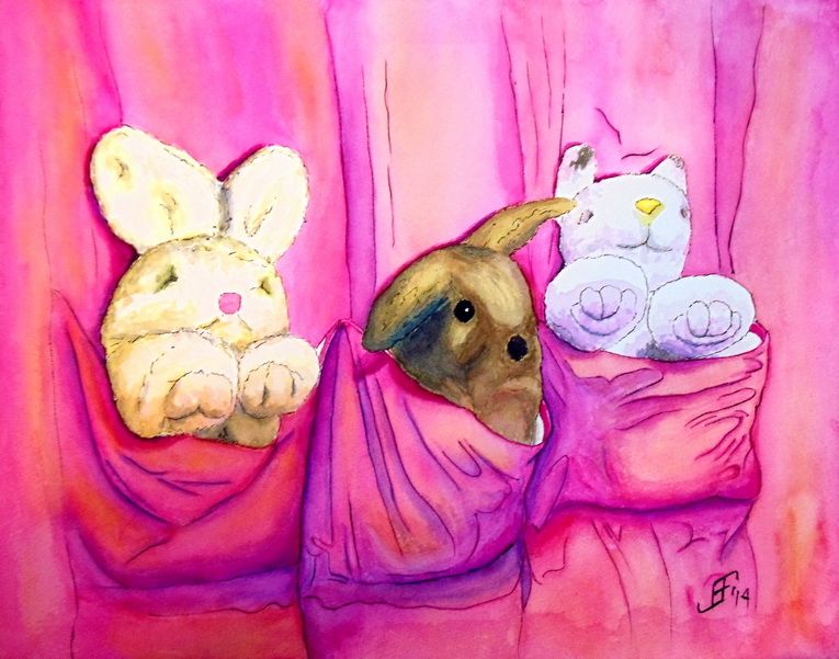
And here's the completed painting of the bunny with his two friends.


As you may know, I took input from comments Google+ and Facebook as input into this painting. I then decided to play with the three primary colors Cyan (Blue), Magenta (Red), and Yellow along with Black. You might be thinking that that's not the set of primary colors you remember from school. Isn't it Yellow, Red, and Blue? Well, you are right.

This particular set of primary colors is used by printers (both print shops and your standard inkjet or laser printers). It is also the color scheme used by some artists in an attempt to obtain very vibrant colors. This color scheme is also known as CYMK.

If you are interested in more about this color scheme, you might be interested in the following video:


It's a fun example of how YouTube can make an a subject such as color theory fun and interesting.

You might notice that each major object in the painting consists of a combination of the three major colors.

First, the curtain consists primarily of magenta (the rose color). However, highlights (where more light hits the curtain, are highlighted with yellow. The color of the shadows are deepened with blue. And of course, black is used to line the curtain folds.

Next the stuffed bunny on the left uses yellow a the primary shadow color. Then to deepen it two different shades of yellow are used. Yellow with Magenta (Red) makes a light orange color. But the deepest shadow has Yellow with Cyan (Blue). This creates several steps of color. And of course, the nose is a pink (Magenta) color.

The second stuffed animal uses a similar approach, but with magenta as the "center" color.

Finally, the bunny itself uses a mix of the three colors to work toward a gray / brown color of the rabbit fur.

How's that for color combinations. This painting only uses the following paints:
  1. Sennieller Opera Rose - Magenta
  2. Sennieller Yellow Light - Yellow
  3. Sennieller Cinereous Blue - Cyan
  4. M. Graham Raw Sienna  - Light Brown
  5. M. Graham Burnt Umber - Dark Brown
  6. M. Graham Payne's Gray - Black
Anyway, I hope you enjoy this painting. It was a lot of fun to do. I learned a great deal going through the two studies and then doing the final painting.

Tuesday, April 15, 2014

20140415 - Bunny Sketch

As I noted in my previous post, I decided to try using blue as the ink for the pen & ink work. This sketch is my sketchbook, rather than on watercolor paper. So, it's not quite what I would expect from the colors. But overall, I'm happier with that color.


However, I may use my water brush to apply the lines rather than a brush pen. I think the lines come out just a bit too strong (in either red or blue). In the final painting, I will use a blue/red color. A "rose" color. Also, I will probably use very light line work with brown ink on all the animals (stuffed and not). The brown of the rabbit is closer to actual brown of the rabbit. I will avoid using the ink as the under painting for this painting. (Note how the ink provides depth to the shadows on the animals. Unfortunately, with these animals it interferes with their coloring. So, in the final painting, I will only use watercolor for adding the shading.

Of course, as you can see, the shading on the stuffed animals is just a quick sketch of what's needed. The shading in the previous study was much better. I hope to attain that (or better) in the final painting.

Now to make my watercolor paper canvas as outlined in the following three posts:
  1. http://bit.ly/1hZka2V
  2. http://bit.ly/1s2O6n2
  3. http://bit.ly/1hZka2V
I hope you are looking forward to the final painting. I know I am.

Saturday, March 29, 2014

20140329 - Blue Bird


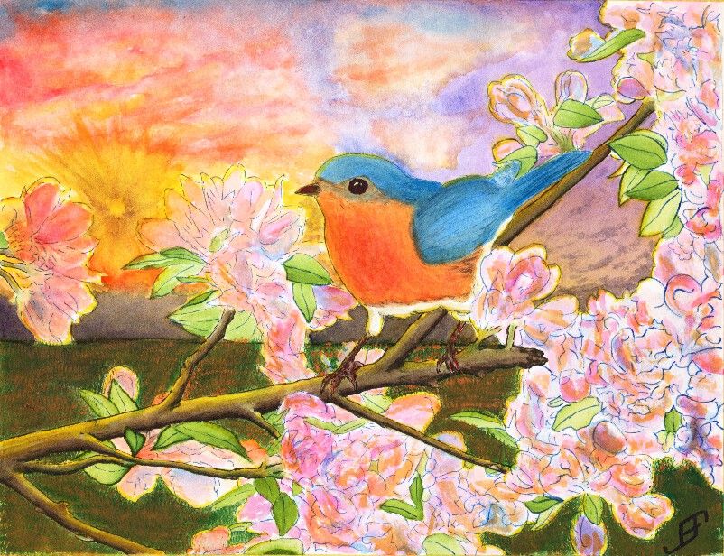
After several eventful weeks that have kept me too busy to do any painting, I decided to try to tackle something a bit more complicated than normal. Believe it or not, this Blue Bird painting is a Pen & Ink with watercolor painting. The tree, flower and foliage as well as the blue bird are done in Pen & Ink. However, the blue bird and flowers had some water color to add additional depth to the painting. The limb and foliage are exclusively done with ink.

This painting is not an ideal painting. For a very bright and busy foreground it would be better to use a simple background. While I could have painted a much simpler sky, I wanted to try some techniques. This includes the sunburst effect and a more complex cloud scene.

The sunburst effect would have been better had I used a simple spray bottle to add some dark patches headed toward the sun. Tom Jones recorded (for Jerry's Artarama) an example of how to do this. The following video shows one technique.


To create the sun burst on my painting, I would have had to use a masking fluid and paint in the background first, remove the masking fluid and then do the foreground painting. I actually did it in reverse order, since I was more interested in the foreground painting.

Unlike my previous version of a bird (gold finch) in a red bud tree, I played around with the color of the blossoms a bit by adding some orange to the blossoms. I also backlit the limbs, flowers, foliage and bird with the yellow of the setting sun. That combined with the orange tint of the flowers - which often appears toward sunset - helps set the stage for Bluebird out at sunset. And that would not be correct for bluebirds. Should I claim "Artistic License"? .. Not really. It would have been better with a simpler sky. If I needed it backlit then a early morning sky / sun would be a better choice.

Why that choice? It's both more accurate to the bird and would provide a simpler background.

Again, I should have done the background first. That would allow me to add in the detail to make it fairly convincing, yet keep it .. well .. in the background!

You will note that there is a good deal of detail in this painting. I post this in a larger format on the blog because I am fairly pleased of that. The field of mown grass feels more natural than others I've done in the past. The detail of the limbs. Shoot, even the feet of the bird have a lot of detail.

Still, it's too busy. I created an 11 x 15 inch, stretched watercolor paper canvas this past Friday. I will probably use it to paint this subject .. But this time, I will use a simpler background. I will set it as a mid-day painting.

Anyway, I hope you enjoy this painting.

Tuesday, February 4, 2014

20140204 - Gold Finch Update

Those of you that have followed the link to my blog know that I see my blog as a way to "learn perspective". Over the years, I learned and relearned that one of the best ways to master any skill is to take the time to teach others those skills. It reinforces what you know. And it often gives you the chance to expand your knowledge.

And that's just what happened when I posted my Gold Finch painting from a couple days ago. I knew it was almost there, but it just did not "feel" right. There was something jarring about the painting that I could not quite clarify.

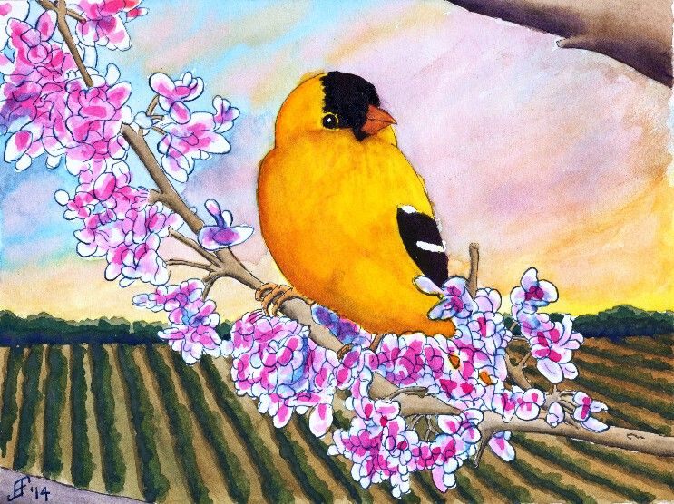
Some people suggested that the background (the field) was too dark. That wasn't quite it. I knew the dark field at sunset was both natural and provided a startling backdrop for the bird and red bud tree.

I continued to struggle at articulating what was not quite right. I was very pleased with some of the contrasts. Light versus dark. Yellow-orange versus blue-green. Left slanting limbs versus right slanting bird and sky. Lots of interest for the eye. Still, something needed improvement.

So, I give a big shout out to +Pedro Castro Caiado Ferrão, who politely suggested that I missed the mark on the three rules of perspective. Those rules include:
  1. decrease of the size of objects proportionally with distance
  2. muting of colors with distance
  3. decrease of the precision of details with distance
As I look at it, he is spot on. All three of those rules were not in play in my painting. I missed the fact that size of the "plants" needed to decrease with distance. I missed the fact that distance between the rows needed to decrease with distance. I missed that the detail needed to be greater closer and less pronounced further away. And finally, the problem with the background color was not that it was too dark, but rather that the color did not become more muted (greyed) with distance.

Once again, taking the time to teach others paid off for me. I learned an invaluable lesson in a way that will maximize that I will really employ it. (The greatest acceptance of knowledge comes when you are ready for the lesson. I've known about perspective. I just was not ready to internalize it with one of my own paintings. Now I see what I was missing. Lesson learned ... Now to practice what I've learned).

So, can you now see what I found this painting both a delight and jarring at the same time?

Wednesday, January 8, 2014

20140108 - Mounted Painting

I've been busy for a few days, but continue to try to practice my brush painting daily. I would like to specifically give a "shout out" to Henry Li of Blue Heron Arts. He specifically provides wonderful YouTube videos to help a novice learn more about Chinese Brush Painting.

For example, the following video shows how to mount a chinese brush painting onto backing paper.


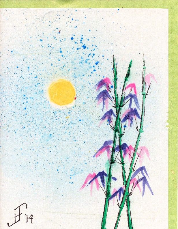
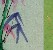
Using the technique shown in this video, I mounted the Sun 'n Bamboo painting. I mounted it onto a green mulberry backing paper that has gold flecks in it. As you can see the the smaller detailed pictyure, the green mulberry paper is quite striking.

As you can see for a first attempt, I am pretty pleased with the results. As you might remember, the original painting that I posted was pretty heavily wrinkled and distorted. This is now much smoother.

Here you can see the painting mounted on the mulberry paper. The scanner can not scan the entire image, as the backing paper shows all around the four edges of the painting. I will then mount the backing paper into a traditional frame with a mat. The mat board will keep the painting away from the glass. And the mounting paper will and painting will be sandwiched between the mat and the mounting board.

With no interest at all, other than as a happy customer, I can recommend Blue Heron Arts. If you are interested in Chinese Brush Painting (or Sumi-E), then take a look at Henry's YouTube channel and store.


Wednesday, October 9, 2013

20131009 - Completing the Paper Canvas

Ready or not, here I come. This blog entry will go over the step by step process of completing the watercolor paper canvas.

Okay. In truth, I was not ready! .. After assembling everything that I need, after wetting the paper, I discovered that someone had previously purchased the stapler that we bought yesterday. How do I know? They had jammed staples that were too small into it and jammed it completely. Unfortunately, this particular model did not allow me to readily disassemble it. There should be a special place in hell for people that buy a product, abuse it (by putting in incorrect staples) and then returning it and pretending nothing is wrong.

Ugh! Back to the sink goes the paper. And back to the store goes the stapler. After much argument my wife is able to convince them that the stapler was broken when we bought it and it's an even exchange with the broken stapler. While I know the store does not like to be scammed, I hate even more having a store scam me! Ah, well, the did allow an even trade. And the new stapler works perfectly. Great. We're ready to go.

  • Stretcher bars. Check.
  • Scissors. Check.
  • Ruler. Check.
  • Stapler and staples. Check.

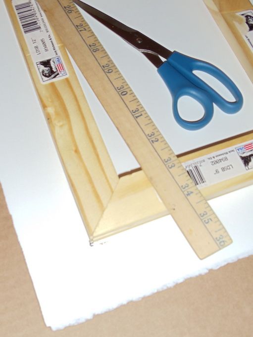
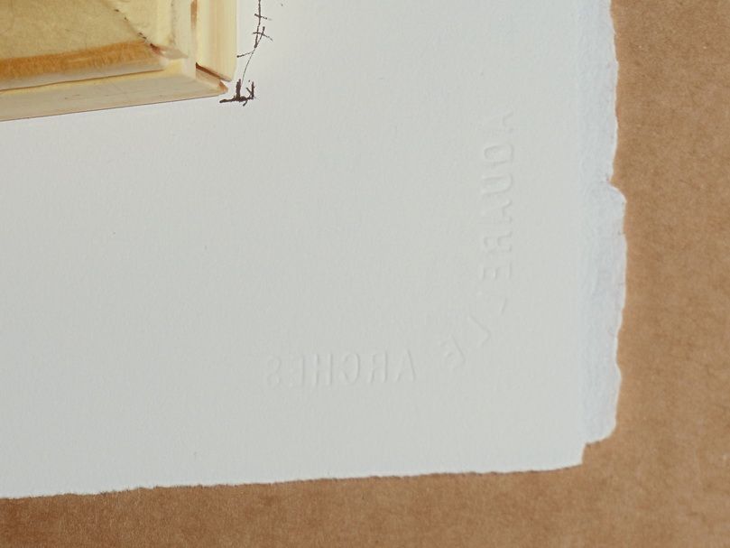
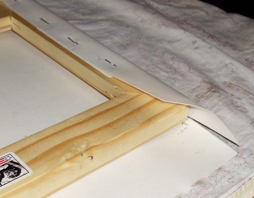
So, it's time to measure and mark the paper. Note that you can just see the raised lettering in the corner. That's the "Arches" mark on the paper. It tells me that the back side of the paper is facing the stretcher bars. Good. Now to mark the paper so the stretcher bars are evenly centered. Don't go hog wild with the marker. But it is the back, so it should not be too visible.
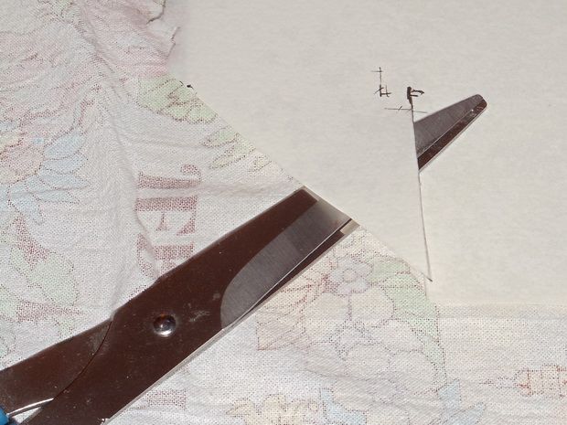
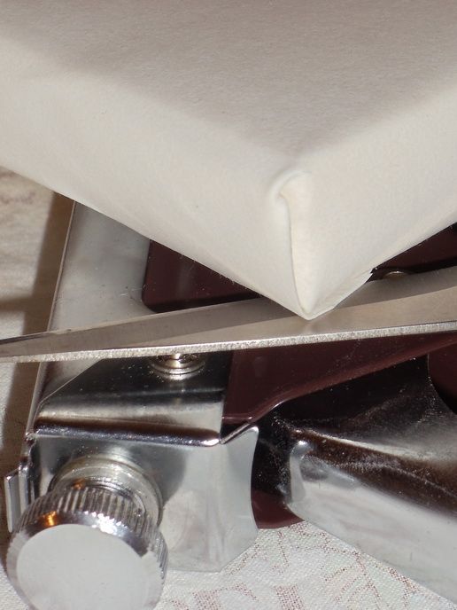
After marking where the stretcher bars should go, I marked from those corners to the edge of the paper along the LONG edge (in this case the 12" edge). Then I marked a 45 degree cut off area on all four of the corners. Once the paper was wet and in place (on the tea towel as you can see), I cut the corners as you see. The cut into the paper from the edge is along the long side. It's like that on each of the corners. Note how the scissors show the cut in the paper. This will allow a neat corner to be folded without too much paper getting in the way.

By the way, if you are wondering, I set the paper soak for more than five minutes to allow it to fully expand. It will slowly dry overnight once it's on the stretcher bars. It should come out sounding like a drum when it's dry.

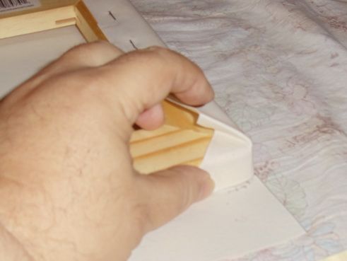
Starting on the short sides, I staple the paper on one side to the stretch bars. I start in the center and work alternatively outward to the corners. Note how the cut corners are set. Don't staple the ends too quickly. You will need to create a "hospital bed" corner. Tuck the corner under a bit and leave a nice square corner. You can see that in the photo where I am holding the corner in place. THEN you can staple the corner in place.

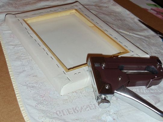
Rotate the paper and do the other short side. Tuck in each of the corners. Then rotate the paper to the long side, start in the center and work outward alternatively (left, then right, then left, then right) and smooth both the back and front of the paper as you go. You should also tighten the paper (without tearing it). In the end, you should have a neatly stapled paper canvas as you can see in the photo. I will probably have to hammer some of the staples into place, but they should more than hold as the paper dries.

And as you can see from the front you should have a nice, neat surface for your painting. While it might be a little more work than using stretched watercolor paper, the advantage is that the watercolor canvas can be hung "as is", or it can be put in a frame used for oil or acrylic paints. No glass needed. Of course, it's still important to spray it with a UV Archival Varnish. And don't forget to spray the BACK of the painting when you are done.

Joyce Faulknor claims that watercolor paint will not fade out as it dries on this type of stretched watercolor paper canvas. I will be interested in seeing if that is true. Time will tell.

Anyway, I hope this helps you learn a new way to stretch your watercolor paper.

"I wish to pain in such a manner as if I were photographing dreams." ... from Zdzislaw Beksiński.
20131009 - Boldy going where ... Wait! What?

So, I finally got the time to start to put together the watercolor "canvas" using watercolor paper.

Let's see if I have everything that I need:
  • Arches Bright White Hot Press 140lb 22"x30" sheet of paper.
  • Jack Richeson Light Duty Stretcher Bars (2x 9" and 2x 12").
  • Staple Gun and Staples
Oops. I know where the staple gun was in the garage. Not sure what happened to that one. A neighbor may have borrowed it. But that's been years ago. My wife has one. Can she find it? Nope. Ah, my son borrowed it. He'll bring that back. Of course my wife notes that it's not as heavy duty as I probably need for this task. Hmmm... Where's that Michael's 40% off coupon? Ah! Got it! Okay, mark all of them with a check mark! Okay, I'm set to start.

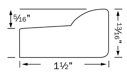
Now, let's do some planning. As you can see from the side profile of the stretcher bars, the paper wraps around quite a ways. The paper "canvas" will be across the top "floating" above the stretcher bars. The paper then wraps around the right hand side and along the bottom toward the left hand side.

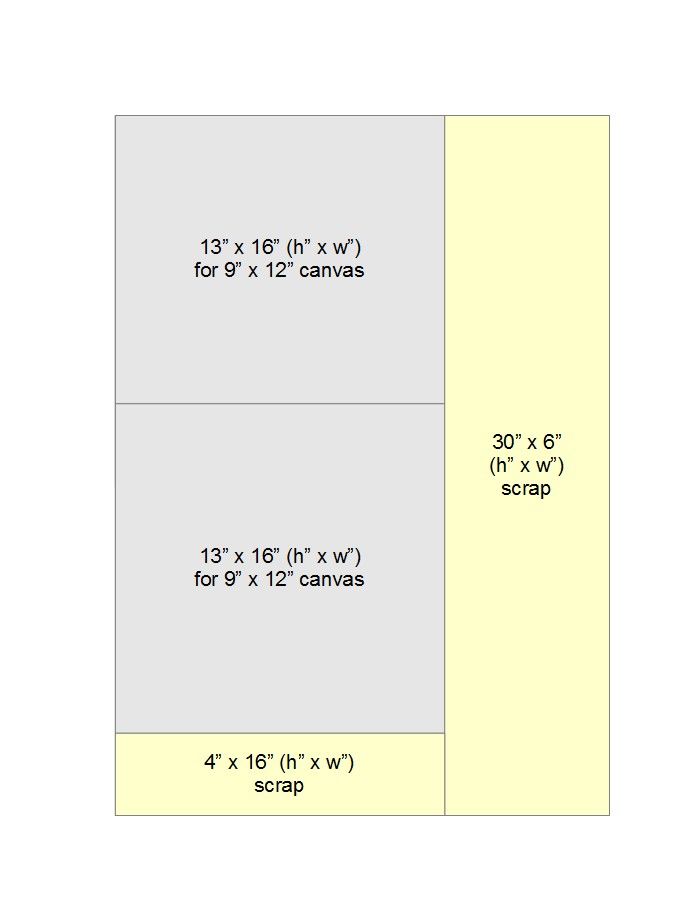
So, we need to allow 2 inches per side for the "canvas wrapping". That means we need an extra 4" on each dimension to create the final 9" x 12" size painting. So, we need a sheet of paper that is 13" x 16" in size. As you can see from my layout sheet, that means we can get two watercolor "canvases" from one 22" x 30" sheet of watercolor paper. I can use the scrap paper for other projects. But if I do more of this, it seems that this would be best done with a roll of watercolor paper.


Ah, well. Time to prepare the stretcher bars. As you can see, I just press the joints together to create the final shape. Of course, this takes a little tapping with a wooden handle (such as a hammer's handle) to move the stretcher bars into a square shape. Don't just "eyeball" it. Check it with a square. And then double check it by measuring both diagonals from corner to corner. They should both be the same measurement. If not, it's not square. Cute trick! But handy. It's far more accurate than just using a square.

Okay, the frame of the stretcher bars are together. But I can't just lay the paper over them "as is". I need to seal them to prevent the acids in the wood from damaging the paper. I will just use the UV Archival Varnish to seal up the wood.

Now to cut the paper. To cut large sections of paper or mat board, I have a Logan Adapt-A-Rule with a Logan Pull Style Mat Cutter. I will measure the paper and cut it. into two 13" x 16" pieces and save the scraps.

Once I've done the cutting and have soaked the paper, I will take some pictures of the process of wrapping the stretcher bars and the resulting watercolor paper "canvas".