Showing posts with label Rural Scene. Show all posts

Thursday, September 26, 2013

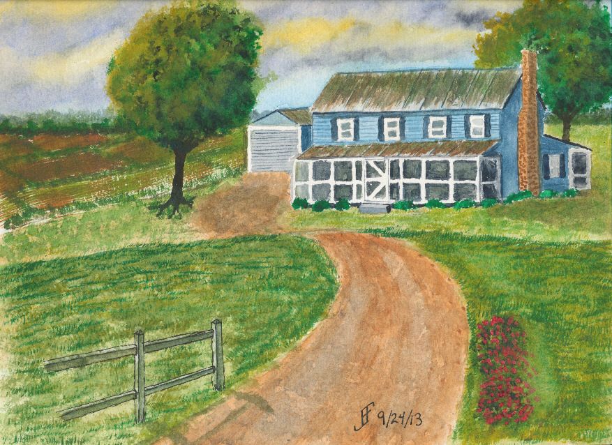
20130925 - NC Farm House Take Two!

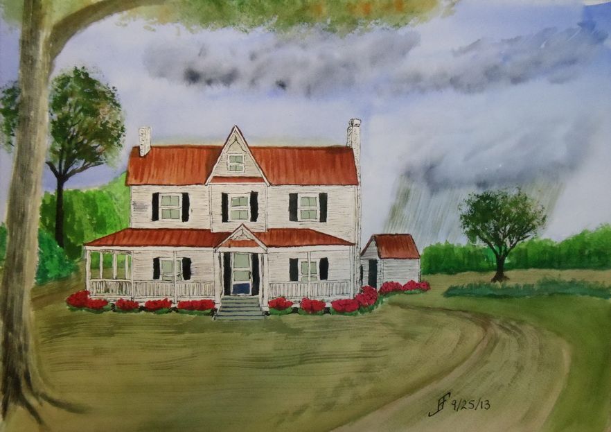
Sometimes it takes more than one time before you get it "right". I'm not all the way "there" yet. But I am definitely learning what works for me and my own personal style of painting. This afternoon, I decided to give another shot to the North Carolina Farm House theme.

As you can see, it's not the same as the previous farm house. In fact, this is more of a run down mansion compared to many farm steads in North Carolina.

As with my previous painting, I decided to try something different with this painting. I decided to have a rain cloud off in the distance. There are great swaths of the state where .. if you can see beyond the tree line .. you can see such rain clouds. So, here we have a cloudy sky with rain in the distance. This mutes all the normal colors that I would tend to choose.

The trees are getting better. The grass is not quite so crass. And the shrubs look as if they might have Knights who say "Nee" looking for them:


By the way, here's the original photograph I used as a reference.
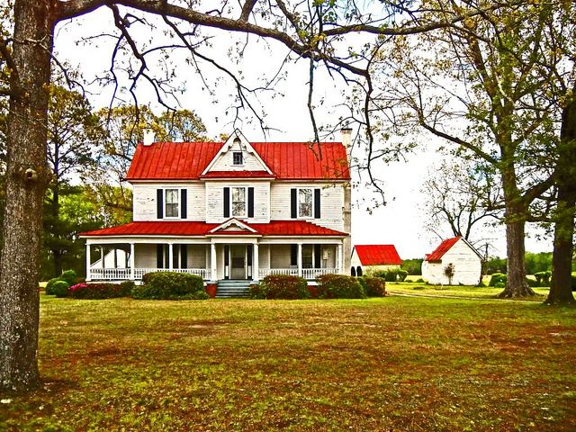

Oh, if you were wondering, since I use this only as a painting exercise and not to create a painting to sell, I can copy use a photograph like this.

Well, I hope you enjoy this. I definitely enjoyed working on it. But it's getting late and I need to crash for the night. Enjoy!

Wednesday, September 25, 2013

20130924 - NC Farm

Today's painting is of a North Carolina farm, you can tell by the red clay and the tin roof with the screened porch. It is the result of using the a teaching video and modifying the subject a little to make it a unique painting for the area where I live.

The original video was made by Mike Keal. It is a teaching video by Terry Harrison, which shows him creating an English farm landscape. I enjoy doing is watching videos of artists to take the time to help show others what you can accomplish with a watercolor painting. The advantage of using example videos is that it provides me both with techniques and a target for my own painting.

I varied the scene quite a bit. The sky is a stormy sky later in the day. You will sometimes see a yellowish / greenish sky in advance of a severe thunderstorm in this area. Such a sky is never a good one to see, since it can lead to tornadoes in the area. Oddly, you will note the Carolina blue in the sky. We often see such skies in this area .. even ahead of a severe storm.

Hopefully you will enjoy this one. This took longer than many of my paintings. There are many things I like about this one. Some that I will improve next time. One thing is that this may have been easier with a larger paint surface. This is a 9x12 inch watercolor paper block. The detail work is a bit hard at this scale.


Sunday, September 22, 2013

20130922 - Playing with color

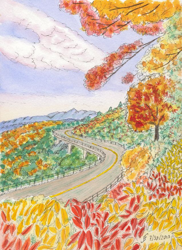
Using some of the lessons that I learned during the past couple months, I decided to tackle a larger version of the Blue Ridge Parkway painting. You might remember that was one of my first pen & ink with watercolor wash paintings. While I liked it, it just lacked the vibrancy that I see in various landscape paintings.

So, my thought was to accentuate the color compliments (opposite colors on the color wheel) as well as accentuating the difference in light versus dark.

First I started with a pen & ink with waterbrush wash. That provided the outline for the painting. It also provides the "under-painting", which helps determine how light and dark portions of the painting should be.

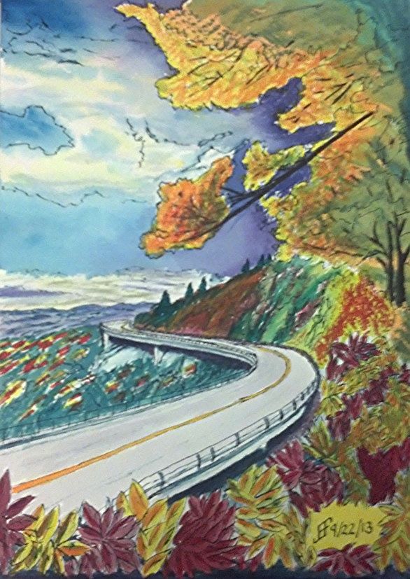
Then I added the watercolor. I decided to change it to a later afternoon / evening and change some of the colors. Until I can get it copied, the following photo using my phone should show you the difference in my color choices.

While it's still "not there" yet, it's interesting seeing the difference in the way that I see and portray a scene. The sky is much more dynamic and the color choices are much more vibrant. It just pops with color.

Sure, there remain some problems. The red of the leaves below is too cool (too blue). It should have been a warmer (scarlet) color. And I got a muddy side of the hill. But the color choices are much more vibrant than in the past.


Thursday, September 19, 2013

20130919 - Preparing for Class

Time to get ready for my watercolor class tomorrow morning. Make certain my paper is in the backpack. Make certain the paints are clean and in the backpack. Make certain the pens are ready to go. Make certain the image we are going to work on has been outlined onto one of the paper blocks. Do I want to do this as a combination of pen & ink and watercolor?? .. Or do I want to do it as just a watercolor?? I think I'll probably lean toward pen & ink with watercolor. Those are the most satisfying paintings in my book.

Oh, as you can see, I tinkered around with my sketchbook. I'm really pleased with it. The colors come out so very vibrant. Plus as you can see, a quick 10 minute sketch comes out a lot more as I intend it than it once would appear. I can see the progress I am making. That's reassuring.

Monday, August 19, 2013

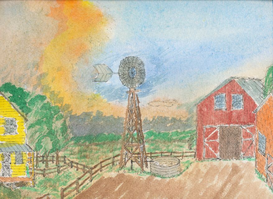
20130728 - Farm (Pen & Ink)

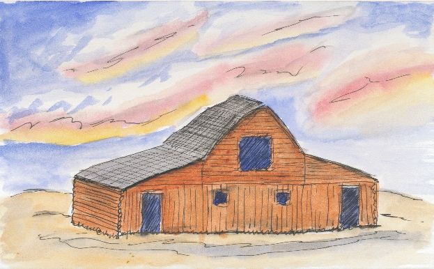
I decided to dive into pen & ink with watercolor. Here's my first attempt to create a farm scene. Unfortunately, I used a cheaper paper that both crumbled and seemed to make the paint muddy. I'll use that paper only for practice in the future. Enjoy!


Sunday, August 18, 2013

20130809 - Yates Mill

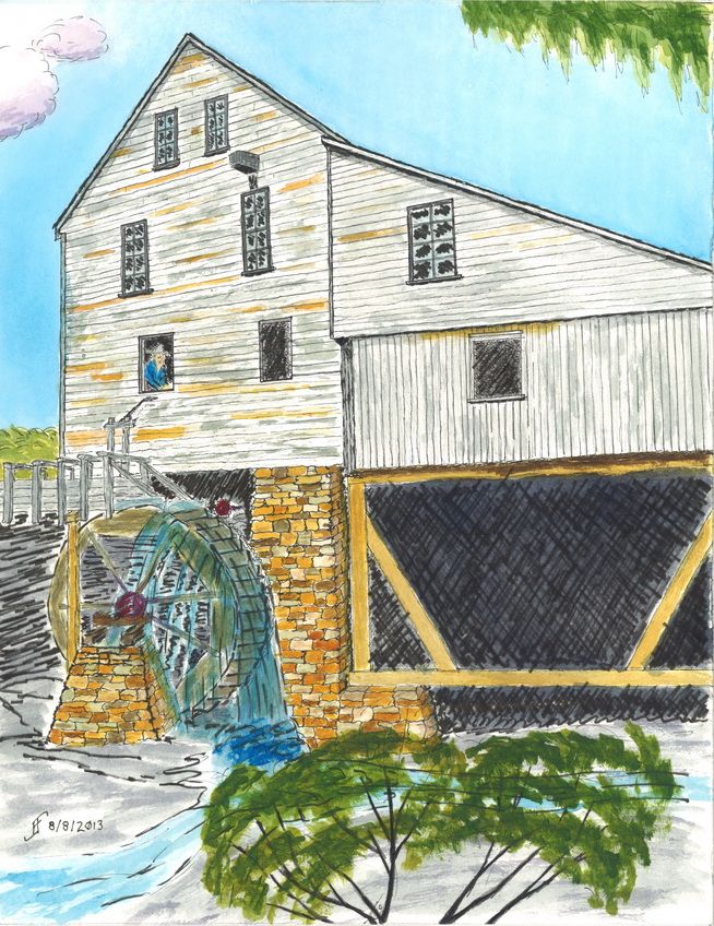
Well, I was able to finish my pen & ink of Yates Mill. Yates Mill is a Wake Country park. They also have a website, which is titled "Escape the Daily Grind". You have to love a sense of humor!

This pen & ink was does using Sakura Pigma Micron pens:


Then I added a watercolor wash to the drawing. The result is:


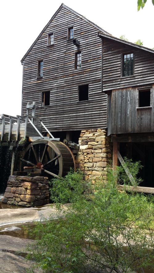
This particular scene is based on the following photograph. However, I merged together several different views of the mill to create this one.


As you can see, I changed several angles and emphasized the building and the miller (which I added).