Well, I picked up my pen and paint brush and dashed off a few sketches this week.
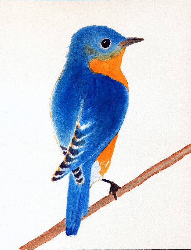
First, is an Eastern Bluebird. It is just a sketch, of which I am thinking how to finish the background. I think I'll use some Blue Ridge mountains and an early morning sky. Stay tuned for more to come!
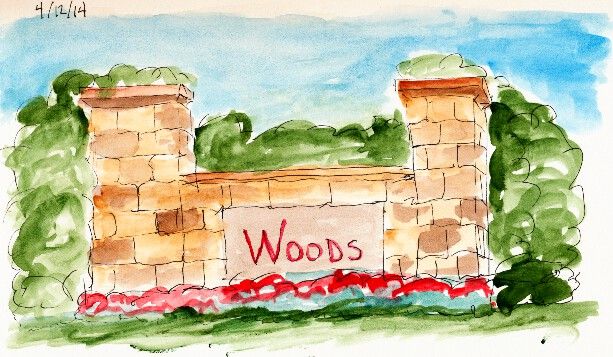
The second sketch is a representation of the small partial walls that you often see at entrances to various neighborhoods. These are not gated communities. It's just a way to show how sturdy and substantial the neighborhood is.
Nothing really spectacular. But that was not my intent. I just wanted to see if I could now better capture the look of real stone and how it varies from block to block. My brush is much looser and more impressionistic than it used to be. I make progress.
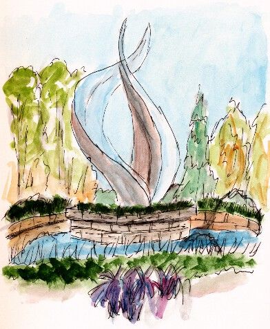
The final sketch is a quick sketch of a fountain near one of my doctor's offices. The flame-like structure is a steel sculpture in the center of the fountain.
My hope was to capture the feeling of the fountain. I think I did fairly well for a quick sketch.
Hope you enjoy and remember to keep on looking for the beauty that surrounds us.
Showing posts with label Garden. Show all posts
Saturday, April 12, 2014
Monday, November 4, 2013
20131104 - Sunflower
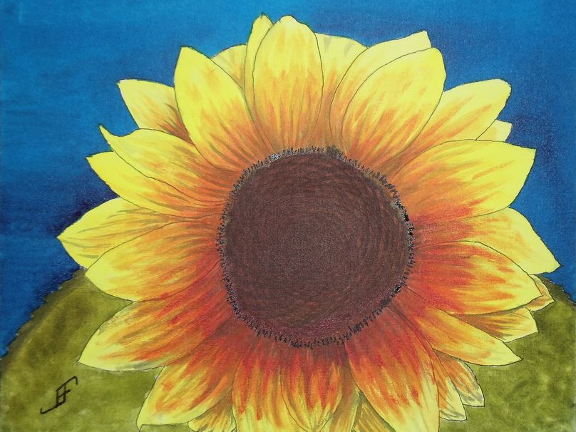
The camera added a bit of reflective light to the mix. So, the center and the detail around the center appears a bit lighter than they appear in person.
Since I don't have a scanner that can handle larger images, I use a camera. While it does well, it does need to use the flash to get a good photograph of the painting. And then of course, I need to do some photo editing to eliminate perspective distortions to the photograph (to bring it back to an 11x14 sized image).
Anyway, hopefully this cheerful sunflower will brighten your day.
Sunday, November 3, 2013
20131103 - Sunflower with a Different Perspective
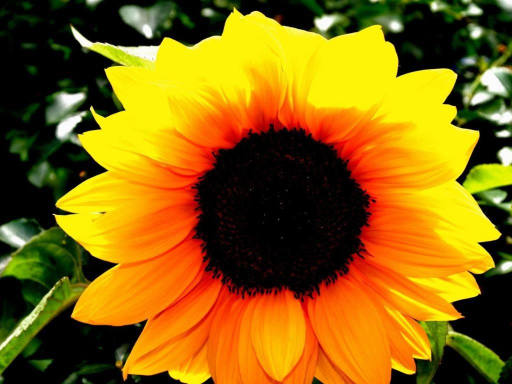
When rendering it in watercolor, I think I will shoot for complimentary and split complimentary colors (using the CMY, or Cyan, Magenta, Yellow color wheel). Thus, the compliment of yellow is blue (on the CMY color wheel). I will paint the green leaves toward the bottom where there is more of an orange coloring of the sunflower. This will yield the split complimentary colors to the complimentary color of blue.
So, here's hoping you will enjoy the final painting.
Friday, October 11, 2013
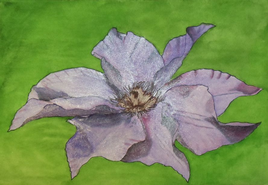
20131010 - Clematis
A bit of an apology. Yes, it has an iridescent medium on it. It's an inside joke in our family. My daughter loved things with purple sparkles. As I was painting this flower from the photograph, I was struck by how it almost seems to sparkle in the light. Well, it was only a short hop form that to purple with sparkles. In person the iridescence is not quite as annoying.
A little on the detail in painting this. I used Noodler's 54th Massachusetts, which is a blue-black ink for the outline of the petals. I used that same color to create the under painting of the shadows. I masked off the center of the flower. After I added the color, I removed the masking and used Noodler's Manjiro Nakahama Whaleman's Sepia on the center. I used M. Graham paints to add the coloring to the paint. After doing research, I discovered that I rather naturally use a CMY (Cyan Magenta Yellow) color wheel to choose colors. In this case, the green and purple are complementary (per the CMY color wheel). This system tends to yield much more vibrant colors than the tradition RBY (Red Blue Yellow) color wheel.
As I noted, I painted this on the watercolor paper canvas that I created yesterday (see my previous blog entry). I will still need to spray it with a UV Protectant Varnish. Since the back of the paper is open to the elements, I will need to spray both the front and back (as well as sides) of this canvas. Once that's done it can be hung "as is" without a frame, or put in a frame, such as is used for oil or acrylic paintings.
Thursday, September 26, 2013
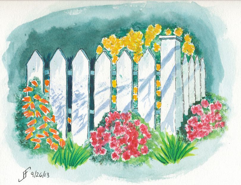
20130926 - Garden
For the first time, I feel as if I've crossed the boundary from primitive watercolor painting to more artistic watercolor painting. Not that I could (since it's a copy of Tom's painting), but for the first time, I would not be embarrassed to sell this painting.
Hopefully you enjoy this adventure as much as I enjoy the process.
Wednesday, September 18, 2013
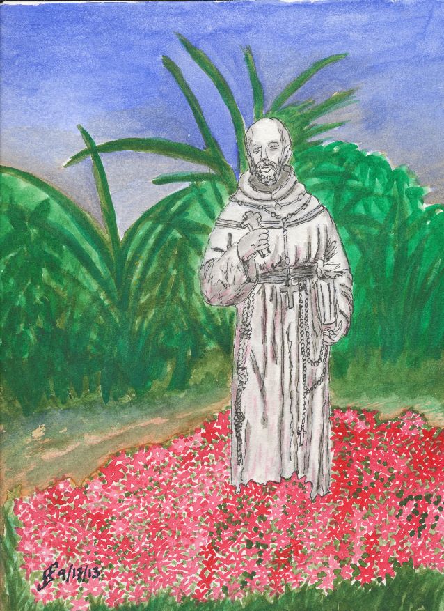
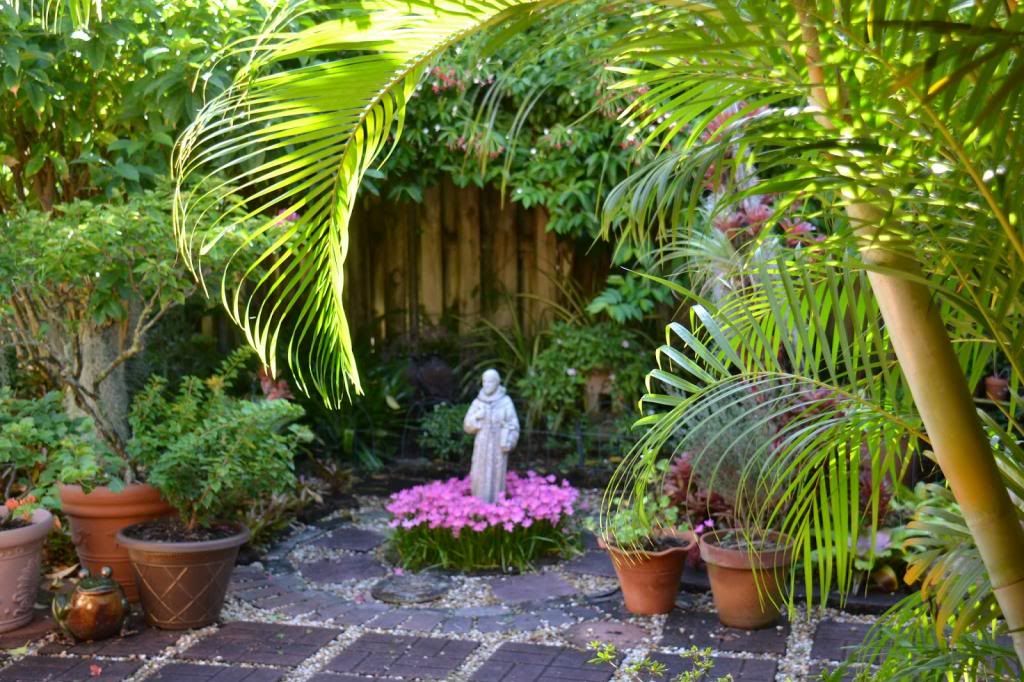
20130918 - St. Francis Statue in Garden
I intended for the statue to be the most detailed object. The rest of the garden was painted to provide the impression of a flower garden. For a reason. It's the saints among us who are the most concrete (pun somewhat intended) individuals. We assume that their positions and beliefs make them less "worldy", when it is they that make the most difference. At once they see the world both as it IS and as it SHOULD BE. Then they go do the impossible. They transform the world in which we live to make it more like what it should be.
Isn't it odd that the saints among us see the world and us as the clay beneath their fingers. As much as we try to venerate them, but hold them at arms length, they wade into life and live it fully. And in so doing, they change our world for the better.
Labels:
Flowers,
Garden,
Pen & Ink,
Still Life,
Watercolor
Tuesday, September 17, 2013
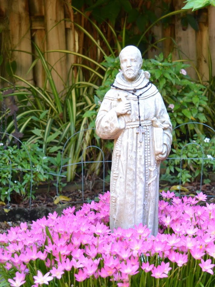
20130917 - Starting St Francis in Garden
The role of the artist is to find that interesting item and highlight it through the painting. And in many ways, that's the role we all have. To highlight those things that are important to us. We highlight them to our children and our friends. Funny how my art is more about learning to live life well than it is about the mechanics of the art.
Monday, September 16, 2013
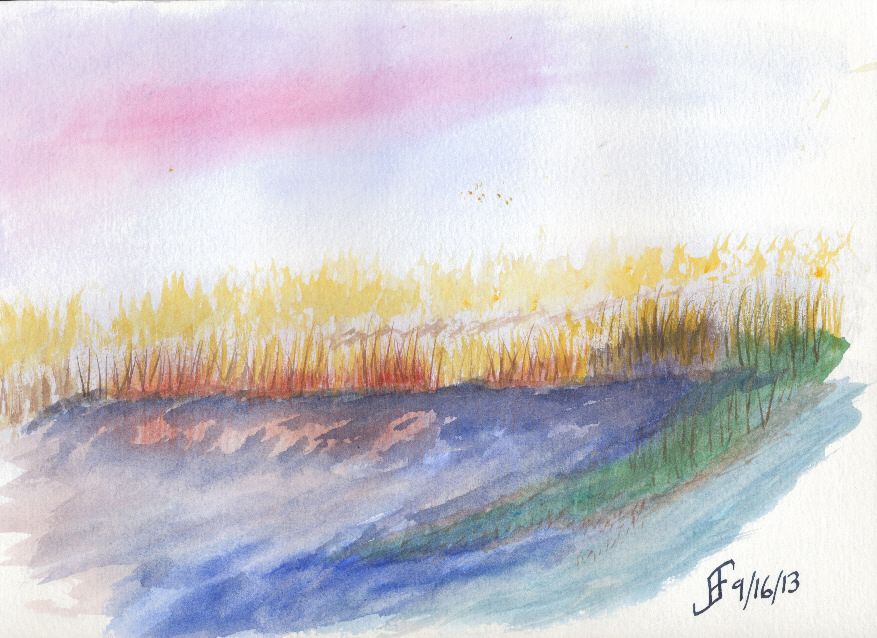
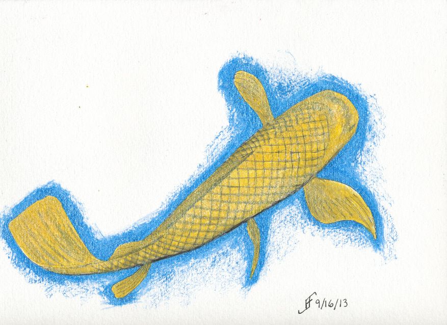
20130916 - Misty Marsh and Golden Koi
Of course, when I go to a more structured pen & ink with watercolor painting technique, I am much happier with the results. It's the engineer in me that wants the structure of a detailed drawing before I just start painting. I am not sure I will ever get past that completely.
Labels:
Class,
Fall Foliage,
Garden,
Pen & Ink,
Water,
Watercolor,
Wilderness
Saturday, September 14, 2013
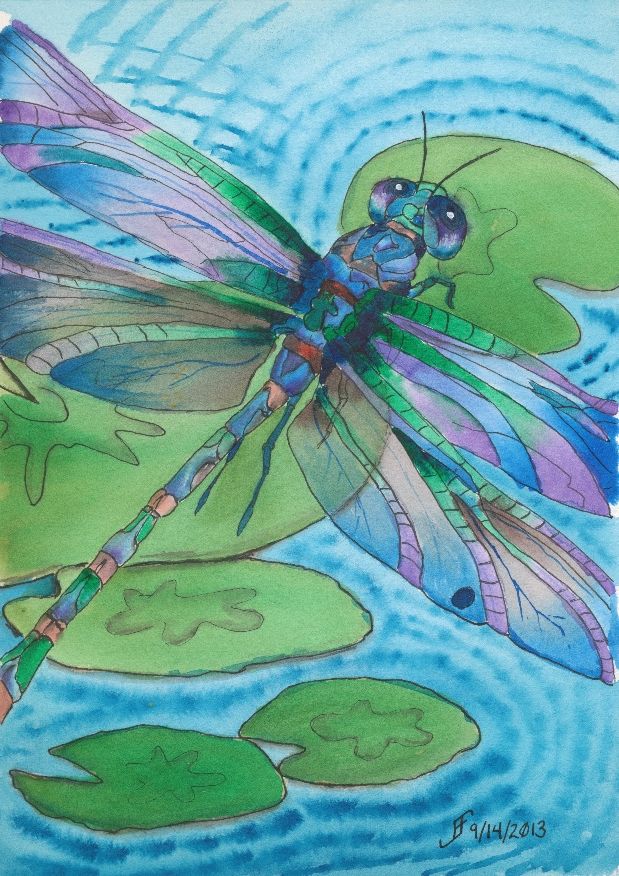
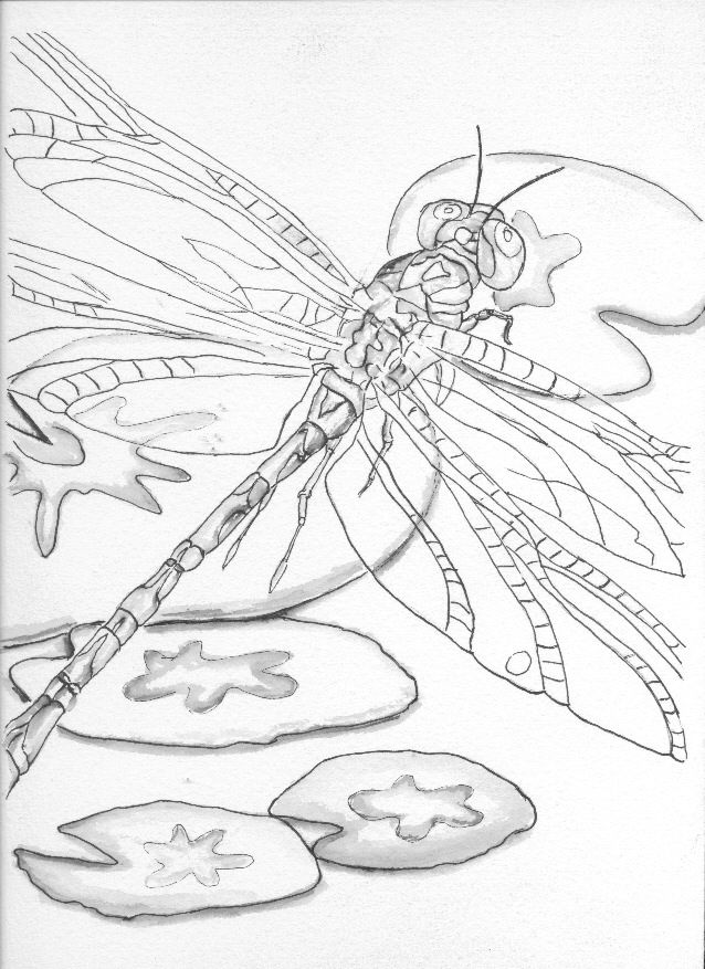
20130914 - Dragonfly
Want to know what I should improve? Here goes. They are not "nit picky", but they don't absolutely spoil it either. But it is a chance to learn more as I work on a piece.
Here's the first item. The upper right lily pad is not oval enough. Thus, it suddenly feels as if the perspective of the painting warps. You go from looking down and sideways toward the lily pads to down onto that upper right one. Lesson learned.
The second item is that the color of the purple in the lower two wings (toward the body of the dragonfly) was created rather than selected from my palette. The purple works better when it's from the palette.
The third issue is that the wings are a bit darker than I would like. They would appear to appear to "shine" more if there was more of the white of the paper showing.
There are other minor things. But as I noted. For the most part, I'm pretty pleased with this one.
There are some things that are right. I got the right gossamer wing effect. You can see through the wing to the lily pad in the center. And I tinted (using a glaze) the wings to make them slightly green in that area. That worked well.
But the most important thin is that I hope you enjoy seeing this as much as I enjoyed making it.
Friday, September 13, 2013
20130913 - Dragonfly Start
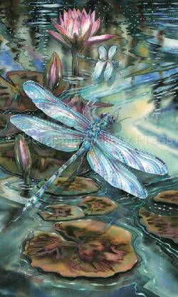
Well, my last painting got me thinking about lily pads and ... dragonflies! .. Yup. I started a new painting. And while doing my research, I found a wonderful video to demonstrate how to paint a dragonfly by Judy Bergsma.
So, I am basing this painting on the style she uses in her demonstration. However, I decided that it should be a pen & ink with watercolor painting. I used her template as a guide. As you can see, the dragonfly is in flight above the lily pads.
I've finished the pen & ink drawing. I've done a little bit of shading work. Now to tackle the painting. I think I will use some of the techniques that she presents. However, I will attempt to show a little more of the background through the wings than she has in her painting, which you can see in the print of her painting.
Also as you can see from her print, there is a lot of detail in her painting. More than I am ready to try to tackle. I want to get a simple painting looking "right" before I attempt to tackle a more difficult background.
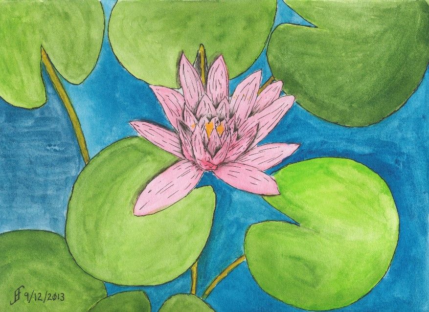
20130912 - Water Lily (A Happy Accident)
This started as an attempt to render the photograph of the water lily I had taken at the JC Raulston Arboretum. Unfortunately, when I went to add a little pink into the water lilly, it exploded out of the brush and filled the water lilly. No smooth transitions.
As I noted, normally this would qualify as an unmitigated disaster. Time to take the paper off the pad of watercolor paper, crumple it, and throw it away. But for some reason, I decided to see what I could do with the painting anyway. I figured that I could still continue to hone techniques, even if I didn't want to hang the painting.
Of course, being careful about the amount of paint on the paint brush was my first lesson in this painting. If you take the time, you learn as much or more from your mistakes. Lesson one .. Brilliantly demonstrated!Part of the problem with this painting is that I have a ceiling fan right over where I paint. If it is running, the flow of air tends to dry the paper too quickly. As a result, "washes" (or large areas of paint that should appear uniform) tend to dry way too quickly. The result is that you can see the brush marks in the painting. Notice the blue water to the left of the lily? See how uniform it appears? The other areas of water show the brush marks. Yuck! Lesson Two .. Sigh! I should have known better!!
So, I finished the painting, but the water lily was a blob of color. What could I do to "rescue it". I decided to add pen & ink to the mix. While it helped, it seemed to make it appear a little "cartoonish". Compare the water lily to a cartoon (such as the Red and Rover cartoon). So, I decided to try to play up that sense of cartoon and added more pen & ink lines to the drawing. And suddenly the painting went from disaster to whimsical. Ta-da! Lesson Three .. By adding lines to a painting with vibrant colors, you and end up with a whimsical painting.
From failure to "happy accident". Is it all just our perspective? The answer is, of course, a resounding "Yes!!".
Saturday, September 7, 2013
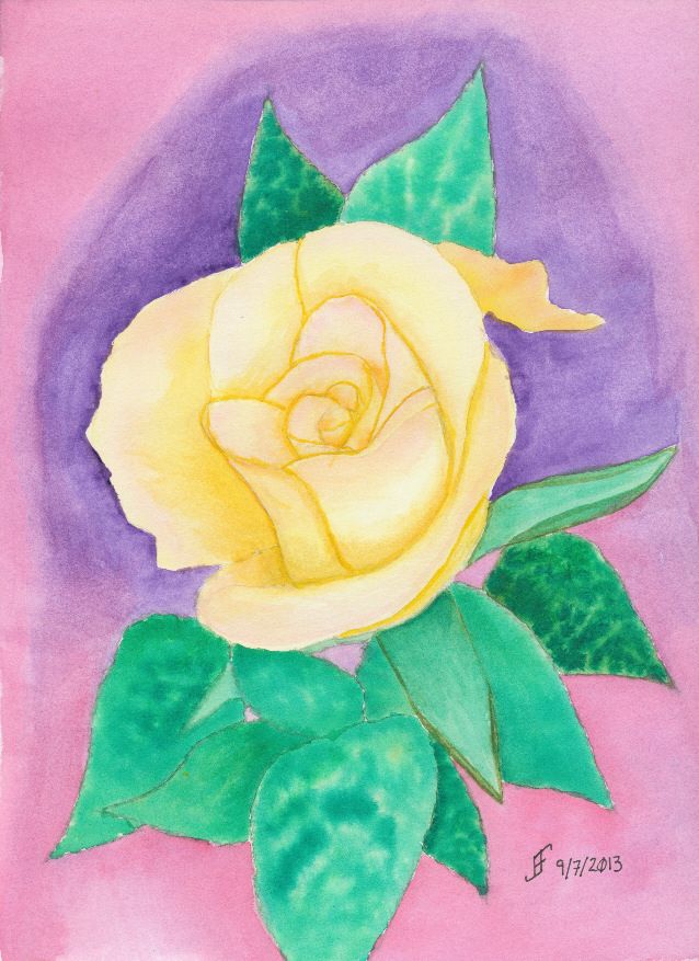
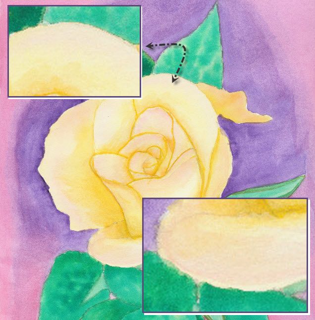
20130907 - Rose
This is particularly true of how the world often views "christians". Why is that? Well, for those who follow Christ, it's important to sometimes hold up a mirror and really look at ourselves. Do we endorse folks like Westboro Baptist Church? They claim to be "Christian". Yet, they spout hate speech whenever they get the chance. Is that the message of Christ? Is it fair to then say "All Christians are fanatics"?
Ah, well. See what happens when I contemplate a rose for a day. Interestingly, I find that on my journey to develop my skill with watercolor, I find time to contemplate the world around me. It's a chance to learn some perspective .. in many different ways.
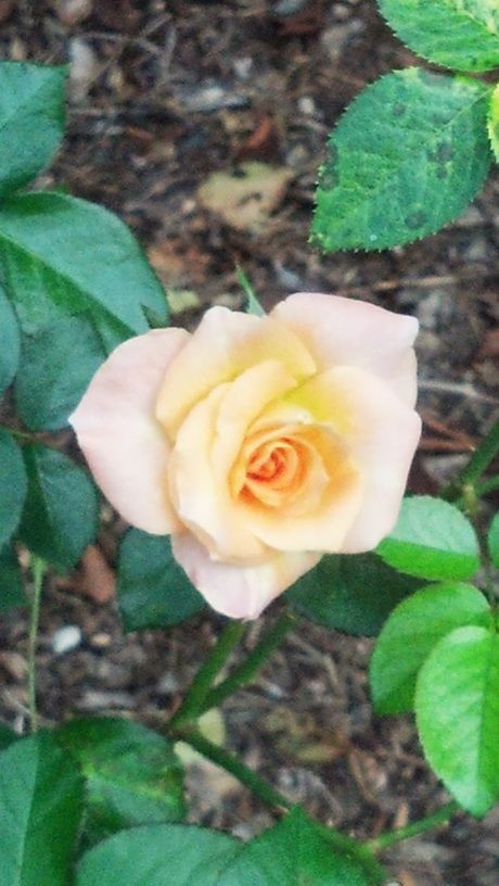
Back to a Rose .. This rose is based on a rose that I found at the JC Raulston Arboretum. The color is a wonderful cream / coral color with a blush of rose pink toward the edges and a light orange color inside the blossom. Getting that transition of colors is very hard to accomplish .. at least for me at my level.
Ah well, it's a process of learning the techniques to accurately portray what I see. The important thing for me is that I enjoy learning and trying. Hopefully you also find the process enlightening.
Friday, September 6, 2013
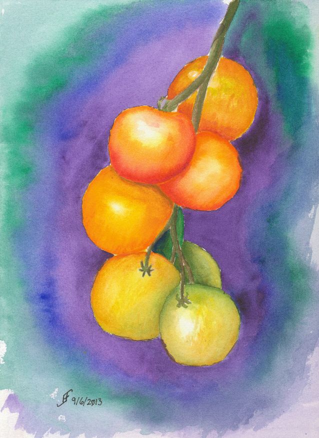
20130906 - Tomatoes
Rocky Alexander is the instructor. Of course, as you would expect, her skill with watercolor is amazing. As I expected, I learn as I watch her work. Seeing her do a rendition of tomatoes was interesting. I learned a new technique to blend together colors. By dropping wet paint into wet paint, you can get a graduated color change. Of course, the round shape of the tomatoes is a good way to exercise that skill.
So, here's the first painting from that class. There are many more to come. Hopefully you will also find my journey with watercolors interesting.
As you look about, remember how wonderful the fall colors are and even in the midst of decline we can see some very spectacular results. While that's true for our gardens, it's particularly true for us. So, take the time and shine out with the radiance that's in your heart.
Sunday, September 1, 2013
20130901 - Completed Garden Path
Here is the completed Garden Path painting. As you can see, the color added a great deal to this picture. I managed to capture the face that boards on a boardwalk are often replaced. I have a mossy/algae stained area on the boardwalk.
As I mentioned, I forced the perspective a little bit so it feels as if the boardwalk if wending it's way through the bushes. Even in the original picture the angles are odd. I just accentuated that a bit.
Overall, I find that I really enjoy doing the pen and ink drawing and then adding the watercolor to build onto the drawing. It's a fascinating process. One I hope to enjoy many more times!
I hope you enjoy this as much as I enjoyed making it.
20130901 - Garden Path Pen & Ink Drawing Completed
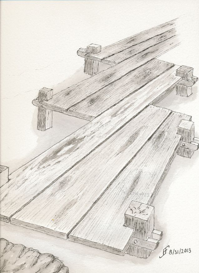
Well, I changed my mind and decided to add more detail in pen & ink. As you can see, the boardwalk no longer floats in space. So, the tonal sketch is complete. Now to add the color.
Saturday, August 31, 2013
20130831 - Down the Garden Path
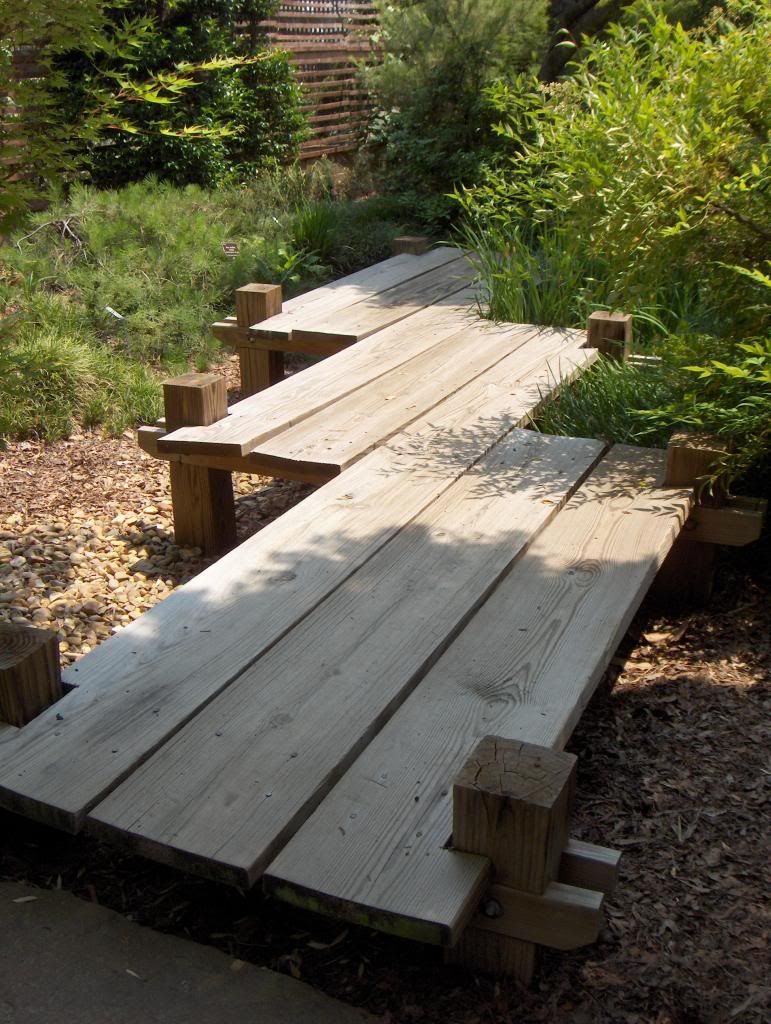
I remembered a photograph I had taken many moons ago at the JC Raulston Arboretum. It was a wonderful garden path wending its way through the garden. Here is the original reference photograph:
I particularly enjoy the shape of the walk way. So, I decided to use this as the reference and create a pen & ink with watercolor painting. I've not completed the painting. But I've done the pen & ink portion of the painting.
As you can see, I intentionally accentuated the perspective. I just love that shape and thought a little bit of emphasis would help others see how unique it is. But I'm pretty pleased with the plank of wood effect that I was able to create.
In addition to that change, I will change some of the background. For example I will probably add a phlox bed in front of some ornamental grass. I will use watercolors to create the impression of wood chips and pebbles. I should finish it some time tomorrow evening.
Subscribe to:
Posts (Atom)