Showing posts with label Coastline. Show all posts

Friday, April 4, 2014

20140404 - Sunset

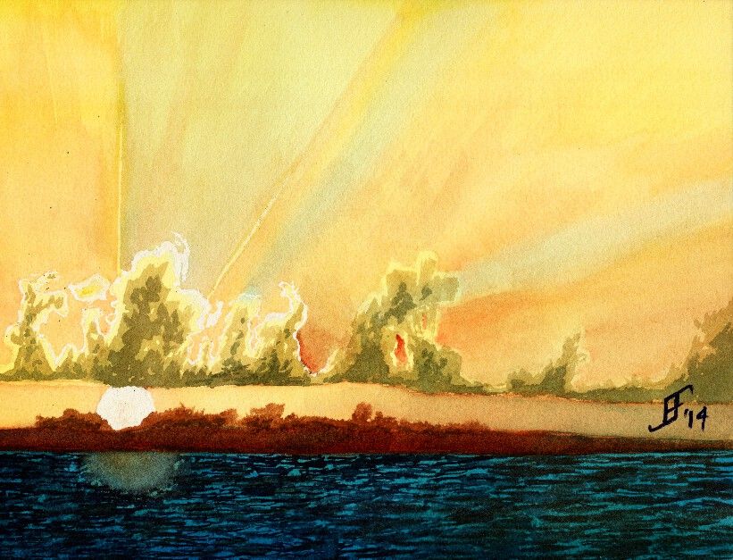
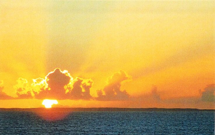
Another day, another painting. Today in my painting class we used another student's photograph (with his permission) to create a sunset picture with rays of light radiating out from the clouds that were farther in the foreground. This sunset (or sunrise) picture includes a lot of oranges and reds deep into the yellowish color. Plus, there are barrier islands an a deep turquoise sea in the foreground.

Here's the original photograph


Here's my attempt at an interpretation of the photograph.


As you can see, the clouds have a greenish cast. I've not worked much with that turquoise blue, but as you can see, a little bit goes a LONG way. It needed more red and less of that blue. Ah, well, lesson learned.

Hope you enjoy!

Tuesday, February 25, 2014

20140225 - Painting Cache

I allowed things to pile up, so this blog post has three paintings that I've done during the past three weeks in my Pen & Ink with Watercolor course. Think of these paintings more as sketches than as full blown paintings, since I spend less than three hours on each.

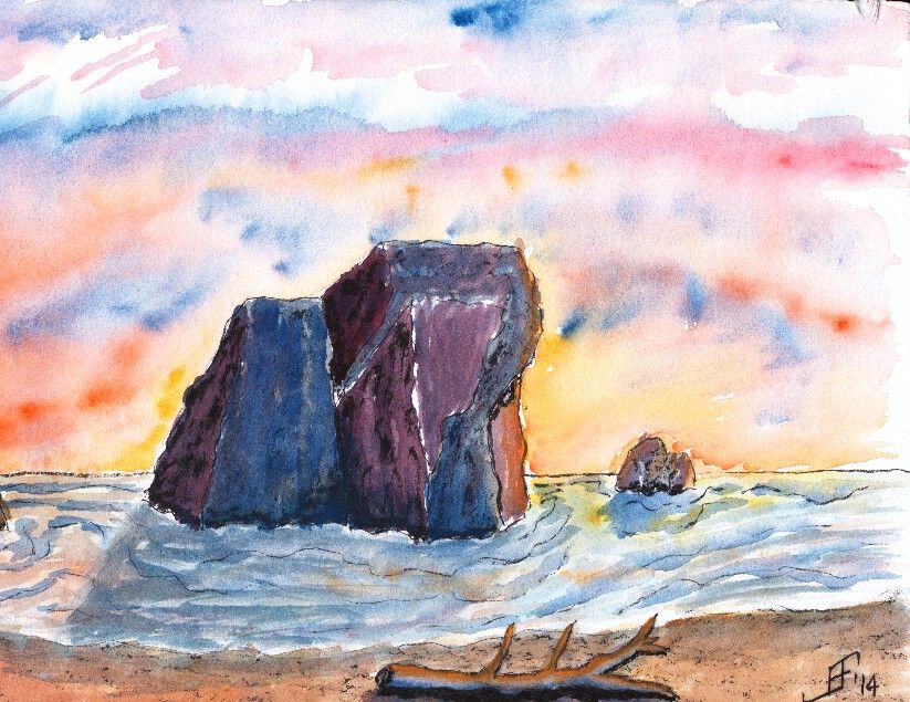
First, I did a painting of the Oregon Coast. It is not drawn from a specific reference photograph. Instead, this is an imagined shoreline along the Oregon Coast. The sharp rocky shoreline along with the narrow beach is shown in this painting. And of course, since I enjoy vibrant sunsets, I added a sunset. This painting used Noodler's Black ink as the ink. I used both a water brush and fountain pen to apply the ink. I then added plenty of color to deepen the shading of the painting.

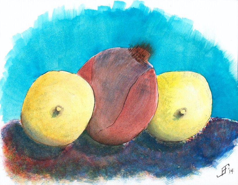
The next painting is a still life of two lemons with a red onion in the middle. Of course, I happened to be sitting facing the lemons in an interesting position. As I faithfully copied the scene in front of me, the teacher pointed out that I was obviously a guy, since I was drawing the nipples first! Oops! It had not been on my mind, but sure enough that is how it looks. Of course, lemons have a "nipple" shape at the bottom of the lemon. Just goes to show that you should carefully examine your subject before beginning to paint or sketch the subject. But I tried to keep at it, regardless of the red cheeks! This painting uses Noodler's Black ink via both a waterbrush and fountain pen. The shadows are deepened with watercolor adding color into the shadow (since there is no true lack of color in nature ... unless you are in complete darkness).

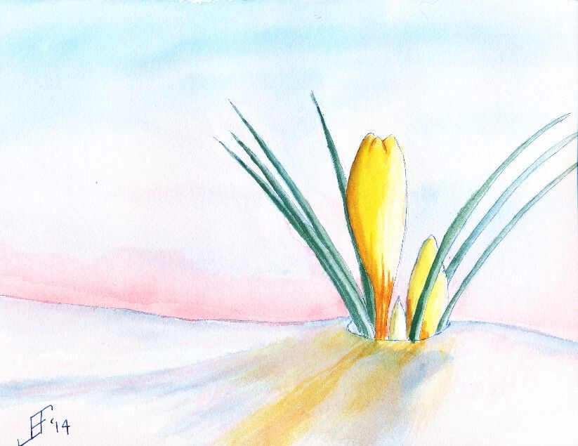
Finally, we did a painting of crocus. I found a wonderful reference photograph of a yellow crocus peeking out of the snow. This painting does much better in person than as a scanned painting. The scanner just seems to miss a lot of the detail of the painting. This used Noodler's 54th Massachusetts (a blue/black) ink for the lines of the crocus and the snow. Remember that blue added to white reminds us of snow and ice. Of course, the snow should also reflect the color of the sky and the crocus.

Hopefully you enjoy these as much as I enjoyed making them.
Friday, September 27, 2013

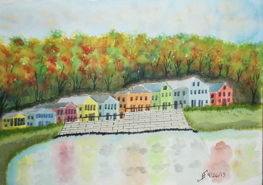
20130926 - Fall Foliage

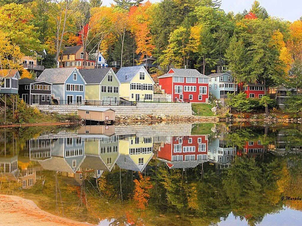
Here's a quick sketch of a fall foliage around a vacation spot in the New England area. It's roughly based on an image I saw in the news yesterday.

This one did not turn out as well as I hoped. I'm tired, so I did not put as much into this as I should have. Lesson learned.


As you can see from the original photograph, it's well worth taking time to enjoy it. And indeed, I hope you enjoy both the photograph and this sketch.


Monday, September 23, 2013

20130923 - Setting a Mood

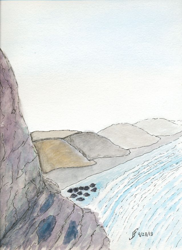
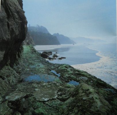
This week the lesson for art class is how to create a mood for a painting. For example, a misty coastline in Oregon provides a great example of how you need to create a unified painting that expresses a mood more than just "capturing" the setting.

While I think I accomplished that in this painting, the scan does not convey the subtle misty blue sky. Oh, and as you can see from the reference photograph, I decided to emphasize the misty, lonely mood of the original setting.

While this is nothing to write home about, it definitely is better than my first attempt, which while it captured more of the detail of the setting, failed miserably at capturing the mood I wanted to convey. It was hard edged and did not have that misty, lonely feel. This one does capture that feeling.

Of course my wife wondered if those were boy scouts camped along the shore. Next one that I do like this, I will need to try to incorporate that idea into it. Hmmm....

Anyway, I hope you enjoy my ramblings as much as I enjoy creating these paintings.