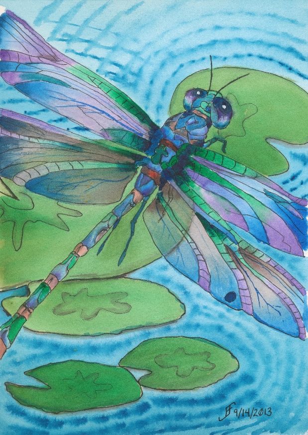
 Well, the dragonfly painting is done. There are some things that I would correct. But overall, I'm pretty pleased with this one.
Want to know what I should improve? Here goes. They are not "nit picky", but they don't absolutely spoil it either. But it is a chance to learn more as I work on a piece.
Here's the first item. The upper right lily pad is not oval enough. Thus, it suddenly feels as if the perspective of the painting warps. You go from looking down and sideways toward the lily pads to down onto that upper right one. Lesson learned.
The second item is that the color of the purple in the lower two wings (toward the body of the dragonfly) was created rather than selected from my palette. The purple works better when it's from the palette.
The third issue is that the wings are a bit darker than I would like. They would appear to appear to "shine" more if there was more of the white of the paper showing.
There are other minor things. But as I noted. For the most part, I'm pretty pleased with this one.
There are some things that are right. I got the right gossamer wing effect. You can see through the wing to the lily pad in the center. And I tinted (using a glaze) the wings to make them slightly green in that area. That worked well.
But the most important thin is that I hope you enjoy seeing this as much as I enjoyed making it.
No comments:
Post a Comment