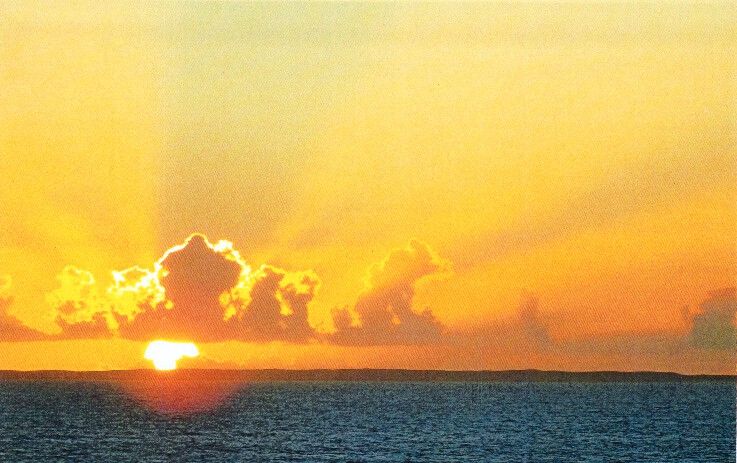
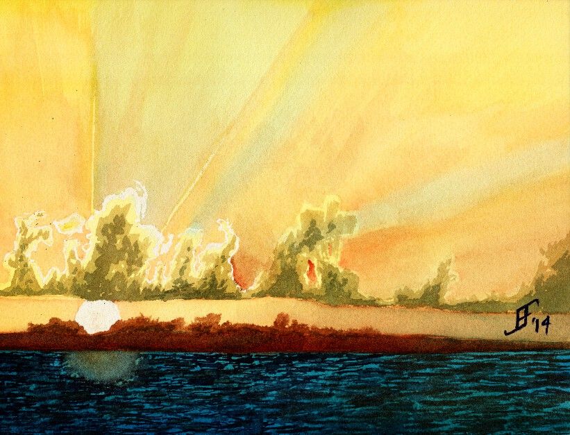
Another day, another painting. Today in my painting class we used another student's photograph (with his permission) to create a sunset picture with rays of light radiating out from the clouds that were farther in the foreground. This sunset (or sunrise) picture includes a lot of oranges and reds deep into the yellowish color. Plus, there are barrier islands an a deep turquoise sea in the foreground.
Here's the original photograph
Here's my attempt at an interpretation of the photograph.
As you can see, the clouds have a greenish cast. I've not worked much with that turquoise blue, but as you can see, a little bit goes a LONG way. It needed more red and less of that blue. Ah, well, lesson learned.
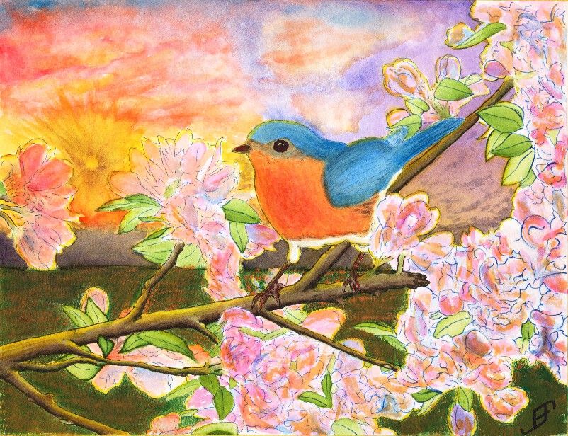
After several eventful weeks that have kept me too busy to do any painting, I decided to try to tackle something a bit more complicated than normal. Believe it or not, this Blue Bird painting is a Pen & Ink with watercolor painting. The tree, flower and foliage as well as the blue bird are done in Pen & Ink. However, the blue bird and flowers had some water color to add additional depth to the painting. The limb and foliage are exclusively done with ink.
This painting is not an ideal painting. For a very bright and busy foreground it would be better to use a simple background. While I could have painted a much simpler sky, I wanted to try some techniques. This includes the sunburst effect and a more complex cloud scene.
The sunburst effect would have been better had I used a simple spray bottle to add some dark patches headed toward the sun. Tom Jones recorded (for Jerry's Artarama) an example of how to do this. The following video shows one technique.
To create the sun burst on my painting, I would have had to use a masking fluid and paint in the background first, remove the masking fluid and then do the foreground painting. I actually did it in reverse order, since I was more interested in the foreground painting.
Unlike my previous version of a bird (gold finch) in a red bud tree, I played around with the color of the blossoms a bit by adding some orange to the blossoms. I also backlit the limbs, flowers, foliage and bird with the yellow of the setting sun. That combined with the orange tint of the flowers - which often appears toward sunset - helps set the stage for Bluebird out at sunset. And that would not be correct for bluebirds. Should I claim "Artistic License"? .. Not really. It would have been better with a simpler sky. If I needed it backlit then a early morning sky / sun would be a better choice.
Why that choice? It's both more accurate to the bird and would provide a simpler background.
Again, I should have done the background first. That would allow me to add in the detail to make it fairly convincing, yet keep it .. well .. in the background!
You will note that there is a good deal of detail in this painting. I post this in a larger format on the blog because I am fairly pleased of that. The field of mown grass feels more natural than others I've done in the past. The detail of the limbs. Shoot, even the feet of the bird have a lot of detail.
Still, it's too busy. I created an 11 x 15 inch, stretched watercolor paper canvas this past Friday. I will probably use it to paint this subject .. But this time, I will use a simpler background. I will set it as a mid-day painting.
Well, it's time to get back to painting. As I may have mentioned, I had a partial vitreous detachment in my one good eye. Though it's not a problem and did not lead to a retina detachment, as I first worried, it did leave a "big honkin' floater" (per the senior ophthalmologist, who examined me) in the MIDDLE of my field of vision. But they are right. Eventually your brain mostly ignores it. And after several weeks of playing various computer games, I mostly don't notice it, or can rather automatically flick my eye to move it out of my way.
So, let the paintings begin. I went to the Art of the Carolinas during the beginning of November. While there I received a sample of Sennelier watercolor paint. Like my M. Graham watercolor paint, it uses honey as one of the binders. This allows the paint to retain a moist quality. Surprisingly, the prices are similar to the M. Graham. And the colors are wonderfully vibrant. I might add some of them to my palette. I'm happy. I now have two paint lines from which I can get the type of watercolor paint that I like.
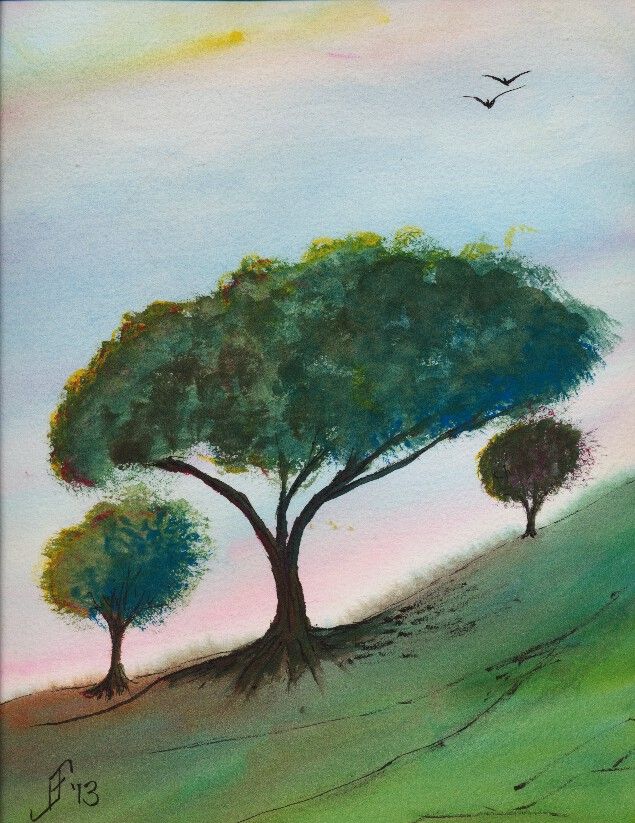
This 10" x 14" painting is done on a Daler-Rowney The Langston Prestige watercolor block. I only used three paints to create this painting. It includes a yellow, red and blue. The yellow is Sennelier Yellow Light. The red is Opera Rose. And the blue is Cinereous Blue.
The yellow and red are transparent watercolor paints. But the blue is opaque. So, I laid down the sky before anything else. Likewise with the green (blue and yellow), I assumed (correctly) that it would cover any other paint.
Unlike most of my pen & ink paintings, I added the ink to this painting after painting the subject. I usually add it before as an underpainting. There were two reasons I did not do it this time. First, and foremost, I wanted to try this paint without the confinement of the pen & ink underpainting. Second, I decided that just a touch of details to the landscape and trees would help.
This painting is not based on any reference photograph. It's solely pulled from my imagination. My intent is to portray a bit of a windswept hill in the area of transition between grassland and woodland areas. The time of year is early summer. It is past the yellow/green of spring, but not into the deep greens and dried browns of summer. Additionally, this is an early morning or early evening sky, with the sun just starting to set and casting a pink and yellow glow. I've seen a few of those sunrise / sunsets to know that when that happens it tends to dramatically increase the color vibrancy. It's almost as if we suddenly see a new color in the world.
Here's hoping this painting helps brighten your day, offering both warmth and hope for your day.
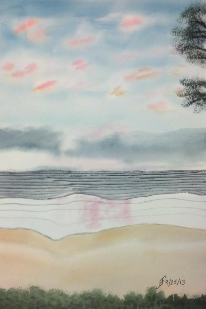
Some of the most attractive settings to paint are sunsets. This painting is based on a photograph a friend took while on vacation.
I can't say that I spent a lot of time on this painting. However, I was trying to capture the different layers that you see in a sunset over the pacific ocean. You of course start with a darker sky the farther it is from the horizon. You often have light clouds reflecting the sunset. And of course there are often clouds closer toward the horizon line. Then the ocean line has several layers. The first is a deeper zone where the waves show a darker color. Then you have a lighter zone which typically reflects the sunset. Finally you have a wet beach before you reach the vegetation at the beach line.
And if you frame it just right, you'll have the edge of a tree in the upper left or right corner.
Here's hoping you enjoy this painting. If you hear the breakers rolling into the shore, don't blame me! It just seems to come with this type of setting! :-)
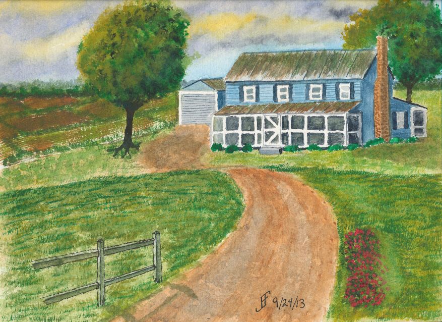
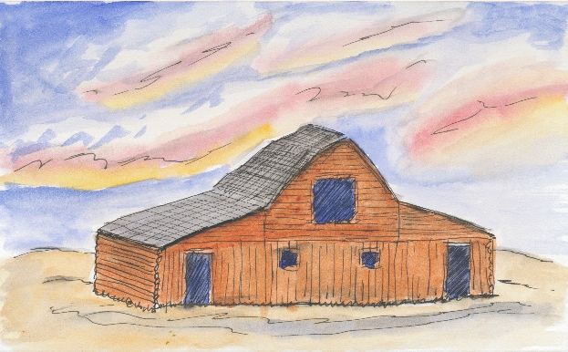
Today's painting is of a North Carolina farm, you can tell by the red clay and the tin roof with the screened porch. It is the result of using the a teaching video and modifying the subject a little to make it a unique painting for the area where I live.
The original video was made by Mike Keal. It is a teaching video by Terry Harrison, which shows him creating an English farm landscape. I enjoy doing is watching videos of artists to take the time to help show others what you can accomplish with a watercolor painting. The advantage of using example videos is that it provides me both with techniques and a target for my own painting.
I varied the scene quite a bit. The sky is a stormy sky later in the day. You will sometimes see a yellowish / greenish sky in advance of a severe thunderstorm in this area. Such a sky is never a good one to see, since it can lead to tornadoes in the area. Oddly, you will note the Carolina blue in the sky. We often see such skies in this area .. even ahead of a severe storm.
Hopefully you will enjoy this one. This took longer than many of my paintings. There are many things I like about this one. Some that I will improve next time. One thing is that this may have been easier with a larger paint surface. This is a 9x12 inch watercolor paper block. The detail work is a bit hard at this scale.
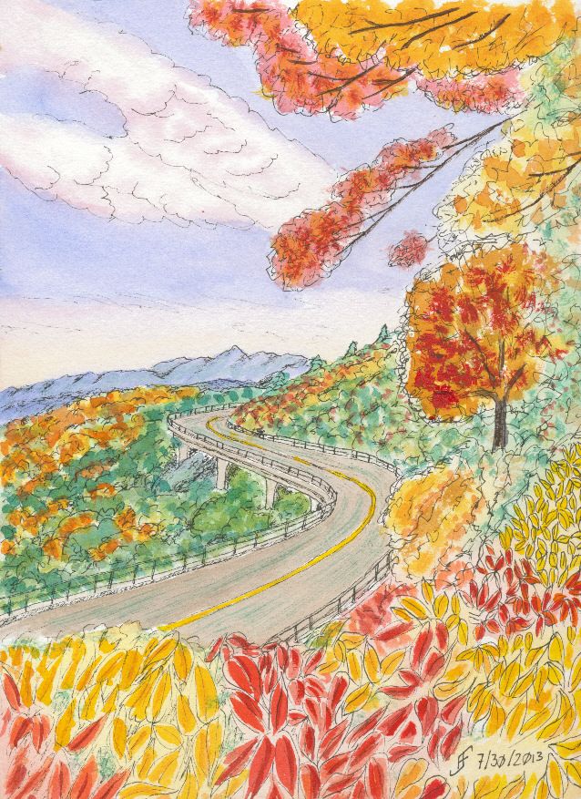
Using some of the lessons that I learned during the past couple months, I decided to tackle a larger version of the Blue Ridge Parkway painting. You might remember that was one of my first pen & ink with watercolor wash paintings. While I liked it, it just lacked the vibrancy that I see in various landscape paintings.
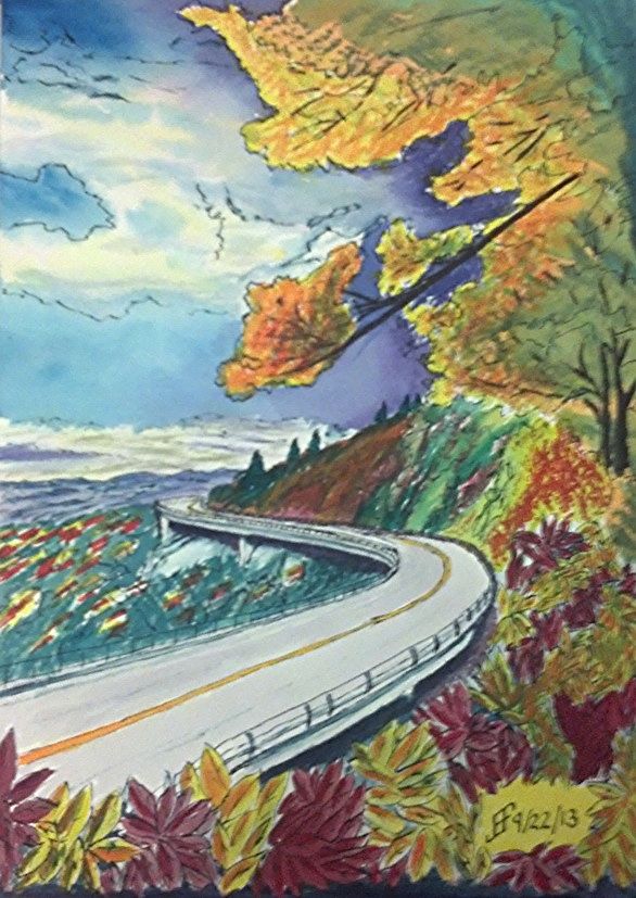
So, my thought was to accentuate the color compliments (opposite colors on the color wheel) as well as accentuating the difference in light versus dark.
First I started with a pen & ink with waterbrush wash. That provided the outline for the painting. It also provides the "under-painting", which helps determine how light and dark portions of the painting should be.
Then I added the watercolor. I decided to change it to a later afternoon / evening and change some of the colors. Until I can get it copied, the following photo using my phone should show you the difference in my color choices.
While it's still "not there" yet, it's interesting seeing the difference in the way that I see and portray a scene. The sky is much more dynamic and the color choices are much more vibrant. It just pops with color.
Sure, there remain some problems. The red of the leaves below is too cool (too blue). It should have been a warmer (scarlet) color. And I got a muddy side of the hill. But the color choices are much more vibrant than in the past.
Time to get ready for my watercolor class tomorrow morning. Make certain my paper is in the backpack. Make certain the paints are clean and in the backpack. Make certain the pens are ready to go. Make certain the image we are going to work on has been outlined onto one of the paper blocks. Do I want to do this as a combination of pen & ink and watercolor?? .. Or do I want to do it as just a watercolor?? I think I'll probably lean toward pen & ink with watercolor. Those are the most satisfying paintings in my book.
Oh, as you can see, I tinkered around with my sketchbook. I'm really pleased with it. The colors come out so very vibrant. Plus as you can see, a quick 10 minute sketch comes out a lot more as I intend it than it once would appear. I can see the progress I am making. That's reassuring.
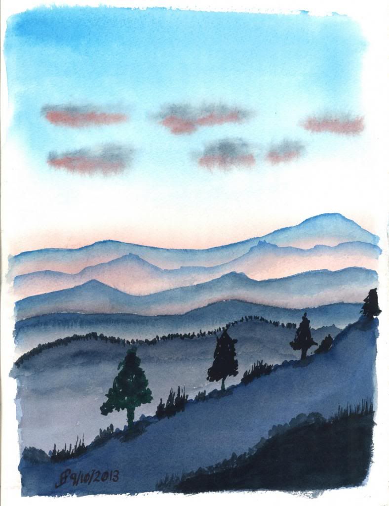
Living along the Appalachian mountain range most of my life left me with a clear image of mountains. They are rolling hills that go as far as the eye can see.
Here's a painting that tries to capture that sense of rolling hills at sunset. You get a slight orange/pink hue tinging the mist and highlighting any remaining clouds.
It's very restful and I highly recommend this to anyone who visits the area.
Today I started a new class at the Senior Center. This is a Pen, Ink & Watercolor class. While I really like the class, the content and the instructor, he emphasizes a more creative style of painting than I normally use. Yes, I was an engineer. I see the detail. I can also see the whole. But ignoring detail is so counter to my normal style that I find it grating.
But that's the style of painting that this instructor emphasizes.
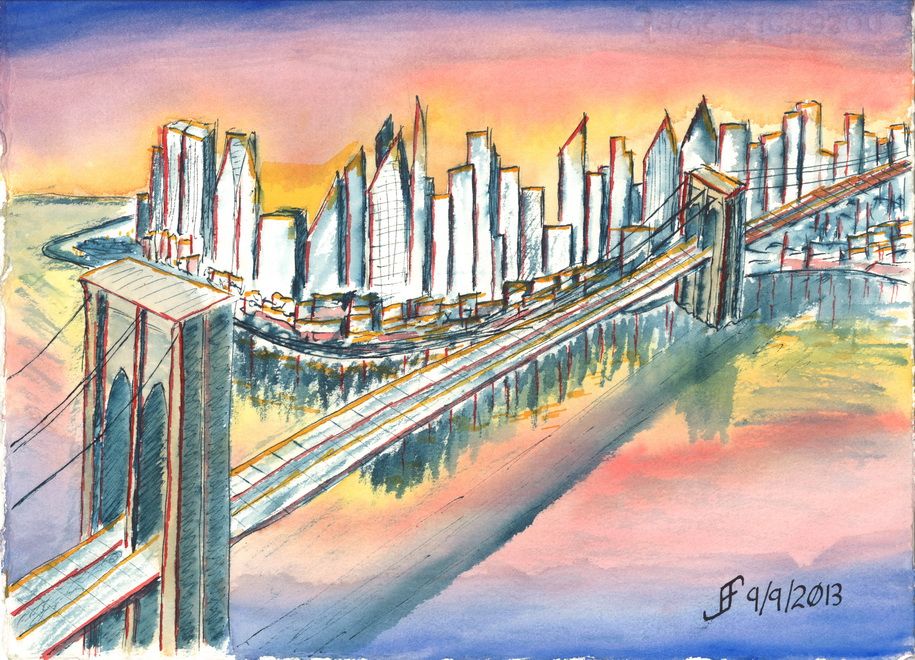
While we attempted a certain style in class, I was not at all happy with the outcome. So, when I came home, I attempted something similar to that style. I can NOT completely ignore lines and shape. I need SOME of the detail. So, I decided to do a Brooklyn Bridge sunset scene.
I was VERY loose with the drawing style. Nowhere near as much of the detail as I normally convey. I did the basic drawing with a dark blue / black ink. Then I added color.
It's much more fanciful / impressionistic than what I normally do. Let me know what you think. I will continue to try to do this type of painting from time to time.