Monday, December 30, 2013

20131229 - Tree

Well, it's time to get back to painting. As I may have mentioned, I had a partial vitreous detachment in my one good eye. Though it's not a problem and did not lead to a retina detachment, as I first worried, it did leave a "big honkin' floater" (per the senior ophthalmologist, who examined me) in the MIDDLE of my field of vision. But they are right. Eventually your brain mostly ignores it. And after several weeks of playing various computer games, I mostly don't notice it, or can rather automatically flick my eye to move it out of my way.

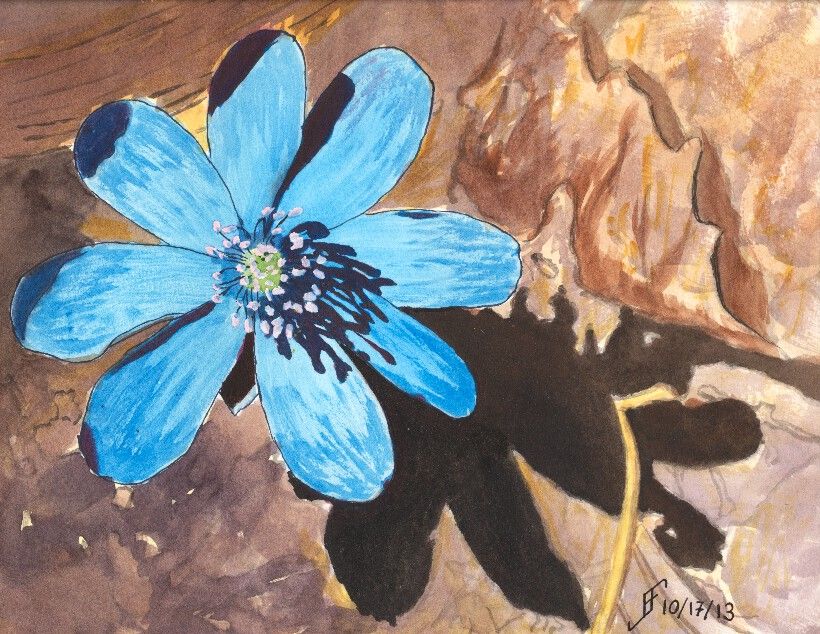
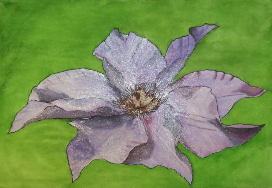
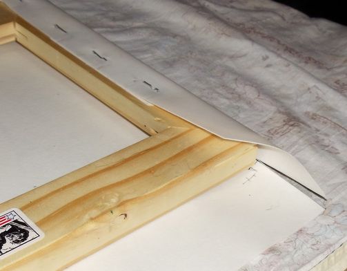
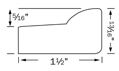
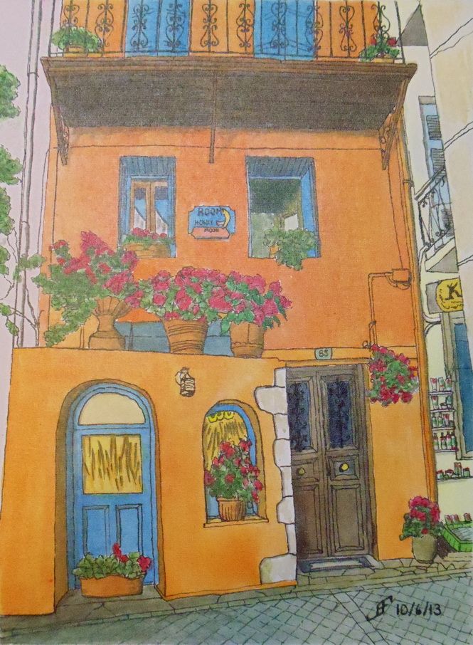
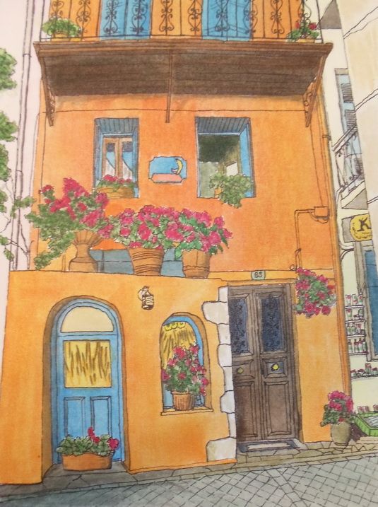
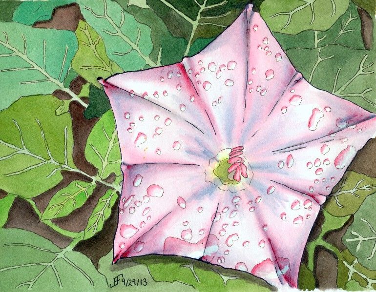
So, let the paintings begin. I went to the Art of the Carolinas during the beginning of November. While there I received a sample of Sennelier watercolor paint. Like my M. Graham watercolor paint, it uses honey as one of the binders. This allows the paint to retain a moist quality. Surprisingly, the prices are similar to the M. Graham. And the colors are wonderfully vibrant. I might add some of them to my palette. I'm happy. I now have two paint lines from which I can get the type of watercolor paint that I like.

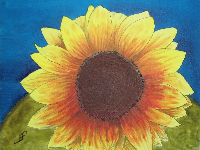
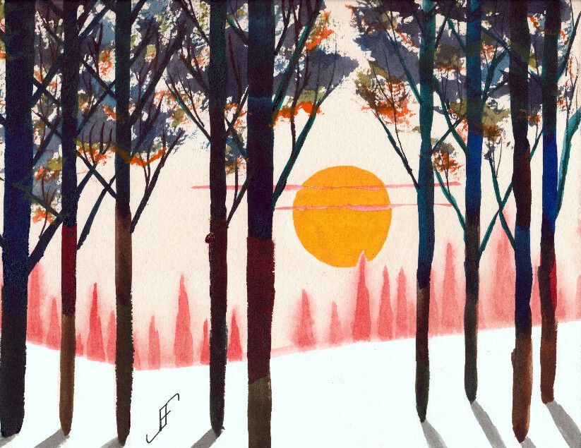
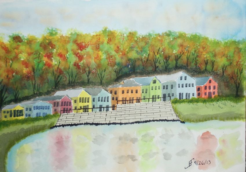
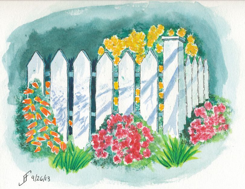
This 10" x 14" painting is done on a Daler-Rowney The Langston Prestige watercolor block. I only used three paints to create this painting. It includes a yellow, red and blue. The yellow is Sennelier Yellow Light. The red is Opera Rose. And the blue is Cinereous Blue.

The yellow and red are transparent watercolor paints. But the blue is opaque. So, I laid down the sky before anything else. Likewise with the green (blue and yellow), I assumed (correctly) that it would cover any other paint.

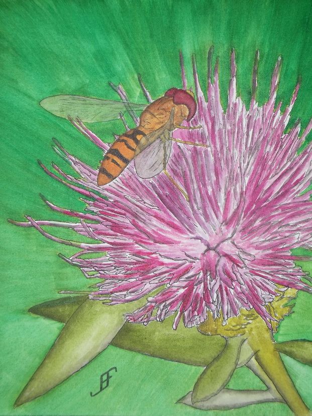
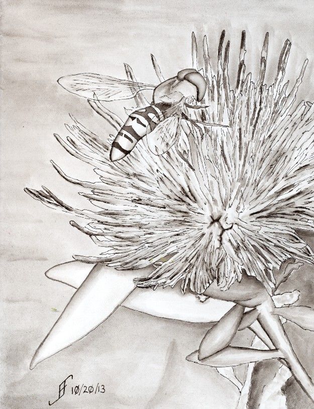
Unlike most of my pen & ink paintings, I added the ink to this painting after painting the subject. I usually add it before as an underpainting. There were two reasons I did not do it this time. First, and foremost, I wanted to try this paint without the confinement of the pen & ink underpainting. Second, I decided that just a touch of details to the landscape and trees would help.

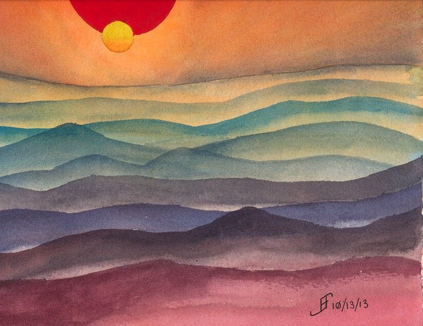
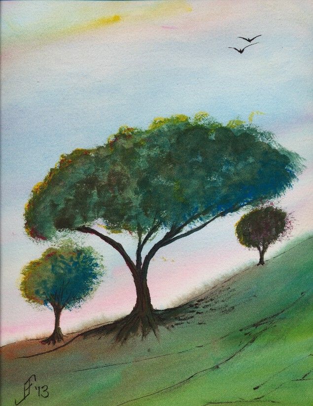
This painting is not based on any reference photograph. It's solely pulled from my imagination. My intent is to portray a bit of a windswept hill in the area of transition between grassland and woodland areas. The time of year is early summer. It is past the yellow/green of spring, but not into the deep greens and dried browns of summer. Additionally, this is an early morning or early evening sky, with the sun just starting to set and casting a pink and yellow glow. I've seen a few of those sunrise / sunsets to know that when that happens it tends to dramatically increase the color vibrancy. It's almost as if we suddenly see a new color in the world.

Here's hoping this painting helps brighten your day, offering both warmth and hope for your day.

Thursday, November 14, 2013

20131114 - Airplane

Today I decided to try something different. I decided to try a pen & ink drawing with watercolor of an airplane. I've tried buildings. I've tried flowers. I've tried landscapes. But this is my first shot at painting a vehicle. I am pretty pleased with the results. I hope you enjoy it as much as I enjoyed trying too paint it.

Monday, November 4, 2013

20131104 - Sunflower

Well, another day, another painting! As promised in yesterday's post, I completed the Sunflower. Most of it was complete last night, but this morning, I added a few finishing touches. Hopefully you will enjoy this rendition of my friend's photograph.

The camera added a bit of reflective light to the mix. So, the center and the detail around the center appears a bit lighter than they appear in person.

Since I don't have a scanner that can handle larger images, I use a camera. While it does well, it does need to use the flash to get a good photograph of the painting. And then of course, I need to do some photo editing to eliminate perspective distortions to the photograph (to bring it back to an 11x14 sized image).

And of course, for your reference, here is my friend's photograph of the back lit sunflower. As you can see, getting the intense yellow is a fairly difficult proposition. Next time, I will probably try a slightly redder yellow (Hansa Yellow Deep). However, in my defense, the yellow in person is much more intense.

Anyway, hopefully this cheerful sunflower will brighten your day.

Sunday, November 3, 2013

20131103 - Sunflower with a Different Perspective

I enjoy finding interesting photographs and subjects within them. A friend recently gave me explicit permission to paint his photographs. This photograph he made of this sunflower with the sun behind it, lighting it from behind. It will make an interesting subject.

When rendering it in watercolor, I think I will shoot for complimentary and split complimentary colors (using the CMY, or Cyan, Magenta, Yellow color wheel). Thus, the compliment of yellow is blue (on the CMY color wheel). I will paint the green leaves toward the bottom where there is more of an orange coloring of the sunflower. This will yield the split complimentary colors to the complimentary color of blue.

But first, I will use pen & ink to create the value sketch (of the shading) of the painting. It will act as the under painting for the finished work. I will use an 11x14 inch Fedrix Watercolor Canvas Board. Unlike a conventional canvas with Gesso, watercolor (and other wet liquids, such as ink) does adhere to the surface. However, unlike watercolor paper, the watercolor and ink doe not fully absorb into the canvas. Thus, it is possible to lift color rather easily. Where this works well is when you do NOT intend to paint one color over another in added glazes. Though it can be done (and I did it with the bee in the Thistle with Bee painting), you must be very careful about adding color onto an area that already has color.

So, here's hoping you will enjoy the final painting.


Thursday, October 31, 2013

20131030 - Thistle with Bee (Painting)

Yesterday, I decided to pick up the challenge of not just drawing, but painting the Thistle with Bee. You may remember that I had done a pen & ink only drawing of the Thistle with Bee. This time, I decided to make it a bit larger (11x14 inches) and paint it.

I am fairly pleased with the painting. My rule of thumb on this is that if I would not mind giving it as a gift, then it passes muster.

Of course, there are always things I would like to improve. The thistle color did not come out quite right. It should have been a bit brighter pink purple. I suspect I should have used Ultramarine Pink. I tried to use a rose and a violet to get some of the same effect.

Things that did work right include the bee. It's not perfect, but I'm pretty pleased with it. I also intentionally color shifted the stems and leaves. I did that to have it show "weedy" growth. For the background I used a similar green, then used a bluer green exploding outward from the thistle. This carries the "motion" of the thistle outward.

All things considered, I am fairly pleased with this painting. Especially since I have also been dealing with a really huge floater that floats into the center of my vision. Yuck. I spent most of the day on this past Sunday at the Duke University emergency room. Appears I developed a partial vitreous detachment in my left (good) eye. Being unaware of the symptoms for that and problems with the retina, I decided I needed to have it checked immediately. The ophthalmologist on duty and the senior ophthalmologist on call both reassured me that since I have usable vision only in that one eye, I did the right thing to have it checked. Fortunately, there's no retina damage. But I do have a "honking big" floater that's right in the middle of my center of focus. And yes, it appears ophthalmologists use technical terms just like computer engineers do! .. ;-) ... So, all things considered, I am really pleased that I can still enjoy painting.

And I hope you enjoy this.


Friday, October 25, 2013

20131025 - Fantasy

Today's project in my watercolor class was to create a misty type forest scene with a setting sun. Of course, I could not leave well enough alone and ended up going for a stylized scene.

The idea is that you have a forest in the far distance, more clearly defined pine trees in the middle distance and either deciduous or long leaf pine trees in the near distance. In the Carolinas this would be the sort of scene that you might find near a Christmas Tree farm.

But rather than going for standard color combinations, I decided to lean toward some more striking colors. So, the trees in the distance are redder than you would ever see in real life. And the nearby trees have vibrant foliage. The upper part of the foliage is darkened  by the gloomy twilight conditions. The bottom of the foliage is highlighted with the setting sun.

Perhaps it's fantastical, but I had a lot of fun bringing the colors and approach of this painting together. Hopefully you will enjoy it as well.

20131018 - Fall Barn

Our project last Friday was to do a fall foliage scene with a barn in the distance. Landscape paintings continue to be a struggle for me. But the trees are improving.

Sadly, I ran my finger through some red paint and smudged the right hand side of the painting. Arrgh! Oh, well, it was more of a learning sketch than anything.

The actual scene did include a shade stripe through the nearby field.

While it's not bad, I still have a long way to go with my landscape paintings. But that's why I am taking the class. To learn. Here's hoping you enjoy this watercolor sketch.

Monday, October 21, 2013

20131020 - Dilemma Solved - Pen & Ink Only


So, I solved my dilemma with this rendition of the photograph. I decided that this time this "painting" will be ONLY with pen & ink. As you can see, I use the ink as a value wash. That is, I use the ink to wash in the shading within the "painting". It's just a pen & ink drawing, but it feel as if it's more of a painting than just a "drawing".


As you can see from the reference photograph, it will be a good candidate for using watercolors.

Everyone loves to see thistle flower - especially with a bee on it.

My next effort with this painting will be to add color to it. I might make that one 11x14 size painting. The subject comes out pretty nicely and lends itself to pen & ink, so adding color to it should be fairly spectacular.

Sunday, October 20, 2013

20131020 - Oy! The Dilemma!!


So, here's the problem of the day. I decided to do a pen & ink with watercolor wash of a photograph that a friend shared. It's a photograph of a thistle flower with a bee on it. As you can see, it's a wonderful, striking photograph.

As you can see,  I started to do the pen & ink work on this photograph. But unlike most of my efforts, I actually think I like this one just as a pen & ink drawing - without any watercolor added.

Oy! The dilemma! Should I leave it "as is" and just complete the pen & ink work. Or should I add color to it.

Of course, I might split the difference and leave this one as pen & ink only, but do another painting with watercolor. Decisions, decisions!


Friday, October 18, 2013

20131017 - Flower

Here's another pen & ink with watercolor flower. I used Noodler's Ink 54th Massachusetts ink for the flower and Nooderler's Ink Black for the shadows on in the leaf litter on the ground.

With this flower, I decided to intentionally leave the leaf litter more of an impression than to shoot for realism. The intent is to show the flower as the primary focus (as it was in the camera) and having more substance than the background.

Not sure it came out all that well. I've been staring at it too long to have a good perspective on it.

Hope you enjoy this one. I know I enjoyed painting it. And my hats off to John Apps, who took the original photograph of the flower. It's quite striking.


Sunday, October 13, 2013

20131013 - Planning a new painting

I'm in the process of planning a new, larger painting. I will sometimes take the effort to initially sketch it in my sketchbook to see if I like the composition. Lots of times I move components around a bit. Then I might even do a larger study of the painting.

In this case, I took the sketch and scaled it up to 12" x 9" (in portrait mode). I plan on taking this idea (of lighted advent candles) and painting it on a 14" x 11" canvas. I will make a "canvas" out of watercolor paper (as I did with the Clematis).

Part of what I wanted to learn is how to make the lighted halo around the candles and how it should fade into the background. This painting did not fully capture it, but I am not completely displeased with it. I think I know how to accomplish what I want.

The fun thing about this is that it will allow me to run some LED lights into the back of the painting and "back light" the advent candles. I suspect I will need to make a mask for behind the watercolor paper so that only those areas I want to be lit will stand out.

I have not yet decided if I want to use some calligraphy along with the candles. While that might look nice, it will be very difficult to get the mask for the calligraphy to match the front of the painting. But the effect could be pretty spectacular.

I suspect you will see this one again.

20131013 - Not all paintings end up as I want them

Sometimes it feels as if the painting takes on a life of its own! That's what happened today when I started to attempt a blue ridge mountain sunset. The colors just did not work out right. But I suddenly realized it looked more like a science fiction scene than it did a mountain landscape. And Voila! The Rainbow Dunes of Tanak were born.

So, even if the painting does get away from you, you can often enjoy the process and clown around a bit. Realistic? Nope. But lots of fun to imagine what might cause this type of psychedelic experience. And it's not all that inconceivable that a planet might end up with "Rainbow Dunes".

So remember that when life hands you some lemons, go ahead and make some lemonade and enjoy the result!

Friday, October 11, 2013

20131010 - Clematis

Today I completed a painting on the watercolor paper canvas that I created yesterday. This is a pen & ink with watercolor of a purple Clematis. It is based on the Clematis by Nicola B., who graciously uploaded it to the Paint My Photo website, where photographers share "reference photos for creating derivative Artwork without copyright worries."

A bit of an apology. Yes, it has an iridescent medium on it. It's an inside joke in our family. My daughter loved things with purple sparkles. As I was painting this flower from the photograph, I was struck by how it almost seems to sparkle in the light. Well, it was only a short hop form that to purple with sparkles. In person the iridescence is not quite as annoying.

A little on the detail in painting this. I used Noodler's 54th Massachusetts, which is a blue-black ink for the outline of the petals. I used that same color to create the under painting of the shadows. I masked off the center of the flower. After I added the color, I removed the masking and used Noodler's Manjiro Nakahama Whaleman's Sepia on the center. I used M. Graham paints to add the coloring to the paint. After doing research, I discovered that I rather naturally use a CMY (Cyan Magenta Yellow) color wheel to choose colors. In this case, the green and purple are complementary (per the CMY color wheel). This system tends to yield much more vibrant colors than the tradition RBY (Red Blue Yellow) color wheel.

As I noted, I painted this on the watercolor paper canvas that I created yesterday (see my previous blog entry). I will still need to spray it with a UV Protectant Varnish. Since the back of the paper is open to the elements, I will need to spray both the front and back (as well as sides) of this canvas. Once that's done it can be hung "as is" without a frame, or put in a frame, such as is used for oil or acrylic paintings.

Wednesday, October 9, 2013

20131009 - Completing the Paper Canvas

Ready or not, here I come. This blog entry will go over the step by step process of completing the watercolor paper canvas.

Okay. In truth, I was not ready! .. After assembling everything that I need, after wetting the paper, I discovered that someone had previously purchased the stapler that we bought yesterday. How do I know? They had jammed staples that were too small into it and jammed it completely. Unfortunately, this particular model did not allow me to readily disassemble it. There should be a special place in hell for people that buy a product, abuse it (by putting in incorrect staples) and then returning it and pretending nothing is wrong.

Ugh! Back to the sink goes the paper. And back to the store goes the stapler. After much argument my wife is able to convince them that the stapler was broken when we bought it and it's an even exchange with the broken stapler. While I know the store does not like to be scammed, I hate even more having a store scam me! Ah, well, the did allow an even trade. And the new stapler works perfectly. Great. We're ready to go.

  • Stretcher bars. Check.
  • Scissors. Check.
  • Ruler. Check.
  • Stapler and staples. Check.

So, it's time to measure and mark the paper. Note that you can just see the raised lettering in the corner. That's the "Arches" mark on the paper. It tells me that the back side of the paper is facing the stretcher bars. Good. Now to mark the paper so the stretcher bars are evenly centered. Don't go hog wild with the marker. But it is the back, so it should not be too visible.
After marking where the stretcher bars should go, I marked from those corners to the edge of the paper along the LONG edge (in this case the 12" edge). Then I marked a 45 degree cut off area on all four of the corners. Once the paper was wet and in place (on the tea towel as you can see), I cut the corners as you see. The cut into the paper from the edge is along the long side. It's like that on each of the corners. Note how the scissors show the cut in the paper. This will allow a neat corner to be folded without too much paper getting in the way.

By the way, if you are wondering, I set the paper soak for more than five minutes to allow it to fully expand. It will slowly dry overnight once it's on the stretcher bars. It should come out sounding like a drum when it's dry.

Starting on the short sides, I staple the paper on one side to the stretch bars. I start in the center and work alternatively outward to the corners. Note how the cut corners are set. Don't staple the ends too quickly. You will need to create a "hospital bed" corner. Tuck the corner under a bit and leave a nice square corner. You can see that in the photo where I am holding the corner in place. THEN you can staple the corner in place.

Rotate the paper and do the other short side. Tuck in each of the corners. Then rotate the paper to the long side, start in the center and work outward alternatively (left, then right, then left, then right) and smooth both the back and front of the paper as you go. You should also tighten the paper (without tearing it). In the end, you should have a neatly stapled paper canvas as you can see in the photo. I will probably have to hammer some of the staples into place, but they should more than hold as the paper dries.

And as you can see from the front you should have a nice, neat surface for your painting. While it might be a little more work than using stretched watercolor paper, the advantage is that the watercolor canvas can be hung "as is", or it can be put in a frame used for oil or acrylic paints. No glass needed. Of course, it's still important to spray it with a UV Archival Varnish. And don't forget to spray the BACK of the painting when you are done.

Joyce Faulknor claims that watercolor paint will not fade out as it dries on this type of stretched watercolor paper canvas. I will be interested in seeing if that is true. Time will tell.

Anyway, I hope this helps you learn a new way to stretch your watercolor paper.

"I wish to pain in such a manner as if I were photographing dreams." ... from Zdzislaw Beksiński.

20131009 - Boldy going where ... Wait! What?

So, I finally got the time to start to put together the watercolor "canvas" using watercolor paper.

Let's see if I have everything that I need:
  • Arches Bright White Hot Press 140lb 22"x30" sheet of paper.
  • Jack Richeson Light Duty Stretcher Bars (2x 9" and 2x 12").
  • Staple Gun and Staples
Oops. I know where the staple gun was in the garage. Not sure what happened to that one. A neighbor may have borrowed it. But that's been years ago. My wife has one. Can she find it? Nope. Ah, my son borrowed it. He'll bring that back. Of course my wife notes that it's not as heavy duty as I probably need for this task. Hmmm... Where's that Michael's 40% off coupon? Ah! Got it! Okay, mark all of them with a check mark! Okay, I'm set to start.

Now, let's do some planning. As you can see from the side profile of the stretcher bars, the paper wraps around quite a ways. The paper "canvas" will be across the top "floating" above the stretcher bars. The paper then wraps around the right hand side and along the bottom toward the left hand side.

So, we need to allow 2 inches per side for the "canvas wrapping". That means we need an extra 4" on each dimension to create the final 9" x 12" size painting. So, we need a sheet of paper that is 13" x 16" in size. As you can see from my layout sheet, that means we can get two watercolor "canvases" from one 22" x 30" sheet of watercolor paper. I can use the scrap paper for other projects. But if I do more of this, it seems that this would be best done with a roll of watercolor paper.


Ah, well. Time to prepare the stretcher bars. As you can see, I just press the joints together to create the final shape. Of course, this takes a little tapping with a wooden handle (such as a hammer's handle) to move the stretcher bars into a square shape. Don't just "eyeball" it. Check it with a square. And then double check it by measuring both diagonals from corner to corner. They should both be the same measurement. If not, it's not square. Cute trick! But handy. It's far more accurate than just using a square.

Okay, the frame of the stretcher bars are together. But I can't just lay the paper over them "as is". I need to seal them to prevent the acids in the wood from damaging the paper. I will just use the UV Archival Varnish to seal up the wood.

Now to cut the paper. To cut large sections of paper or mat board, I have a Logan Adapt-A-Rule with a Logan Pull Style Mat Cutter. I will measure the paper and cut it. into two 13" x 16" pieces and save the scraps.

Once I've done the cutting and have soaked the paper, I will take some pictures of the process of wrapping the stretcher bars and the resulting watercolor paper "canvas".

Sunday, October 6, 2013

20131006 - Next Project

Or as my daughter once said when we were visiting the North Carolina Zoo, "Next Animal!". Like her, I don't like to let grass grow under me. I am off to my next project.

As you probably noted, I tried the watercolor canvas as a surface for watercolor painting. Now, I think I will try making a watercolor canvas with watercolor paper. This approach uses traditional watercolor paper, but stretches it onto canvas stretcher bars. It appears there are several advantages to this approach:

  • The painting appears to be more of a traditional painting on canvas.
  • The watercolor paper is held tight on the stretcher bars (no ripples or warping).
  • Traditional canvas frames can be used, eliminating the need to use mats and glass.
  • Per Joyce Faulkner, the watercolor remains the same color as in the palette.
  • The painting style will remain the same as painting on watercolor paper.

To mount the artwork without glass requires using a UV protecting varnish. I have some that I used on the Honeymoon House painting on the watercolor canvas board. I can use the same spray varnish on the watercolor paper.

Unlike a traditional oil color canvas, the stretcher bars must also be varnished before the watercolor paper is stretched onto it. The reason is that the stretcher bars contain some acid, which must be kept away from the paper. A couple coats of the varnish spray should seal the wood and protect the paper.

I do not know about the claim that the color remains the same. I would think it would lighten a bit, just as it does on a watercolor paper block. There should not be any difference. But Joyce insists that the color remains the same as in the palette. Perhaps having the paper suspended in the air (off a watercolor board) tends to make it behave a little differently. I will test this.

Here is a video by Joyce Faulkner on how to stretch watercolor paper onto canvas stretcher bars and how to use them for painting:


Here is another video by Doris Joa on how to do the same thing. She provides more detail on the step by step process.


20131006 - Honeymoon House Completed

So here is the completed Honeymoon House painting. I added the lettering and a few small details. Working on the Fredrix Watercolor Canvas Board was an interesting, but pleasant experience. Fortunately, when I purchased the canvas board, I purchases several at a time. So, you will see more in the future.

You might also note above the middle set of flowers there is a bit of a whiteness that was not there before. The semigloss UV protecting varnish created a little bit of a "shine" in this part of the painting. This is one of those cases where what the camera sees and what the eye sees is a little bit different. In person, the painting looks just like it did without the varnish.

Unfortunately, the blue painters tape did not stop the paint from bleeding under the edge of the tape. I will need to see if I can't create more of a barrier in the future to resist that type of bleeding.

To correct this, I used Creative Mark's Aquacover Liquid Watercolor Paper to cover the edge of the painting. You can't see it in the above picture. It's not perfect, but it looks better than the bleeding under the tape.

Anyway, I hope to do more paintings with this watercolor canvas in the fairly near future. I hope you enjoyed seeing the process from picture to completed painting.


20131006 - Honeymoon House Final Stretch

I decided not to wait. I still have a little more to do on the Honeymoon House painting. But I wanted to share with you how it looks at this point. I've very pleased with how the colors stayed true to the color that was on my palette. Working with the Fredrix watercolor canvas boards was an "interesting" experience.

It was not a bad experience. But it was definitely different than working with watercolor paper. This will take some adjusting on my part. Getting a very smooth wash is pretty difficult on this surface. Working over a previously painted area must be done quite carefully, since unlike watercolor paper, the previous paint will tend to lift.

If you are familiar with Yupo "paper" (an artificial paper made from petrochemicals), then you realize that on some surfaces the watercolor will not adhere. It will dry. It will stick to the surface. But it's not really soaked into the "paper".

While the watercolor canvas is not "paper", it feels a little more like paper than Yupo "paper". But color will lift if you wet an area of paint. Thus, if you want to "glaze" over a previous area that you already painted, you must be quite careful to not lift the paint. It takes a gentle brush stroke. This surface also does better with a single brush stroke. If you use lots of little brush strokes, the paint will not evenly distribute.

But Tom Lynch is right about this surface. Normally, I don't believe claims that are made in advertising a product. But this surface does work as advertised. I could lift the color. And the color in my palette matches the color on the canvas. I am pretty impressed. You can see more about this surface in Tom's Fredrix Watercolor Canvas Tips video below:


Additionally, you can purchase prepared watercolor canvas and make your own stretched canvases. There is an art show (Art of the Carolinas) coming in November 2013. I might see if they have a good deal on a roll of canvas at that show.

You might be wondering what's left on the painting. Well, I need to add the lettering to the sign. Plus, I need to sign the painting. Then I need to use a UV protecting spray varnish. Once I've done that, the blue painters tape around the edges of the painting (not shown above) can come off. When I do that the canvas board can then be mounted "as is" in a frame. No glass or other protection is needed. That should significantly decrease the cost of the final paintings.

Well, I hope you enjoy seeing the process of making this painting. I know I've enjoyed working on this one.

20131005 - Honeymoon House

This past week, I joined a group which encourages photographers to post their photographs for people to create a painting of them. Paint My Photo had a fun urban scene of a Honeymoon House. The colors (as you can see below) are quite vibrant. Needless to say, I decided this would be a great opportunity for me to try using a watercolor canvas board, manufactured by Fredrix. This consists of a canvas treated for watercolor (and other liquid art materials) and wrapped around a hardboard.

Supposedly painting watercolors on canvas provides a more lively / brighter painting experience. One reason is that the canvas does not absorb the paint the same way that watercolor paper does. Thus, the colors are supposed to be more vibrant and clear. Time will tell.

In preparation, I created this pen and ink painting of the Honeymoon House. It serves as the "under painting" of my final painting. On Sunday, the 6th, I will paint this with my watercolor paints.


Friday, October 4, 2013

20131004 - Falling Leaves (at Last!)

This painting is based on Falling Leaves 3 by Maria Balcells. She participates in Paint My Photo, which provides painters a wonderful source of reference photographs. I will of course always try to reference the source photograph and photographer. Well, at least that's how I will use that website.

As you can see, I tend to modify and accentuate the colors and lines within the painting. The original photograph, while it includes some unique colors is not quite as colorful as what I painted. It's just the accentuation of what I see in the photograph.

I don't know if she "punched up" the color a bit within the photograph. But I found this fall foliage scene rather striking.

You might be wondering why I did not have any posts for a few days. Unfortunately, I spent the past few days dealing with an insurance company, trying to get them to pay for something that they should pay. They lost the claim (so they said) no less than four times. I'm still not certain that they have it and will honor it. But I've escalated it within their company. (The short message is that you should not mess with someone who used to make a living dealing with the very hard escalations .. I DO know how to work a system. Politely, but firmly!!).

Anyway, I hope you enjoy this rendition of the photograph.

Sunday, September 29, 2013

20130929 - Flower Power - Star Flower

Why not continue a great theme. Here's a pen & ink with watercolor painting that does just that. Flowers can be amazingly difficult, but also wonderful as a painting subject. Nature tends to create some very subtle (at least to our eyes) shading. Of course, if we could see in the spectrum that bees see, we would not think their shading all that subtle! By the way, see the video toward the end of this blog post for more information on that. Painting that subtle shading can be formidable. But I think I'm starting to get the hang of it. So, what do you think?

This particular flower is a rendition of a photograph that my cousin took during her travels in the US Southwest. I'm not certain the type of flower, but it was pretty remarkable. And I decided it would make a lovely painting.

As you can see from the photograph, it's an unusual flower shape. The coloring is in fact very subtle. I decided to punch up the color a bit. I also decided to add a little trick that I've seen .. adding water drops to a painting.

You might be wondering how I did this one. Well, it starts with the pen & ink drawing of the painting. Once again, I used the blue ink to create the outline of the petals and the blue shadow areas. The leaves and water drops I created with black ink. I added the shadows with a water brush and the black ink. Then I added the color onto the flower and the background. By varying the green, I made the leaves feel "right". There is a fairly natural change of colors. Otherwise the outlining of the veins of the leaves would tend to make them appear is if they were a cartoon.

Anyway, I hope you enjoy this painting as much as I enjoyed making it.

Oh, don't forget to watch the science video:


20130929 - Flower Power Take Two

So, as I mentioned, I thought I would try another shot at that painting of a flower. This rendition of a photograph of a flower from her trip to Scotland. I think you will agree the results this time around are much clearer and more enjoyable.

This time, I decided the orientation of the flower to the sheet of paper should be flipped and it be painted in "landscape" mode. And of course, I also used a whiter paper and smoother paper (hot press). That tends to make the color transitions smoother.

I also used blue ink for the petal outline, which gave me the blue highlights within the petals. This under painting is known as a "grisaille". It provides the value of light to dark within the painting subject (though the dark background is done only with watercolor). Additionally, I used three colors of ink. The anthers (the part of the flower that contains the yellow pollen) were drawn with black ink. And the center portion (where the seeds form) the pollen is deposited was drawn with green ink. It probably did not need such differences, but it seems to have made the picture less "muddy". (The colors are more vibrant).

And of course, in keeping with my lessons learned, I used the masking fluid to block off the anthers, so that once everything else was done, I could paint them a yellow color. As you can see, this time around, the painting is closer to the photograph.

Clearly doing art is something that improves with practice. But it's rare to see someone work through what works and what does not. Hopefully you find this type of post interesting. It helps me to "talk through" my own process of learning. I'm enjoying it. I sure hope you are as well.


Saturday, September 28, 2013

20130928 - Flower Power

Today's subject is based on a photograph of a flower that a friend took in Scotland. This is a pen & ink with watercolor rendition of the photograph. While the flower itself is not bad, the background needs some work. I suspect it would look better if I used the three primary colors to add interest around the flower.

The color of the paper is a bit browner than some of the other watercolor paper that I have. I'll need to remember that when I do a light colored painting in the future. This is Strathmore 400 paper, which normally is fine for most of my paintings. But it does a poor job of scanning as a white paper. The Daler-Rowney The Langton Prestige and the Arches watercolor paper have a brighter white than this paper.

I also should have used masking fluid (also known as "frisket") to preserve the white of the center portion of the flower. Without it, the colors are not as true to life as I would like.

Oh, and so you can compare, here is a cropped original photograph (cropped to focus on one flower).

Once again, I hope you enjoy seeing the process I go through with each painting and what I learn from working on them. I know I find it enjoyable.

Friday, September 27, 2013

20130926 - Fall Foliage

Here's a quick sketch of a fall foliage around a vacation spot in the New England area. It's roughly based on an image I saw in the news yesterday.

This one did not turn out as well as I hoped. I'm tired, so I did not put as much into this as I should have. Lesson learned.


As you can see from the original photograph, it's well worth taking time to enjoy it. And indeed, I hope you enjoy both the photograph and this sketch.


Thursday, September 26, 2013

20130926 - Garden

In a word ... YES!! I am very happy with this painting. I have been looking at courses offered during the Art of the Carolinas show. One of the instructors is Tom Lynch, an internationally known watercolorist. One of his courses is titled "The Magic of Leaving White Paper". The sample photo (which you can see below) intrigued me and made me want to try something along that line. I know I'm not as good at watercolor painting as he is, so I simplified the painting quite a bit. And I added some flowers behind the picket fence. And VoilĂ !


For the first time, I feel as if I've crossed the boundary from primitive watercolor painting to more artistic watercolor painting. Not that I could (since it's a copy of Tom's painting), but for the first time, I would not be embarrassed to sell this painting.

Hopefully you enjoy this adventure as much as I enjoy the process.