Showing posts with label Fall Foliage. Show all posts

Tuesday, April 29, 2014

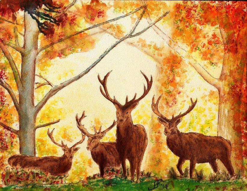
20140429 - Deer

Today's painting is an autumn scene. I happened across a delightful wall paper scene of four deer at the edge of a glade beside an autumn forest. I wish I could give credit to the original photographer that took the picture of the deer. Unfortunately these free wall paper sites probably lifted the picture without giving credit or funding to the original artist. I would normally not use such a site or photograph, but it presented two unique challenges.

First, the photograph included four deer. While I've been tackling harder and harder subjects, I have not jumped into painting animals (other than the birds). So, painting for deer was a big new challenge for me.

Second, painting a misty forest scene requires several different techniques. One is that you need to paint an overall wash of the background color. Then you need to add and then immediately dab away trees and limbs in the background.
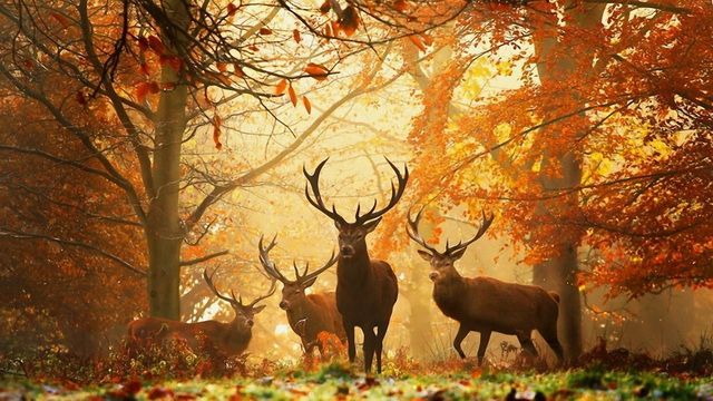
As you can see, I took the original photograph and cropped it to just the central image. This felt more interesting. Additionally, when working in watercolor, it is sometimes important to get the main object in the painting large enough to paint well. Smaller and it would be much more difficult for me to get the detail of the deer correct.

I did the deer and trees with pen & ink, using Noodler's Ink Polar Brown ink.

Those challenges made this scene an interesting lesson. I'm fairly pleased with my rendition of the original photograph. It's a warm, autumn scene.

What could be better? Well, the foreground is too dark / blue. It should be warmer (redder) and lighter in color. A yellow green would have been a better choice. I should have put more branches / limbs / twigs into the painting. Next time I try something like this I will try to use the ink for the small detailed limbs / twigs. That might feel better and attain the look that I want to see.

Anyway, I hope you enjoy this painting. It was a fun learning process.

Friday, January 31, 2014

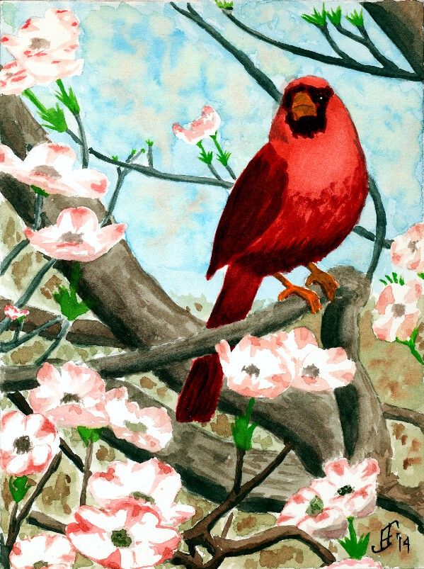
20140130 - Cardinal

Today I decided to do a pure watercolor painting. Need to keep those skills as sharp as possible! :-) Today's subject is another cardinal. It's a good winter subject, but as you can see, this cardinal is sitting in a dogwood tree. So there's the promise of spring in the painting.

With this painting, I tried several different techniques.

First, as you can see, you can see the sky in the background. But as you know any sky through a tree has leaves and/or flowers that break up the blue of the sky. I tried to paint a mottled sky to represent that. The green and brown faded quite a bit once I added the foreground colors. So, I will need to be bolder in this technique in the future.

Second, I attempted to vary the colors of branches, with the closer objects being warmer or have more red in the color .. than objects that are farther away, which are cooler or have more blue in the color. It worked fairly well, though I see a couple branches that should have been a bit cooler in color following that pattern. I'll remember to keep it a bit more consistent.

To paint the dogwood flowers, I masked them initially with masking fluid. Once the rest of the painting was completed, I removed the masking and painted the flowers. I really only tried to suggest the flowers, rather than attempting to get all the details.

So, here's hoping this cheerful cardinal brightens your day!


Friday, October 25, 2013

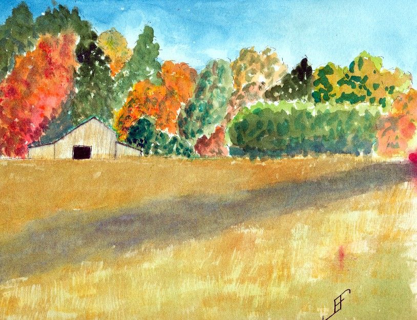
20131018 - Fall Barn

Our project last Friday was to do a fall foliage scene with a barn in the distance. Landscape paintings continue to be a struggle for me. But the trees are improving.

Sadly, I ran my finger through some red paint and smudged the right hand side of the painting. Arrgh! Oh, well, it was more of a learning sketch than anything.

The actual scene did include a shade stripe through the nearby field.

While it's not bad, I still have a long way to go with my landscape paintings. But that's why I am taking the class. To learn. Here's hoping you enjoy this watercolor sketch.

Friday, October 4, 2013

20131004 - Falling Leaves (at Last!)

This painting is based on Falling Leaves 3 by Maria Balcells. She participates in Paint My Photo, which provides painters a wonderful source of reference photographs. I will of course always try to reference the source photograph and photographer. Well, at least that's how I will use that website.

As you can see, I tend to modify and accentuate the colors and lines within the painting. The original photograph, while it includes some unique colors is not quite as colorful as what I painted. It's just the accentuation of what I see in the photograph.

I don't know if she "punched up" the color a bit within the photograph. But I found this fall foliage scene rather striking.

You might be wondering why I did not have any posts for a few days. Unfortunately, I spent the past few days dealing with an insurance company, trying to get them to pay for something that they should pay. They lost the claim (so they said) no less than four times. I'm still not certain that they have it and will honor it. But I've escalated it within their company. (The short message is that you should not mess with someone who used to make a living dealing with the very hard escalations .. I DO know how to work a system. Politely, but firmly!!).

Anyway, I hope you enjoy this rendition of the photograph.

Friday, September 27, 2013

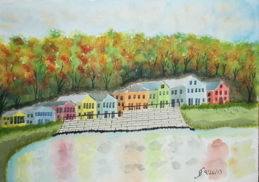
20130926 - Fall Foliage

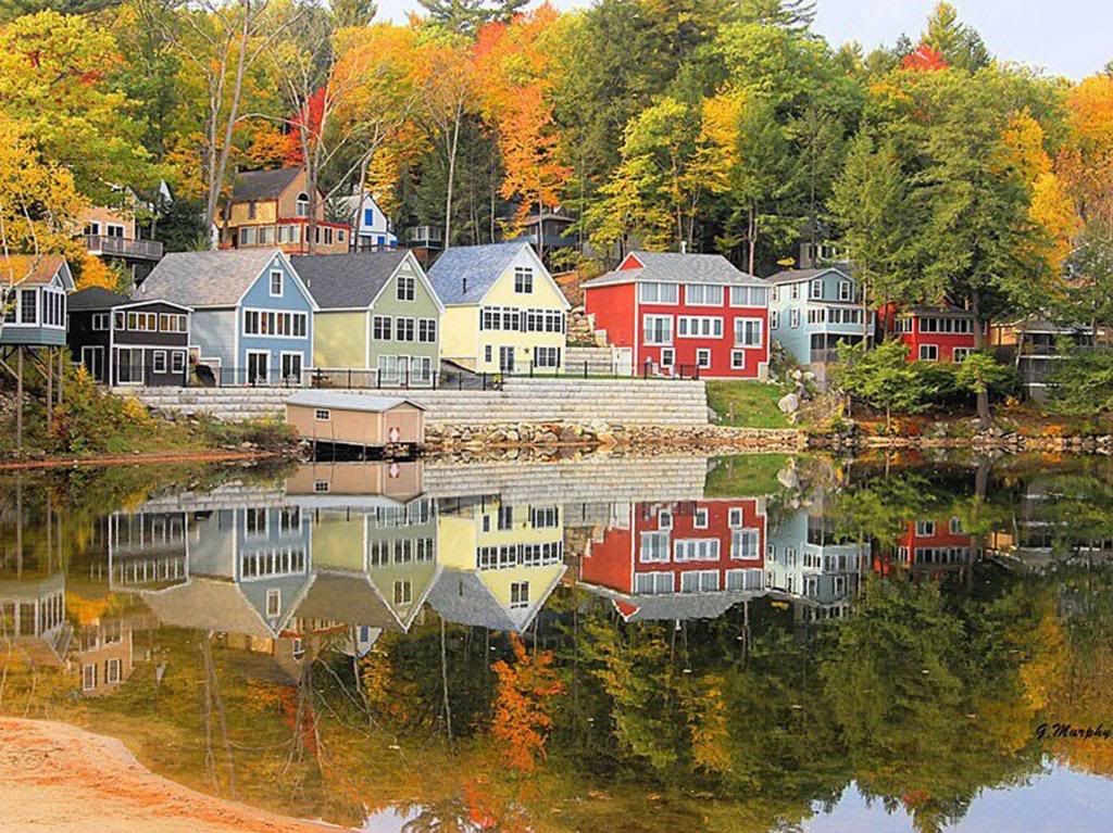
Here's a quick sketch of a fall foliage around a vacation spot in the New England area. It's roughly based on an image I saw in the news yesterday.

This one did not turn out as well as I hoped. I'm tired, so I did not put as much into this as I should have. Lesson learned.


As you can see from the original photograph, it's well worth taking time to enjoy it. And indeed, I hope you enjoy both the photograph and this sketch.


Sunday, September 22, 2013

20130922 - Playing with color

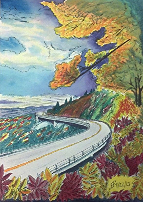
Using some of the lessons that I learned during the past couple months, I decided to tackle a larger version of the Blue Ridge Parkway painting. You might remember that was one of my first pen & ink with watercolor wash paintings. While I liked it, it just lacked the vibrancy that I see in various landscape paintings.

So, my thought was to accentuate the color compliments (opposite colors on the color wheel) as well as accentuating the difference in light versus dark.

First I started with a pen & ink with waterbrush wash. That provided the outline for the painting. It also provides the "under-painting", which helps determine how light and dark portions of the painting should be.

Then I added the watercolor. I decided to change it to a later afternoon / evening and change some of the colors. Until I can get it copied, the following photo using my phone should show you the difference in my color choices.

While it's still "not there" yet, it's interesting seeing the difference in the way that I see and portray a scene. The sky is much more dynamic and the color choices are much more vibrant. It just pops with color.

Sure, there remain some problems. The red of the leaves below is too cool (too blue). It should have been a warmer (scarlet) color. And I got a muddy side of the hill. But the color choices are much more vibrant than in the past.


Friday, September 20, 2013

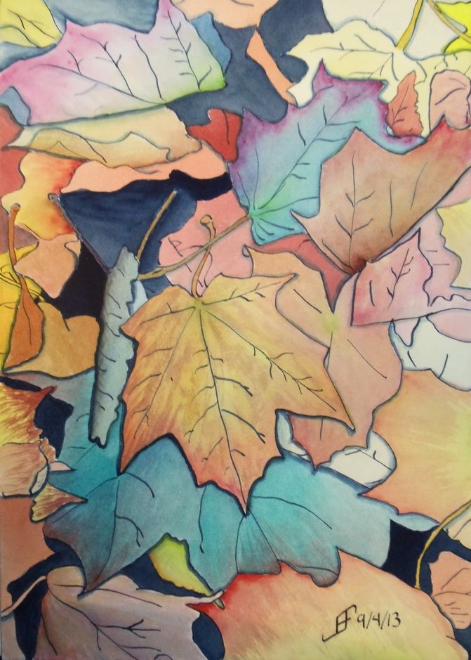
20130920 - Fall Leaves

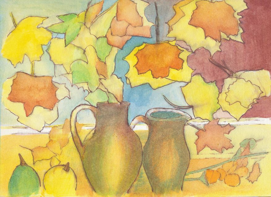
Well, I'm back from class with a finished painting. This week we were working on fall leaves. I decided that I wanted to mix pen & ink along with watercolors.

I used my Noodler's Ahab pen along with Noodler's Ink Whalman's Sepia. Sepia just seemed to be the perfect color for a fall foliage watercolor. So, along with a Pentel Aquash water brush, I created the basic outline for the watercolor painting.

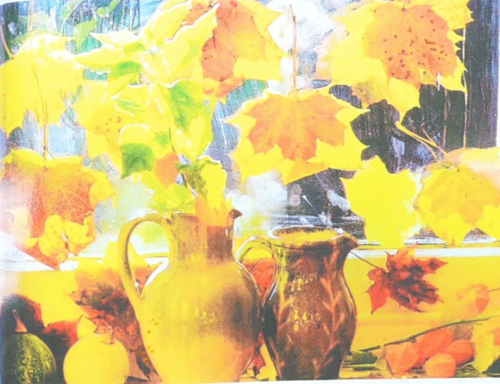
The painting for the class is based on an old photograph of a painting from an old magazine (or catalog). The original photograph had a fairly muddy background.

While it's colorful, it really lacks definition. It may well be that in person it is more interesting than this photograph presents. That often happens with paintings. The devil is in the detail and in this case a lot of detail is lost in this photograph.

So, I decided to clean it up and make it a little more abstract. Since it is based on another work, I can not claim credit for either the composition or even the work. I won't be selling this. But I do think that my interpretation is less busy and more interesting.


As I've noted before, sometimes our role (in life and art) is to highlight those things that are important. I don't think a slavish adherence to realism is as important as that ability to spotlight things that are important to us and others. So, when you look around take note of what's important and ask yourself if you have highlighted it enough for others. Are you encouraging others to see the world in a new light?

Monday, September 16, 2013

20130916 - Misty Marsh and Golden Koi

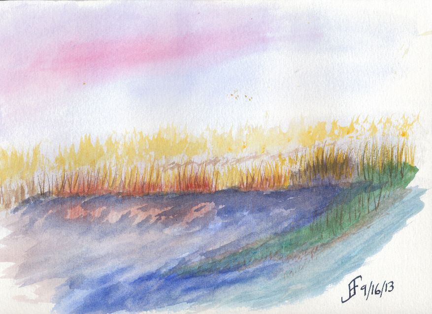
First of all, our objective today in the art class (Pen & Ink with Watercolor) was to create a misty marsh scene. As I've noted, I'm not very comfortable creating a very loose painting. This was my third or fourth attempt. I was doing wet into wet. Perhaps if I try a wet onto dry painting technique, I will have better success. I'm not completely upset with this one. But it's clearly not one of my better paintings. A clear sign that I have a lot still to learn. I knew it, but this clearly demonstrates that.


Of course, when I go to a more structured pen & ink with watercolor painting technique, I am much happier with the results. It's the engineer in me that wants the structure of a detailed drawing before I just start painting. I am not sure I will ever get past that completely.

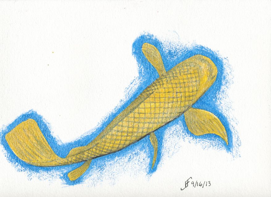
Additionally, today Brian (my son) gave me a three bottles of Daler-Rowney FW Pearlescent Acrylic ink. So, I had to try it out. The result was a combination of pen & ink with the Pearlescent Acrylic Ink. The three inks were Galactic Blue, Mazuma Gold and Silver Pearl. So, I also decided to do a golden koi. As you can see, the pearlescent inks my son gave me work very well with pen & ink. I am much happier with this painting. You will no doubt see more of this type of painting in the future.

Friday, September 6, 2013

20130906 - Tomatoes

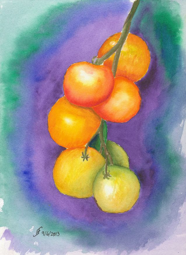
I started a couple of watercolor courses today. One is a watercolor course with fall colors. The second is a pen & ink with watercolor course. The course today was the watercolor only course.

Rocky Alexander is the instructor. Of course, as you would expect, her skill with watercolor is amazing. As I expected, I learn as I watch her work. Seeing her do a rendition of tomatoes was interesting. I learned a new technique to blend together colors. By dropping wet paint into wet paint, you can get a graduated color change. Of course, the round shape of the tomatoes is a good way to exercise that skill.

So, here's the first painting from that class. There are many more to come. Hopefully you will also find my journey with watercolors interesting.

As you look about, remember how wonderful the fall colors are and even in the midst of decline we can see some very spectacular results. While that's true for our gardens, it's particularly true for us. So, take the time and shine out with the radiance that's in your heart.

Monday, August 19, 2013

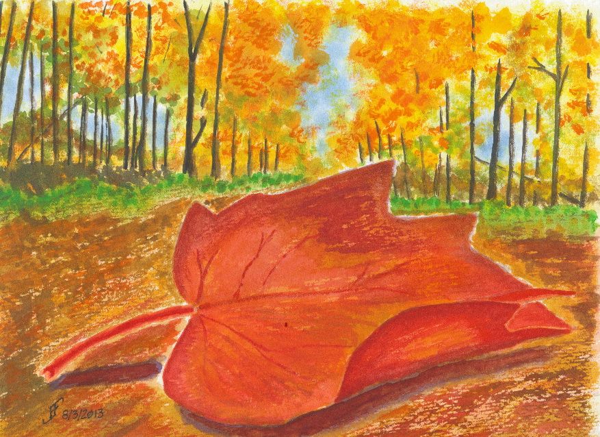
20130803 - Leaf on Road

Here's a painting of a leaf on a road. You'll note the leaf feels much more realistic than the background. Imagine a leaf sitting on the impressionistic painting of the road and background forest. Enjoy!


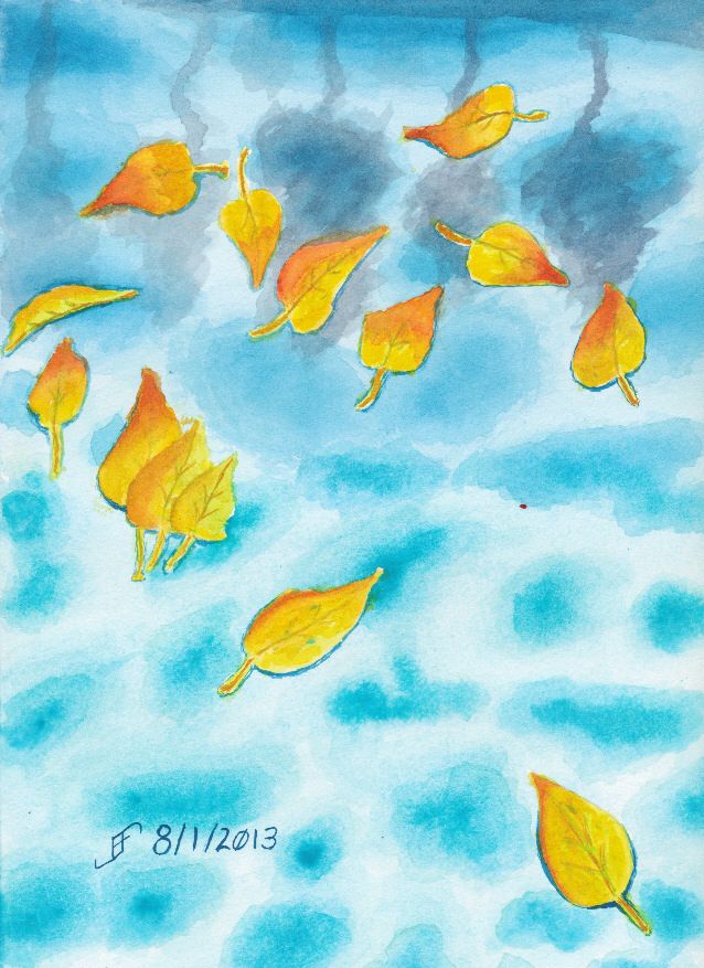
20130801 - Leaves on Water

Here's an attempt to show leaves floating on water. The water is of course a pool. Though I need to improve the technique, I am very happy with my new paints, since they are so very vibrant. Enjoy!


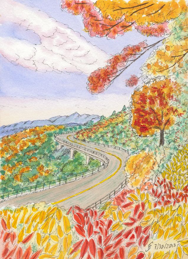
20130731 - Blue Ridge Parkway (pen & ink)

Here's my second pen & ink. Once again, there is an interesting viewing point in the painting. Enjoy!