Tuesday, February 25, 2014

20140225 - Painting Cache

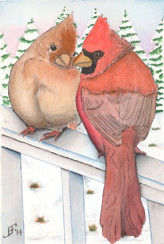
I allowed things to pile up, so this blog post has three paintings that I've done during the past three weeks in my Pen & Ink with Watercolor course. Think of these paintings more as sketches than as full blown paintings, since I spend less than three hours on each.

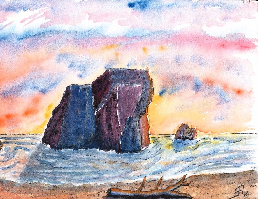
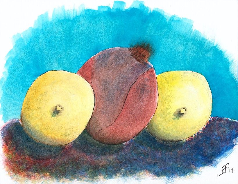
First, I did a painting of the Oregon Coast. It is not drawn from a specific reference photograph. Instead, this is an imagined shoreline along the Oregon Coast. The sharp rocky shoreline along with the narrow beach is shown in this painting. And of course, since I enjoy vibrant sunsets, I added a sunset. This painting used Noodler's Black ink as the ink. I used both a water brush and fountain pen to apply the ink. I then added plenty of color to deepen the shading of the painting.

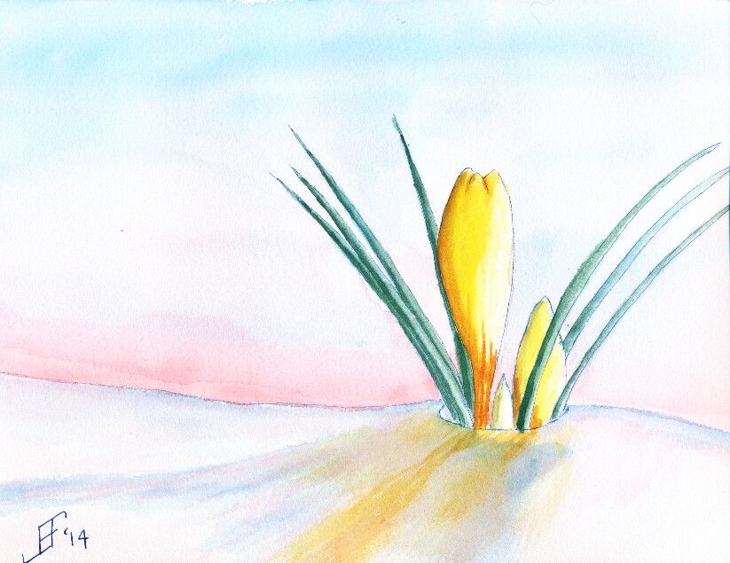
The next painting is a still life of two lemons with a red onion in the middle. Of course, I happened to be sitting facing the lemons in an interesting position. As I faithfully copied the scene in front of me, the teacher pointed out that I was obviously a guy, since I was drawing the nipples first! Oops! It had not been on my mind, but sure enough that is how it looks. Of course, lemons have a "nipple" shape at the bottom of the lemon. Just goes to show that you should carefully examine your subject before beginning to paint or sketch the subject. But I tried to keep at it, regardless of the red cheeks! This painting uses Noodler's Black ink via both a waterbrush and fountain pen. The shadows are deepened with watercolor adding color into the shadow (since there is no true lack of color in nature ... unless you are in complete darkness).

Finally, we did a painting of crocus. I found a wonderful reference photograph of a yellow crocus peeking out of the snow. This painting does much better in person than as a scanned painting. The scanner just seems to miss a lot of the detail of the painting. This used Noodler's 54th Massachusetts (a blue/black) ink for the lines of the crocus and the snow. Remember that blue added to white reminds us of snow and ice. Of course, the snow should also reflect the color of the sky and the crocus.

Hopefully you enjoy these as much as I enjoyed making them.

Saturday, February 15, 2014

20140215 - Cardinal Pair

Well, painting the Cardinal Pair took much less time than I expected.

That's the advantage of snow scenes. There's less of the paper that needs to be painted.

Of course, the flip side is that you must believably cover enough of the paper to KNOW that it's a snow scene.

In effect, you have to think in an opposite direction to how we normally think. Normally we start with an empty scene in our mind and add color (including white) to create the scene. However, with watercolor painting it's necessary to create a NEGATIVE painting. I don't paint the trees. I paint the parts of the limbs NOT covered with paint and the sky above them. Do that properly and the tree suddenly pops out when you look at the painting.

In this case, making it a little more difficult is the need to provide enough detail so it is believable, but not too much. Too much detail would make the trees appear closer.

Also, by using cooler (bluer) colors it helps the trees recede. Warmer (redder) colors make objects appear closer. For example, even though the male cardinal is a bluer color, I added a orange glaze over the cooler blue-red. This helps it pop out of the painting and appear much closer.

So, here's hoping you enjoy the result. I know my wife likes it.

20140215 - Cardinal Pair in Ink

Yesterday, a friend (Sandra) posted a photo of a cardinal pair. My wife also loves cardinals. So, I decided this would be a perfect Valentine's Day present for her (in addition to what I had already gotten for her).

As you can see, it's a perfect subject (the pair of cardinals). In addition it has an interesting perspective that I enjoy painting. Plus the cardinals both have "personality".

So, I decided this would be a good pen and ink subject. For the ink work, I used Noodler's 54th Massachusetts (a blue black ink) for the railing and the snow. And of course, I used Noodler's Black ink for the birds and shadows.

A trick of color to keep in mind is that we naturally think that white is even whiter if it is tinged blue. Remember women with their slightly blue tinged hair? So, why do we associate a brighter, cleaner white if it is tinged blue? Perhaps it's because when we see ice and snow it seems to be tinged blue.

Today I will work on the coloring of this painting. I may add a bit more shading to the railing. But it's just about read to add the watercolor paint. I will probably change the background to an evergreen color to increase the contrast and interest in the cardinals.

Hope you enjoy!

Tuesday, February 4, 2014

20140204 - Gold Finch Update

Those of you that have followed the link to my blog know that I see my blog as a way to "learn perspective". Over the years, I learned and relearned that one of the best ways to master any skill is to take the time to teach others those skills. It reinforces what you know. And it often gives you the chance to expand your knowledge.

And that's just what happened when I posted my Gold Finch painting from a couple days ago. I knew it was almost there, but it just did not "feel" right. There was something jarring about the painting that I could not quite clarify.

Some people suggested that the background (the field) was too dark. That wasn't quite it. I knew the dark field at sunset was both natural and provided a startling backdrop for the bird and red bud tree.

I continued to struggle at articulating what was not quite right. I was very pleased with some of the contrasts. Light versus dark. Yellow-orange versus blue-green. Left slanting limbs versus right slanting bird and sky. Lots of interest for the eye. Still, something needed improvement.

So, I give a big shout out to +Pedro Castro Caiado Ferrão, who politely suggested that I missed the mark on the three rules of perspective. Those rules include:
  1. decrease of the size of objects proportionally with distance
  2. muting of colors with distance
  3. decrease of the precision of details with distance
As I look at it, he is spot on. All three of those rules were not in play in my painting. I missed the fact that size of the "plants" needed to decrease with distance. I missed the fact that distance between the rows needed to decrease with distance. I missed that the detail needed to be greater closer and less pronounced further away. And finally, the problem with the background color was not that it was too dark, but rather that the color did not become more muted (greyed) with distance.

Once again, taking the time to teach others paid off for me. I learned an invaluable lesson in a way that will maximize that I will really employ it. (The greatest acceptance of knowledge comes when you are ready for the lesson. I've known about perspective. I just was not ready to internalize it with one of my own paintings. Now I see what I was missing. Lesson learned ... Now to practice what I've learned).

So, can you now see what I found this painting both a delight and jarring at the same time?

Sunday, February 2, 2014

20140202 - Gold Finch

This time, I decided to try to do the Gold Finch as a traditional watercolor with pen & ink. To complete the painting, I did the painting in several stages.
 
First, I sketched the painting in pen & ink. I used Noodler's Black Ink on the limbs and bird. For this, I used a Noodler's Ink Brush Pen to paint the lines of the limbs and bird. This allows a varied line based on the subject. I also used Noodler's Black Ink for the black feathering of the Gold Finch.  I used Noodler's 54th Massachusetts Ink (a blue black ink) for the Red Bud flowers. I used a traditional fountain pen to draw these lines. This kept the lines much lighter. However, I used a Pentel Aquash waterbrush to spread the ink to provide the blue shading in the flowers. I also used the waterbrush to create the shading of the limbs. I am pretty pleased with that overall effect. Oh, and I used Noodler's Yellow Ink to "paint" the yellow feathering of the Gold Finch.
 
Second, I spent a good bit of time applying masking fluid to all the exposed inked portions of the painting. This allowed me to paint over the previously inked portions and create the background for the painting. I decided to create a field heading off toward a hedge row (typically separating fields) in the background. And I wanted the sky to be a setting sun.
 
You will note that for the composition of this piece, I placed the Gold Finch in the center. Then the tree limbs reach from bottom right to top left. The field due to perspective switches from an up and down appearance on the left side of the painting to one that follows the tree limbs on the right hand side of the painting. And the sky runs counter to the tree. All of these thinks set eye in motion as it scans the painting, but draws the eye back toward the center.
 
As you might imagine, this painting took longer than my normal paintings. I hope you enjoy the results as much as I enjoyed painting this.