Well, I picked up my pen and paint brush and dashed off a few sketches this week.
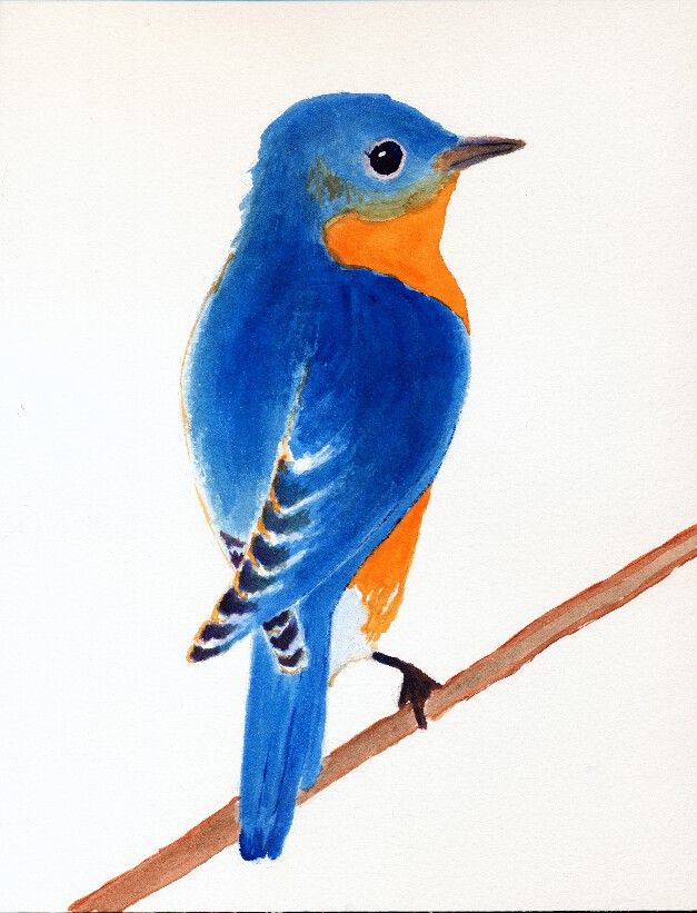
First, is an Eastern Bluebird. It is just a sketch, of which I am thinking how to finish the background. I think I'll use some Blue Ridge mountains and an early morning sky. Stay tuned for more to come!
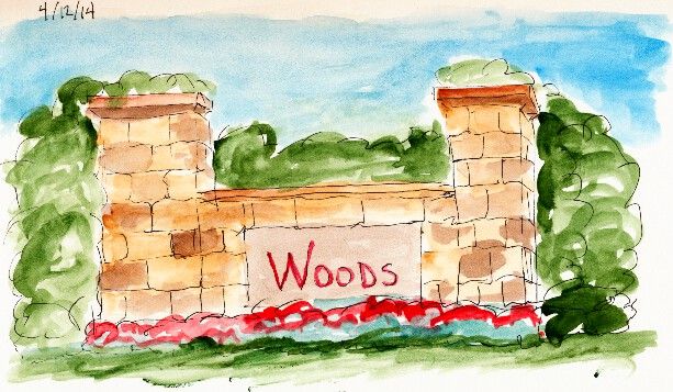
The second sketch is a representation of the small partial walls that you often see at entrances to various neighborhoods. These are not gated communities. It's just a way to show how sturdy and substantial the neighborhood is.
Nothing really spectacular. But that was not my intent. I just wanted to see if I could now better capture the look of real stone and how it varies from block to block. My brush is much looser and more impressionistic than it used to be. I make progress.
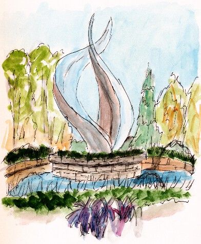
The final sketch is a quick sketch of a fountain near one of my doctor's offices. The flame-like structure is a steel sculpture in the center of the fountain.
My hope was to capture the feeling of the fountain. I think I did fairly well for a quick sketch.
Hope you enjoy and remember to keep on looking for the beauty that surrounds us.
Showing posts with label Urban Sketching. Show all posts
Saturday, April 12, 2014
Sunday, October 6, 2013
20131006 - Honeymoon House Completed
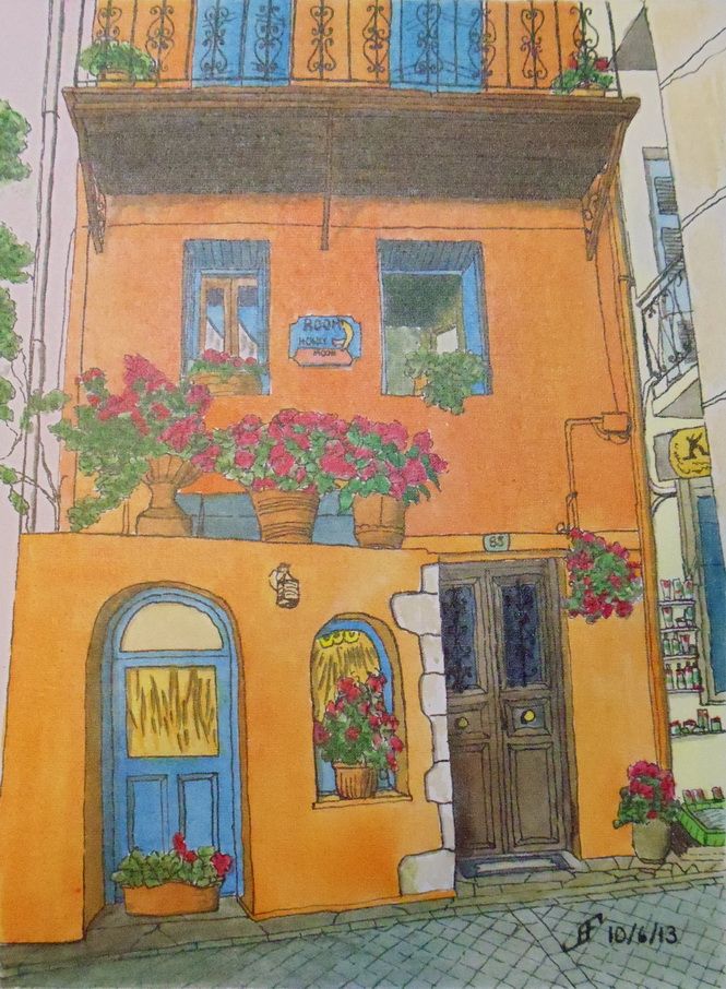
You might also note above the middle set of flowers there is a bit of a whiteness that was not there before. The semigloss UV protecting varnish created a little bit of a "shine" in this part of the painting. This is one of those cases where what the camera sees and what the eye sees is a little bit different. In person, the painting looks just like it did without the varnish.
To correct this, I used Creative Mark's Aquacover Liquid Watercolor Paper to cover the edge of the painting. You can't see it in the above picture. It's not perfect, but it looks better than the bleeding under the tape.
Anyway, I hope to do more paintings with this watercolor canvas in the fairly near future. I hope you enjoyed seeing the process from picture to completed painting.
20131006 - Honeymoon House Final Stretch
It was not a bad experience. But it was definitely different than working with watercolor paper. This will take some adjusting on my part. Getting a very smooth wash is pretty difficult on this surface. Working over a previously painted area must be done quite carefully, since unlike watercolor paper, the previous paint will tend to lift.
While the watercolor canvas is not "paper", it feels a little more like paper than Yupo "paper". But color will lift if you wet an area of paint. Thus, if you want to "glaze" over a previous area that you already painted, you must be quite careful to not lift the paint. It takes a gentle brush stroke. This surface also does better with a single brush stroke. If you use lots of little brush strokes, the paint will not evenly distribute.
But Tom Lynch is right about this surface. Normally, I don't believe claims that are made in advertising a product. But this surface does work as advertised. I could lift the color. And the color in my palette matches the color on the canvas. I am pretty impressed. You can see more about this surface in Tom's Fredrix Watercolor Canvas Tips video below:
Additionally, you can purchase prepared watercolor canvas and make your own stretched canvases. There is an art show (Art of the Carolinas) coming in November 2013. I might see if they have a good deal on a roll of canvas at that show.
You might be wondering what's left on the painting. Well, I need to add the lettering to the sign. Plus, I need to sign the painting. Then I need to use a UV protecting spray varnish. Once I've done that, the blue painters tape around the edges of the painting (not shown above) can come off. When I do that the canvas board can then be mounted "as is" in a frame. No glass or other protection is needed. That should significantly decrease the cost of the final paintings.
Well, I hope you enjoy seeing the process of making this painting. I know I've enjoyed working on this one.
20131005 - Honeymoon House
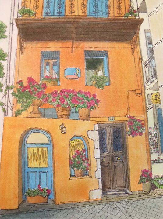
In preparation, I created this pen and ink painting of the Honeymoon House. It serves as the "under painting" of my final painting. On Sunday, the 6th, I will paint this with my watercolor paints.
Friday, September 27, 2013
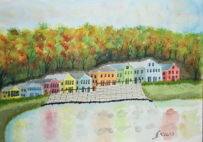
20130926 - Fall Foliage
This one did not turn out as well as I hoped. I'm tired, so I did not put as much into this as I should have. Lesson learned.
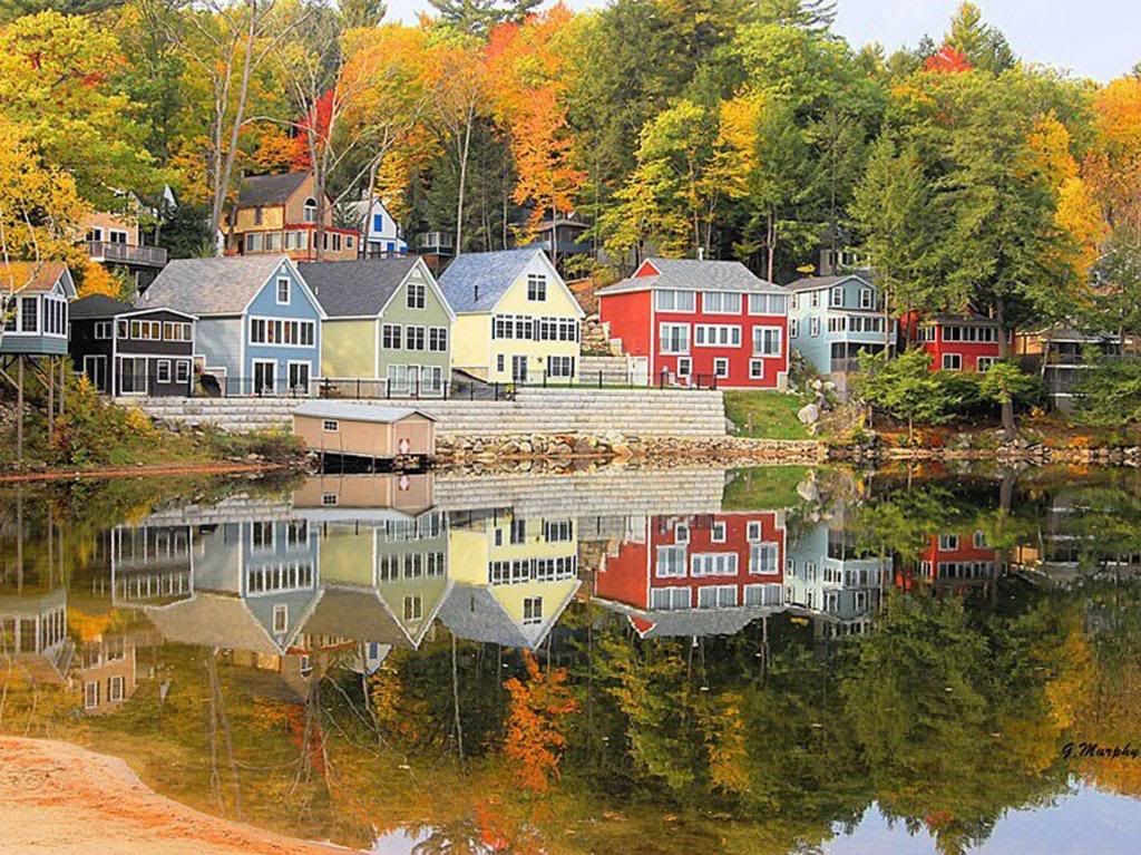
As you can see from the original photograph, it's well worth taking time to enjoy it. And indeed, I hope you enjoy both the photograph and this sketch.
Monday, September 9, 2013
20130909 - New Class / New Style
Today I started a new class at the Senior Center. This is a Pen, Ink & Watercolor class. While I really like the class, the content and the instructor, he emphasizes a more creative style of painting than I normally use. Yes, I was an engineer. I see the detail. I can also see the whole. But ignoring detail is so counter to my normal style that I find it grating.
But that's the style of painting that this instructor emphasizes.
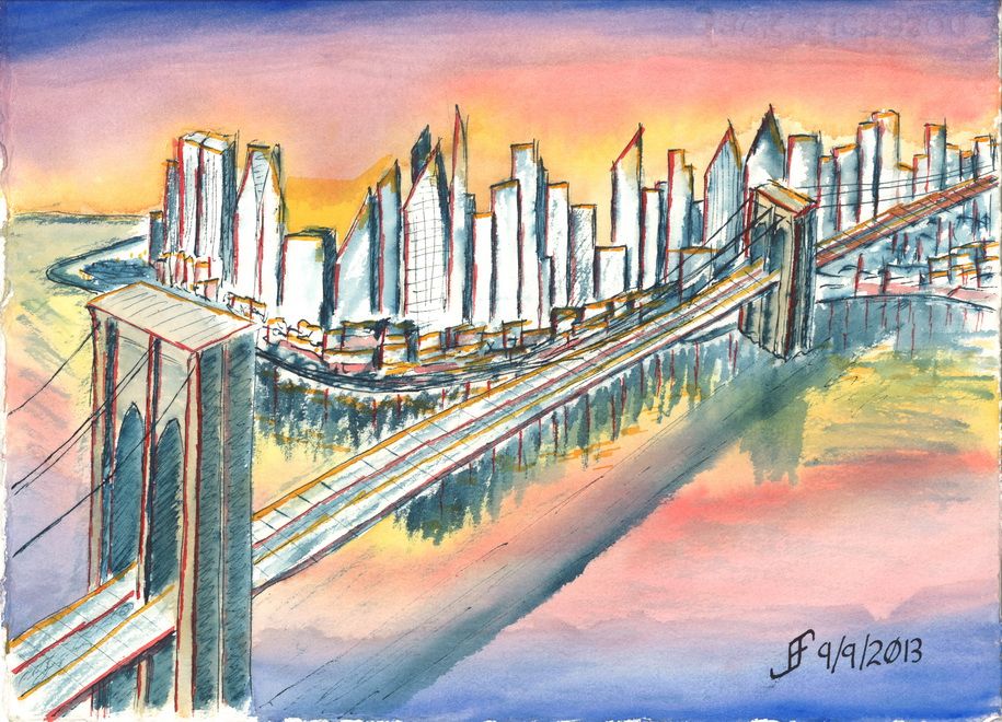
While we attempted a certain style in class, I was not at all happy with the outcome. So, when I came home, I attempted something similar to that style. I can NOT completely ignore lines and shape. I need SOME of the detail. So, I decided to do a Brooklyn Bridge sunset scene.
I was VERY loose with the drawing style. Nowhere near as much of the detail as I normally convey. I did the basic drawing with a dark blue / black ink. Then I added color.
It's much more fanciful / impressionistic than what I normally do. Let me know what you think. I will continue to try to do this type of painting from time to time.
Sunday, September 8, 2013
20130908 - Urban Sketching
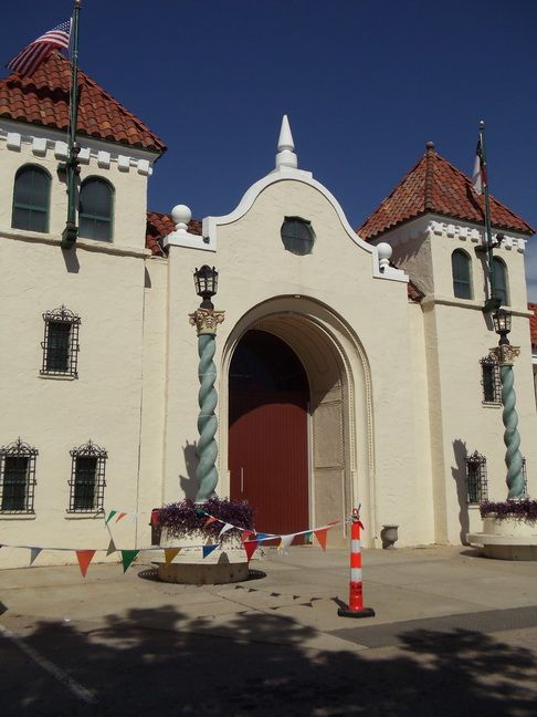
| NC State Fairgrounds (Source Photo) |
The Urban Sketchers manifesto states:
- We draw on location, indoors or out, capturing what we see from direct observation.
- Our drawings tell the story of our surroundings, the places we live and where we travel.
- Our drawings are a record of time and place.
- We are truthful to the scenes we witness.
- We use any kind of media and cherish our individual styles.
- We support each other and draw together.
- We share our drawings online.
- We show the world, one drawing at a time.
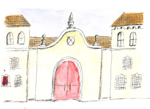
| NC State Fairgrounds (Canson) |
One thing to note is that it is important to use the right sketchbook for this type of sketching. It requires the ability of the material to handle both pen & ink and watercolor. It needs to not absorb the watercolor too quickly. It needs to be able to handle scrubbing and not dissolve into a pulpy mess.
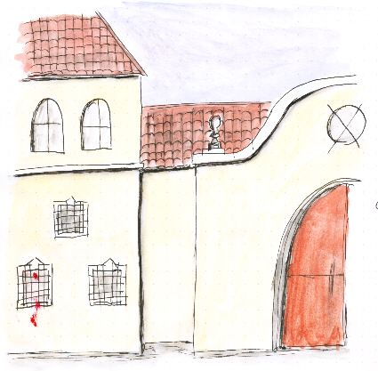
| NC State Fairgrounds (Rhodia) |
I also have Rhodia paper. It's a great paper for jotting notes and even capturing some simple sketches. Unlike the Canson paper, it does a better job of presenting the colors. Colors are fairly vibrant. The Rhodia paper does not absorb water as quickly. But it still tends to buckle when water is added. I will continue to use it for jotting notes and some quick sketches.
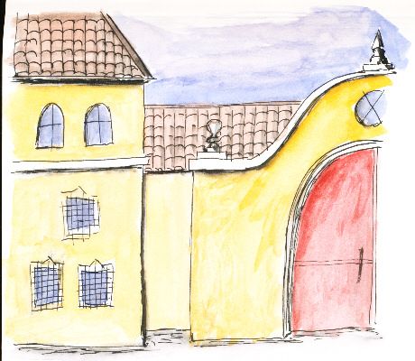
| NC State Fairgrounds (Stillman & Birn Zeta Series) |
Finally, I decided to purchase a Stillman & Birn Zeta Series Sketchbook. This sketchbook is 180lb natural white with a smooth surface. It's ideal for mixed media, including pen & ink and watercolor. The paper tends to buckle a little if you really saturate it. But the color it presents is very vibrant. This is the sketchbook that I will use for urban sketching.
Subscribe to:
Posts (Atom)