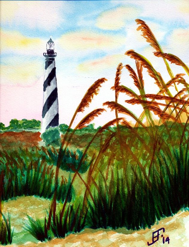
Well, today I passed another milestone in my painting "career". Isn't it an axiom that anyone that paints somehow feels compelled to paint a lighthouse? Yup. That's exactly what I did! As you can see, I decided on this beautiful day that the Hatteras Lighthouse on the NC Outerbanks would be an excellent subject.
My compliments to Dan Carmichael, who took the photograph on which this painting is based. Please note that I will NOT in anyway sell or make a profit from this rendition of his work. Instead it was intended as a teaching exercise. It's neither legal nor right to just copy the work of another and take credit and/or pay for it. In this case, since I'm only using it as a teaching exercise, it is "fair use". But all rights to the image remain with the original photographer.
While this could be better, I'm fairly pleased with this rendition. It does a pretty good job of capturing the spirit of the original. I changed the sky to make it a little more early / late in it's feel. The scan does not do justice to the subtle shading. The sea oats don't have the glitter that is in the original painting. Capturing and maintaining the highlights in the original sea oats is beyond me at this point. I might try another pass at this painting using Hot press paper and seeing if I can reserve some of the white paper to help preserve the highlights. I also need to work on the foreground vs. background a little more. Well, it's another example of how I learn by doing.
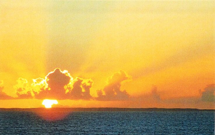
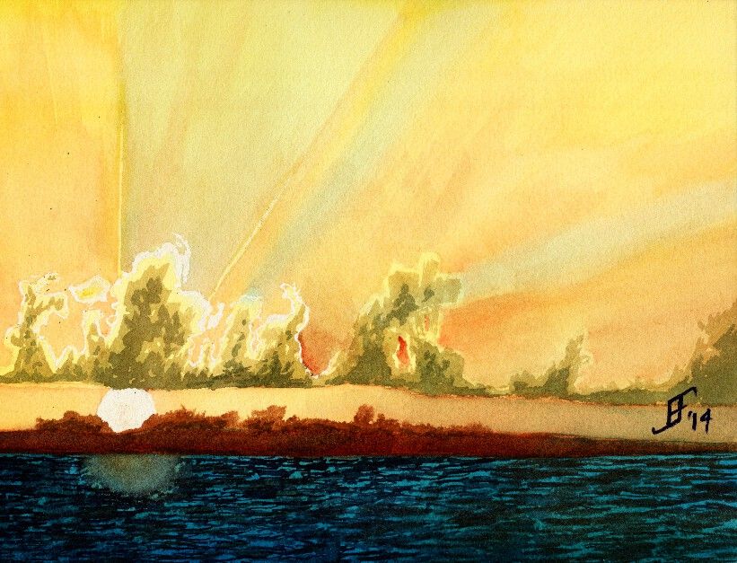
Another day, another painting. Today in my painting class we used another student's photograph (with his permission) to create a sunset picture with rays of light radiating out from the clouds that were farther in the foreground. This sunset (or sunrise) picture includes a lot of oranges and reds deep into the yellowish color. Plus, there are barrier islands an a deep turquoise sea in the foreground.
Here's the original photograph
Here's my attempt at an interpretation of the photograph.
As you can see, the clouds have a greenish cast. I've not worked much with that turquoise blue, but as you can see, a little bit goes a LONG way. It needed more red and less of that blue. Ah, well, lesson learned.
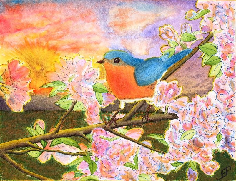
After several eventful weeks that have kept me too busy to do any painting, I decided to try to tackle something a bit more complicated than normal. Believe it or not, this Blue Bird painting is a Pen & Ink with watercolor painting. The tree, flower and foliage as well as the blue bird are done in Pen & Ink. However, the blue bird and flowers had some water color to add additional depth to the painting. The limb and foliage are exclusively done with ink.
This painting is not an ideal painting. For a very bright and busy foreground it would be better to use a simple background. While I could have painted a much simpler sky, I wanted to try some techniques. This includes the sunburst effect and a more complex cloud scene.
The sunburst effect would have been better had I used a simple spray bottle to add some dark patches headed toward the sun. Tom Jones recorded (for Jerry's Artarama) an example of how to do this. The following video shows one technique.
To create the sun burst on my painting, I would have had to use a masking fluid and paint in the background first, remove the masking fluid and then do the foreground painting. I actually did it in reverse order, since I was more interested in the foreground painting.
Unlike my previous version of a bird (gold finch) in a red bud tree, I played around with the color of the blossoms a bit by adding some orange to the blossoms. I also backlit the limbs, flowers, foliage and bird with the yellow of the setting sun. That combined with the orange tint of the flowers - which often appears toward sunset - helps set the stage for Bluebird out at sunset. And that would not be correct for bluebirds. Should I claim "Artistic License"? .. Not really. It would have been better with a simpler sky. If I needed it backlit then a early morning sky / sun would be a better choice.
Why that choice? It's both more accurate to the bird and would provide a simpler background.
Again, I should have done the background first. That would allow me to add in the detail to make it fairly convincing, yet keep it .. well .. in the background!
You will note that there is a good deal of detail in this painting. I post this in a larger format on the blog because I am fairly pleased of that. The field of mown grass feels more natural than others I've done in the past. The detail of the limbs. Shoot, even the feet of the bird have a lot of detail.
Still, it's too busy. I created an 11 x 15 inch, stretched watercolor paper canvas this past Friday. I will probably use it to paint this subject .. But this time, I will use a simpler background. I will set it as a mid-day painting.
As I write this, it's below freezing outside with "snow" on the ground. The snow we had last night was more like frozen mist falling from the sky. It's a couple inches thick. So, of course I'm going to paint something a bit more cheerful and warm!! :-)
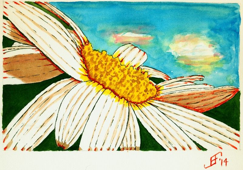
Today's painting is based on a photograph taken by Johnina Payne Young (see below). It is titled "Tilted Daisy 2". This is part of the Paint My Photo website.
As you can see, I changed some of the background colors to add to the dramatic effect. And as per my usual approach, I used pen & ink to create the outline of the daisy. I used Sennelier Blue and Yellow for the sky and center of the daisy, respectively. I used M. Graham Sap Green Permanent for the green background. I combined the Sennelier Opera Rose with green for the shadow color. And I used Noodler's Black, Yellow and Fox Red for the inks.
This did not come out as well as I hoped. But it's at least a cheerful little painting. And that's my hope for you .. that it will help brighten your day and help you smile in spite of your day.
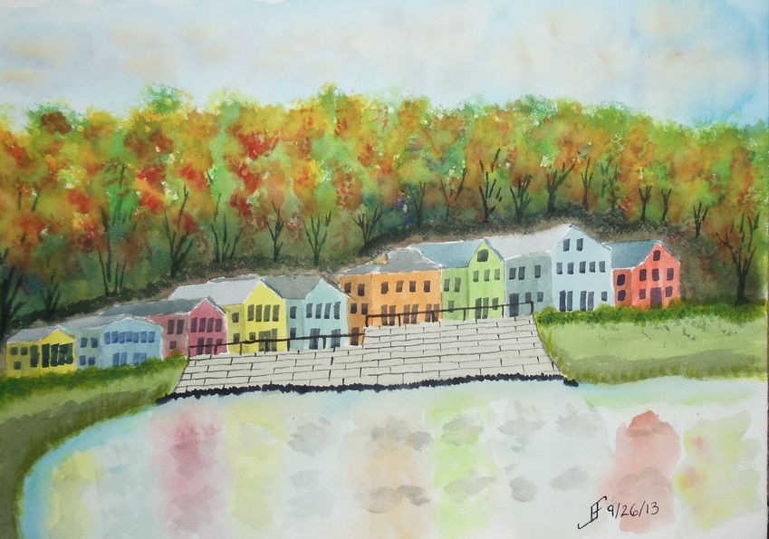
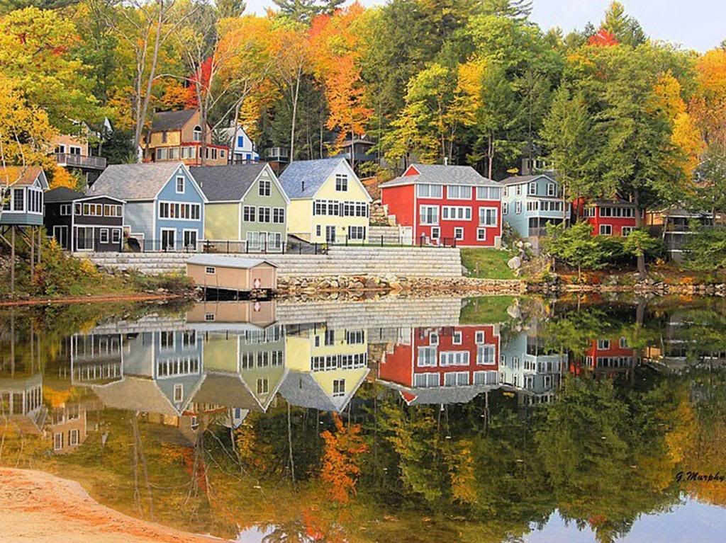
Here's a quick sketch of a fall foliage around a vacation spot in the New England area. It's roughly based on an image I saw in the news yesterday.
This one did not turn out as well as I hoped. I'm tired, so I did not put as much into this as I should have. Lesson learned.
As you can see from the original photograph, it's well worth taking time to enjoy it. And indeed, I hope you enjoy both the photograph and this sketch.
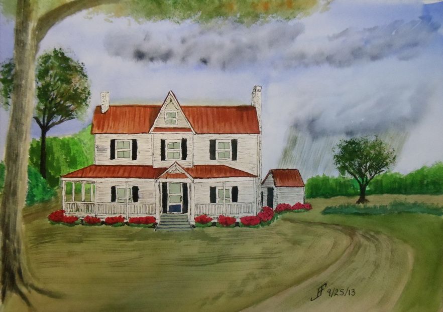
Sometimes it takes more than one time before you get it "right". I'm not all the way "there" yet. But I am definitely learning what works for me and my own personal style of painting. This afternoon, I decided to give another shot to the North Carolina Farm House theme.
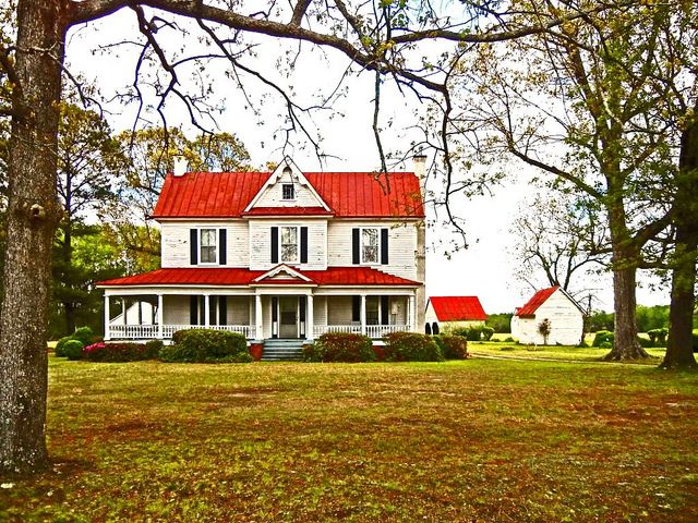
As you can see, it's not the same as the previous farm house. In fact, this is more of a run down mansion compared to many farm steads in North Carolina.
As with my previous painting, I decided to try something different with this painting. I decided to have a rain cloud off in the distance. There are great swaths of the state where .. if you can see beyond the tree line .. you can see such rain clouds. So, here we have a cloudy sky with rain in the distance. This mutes all the normal colors that I would tend to choose.
The trees are getting better. The grass is not quite so crass. And the shrubs look as if they might have Knights who say "Nee" looking for them:
By the way, here's the original photograph I used as a reference.
Oh, if you were wondering, since I use this only as a painting exercise and not to create a painting to sell, I can copy use a photograph like this.
Well, I hope you enjoy this. I definitely enjoyed working on it. But it's getting late and I need to crash for the night. Enjoy!
 My compliments to Dan Carmichael, who took the photograph on which this painting is based. Please note that I will NOT in anyway sell or make a profit from this rendition of his work. Instead it was intended as a teaching exercise. It's neither legal nor right to just copy the work of another and take credit and/or pay for it. In this case, since I'm only using it as a teaching exercise, it is "fair use". But all rights to the image remain with the original photographer.