Showing posts with label Still Life. Show all posts

Tuesday, February 25, 2014

20140225 - Painting Cache

I allowed things to pile up, so this blog post has three paintings that I've done during the past three weeks in my Pen & Ink with Watercolor course. Think of these paintings more as sketches than as full blown paintings, since I spend less than three hours on each.
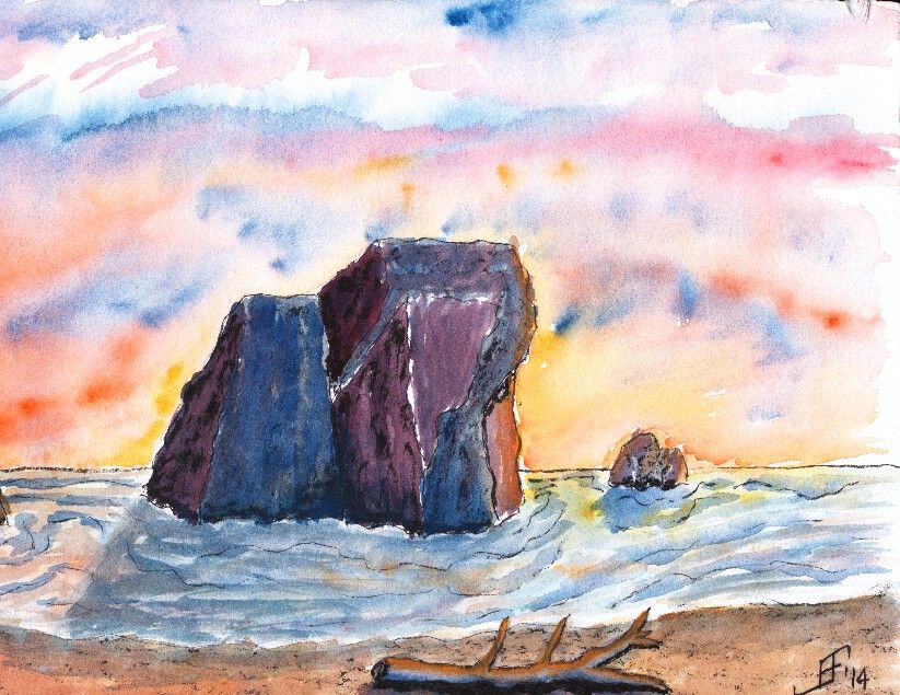
First, I did a painting of the Oregon Coast. It is not drawn from a specific reference photograph. Instead, this is an imagined shoreline along the Oregon Coast. The sharp rocky shoreline along with the narrow beach is shown in this painting. And of course, since I enjoy vibrant sunsets, I added a sunset. This painting used Noodler's Black ink as the ink. I used both a water brush and fountain pen to apply the ink. I then added plenty of color to deepen the shading of the painting.
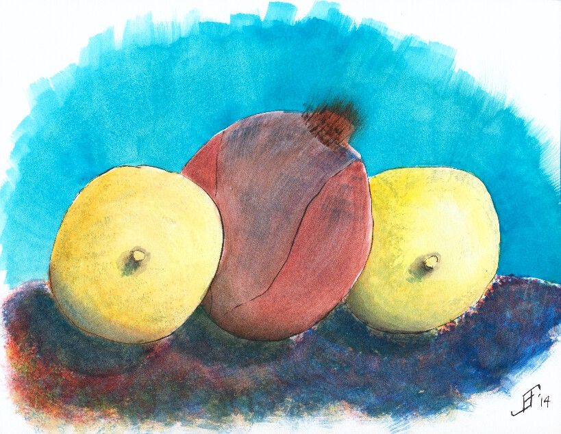
The next painting is a still life of two lemons with a red onion in the middle. Of course, I happened to be sitting facing the lemons in an interesting position. As I faithfully copied the scene in front of me, the teacher pointed out that I was obviously a guy, since I was drawing the nipples first! Oops! It had not been on my mind, but sure enough that is how it looks. Of course, lemons have a "nipple" shape at the bottom of the lemon. Just goes to show that you should carefully examine your subject before beginning to paint or sketch the subject. But I tried to keep at it, regardless of the red cheeks! This painting uses Noodler's Black ink via both a waterbrush and fountain pen. The shadows are deepened with watercolor adding color into the shadow (since there is no true lack of color in nature ... unless you are in complete darkness).

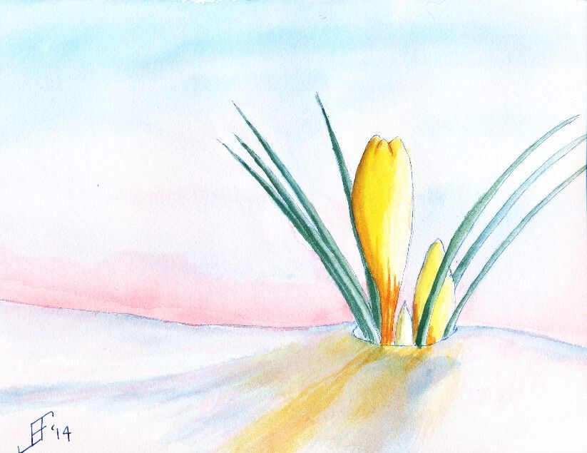
Finally, we did a painting of crocus. I found a wonderful reference photograph of a yellow crocus peeking out of the snow. This painting does much better in person than as a scanned painting. The scanner just seems to miss a lot of the detail of the painting. This used Noodler's 54th Massachusetts (a blue/black) ink for the lines of the crocus and the snow. Remember that blue added to white reminds us of snow and ice. Of course, the snow should also reflect the color of the sky and the crocus.

Hopefully you enjoy these as much as I enjoyed making them.

Friday, January 3, 2014

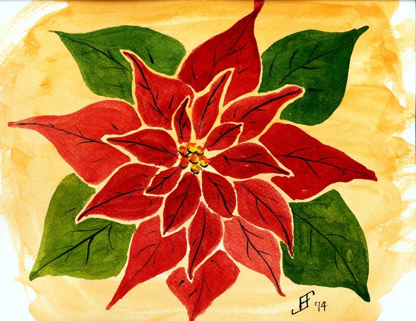
20130103 - Poinsettia

My painting for the day (though I may do another in a little bit) is an attempt at a new technique (at least new for me). Essentially, I am taking a graphic artists slant on drawing a poinsettia. Though I can (and did) paint a poinsettia to be more realistic, I wanted to blend my love of pen & ink with a graphic design. I've seen others add the blank border around the petals of flowers. I like that approach. So I attempted it. Overall, I find the result fairly pleasing. No doubt I'll try this approach again in the future.

Hopefully you enjoy my noodling around with my painting. And here's hoping that this flower helps brighten your day .. as so much of the country is locked in very cold weather. There's something fundamentally cheerful about poinsettias. So, here's hoping you enjoy!


Monday, November 4, 2013

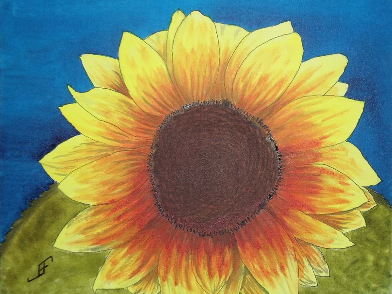
20131104 - Sunflower

Well, another day, another painting! As promised in yesterday's post, I completed the Sunflower. Most of it was complete last night, but this morning, I added a few finishing touches. Hopefully you will enjoy this rendition of my friend's photograph.

The camera added a bit of reflective light to the mix. So, the center and the detail around the center appears a bit lighter than they appear in person.

Since I don't have a scanner that can handle larger images, I use a camera. While it does well, it does need to use the flash to get a good photograph of the painting. And then of course, I need to do some photo editing to eliminate perspective distortions to the photograph (to bring it back to an 11x14 sized image).

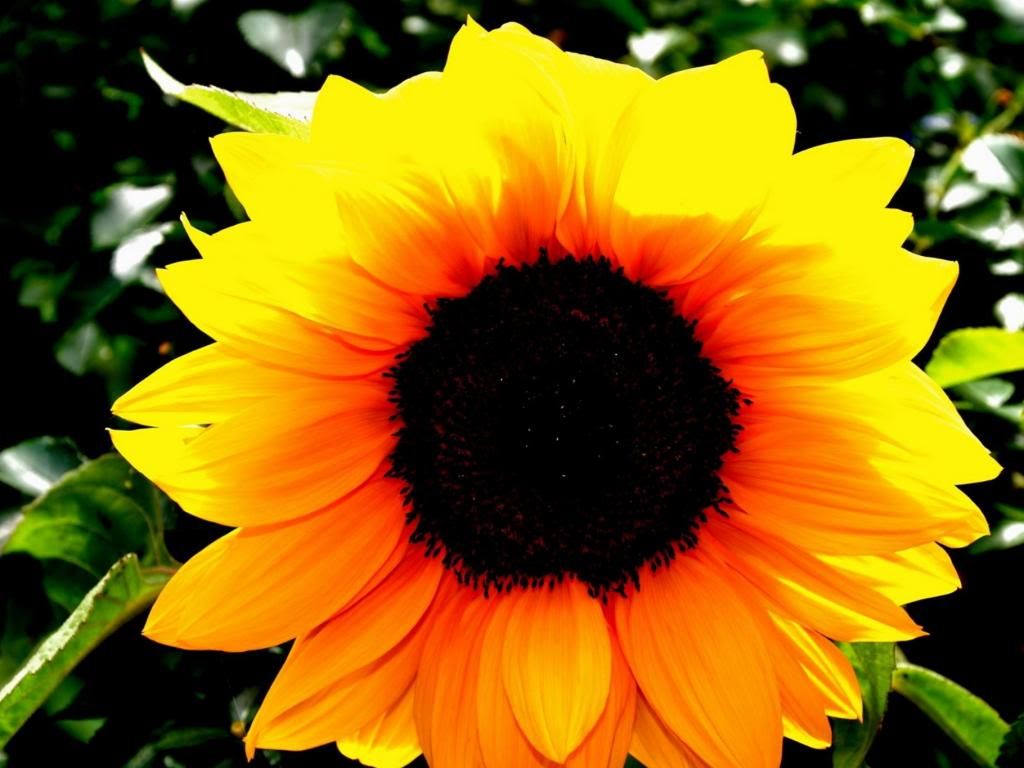
And of course, for your reference, here is my friend's photograph of the back lit sunflower. As you can see, getting the intense yellow is a fairly difficult proposition. Next time, I will probably try a slightly redder yellow (Hansa Yellow Deep). However, in my defense, the yellow in person is much more intense.

Anyway, hopefully this cheerful sunflower will brighten your day.

Sunday, November 3, 2013

20131103 - Sunflower with a Different Perspective

I enjoy finding interesting photographs and subjects within them. A friend recently gave me explicit permission to paint his photographs. This photograph he made of this sunflower with the sun behind it, lighting it from behind. It will make an interesting subject.

When rendering it in watercolor, I think I will shoot for complimentary and split complimentary colors (using the CMY, or Cyan, Magenta, Yellow color wheel). Thus, the compliment of yellow is blue (on the CMY color wheel). I will paint the green leaves toward the bottom where there is more of an orange coloring of the sunflower. This will yield the split complimentary colors to the complimentary color of blue.

But first, I will use pen & ink to create the value sketch (of the shading) of the painting. It will act as the under painting for the finished work. I will use an 11x14 inch Fedrix Watercolor Canvas Board. Unlike a conventional canvas with Gesso, watercolor (and other wet liquids, such as ink) does adhere to the surface. However, unlike watercolor paper, the watercolor and ink doe not fully absorb into the canvas. Thus, it is possible to lift color rather easily. Where this works well is when you do NOT intend to paint one color over another in added glazes. Though it can be done (and I did it with the bee in the Thistle with Bee painting), you must be very careful about adding color onto an area that already has color.

So, here's hoping you will enjoy the final painting.


Sunday, October 13, 2013

20131013 - Planning a new painting

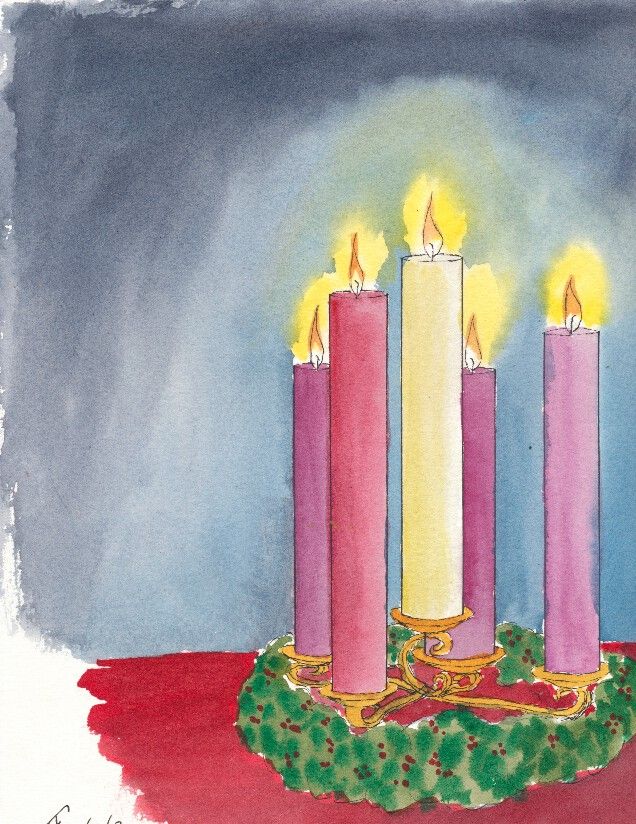
I'm in the process of planning a new, larger painting. I will sometimes take the effort to initially sketch it in my sketchbook to see if I like the composition. Lots of times I move components around a bit. Then I might even do a larger study of the painting.

In this case, I took the sketch and scaled it up to 12" x 9" (in portrait mode). I plan on taking this idea (of lighted advent candles) and painting it on a 14" x 11" canvas. I will make a "canvas" out of watercolor paper (as I did with the Clematis).

Part of what I wanted to learn is how to make the lighted halo around the candles and how it should fade into the background. This painting did not fully capture it, but I am not completely displeased with it. I think I know how to accomplish what I want.

The fun thing about this is that it will allow me to run some LED lights into the back of the painting and "back light" the advent candles. I suspect I will need to make a mask for behind the watercolor paper so that only those areas I want to be lit will stand out.

I have not yet decided if I want to use some calligraphy along with the candles. While that might look nice, it will be very difficult to get the mask for the calligraphy to match the front of the painting. But the effect could be pretty spectacular.

I suspect you will see this one again.

Friday, September 20, 2013

20130920 - Fall Leaves

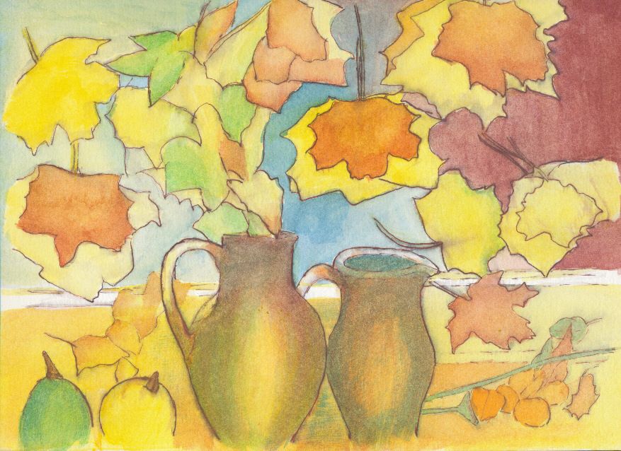
Well, I'm back from class with a finished painting. This week we were working on fall leaves. I decided that I wanted to mix pen & ink along with watercolors.

I used my Noodler's Ahab pen along with Noodler's Ink Whalman's Sepia. Sepia just seemed to be the perfect color for a fall foliage watercolor. So, along with a Pentel Aquash water brush, I created the basic outline for the watercolor painting.

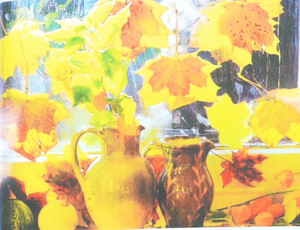
The painting for the class is based on an old photograph of a painting from an old magazine (or catalog). The original photograph had a fairly muddy background.

While it's colorful, it really lacks definition. It may well be that in person it is more interesting than this photograph presents. That often happens with paintings. The devil is in the detail and in this case a lot of detail is lost in this photograph.

So, I decided to clean it up and make it a little more abstract. Since it is based on another work, I can not claim credit for either the composition or even the work. I won't be selling this. But I do think that my interpretation is less busy and more interesting.


As I've noted before, sometimes our role (in life and art) is to highlight those things that are important. I don't think a slavish adherence to realism is as important as that ability to spotlight things that are important to us and others. So, when you look around take note of what's important and ask yourself if you have highlighted it enough for others. Are you encouraging others to see the world in a new light?

Wednesday, September 18, 2013

20130918 - St. Francis Statue in Garden

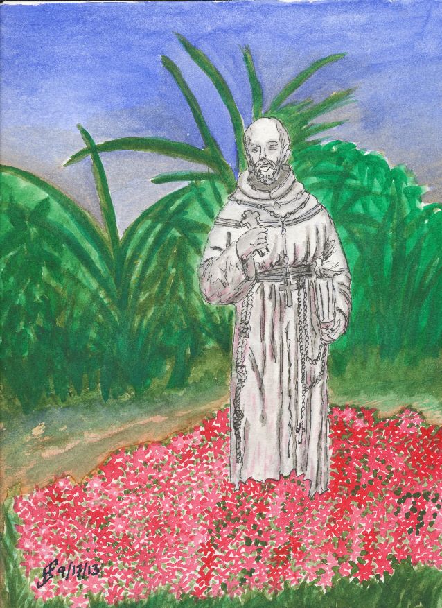
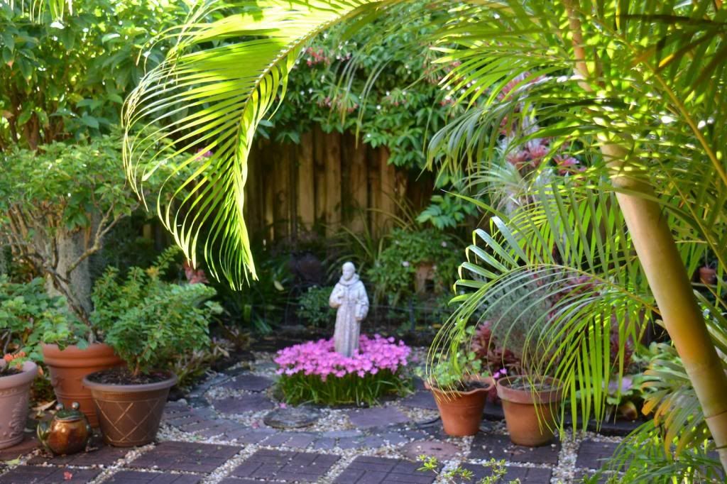
I finished the painting of the St. Francis statue in a flower garden. This painting came out okay. It's not quite what I wanted. But it's not bad either.

I intended for the statue to be the most detailed object. The rest of the garden was painted to provide the impression of a flower garden. For a reason. It's the saints among us who are the most concrete (pun somewhat intended) individuals. We assume that their positions and beliefs make them less "worldy", when it is they that make the most difference. At once they see the world both as it IS and as it SHOULD BE. Then they go do the impossible. They transform the world in which we live to make it more like what it should be.

Isn't it odd that the saints among us see the world and us as the clay beneath their fingers. As much as we try to venerate them, but hold them at arms length, they wade into life and live it fully. And in so doing, they change our world for the better.

Tuesday, September 17, 2013

20130917 - Starting St Francis in Garden

Well, I've decided my next pen & ink with watercolor painting. I will do a Saint Francis statue in a flower garden. The Saint Francis statue will only be done with pen & ink and the garden will only be done with watercolors.

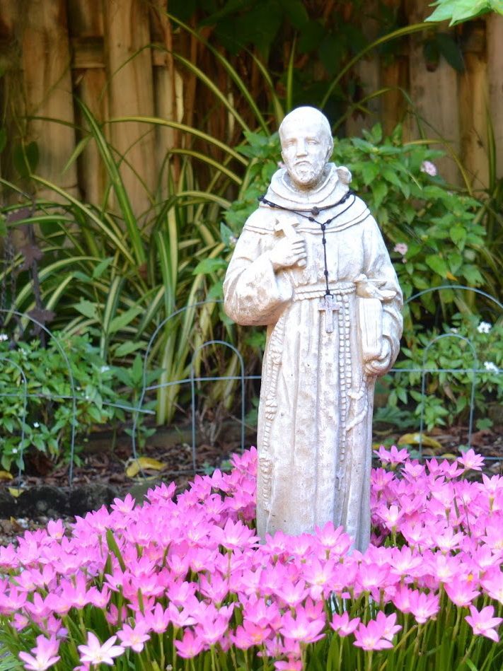
As you can see, I've already done the Saint Francis statue. Now to add the garden. You might be interested in seeing the reference photograph. What's important to understand is that sometimes the perfect painting is something that's tucked away in a corner and not very conspicuous. Take a look at where the Saint Francis statue was located in the garden. It's very easy to overlook.

The role of the artist is to find that interesting item and highlight it through the painting. And in many ways, that's the role we all have. To highlight those things that are important to us. We highlight them to our children and our friends. Funny how my art is more about learning to live life well than it is about the mechanics of the art.


Saturday, September 7, 2013

20130907 - Rose

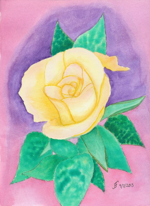
It's classic: "A rose by any other name would smell as sweet" .. Shakespeare realized the essence of a thing is not its name. It is the characteristics of the thing that define it. This is true of roses. It is true of people.

This is particularly true of how the world often views "christians". Why is that? Well, for those who follow Christ, it's important to sometimes hold up a mirror and really look at ourselves. Do we endorse folks like Westboro Baptist Church? They claim to be "Christian". Yet, they spout hate speech whenever they get the chance. Is that the message of Christ? Is it fair to then say "All Christians are fanatics"?

Is our society any different when we turn and claim all Muslims clearly are violent and preach violence? Are we not lumping all adherents of Islam into the same boat as the extremists? Are we doing anything different than when someone claims "All Christians are fanatics"?

Ah, well. See what happens when I contemplate a rose for a day. Interestingly, I find that on my journey to develop my skill with watercolor, I find time to contemplate the world around me. It's a chance to learn some perspective .. in many different ways.

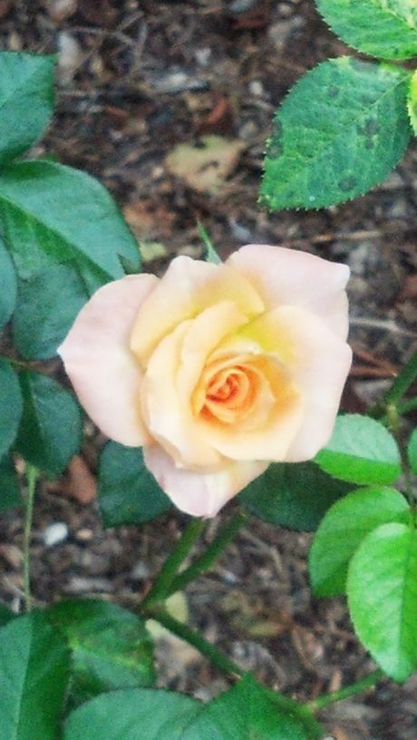
Back to a Rose .. This rose is based on a rose that I found at the JC Raulston Arboretum. The color is a wonderful cream / coral color with a blush of rose pink toward the edges and a light orange color inside the blossom. Getting that transition of colors is very hard to accomplish .. at least for me at my level.

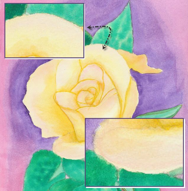
But I learned a trick yesterday in class that I wanted to apply. It involves wetting the area to paint with plain water. Then painting the base color (unless you are leaving a little bit unpainted to have some white show). Then you drop a touch of color in the area you want to blend together. It takes practice. As you can see (just barely) from the detail in some areas of the rose (top left highlighted area) the blending went just right. But if you have too much water then you get some distinct water marks when the water evaporates. It looks for all the world like a "high tide" mark on the painting.

Ah well, it's a process of learning the techniques to accurately portray what I see. The important thing for me is that I enjoy learning and trying. Hopefully you also find the process enlightening.

Friday, September 6, 2013

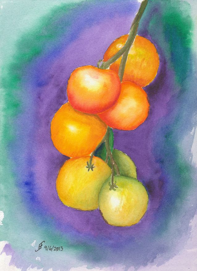
20130906 - Tomatoes

I started a couple of watercolor courses today. One is a watercolor course with fall colors. The second is a pen & ink with watercolor course. The course today was the watercolor only course.

Rocky Alexander is the instructor. Of course, as you would expect, her skill with watercolor is amazing. As I expected, I learn as I watch her work. Seeing her do a rendition of tomatoes was interesting. I learned a new technique to blend together colors. By dropping wet paint into wet paint, you can get a graduated color change. Of course, the round shape of the tomatoes is a good way to exercise that skill.

So, here's the first painting from that class. There are many more to come. Hopefully you will also find my journey with watercolors interesting.

As you look about, remember how wonderful the fall colors are and even in the midst of decline we can see some very spectacular results. While that's true for our gardens, it's particularly true for us. So, take the time and shine out with the radiance that's in your heart.

Saturday, August 31, 2013

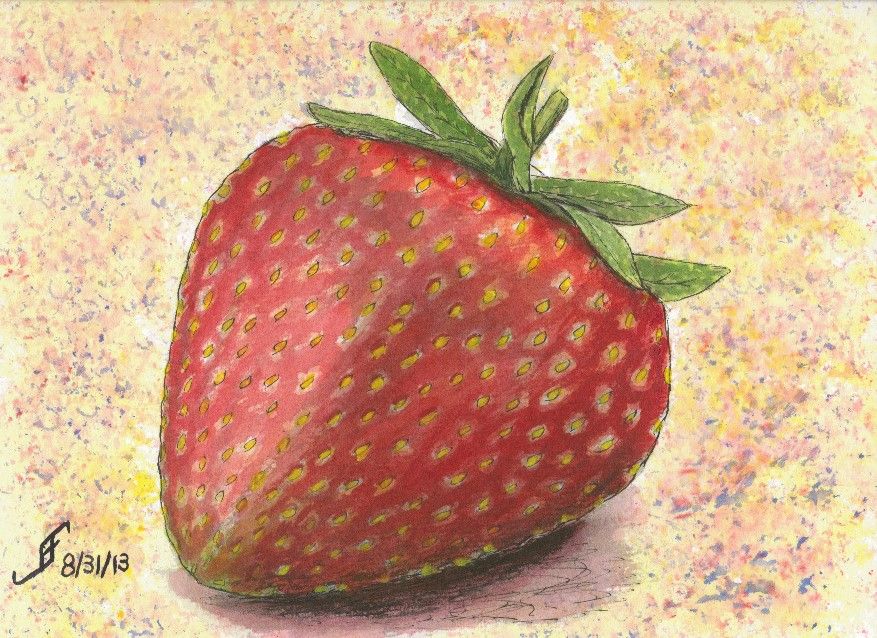
20130831 - Strawberry Fields Forever

Another day, another painting!


By the way, if you click on any painting in this blog, it presents you with a larger version. You can then exit by clicking on the "X" in the upper right hand corner of the window.

Well, as you can see, I decided against doing the ultra-realistic painting of a strawberry. Why? Did I think I would have problems doing that? Perhaps. But in all honesty, I just decided that I really love doing the pen & ink with watercolor. I *really* like it. So, that's exactly what I did.

Oddly, the color in this painting is much more vibrant in person than this scanned image. Ah, well, you get the idea behind it.

And since working on this painting put a song in my head, I thought I would share it with you:


Hope you have a great day!

Monday, August 26, 2013

20130826 - Possible next painting ..

Well, the artwork is submitted. As I noted there are some really remarkable artists that have submitted work in the past. They submitted new works today. It should be interesting to see who gets what.

I'm just happy that I reached a point that I could submit a couple works to the show. I've not had any classes (other than YouTube videos and a painting course on DVD). While I've learned a lot from that, it's not the same as any sort of formal training. But it seems to suit me well. I enjoy learning new techniques.

Speaking of which, I happened to find a YouTube video of drawing a realistic strawberry. The artist, Anna Mason, offers an online workshop and shows, step by step, how to create realistic paintings. Though I do not think I will end up with "realism" as my own personal style, I am fascinated at the possibility of taking a very impressionistic art form and moving toward realism. I might see what the free membership provides and how what the results will be.

Here's the YouTube video if you are interested.


Additionally, next week I will start two courses that the Town of Cary offers. One is titled "Painting Fall Landscapes and Florals". The other is titled "Pen, Ink and Watercolor Painting". Should be interesting. As I noted, I love to learn new techniques and approaches.