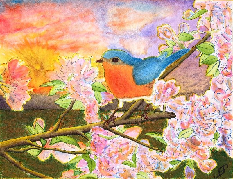
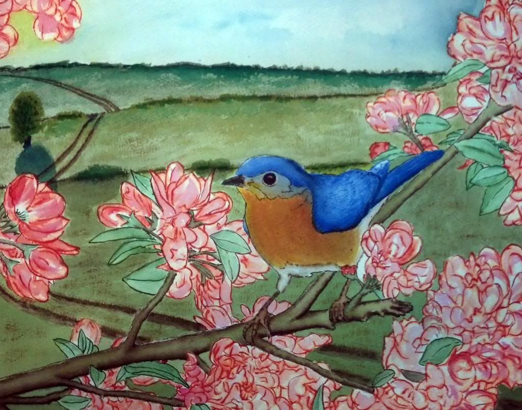
Well, as promised, I completed a larger (11 x 14 inch) painting of the bluebird. I might make a few more tweaks to the colors. But on the whole, I'm pretty pleased with this one. Unfortunately, the brilliance of the colors do note really come through on this picture. My phone (which I used to take this picture) tends to emphasize the blue more than the warmer colors. Perhaps tomorrow I will have it scanned at the copy shop.
Anyway, I hope you enjoy.
Showing posts with label Flowers. Show all posts
Thursday, April 3, 2014
Saturday, March 29, 2014
20140329 - Blue Bird
After several eventful weeks that have kept me too busy to do any painting, I decided to try to tackle something a bit more complicated than normal. Believe it or not, this Blue Bird painting is a Pen & Ink with watercolor painting. The tree, flower and foliage as well as the blue bird are done in Pen & Ink. However, the blue bird and flowers had some water color to add additional depth to the painting. The limb and foliage are exclusively done with ink.
This painting is not an ideal painting. For a very bright and busy foreground it would be better to use a simple background. While I could have painted a much simpler sky, I wanted to try some techniques. This includes the sunburst effect and a more complex cloud scene.
The sunburst effect would have been better had I used a simple spray bottle to add some dark patches headed toward the sun. Tom Jones recorded (for Jerry's Artarama) an example of how to do this. The following video shows one technique.
To create the sun burst on my painting, I would have had to use a masking fluid and paint in the background first, remove the masking fluid and then do the foreground painting. I actually did it in reverse order, since I was more interested in the foreground painting.
Unlike my previous version of a bird (gold finch) in a red bud tree, I played around with the color of the blossoms a bit by adding some orange to the blossoms. I also backlit the limbs, flowers, foliage and bird with the yellow of the setting sun. That combined with the orange tint of the flowers - which often appears toward sunset - helps set the stage for Bluebird out at sunset. And that would not be correct for bluebirds. Should I claim "Artistic License"? .. Not really. It would have been better with a simpler sky. If I needed it backlit then a early morning sky / sun would be a better choice.
Why that choice? It's both more accurate to the bird and would provide a simpler background.
Again, I should have done the background first. That would allow me to add in the detail to make it fairly convincing, yet keep it .. well .. in the background!
You will note that there is a good deal of detail in this painting. I post this in a larger format on the blog because I am fairly pleased of that. The field of mown grass feels more natural than others I've done in the past. The detail of the limbs. Shoot, even the feet of the bird have a lot of detail.
Still, it's too busy. I created an 11 x 15 inch, stretched watercolor paper canvas this past Friday. I will probably use it to paint this subject .. But this time, I will use a simpler background. I will set it as a mid-day painting.
Anyway, I hope you enjoy this painting.
Labels:
Birds,
Clouds,
Flowers,
Foliage,
Pen & Ink,
Realism,
Sunset,
Techniques,
Trees,
Watercolor
Tuesday, February 25, 2014
20140225 - Painting Cache
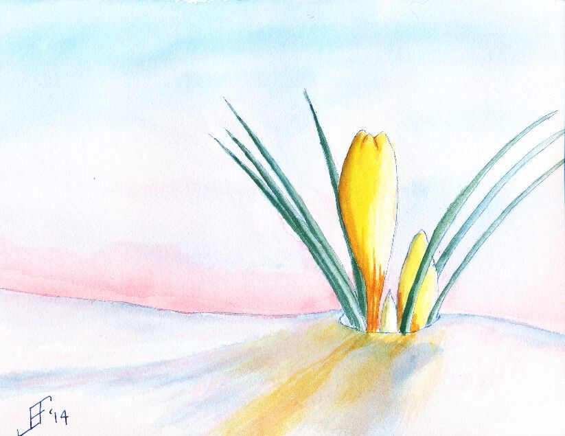
Finally, we did a painting of crocus. I found a wonderful reference photograph of a yellow crocus peeking out of the snow. This painting does much better in person than as a scanned painting. The scanner just seems to miss a lot of the detail of the painting. This used Noodler's 54th Massachusetts (a blue/black) ink for the lines of the crocus and the snow. Remember that blue added to white reminds us of snow and ice. Of course, the snow should also reflect the color of the sky and the crocus.
Hopefully you enjoy these as much as I enjoyed making them.
Tuesday, February 4, 2014
20140204 - Gold Finch Update
Those of you that have followed the link to my blog know that I see my blog as a way to "learn perspective". Over the years, I learned and relearned that one of the best ways to master any skill is to take the time to teach others those skills. It reinforces what you know. And it often gives you the chance to expand your knowledge.
And that's just what happened when I posted my Gold Finch painting from a couple days ago. I knew it was almost there, but it just did not "feel" right. There was something jarring about the painting that I could not quite clarify.
Some people suggested that the background (the field) was too dark. That wasn't quite it. I knew the dark field at sunset was both natural and provided a startling backdrop for the bird and red bud tree.
I continued to struggle at articulating what was not quite right. I was very pleased with some of the contrasts. Light versus dark. Yellow-orange versus blue-green. Left slanting limbs versus right slanting bird and sky. Lots of interest for the eye. Still, something needed improvement.
So, I give a big shout out to +Pedro Castro Caiado Ferrão, who politely suggested that I missed the mark on the three rules of perspective. Those rules include:
Once again, taking the time to teach others paid off for me. I learned an invaluable lesson in a way that will maximize that I will really employ it. (The greatest acceptance of knowledge comes when you are ready for the lesson. I've known about perspective. I just was not ready to internalize it with one of my own paintings. Now I see what I was missing. Lesson learned ... Now to practice what I've learned).
So, can you now see what I found this painting both a delight and jarring at the same time?
And that's just what happened when I posted my Gold Finch painting from a couple days ago. I knew it was almost there, but it just did not "feel" right. There was something jarring about the painting that I could not quite clarify.
Some people suggested that the background (the field) was too dark. That wasn't quite it. I knew the dark field at sunset was both natural and provided a startling backdrop for the bird and red bud tree.
I continued to struggle at articulating what was not quite right. I was very pleased with some of the contrasts. Light versus dark. Yellow-orange versus blue-green. Left slanting limbs versus right slanting bird and sky. Lots of interest for the eye. Still, something needed improvement.
So, I give a big shout out to +Pedro Castro Caiado Ferrão, who politely suggested that I missed the mark on the three rules of perspective. Those rules include:
- decrease of the size of objects proportionally with distance
- muting of colors with distance
- decrease of the precision of details with distance
Once again, taking the time to teach others paid off for me. I learned an invaluable lesson in a way that will maximize that I will really employ it. (The greatest acceptance of knowledge comes when you are ready for the lesson. I've known about perspective. I just was not ready to internalize it with one of my own paintings. Now I see what I was missing. Lesson learned ... Now to practice what I've learned).
So, can you now see what I found this painting both a delight and jarring at the same time?
Labels:
Birds,
Flowers,
Foliage,
Pen & Ink,
Techniques,
Watercolor
Sunday, February 2, 2014
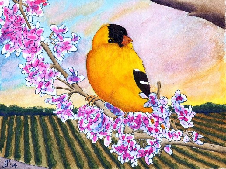
20140202 - Gold Finch
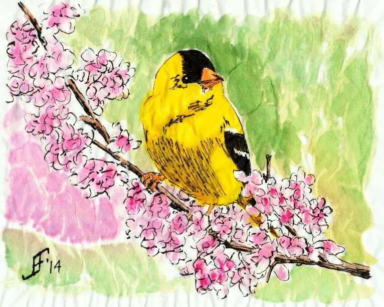
This time, I decided to try to do the Gold Finch as a traditional watercolor with pen & ink. To complete the painting, I did the painting in several stages.
First, I sketched the painting in pen & ink. I used Noodler's Black Ink on the limbs and bird. For this, I used a Noodler's Ink Brush Pen to paint the lines of the limbs and bird. This allows a varied line based on the subject. I also used Noodler's Black Ink for the black feathering of the Gold Finch. I used Noodler's 54th Massachusetts Ink (a blue black ink) for the Red Bud flowers. I used a traditional fountain pen to draw these lines. This kept the lines much lighter. However, I used a Pentel Aquash waterbrush to spread the ink to provide the blue shading in the flowers. I also used the waterbrush to create the shading of the limbs. I am pretty pleased with that overall effect. Oh, and I used Noodler's Yellow Ink to "paint" the yellow feathering of the Gold Finch.
Second, I spent a good bit of time applying masking fluid to all the exposed inked portions of the painting. This allowed me to paint over the previously inked portions and create the background for the painting. I decided to create a field heading off toward a hedge row (typically separating fields) in the background. And I wanted the sky to be a setting sun.
You will note that for the composition of this piece, I placed the Gold Finch in the center. Then the tree limbs reach from bottom right to top left. The field due to perspective switches from an up and down appearance on the left side of the painting to one that follows the tree limbs on the right hand side of the painting. And the sky runs counter to the tree. All of these thinks set eye in motion as it scans the painting, but draws the eye back toward the center.
As you might imagine, this painting took longer than my normal paintings. I hope you enjoy the results as much as I enjoyed painting this.
Friday, January 31, 2014
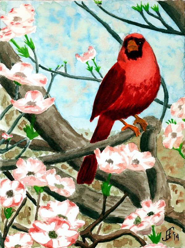
20140130 - Cardinal
Today I decided to do a pure watercolor painting. Need to keep those skills as sharp as possible! :-) Today's subject is another cardinal. It's a good winter subject, but as you can see, this cardinal is sitting in a dogwood tree. So there's the promise of spring in the painting.
With this painting, I tried several different techniques.
First, as you can see, you can see the sky in the background. But as you know any sky through a tree has leaves and/or flowers that break up the blue of the sky. I tried to paint a mottled sky to represent that. The green and brown faded quite a bit once I added the foreground colors. So, I will need to be bolder in this technique in the future.
Second, I attempted to vary the colors of branches, with the closer objects being warmer or have more red in the color .. than objects that are farther away, which are cooler or have more blue in the color. It worked fairly well, though I see a couple branches that should have been a bit cooler in color following that pattern. I'll remember to keep it a bit more consistent.
To paint the dogwood flowers, I masked them initially with masking fluid. Once the rest of the painting was completed, I removed the masking and painted the flowers. I really only tried to suggest the flowers, rather than attempting to get all the details.
So, here's hoping this cheerful cardinal brightens your day!
Wednesday, January 29, 2014
20140129 - Gold Finch
Well, I decided to try the Gold Finch on an Aquaboard. This is essentially a masonite board with a clay surface that can be painted:
It provides a smooth surface that is lightly textured, rather like hot press paper. Since it is a clay surface, it is not as absorbent as paper. But unlike paper, I found that the ink tended to not keep as sharp a line as I would prefer. As a result, I'm not as pleased with this painting as I am of the gold finch on the rice paper. It will do, but just doesn't have quite the punch without the fine lines. It will work well for more traditional watercolor painting.
An additional issue is that the surface is not as bright a white as paper. This tends to dull the painting quite a bit. Well, lessons learned. Hope you enjoy it.
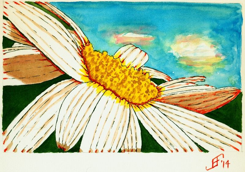
20140129 - Tilted Daisy
As I write this, it's below freezing outside with "snow" on the ground. The snow we had last night was more like frozen mist falling from the sky. It's a couple inches thick. So, of course I'm going to paint something a bit more cheerful and warm!! :-)
Today's painting is based on a photograph taken by Johnina Payne Young (see below). It is titled "Tilted Daisy 2". This is part of the Paint My Photo website.
As you can see, I changed some of the background colors to add to the dramatic effect. And as per my usual approach, I used pen & ink to create the outline of the daisy. I used Sennelier Blue and Yellow for the sky and center of the daisy, respectively. I used M. Graham Sap Green Permanent for the green background. I combined the Sennelier Opera Rose with green for the shadow color. And I used Noodler's Black, Yellow and Fox Red for the inks.
Tuesday, January 28, 2014
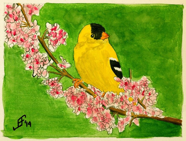
20140128 - Gold Finch
Using similar techniques as I used with the cardinal, I painted this gold finch on a branch. As we brace for winter weather, it helps to have something cheerful to brighten the day. I hope you enjoy the results.
In case you are wondering, the black in the painting is Noodler's Black Ink, which is one of the "eternal" Noodler's Inks. It does not fade, even in direct sunlight. The yellow of the gold finch is Noodler's Yellow ink. It is supposedly an "eternal" ink, but testing by others has shown that it does fade in direct sunlight. So, this painting will need to be put behind UV protecting glass or acrylic. The remaining colors are watercolors.
Friday, January 3, 2014
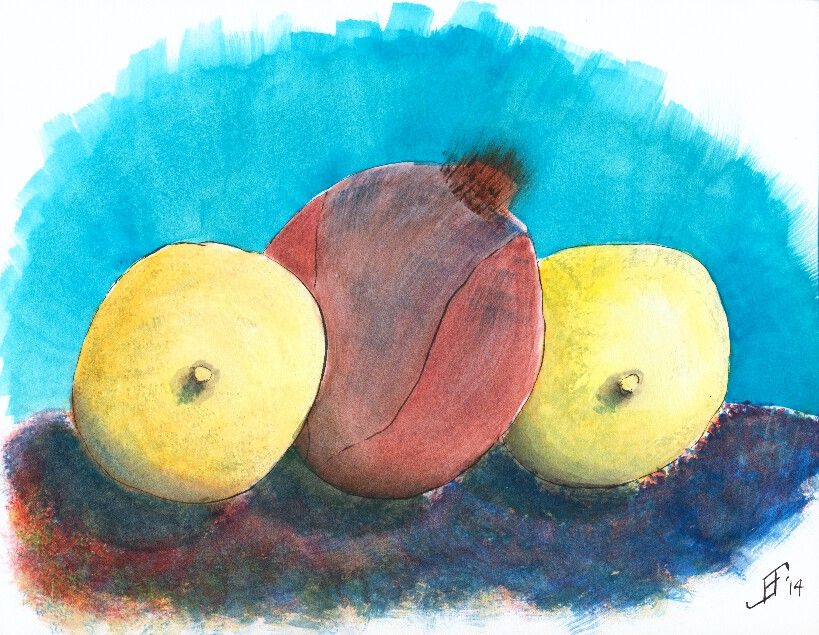
20140103 - Plum
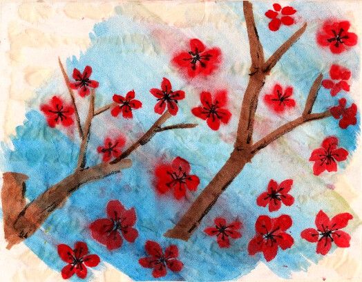
I'm very happy with the feel of this painting. When properly mounted, it should provide some good results.
Here's hoping you will find this a cheerful painting, full of the promise of spring and warmer weather ahead!
20130103 - Poinsettia
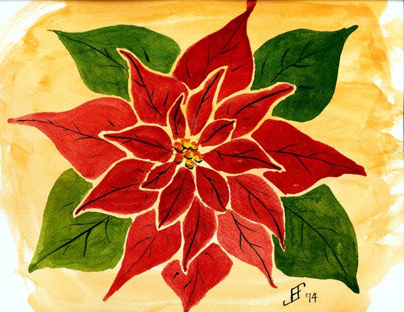
Hopefully you enjoy my noodling around with my painting. And here's hoping that this flower helps brighten your day .. as so much of the country is locked in very cold weather. There's something fundamentally cheerful about poinsettias. So, here's hoping you enjoy!
Monday, November 4, 2013
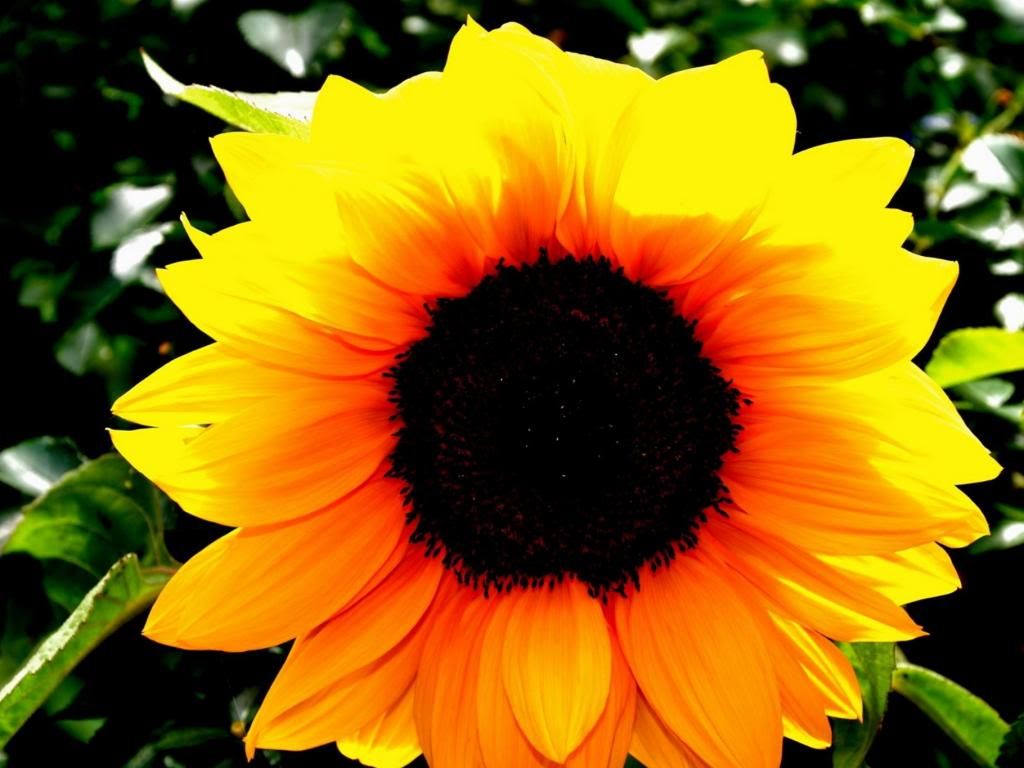
20131104 - Sunflower
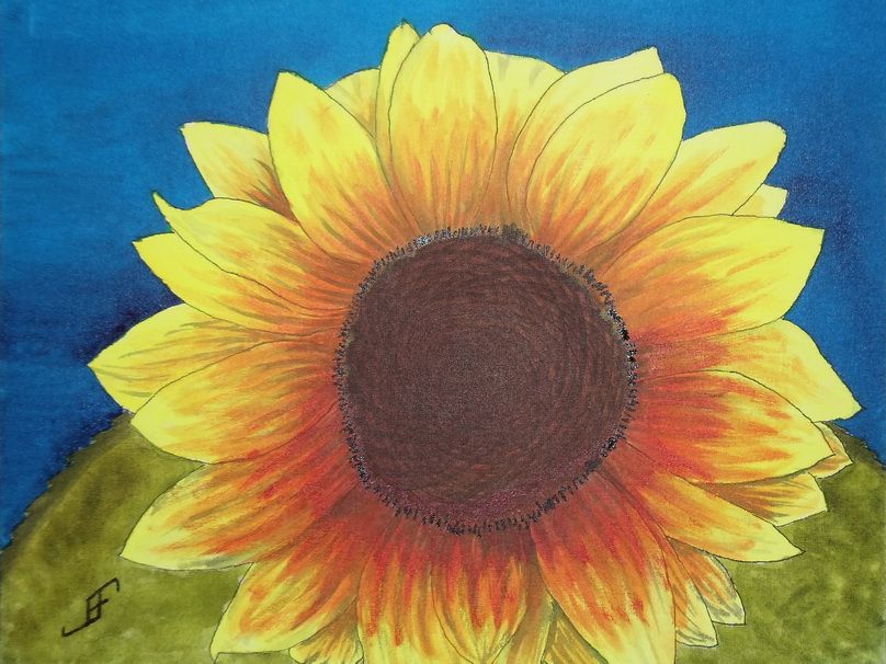
The camera added a bit of reflective light to the mix. So, the center and the detail around the center appears a bit lighter than they appear in person.
Since I don't have a scanner that can handle larger images, I use a camera. While it does well, it does need to use the flash to get a good photograph of the painting. And then of course, I need to do some photo editing to eliminate perspective distortions to the photograph (to bring it back to an 11x14 sized image).
Anyway, hopefully this cheerful sunflower will brighten your day.
Sunday, November 3, 2013
20131103 - Sunflower with a Different Perspective
When rendering it in watercolor, I think I will shoot for complimentary and split complimentary colors (using the CMY, or Cyan, Magenta, Yellow color wheel). Thus, the compliment of yellow is blue (on the CMY color wheel). I will paint the green leaves toward the bottom where there is more of an orange coloring of the sunflower. This will yield the split complimentary colors to the complimentary color of blue.
So, here's hoping you will enjoy the final painting.
Thursday, October 31, 2013
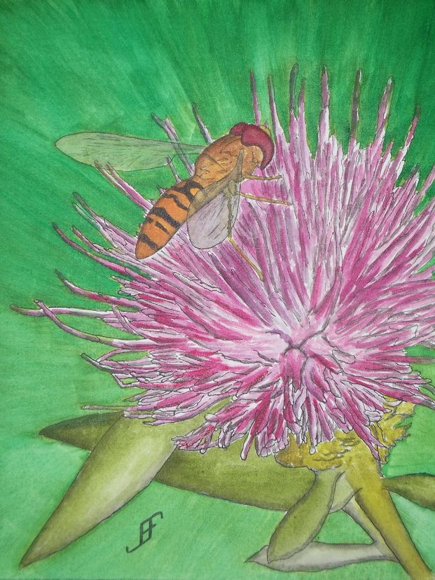
20131030 - Thistle with Bee (Painting)
Yesterday, I decided to pick up the challenge of not just drawing, but painting the Thistle with Bee. You may remember that I had done a pen & ink only drawing of the Thistle with Bee. This time, I decided to make it a bit larger (11x14 inches) and paint it.
I am fairly pleased with the painting. My rule of thumb on this is that if I would not mind giving it as a gift, then it passes muster.
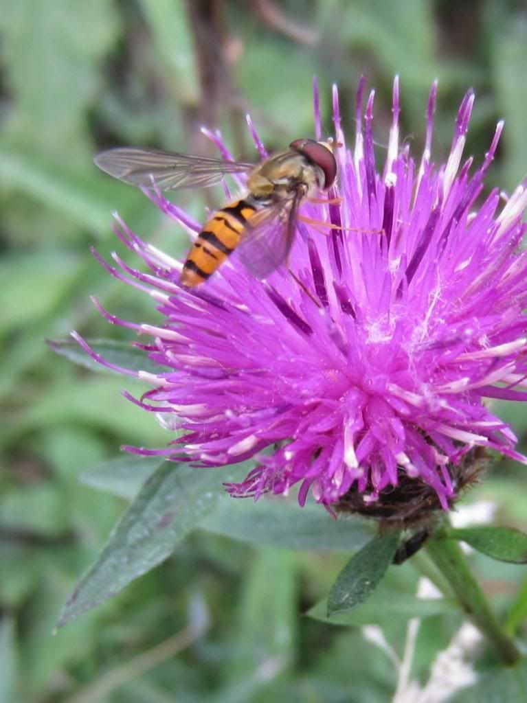
Things that did work right include the bee. It's not perfect, but I'm pretty pleased with it. I also intentionally color shifted the stems and leaves. I did that to have it show "weedy" growth. For the background I used a similar green, then used a bluer green exploding outward from the thistle. This carries the "motion" of the thistle outward.
Of course, there are always things I would like to improve. The thistle color did not come out quite right. It should have been a bit brighter pink purple. I suspect I should have used Ultramarine Pink. I tried to use a rose and a violet to get some of the same effect.
All things considered, I am fairly pleased with this painting. Especially since I have also been dealing with a really huge floater that floats into the center of my vision. Yuck. I spent most of the day on this past Sunday at the Duke University emergency room. Appears I developed a partial vitreous detachment in my left (good) eye. Being unaware of the symptoms for that and problems with the retina, I decided I needed to have it checked immediately. The ophthalmologist on duty and the senior ophthalmologist on call both reassured me that since I have usable vision only in that one eye, I did the right thing to have it checked. Fortunately, there's no retina damage. But I do have a "honking big" floater that's right in the middle of my center of focus. And yes, it appears ophthalmologists use technical terms just like computer engineers do! .. ;-) ... So, all things considered, I am really pleased that I can still enjoy painting.
And I hope you enjoy this.
Monday, October 21, 2013
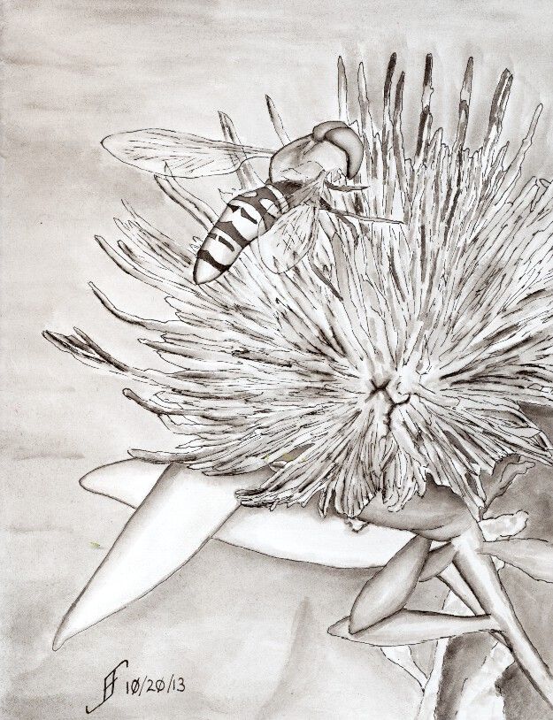
20131020 - Dilemma Solved - Pen & Ink Only
So, I solved my dilemma with this rendition of the photograph. I decided that this time this "painting" will be ONLY with pen & ink. As you can see, I use the ink as a value wash. That is, I use the ink to wash in the shading within the "painting". It's just a pen & ink drawing, but it feel as if it's more of a painting than just a "drawing".
As you can see from the reference photograph, it will be a good candidate for using watercolors.
My next effort with this painting will be to add color to it. I might make that one 11x14 size painting. The subject comes out pretty nicely and lends itself to pen & ink, so adding color to it should be fairly spectacular.
Sunday, October 20, 2013
20131020 - Oy! The Dilemma!!
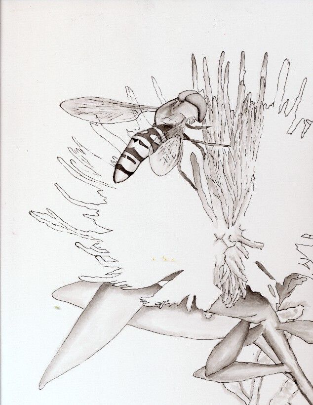
So, here's the problem of the day. I decided to do a pen & ink with watercolor wash of a photograph that a friend shared. It's a photograph of a thistle flower with a bee on it. As you can see, it's a wonderful, striking photograph.
Oy! The dilemma! Should I leave it "as is" and just complete the pen & ink work. Or should I add color to it.
Of course, I might split the difference and leave this one as pen & ink only, but do another painting with watercolor. Decisions, decisions!
Friday, October 18, 2013
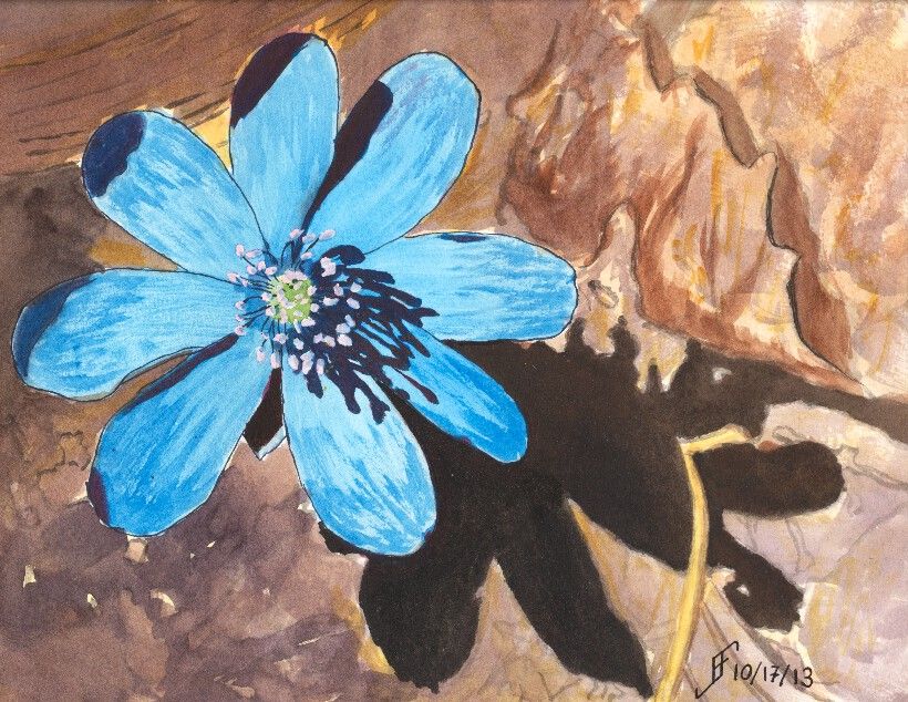
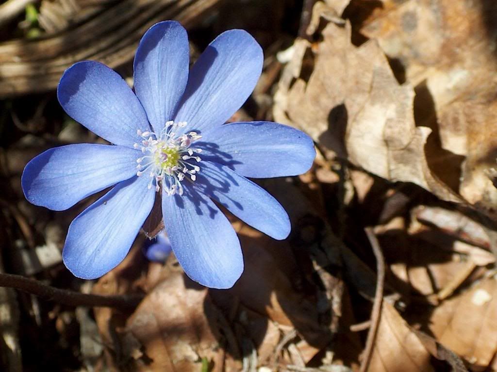
20131017 - Flower
With this flower, I decided to intentionally leave the leaf litter more of an impression than to shoot for realism. The intent is to show the flower as the primary focus (as it was in the camera) and having more substance than the background.
Hope you enjoy this one. I know I enjoyed painting it. And my hats off to John Apps, who took the original photograph of the flower. It's quite striking.
Friday, October 11, 2013
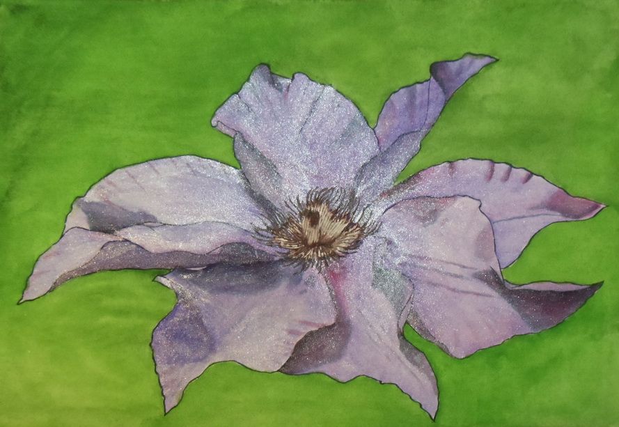
20131010 - Clematis
A bit of an apology. Yes, it has an iridescent medium on it. It's an inside joke in our family. My daughter loved things with purple sparkles. As I was painting this flower from the photograph, I was struck by how it almost seems to sparkle in the light. Well, it was only a short hop form that to purple with sparkles. In person the iridescence is not quite as annoying.
A little on the detail in painting this. I used Noodler's 54th Massachusetts, which is a blue-black ink for the outline of the petals. I used that same color to create the under painting of the shadows. I masked off the center of the flower. After I added the color, I removed the masking and used Noodler's Manjiro Nakahama Whaleman's Sepia on the center. I used M. Graham paints to add the coloring to the paint. After doing research, I discovered that I rather naturally use a CMY (Cyan Magenta Yellow) color wheel to choose colors. In this case, the green and purple are complementary (per the CMY color wheel). This system tends to yield much more vibrant colors than the tradition RBY (Red Blue Yellow) color wheel.
As I noted, I painted this on the watercolor paper canvas that I created yesterday (see my previous blog entry). I will still need to spray it with a UV Protectant Varnish. Since the back of the paper is open to the elements, I will need to spray both the front and back (as well as sides) of this canvas. Once that's done it can be hung "as is" without a frame, or put in a frame, such as is used for oil or acrylic paintings.
Sunday, September 29, 2013
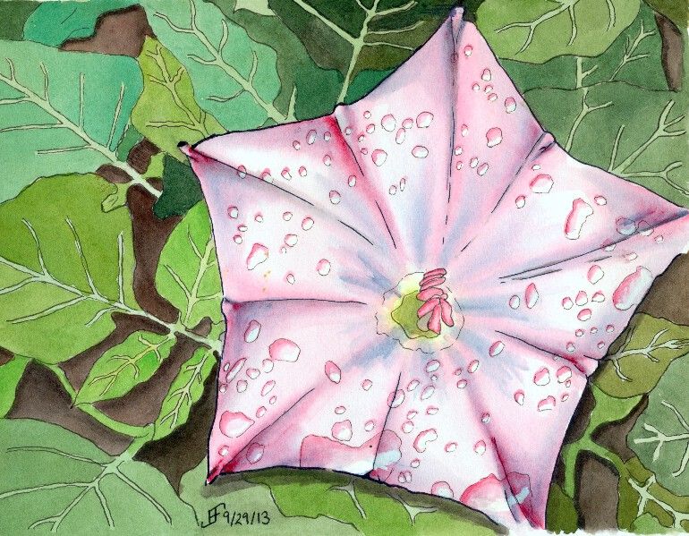
20130929 - Flower Power - Star Flower
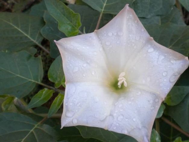
This particular flower is a rendition of a photograph that my cousin took during her travels in the US Southwest. I'm not certain the type of flower, but it was pretty remarkable. And I decided it would make a lovely painting.
You might be wondering how I did this one. Well, it starts with the pen & ink drawing of the painting. Once again, I used the blue ink to create the outline of the petals and the blue shadow areas. The leaves and water drops I created with black ink. I added the shadows with a water brush and the black ink. Then I added the color onto the flower and the background. By varying the green, I made the leaves feel "right". There is a fairly natural change of colors. Otherwise the outlining of the veins of the leaves would tend to make them appear is if they were a cartoon.
Anyway, I hope you enjoy this painting as much as I enjoyed making it.
Oh, don't forget to watch the science video:
20130929 - Flower Power Take Two
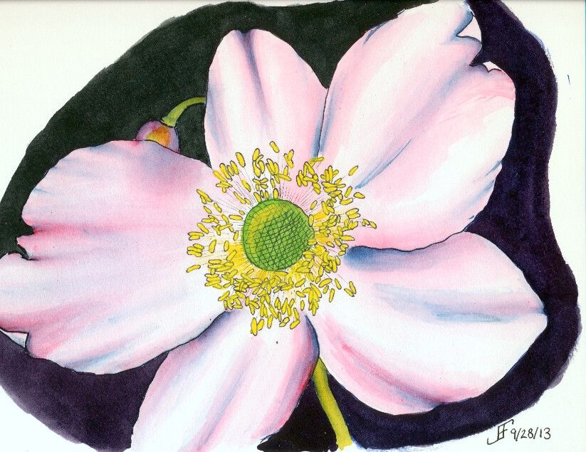
This time, I decided the orientation of the flower to the sheet of paper should be flipped and it be painted in "landscape" mode. And of course, I also used a whiter paper and smoother paper (hot press). That tends to make the color transitions smoother.
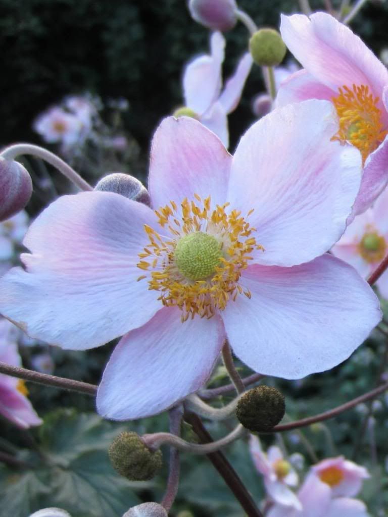
And of course, in keeping with my lessons learned, I used the masking fluid to block off the anthers, so that once everything else was done, I could paint them a yellow color. As you can see, this time around, the painting is closer to the photograph.
Clearly doing art is something that improves with practice. But it's rare to see someone work through what works and what does not. Hopefully you find this type of post interesting. It helps me to "talk through" my own process of learning. I'm enjoying it. I sure hope you are as well.
Subscribe to:
Posts (Atom)