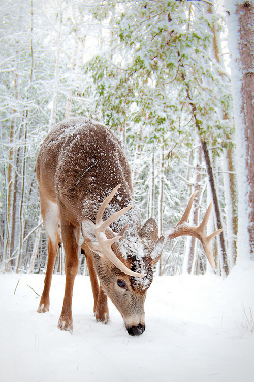
I thought you might like to see how I create the under painting using pen & ink. I've been working on the a deer feeding in winter. This is a "work in progress", so you get to see it before I add the watercolor to the painting.
As you can see, I try to outline my subject, then use a waterbrush to create the texture of the painting.
All of what you see is just pen & ink work. I am using a Noodler's Ink brush pen. The ink is Noodler's Ink Polar Brown. It's a permanent ink that binds with the cellulose in the paper and becomes quite permanent and lightfast. But by using the waterbrush it may not be as lightfast as I would like. So, the watercolor added to the painting solves any problems due to fading.
You can also see that I by using my pen & ink I tend to get an image that feels as if it comes out of an illustrator's guide, rather than a pure watercolor painting guide. But that's okay, since I am really drawn to the pen & ink work with watercolor.
As you can see, I also provide a small copy of the reference photograph that I am using. As you can see, it's a wonderful photograph.
Hopefully you will enjoy seeing the work in process and the resulting painting.
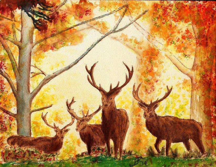
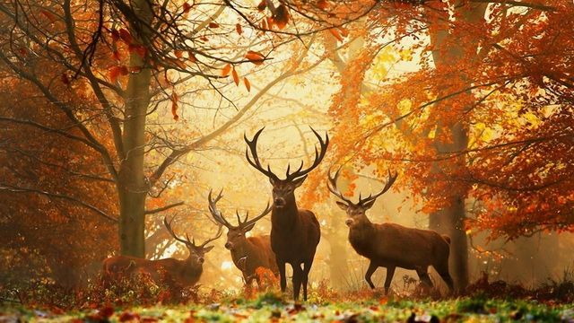
Today's painting is an autumn scene. I happened across a delightful wall paper scene of four deer at the edge of a glade beside an autumn forest. I wish I could give credit to the original photographer that took the picture of the deer. Unfortunately these free wall paper sites probably lifted the picture without giving credit or funding to the original artist. I would normally not use such a site or photograph, but it presented two unique challenges.
First, the photograph included four deer. While I've been tackling harder and harder subjects, I have not jumped into painting animals (other than the birds). So, painting for deer was a big new challenge for me.
Second, painting a misty forest scene requires several different techniques. One is that you need to paint an overall wash of the background color. Then you need to add and then immediately dab away trees and limbs in the background.
As you can see, I took the original photograph and cropped it to just the central image. This felt more interesting. Additionally, when working in watercolor, it is sometimes important to get the main object in the painting large enough to paint well. Smaller and it would be much more difficult for me to get the detail of the deer correct.
I did the deer and trees with pen & ink, using Noodler's Ink Polar Brown ink.
Those challenges made this scene an interesting lesson. I'm fairly pleased with my rendition of the original photograph. It's a warm, autumn scene.
What could be better? Well, the foreground is too dark / blue. It should be warmer (redder) and lighter in color. A yellow green would have been a better choice. I should have put more branches / limbs / twigs into the painting. Next time I try something like this I will try to use the ink for the small detailed limbs / twigs. That might feel better and attain the look that I want to see.
Anyway, I hope you enjoy this painting. It was a fun learning process.
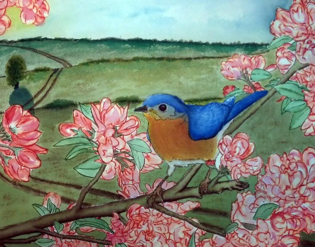
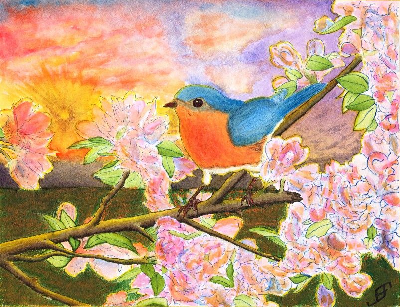
Well, as promised, I completed a larger (11 x 14 inch) painting of the bluebird. I might make a few more tweaks to the colors. But on the whole, I'm pretty pleased with this one. Unfortunately, the brilliance of the colors do note really come through on this picture. My phone (which I used to take this picture) tends to emphasize the blue more than the warmer colors. Perhaps tomorrow I will have it scanned at the copy shop.
After several eventful weeks that have kept me too busy to do any painting, I decided to try to tackle something a bit more complicated than normal. Believe it or not, this Blue Bird painting is a Pen & Ink with watercolor painting. The tree, flower and foliage as well as the blue bird are done in Pen & Ink. However, the blue bird and flowers had some water color to add additional depth to the painting. The limb and foliage are exclusively done with ink.
This painting is not an ideal painting. For a very bright and busy foreground it would be better to use a simple background. While I could have painted a much simpler sky, I wanted to try some techniques. This includes the sunburst effect and a more complex cloud scene.
The sunburst effect would have been better had I used a simple spray bottle to add some dark patches headed toward the sun. Tom Jones recorded (for Jerry's Artarama) an example of how to do this. The following video shows one technique.
To create the sun burst on my painting, I would have had to use a masking fluid and paint in the background first, remove the masking fluid and then do the foreground painting. I actually did it in reverse order, since I was more interested in the foreground painting.
Unlike my previous version of a bird (gold finch) in a red bud tree, I played around with the color of the blossoms a bit by adding some orange to the blossoms. I also backlit the limbs, flowers, foliage and bird with the yellow of the setting sun. That combined with the orange tint of the flowers - which often appears toward sunset - helps set the stage for Bluebird out at sunset. And that would not be correct for bluebirds. Should I claim "Artistic License"? .. Not really. It would have been better with a simpler sky. If I needed it backlit then a early morning sky / sun would be a better choice.
Why that choice? It's both more accurate to the bird and would provide a simpler background.
Again, I should have done the background first. That would allow me to add in the detail to make it fairly convincing, yet keep it .. well .. in the background!
You will note that there is a good deal of detail in this painting. I post this in a larger format on the blog because I am fairly pleased of that. The field of mown grass feels more natural than others I've done in the past. The detail of the limbs. Shoot, even the feet of the bird have a lot of detail.
Still, it's too busy. I created an 11 x 15 inch, stretched watercolor paper canvas this past Friday. I will probably use it to paint this subject .. But this time, I will use a simpler background. I will set it as a mid-day painting.
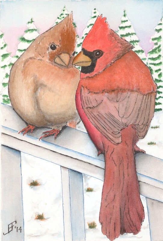
Well, painting the Cardinal Pair took much less time than I expected.
That's the advantage of snow scenes. There's less of the paper that needs to be painted.
Of course, the flip side is that you must believably cover enough of the paper to KNOW that it's a snow scene.
In effect, you have to think in an opposite direction to how we normally think. Normally we start with an empty scene in our mind and add color (including white) to create the scene. However, with watercolor painting it's necessary to create a NEGATIVE painting. I don't paint the trees. I paint the parts of the limbs NOT covered with paint and the sky above them. Do that properly and the tree suddenly pops out when you look at the painting.
In this case, making it a little more difficult is the need to provide enough detail so it is believable, but not too much. Too much detail would make the trees appear closer.
Also, by using cooler (bluer) colors it helps the trees recede. Warmer (redder) colors make objects appear closer. For example, even though the male cardinal is a bluer color, I added a orange glaze over the cooler blue-red. This helps it pop out of the painting and appear much closer.
So, here's hoping you enjoy the result. I know my wife likes it.
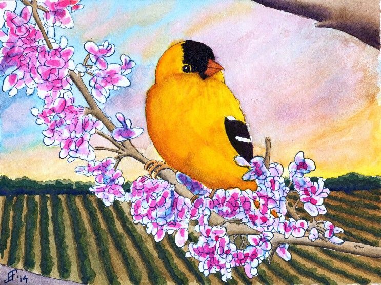
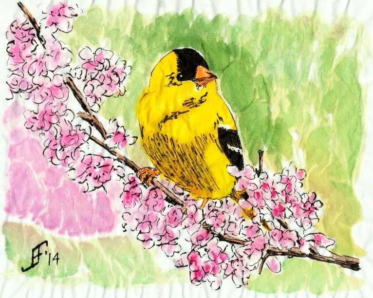
This time, I decided to try to do the Gold Finch as a traditional watercolor with pen & ink. To complete the painting, I did the painting in several stages.
First, I sketched the painting in pen & ink. I used Noodler's Black Ink on the limbs and bird. For this, I used a Noodler's Ink Brush Pen to paint the lines of the limbs and bird. This allows a varied line based on the subject. I also used Noodler's Black Ink for the black feathering of the Gold Finch. I used Noodler's 54th Massachusetts Ink (a blue black ink) for the Red Bud flowers. I used a traditional fountain pen to draw these lines. This kept the lines much lighter. However, I used a Pentel Aquash waterbrush to spread the ink to provide the blue shading in the flowers. I also used the waterbrush to create the shading of the limbs. I am pretty pleased with that overall effect. Oh, and I used Noodler's Yellow Ink to "paint" the yellow feathering of the Gold Finch.
Second, I spent a good bit of time applying masking fluid to all the exposed inked portions of the painting. This allowed me to paint over the previously inked portions and create the background for the painting. I decided to create a field heading off toward a hedge row (typically separating fields) in the background. And I wanted the sky to be a setting sun.
You will note that for the composition of this piece, I placed the Gold Finch in the center. Then the tree limbs reach from bottom right to top left. The field due to perspective switches from an up and down appearance on the left side of the painting to one that follows the tree limbs on the right hand side of the painting. And the sky runs counter to the tree. All of these thinks set eye in motion as it scans the painting, but draws the eye back toward the center.
As you might imagine, this painting took longer than my normal paintings. I hope you enjoy the results as much as I enjoyed painting this.
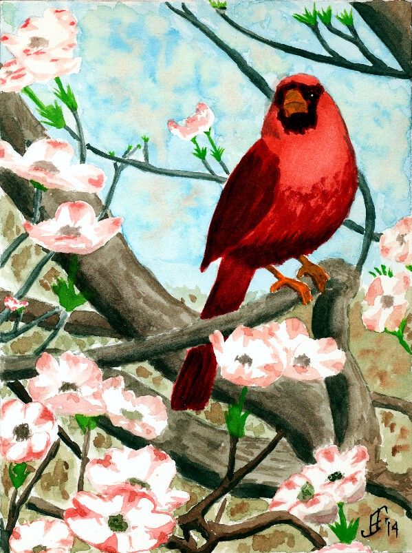
Today I decided to do a pure watercolor painting. Need to keep those skills as sharp as possible! :-) Today's subject is another cardinal. It's a good winter subject, but as you can see, this cardinal is sitting in a dogwood tree. So there's the promise of spring in the painting.
With this painting, I tried several different techniques.
First, as you can see, you can see the sky in the background. But as you know any sky through a tree has leaves and/or flowers that break up the blue of the sky. I tried to paint a mottled sky to represent that. The green and brown faded quite a bit once I added the foreground colors. So, I will need to be bolder in this technique in the future.
Second, I attempted to vary the colors of branches, with the closer objects being warmer or have more red in the color .. than objects that are farther away, which are cooler or have more blue in the color. It worked fairly well, though I see a couple branches that should have been a bit cooler in color following that pattern. I'll remember to keep it a bit more consistent.
To paint the dogwood flowers, I masked them initially with masking fluid. Once the rest of the painting was completed, I removed the masking and painted the flowers. I really only tried to suggest the flowers, rather than attempting to get all the details.
So, here's hoping this cheerful cardinal brightens your day!
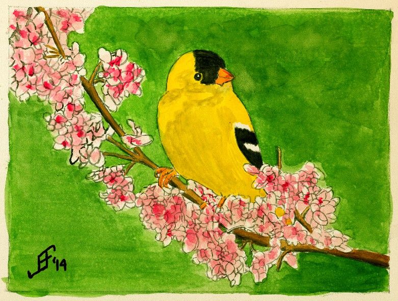
Well, I decided to try the Gold Finch on an Aquaboard. This is essentially a masonite board with a clay surface that can be painted:
It provides a smooth surface that is lightly textured, rather like hot press paper. Since it is a clay surface, it is not as absorbent as paper. But unlike paper, I found that the ink tended to not keep as sharp a line as I would prefer. As a result, I'm not as pleased with this painting as I am of the gold finch on the rice paper. It will do, but just doesn't have quite the punch without the fine lines. It will work well for more traditional watercolor painting.
An additional issue is that the surface is not as bright a white as paper. This tends to dull the painting quite a bit. Well, lessons learned. Hope you enjoy it.
Using similar techniques as I used with the cardinal, I painted this gold finch on a branch. As we brace for winter weather, it helps to have something cheerful to brighten the day. I hope you enjoy the results.
In case you are wondering, the black in the painting is Noodler's Black Ink, which is one of the "eternal" Noodler's Inks. It does not fade, even in direct sunlight. The yellow of the gold finch is Noodler's Yellow ink. It is supposedly an "eternal" ink, but testing by others has shown that it does fade in direct sunlight. So, this painting will need to be put behind UV protecting glass or acrylic. The remaining colors are watercolors.
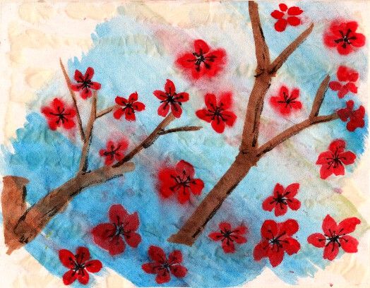
For my second painting (that I'm showing) for the day, I tried to do some Chinese Brush Painting. This technique uses different brushes and brush techniques than classic watercolor paper. Unfortunately, I don't have the correct mounting paste, so this one is mounted with Elmer's glue. As you can see, the results are less than ideal. Ah well! I'll put together a list of supplies I need.
I'm very happy with the feel of this painting. When properly mounted, it should provide some good results.
Here's hoping you will find this a cheerful painting, full of the promise of spring and warmer weather ahead!
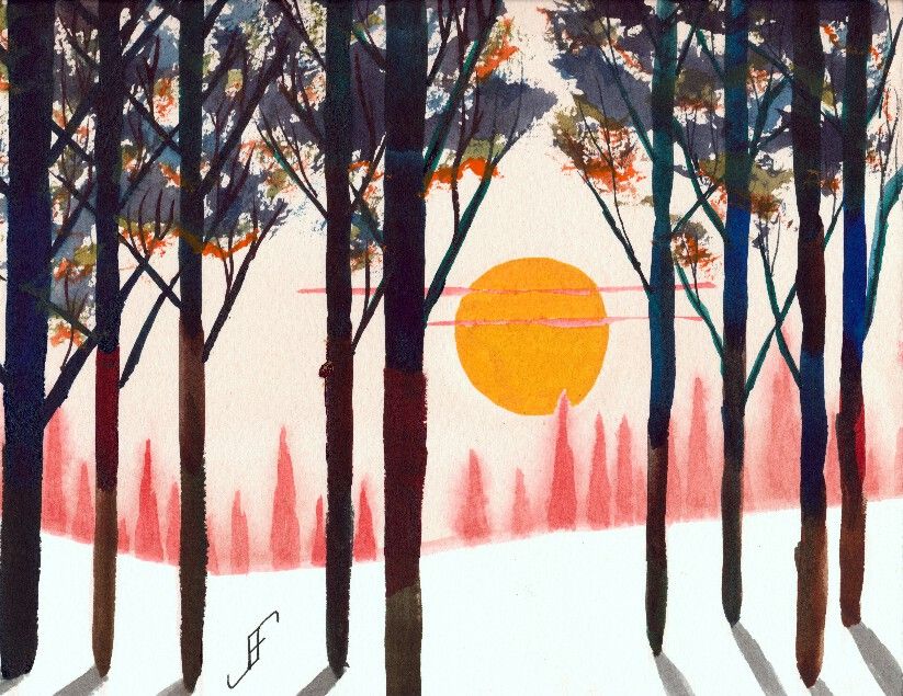
Today's project in my watercolor class was to create a misty type forest scene with a setting sun. Of course, I could not leave well enough alone and ended up going for a stylized scene.
The idea is that you have a forest in the far distance, more clearly defined pine trees in the middle distance and either deciduous or long leaf pine trees in the near distance. In the Carolinas this would be the sort of scene that you might find near a Christmas Tree farm.
But rather than going for standard color combinations, I decided to lean toward some more striking colors. So, the trees in the distance are redder than you would ever see in real life. And the nearby trees have vibrant foliage. The upper part of the foliage is darkened by the gloomy twilight conditions. The bottom of the foliage is highlighted with the setting sun.
Perhaps it's fantastical, but I had a lot of fun bringing the colors and approach of this painting together. Hopefully you will enjoy it as well.
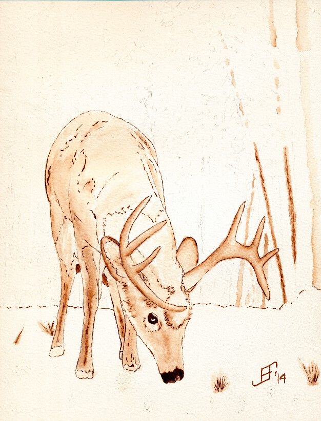 I thought you might like to see how I create the under painting using pen & ink. I've been working on the a deer feeding in winter. This is a "work in progress", so you get to see it before I add the watercolor to the painting.