Showing posts with label Architecture. Show all posts

Thursday, April 24, 2014

20140424 - Hatteras Lighthouse at Sunset

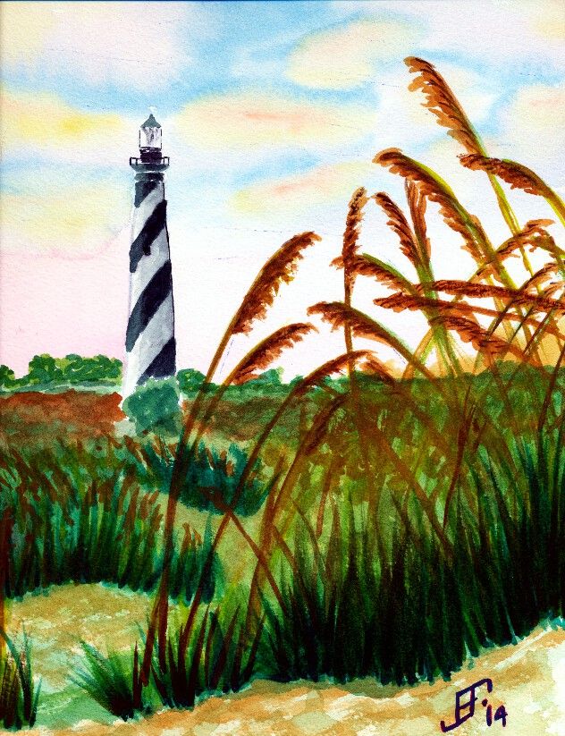
Well, today I passed another milestone in my painting "career". Isn't it an axiom that anyone that paints somehow feels compelled to paint a lighthouse? Yup. That's exactly what I did! As you can see, I decided on this beautiful day that the Hatteras Lighthouse on the NC Outerbanks would be an excellent subject.

My compliments to Dan Carmichael, who took the photograph on which this painting is based. Please note that I will NOT in anyway sell or make a profit from this rendition of his work. Instead it was intended as a teaching exercise. It's neither legal nor right to just copy the work of another and take credit and/or pay for it. In this case, since I'm only using it as a teaching exercise, it is "fair use". But all rights to the image remain with the original photographer.

While this could be better, I'm fairly pleased with this rendition. It does a pretty good job of capturing the spirit of the original. I changed the sky to make it a little more early / late in it's feel. The scan does not do justice to the subtle shading. The sea oats don't have the glitter that is in the original painting. Capturing and maintaining the highlights in the original sea oats is beyond me at this point. I might try another pass at this painting using Hot press paper and seeing if I can reserve some of the white paper to help preserve the highlights. I also need to work on the foreground vs. background a little more. Well, it's another example of how I learn by doing.

Anyway, I hope you enjoy!


Friday, October 25, 2013

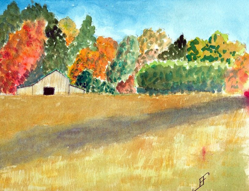
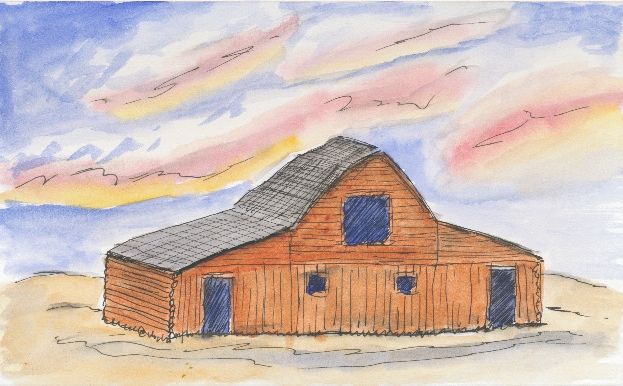
20131018 - Fall Barn

Our project last Friday was to do a fall foliage scene with a barn in the distance. Landscape paintings continue to be a struggle for me. But the trees are improving.

Sadly, I ran my finger through some red paint and smudged the right hand side of the painting. Arrgh! Oh, well, it was more of a learning sketch than anything.

The actual scene did include a shade stripe through the nearby field.

While it's not bad, I still have a long way to go with my landscape paintings. But that's why I am taking the class. To learn. Here's hoping you enjoy this watercolor sketch.

Sunday, October 6, 2013

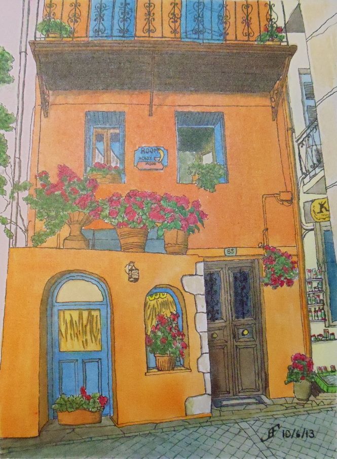
20131006 - Honeymoon House Completed

So here is the completed Honeymoon House painting. I added the lettering and a few small details. Working on the Fredrix Watercolor Canvas Board was an interesting, but pleasant experience. Fortunately, when I purchased the canvas board, I purchases several at a time. So, you will see more in the future.

You might also note above the middle set of flowers there is a bit of a whiteness that was not there before. The semigloss UV protecting varnish created a little bit of a "shine" in this part of the painting. This is one of those cases where what the camera sees and what the eye sees is a little bit different. In person, the painting looks just like it did without the varnish.

Unfortunately, the blue painters tape did not stop the paint from bleeding under the edge of the tape. I will need to see if I can't create more of a barrier in the future to resist that type of bleeding.

To correct this, I used Creative Mark's Aquacover Liquid Watercolor Paper to cover the edge of the painting. You can't see it in the above picture. It's not perfect, but it looks better than the bleeding under the tape.

Anyway, I hope to do more paintings with this watercolor canvas in the fairly near future. I hope you enjoyed seeing the process from picture to completed painting.


20131006 - Honeymoon House Final Stretch

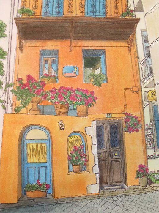
I decided not to wait. I still have a little more to do on the Honeymoon House painting. But I wanted to share with you how it looks at this point. I've very pleased with how the colors stayed true to the color that was on my palette. Working with the Fredrix watercolor canvas boards was an "interesting" experience.

It was not a bad experience. But it was definitely different than working with watercolor paper. This will take some adjusting on my part. Getting a very smooth wash is pretty difficult on this surface. Working over a previously painted area must be done quite carefully, since unlike watercolor paper, the previous paint will tend to lift.

If you are familiar with Yupo "paper" (an artificial paper made from petrochemicals), then you realize that on some surfaces the watercolor will not adhere. It will dry. It will stick to the surface. But it's not really soaked into the "paper".

While the watercolor canvas is not "paper", it feels a little more like paper than Yupo "paper". But color will lift if you wet an area of paint. Thus, if you want to "glaze" over a previous area that you already painted, you must be quite careful to not lift the paint. It takes a gentle brush stroke. This surface also does better with a single brush stroke. If you use lots of little brush strokes, the paint will not evenly distribute.

But Tom Lynch is right about this surface. Normally, I don't believe claims that are made in advertising a product. But this surface does work as advertised. I could lift the color. And the color in my palette matches the color on the canvas. I am pretty impressed. You can see more about this surface in Tom's Fredrix Watercolor Canvas Tips video below:


Additionally, you can purchase prepared watercolor canvas and make your own stretched canvases. There is an art show (Art of the Carolinas) coming in November 2013. I might see if they have a good deal on a roll of canvas at that show.

You might be wondering what's left on the painting. Well, I need to add the lettering to the sign. Plus, I need to sign the painting. Then I need to use a UV protecting spray varnish. Once I've done that, the blue painters tape around the edges of the painting (not shown above) can come off. When I do that the canvas board can then be mounted "as is" in a frame. No glass or other protection is needed. That should significantly decrease the cost of the final paintings.

Well, I hope you enjoy seeing the process of making this painting. I know I've enjoyed working on this one.

20131005 - Honeymoon House

This past week, I joined a group which encourages photographers to post their photographs for people to create a painting of them. Paint My Photo had a fun urban scene of a Honeymoon House. The colors (as you can see below) are quite vibrant. Needless to say, I decided this would be a great opportunity for me to try using a watercolor canvas board, manufactured by Fredrix. This consists of a canvas treated for watercolor (and other liquid art materials) and wrapped around a hardboard.

Supposedly painting watercolors on canvas provides a more lively / brighter painting experience. One reason is that the canvas does not absorb the paint the same way that watercolor paper does. Thus, the colors are supposed to be more vibrant and clear. Time will tell.

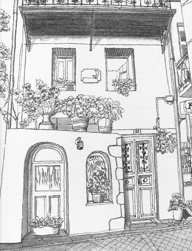
In preparation, I created this pen and ink painting of the Honeymoon House. It serves as the "under painting" of my final painting. On Sunday, the 6th, I will paint this with my watercolor paints.


Friday, September 27, 2013

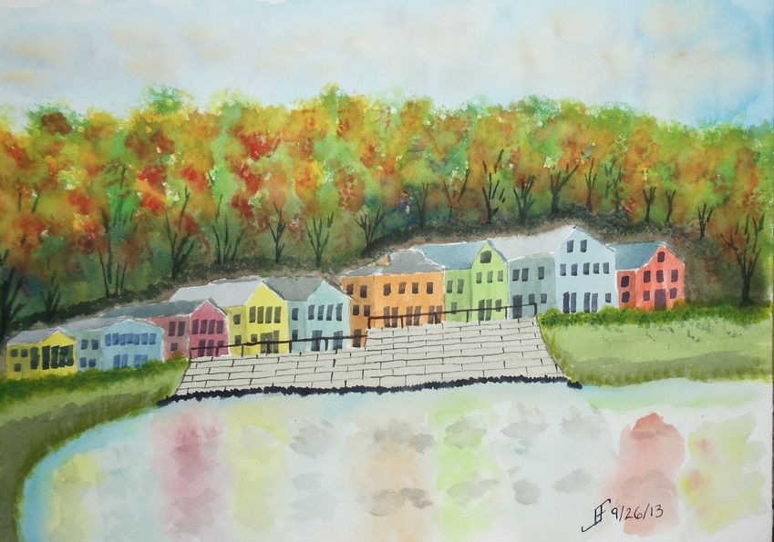
20130926 - Fall Foliage

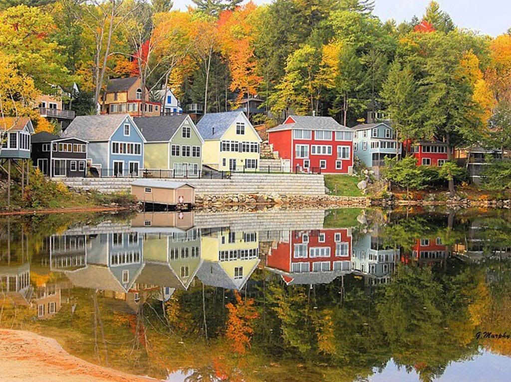
Here's a quick sketch of a fall foliage around a vacation spot in the New England area. It's roughly based on an image I saw in the news yesterday.

This one did not turn out as well as I hoped. I'm tired, so I did not put as much into this as I should have. Lesson learned.


As you can see from the original photograph, it's well worth taking time to enjoy it. And indeed, I hope you enjoy both the photograph and this sketch.


Thursday, September 26, 2013

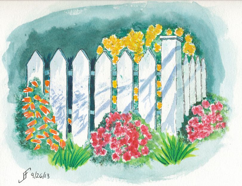
20130926 - Garden

In a word ... YES!! I am very happy with this painting. I have been looking at courses offered during the Art of the Carolinas show. One of the instructors is Tom Lynch, an internationally known watercolorist. One of his courses is titled "The Magic of Leaving White Paper". The sample photo (which you can see below) intrigued me and made me want to try something along that line. I know I'm not as good at watercolor painting as he is, so I simplified the painting quite a bit. And I added some flowers behind the picket fence. And VoilĂ !


For the first time, I feel as if I've crossed the boundary from primitive watercolor painting to more artistic watercolor painting. Not that I could (since it's a copy of Tom's painting), but for the first time, I would not be embarrassed to sell this painting.

Hopefully you enjoy this adventure as much as I enjoy the process.


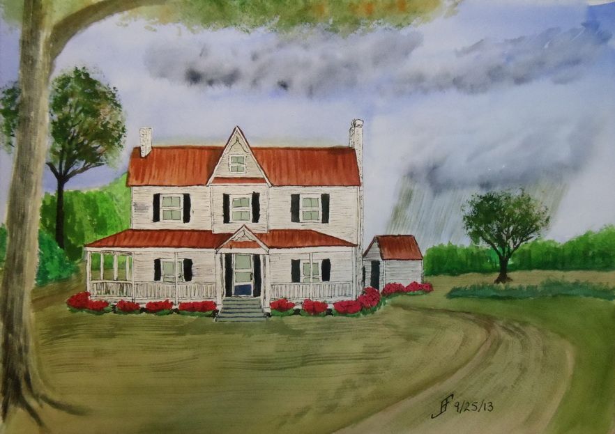
20130925 - NC Farm House Take Two!

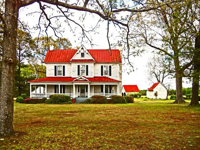
Sometimes it takes more than one time before you get it "right". I'm not all the way "there" yet. But I am definitely learning what works for me and my own personal style of painting. This afternoon, I decided to give another shot to the North Carolina Farm House theme.

As you can see, it's not the same as the previous farm house. In fact, this is more of a run down mansion compared to many farm steads in North Carolina.

As with my previous painting, I decided to try something different with this painting. I decided to have a rain cloud off in the distance. There are great swaths of the state where .. if you can see beyond the tree line .. you can see such rain clouds. So, here we have a cloudy sky with rain in the distance. This mutes all the normal colors that I would tend to choose.

The trees are getting better. The grass is not quite so crass. And the shrubs look as if they might have Knights who say "Nee" looking for them:


By the way, here's the original photograph I used as a reference.


Oh, if you were wondering, since I use this only as a painting exercise and not to create a painting to sell, I can copy use a photograph like this.

Well, I hope you enjoy this. I definitely enjoyed working on it. But it's getting late and I need to crash for the night. Enjoy!

Wednesday, September 25, 2013

20130924 - NC Farm

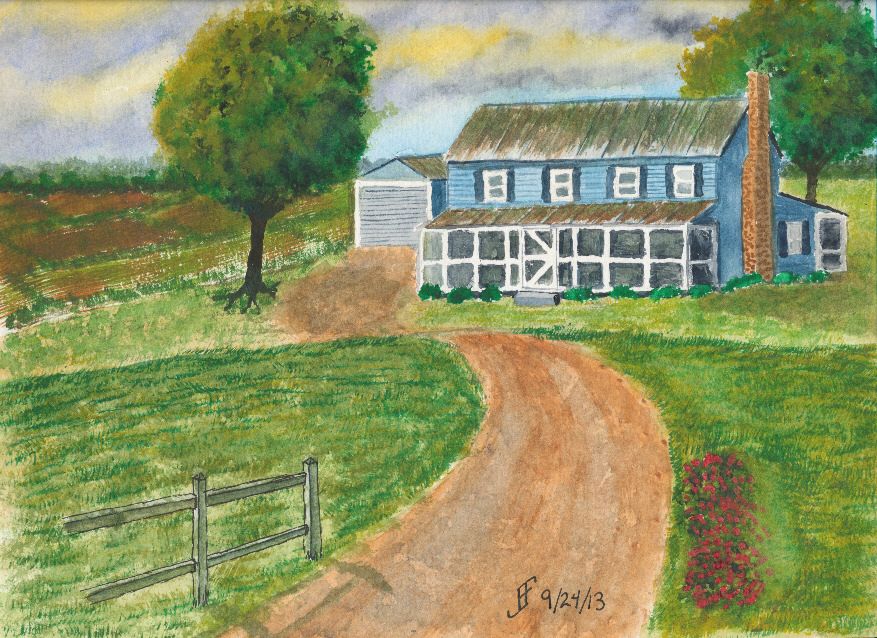
Today's painting is of a North Carolina farm, you can tell by the red clay and the tin roof with the screened porch. It is the result of using the a teaching video and modifying the subject a little to make it a unique painting for the area where I live.

The original video was made by Mike Keal. It is a teaching video by Terry Harrison, which shows him creating an English farm landscape. I enjoy doing is watching videos of artists to take the time to help show others what you can accomplish with a watercolor painting. The advantage of using example videos is that it provides me both with techniques and a target for my own painting.

I varied the scene quite a bit. The sky is a stormy sky later in the day. You will sometimes see a yellowish / greenish sky in advance of a severe thunderstorm in this area. Such a sky is never a good one to see, since it can lead to tornadoes in the area. Oddly, you will note the Carolina blue in the sky. We often see such skies in this area .. even ahead of a severe storm.

Hopefully you will enjoy this one. This took longer than many of my paintings. There are many things I like about this one. Some that I will improve next time. One thing is that this may have been easier with a larger paint surface. This is a 9x12 inch watercolor paper block. The detail work is a bit hard at this scale.


Sunday, September 22, 2013

20130922 - Playing with color

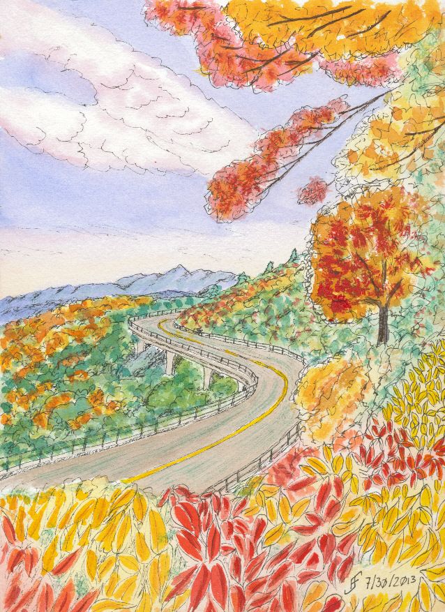
Using some of the lessons that I learned during the past couple months, I decided to tackle a larger version of the Blue Ridge Parkway painting. You might remember that was one of my first pen & ink with watercolor wash paintings. While I liked it, it just lacked the vibrancy that I see in various landscape paintings.

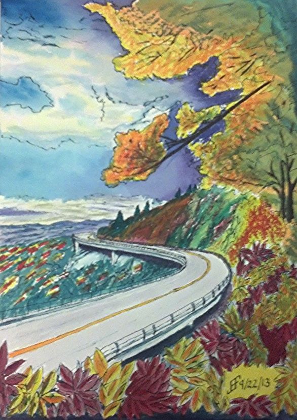
So, my thought was to accentuate the color compliments (opposite colors on the color wheel) as well as accentuating the difference in light versus dark.

First I started with a pen & ink with waterbrush wash. That provided the outline for the painting. It also provides the "under-painting", which helps determine how light and dark portions of the painting should be.

Then I added the watercolor. I decided to change it to a later afternoon / evening and change some of the colors. Until I can get it copied, the following photo using my phone should show you the difference in my color choices.

While it's still "not there" yet, it's interesting seeing the difference in the way that I see and portray a scene. The sky is much more dynamic and the color choices are much more vibrant. It just pops with color.

Sure, there remain some problems. The red of the leaves below is too cool (too blue). It should have been a warmer (scarlet) color. And I got a muddy side of the hill. But the color choices are much more vibrant than in the past.


Thursday, September 19, 2013

20130919 - Preparing for Class

Time to get ready for my watercolor class tomorrow morning. Make certain my paper is in the backpack. Make certain the paints are clean and in the backpack. Make certain the pens are ready to go. Make certain the image we are going to work on has been outlined onto one of the paper blocks. Do I want to do this as a combination of pen & ink and watercolor?? .. Or do I want to do it as just a watercolor?? I think I'll probably lean toward pen & ink with watercolor. Those are the most satisfying paintings in my book.

Oh, as you can see, I tinkered around with my sketchbook. I'm really pleased with it. The colors come out so very vibrant. Plus as you can see, a quick 10 minute sketch comes out a lot more as I intend it than it once would appear. I can see the progress I am making. That's reassuring.

Monday, September 9, 2013

20130909 - New Class / New Style

Today I started a new class at the Senior Center. This is a Pen, Ink & Watercolor class. While I really like the class, the content and the instructor, he emphasizes a more creative style of painting than I normally use. Yes, I was an engineer. I see the detail. I can also see the whole. But ignoring detail is so counter to my normal style that I find it grating.

But that's the style of painting that this instructor emphasizes.

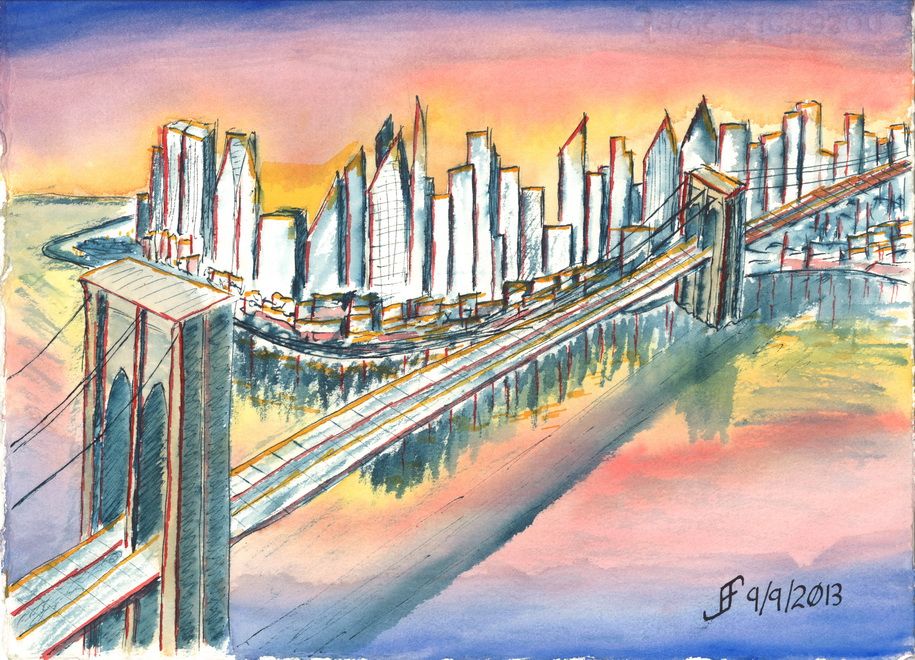
While we attempted a certain style in class, I was not at all happy with the outcome. So, when I came home, I attempted something similar to that style. I can NOT completely ignore lines and shape. I need SOME of the detail. So, I decided to do a Brooklyn Bridge sunset scene.

I was VERY loose with the drawing style. Nowhere near as much of the detail as I normally convey. I did the basic drawing with a dark blue / black ink. Then I added color.

It's much more fanciful / impressionistic than what I normally do. Let me know what you think. I will continue to try to do this type of painting from time to time.


Sunday, September 8, 2013

20130908 - Urban Sketching

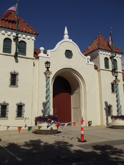
NC State Fairgrounds (Source Photo)
In addition to courtroom sketchers, there are many artists that try to capture life as it is lived. They capture the "urban landscape". These are the Urban Sketchers. They provide a great example of what pen & ink drawing / painting can do.

The Urban Sketchers manifesto states:

  • We draw on location, indoors or out, capturing what we see from direct observation.
  • Our drawings tell the story of our surroundings, the places we live and where we travel.
  • Our drawings are a record of time and place.
  • We are truthful to the scenes we witness.
  • We use any kind of media and cherish our individual styles.
  • We support each other and draw together.
  • We share our drawings online.
  • We show the world, one drawing at a time.
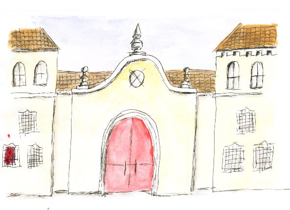
NC State Fairgrounds (Canson)

So, I decided to try my hand at this style of sketching / painting. To do this, I will use various photographs that my wife and I took over the years. These source photographs will teach me how to sketch and capture the essence of a scene. For example, the drawing above of the NC State Fairgrounds provides a good reference photograph. Understand that for a while, I will simplify the scenes that I wish to sketch. But as my skill progresses, I will try to accurately represent what I see in the photographs in my sketches.

One thing to note is that it is important to use the right sketchbook for this type of sketching. It requires the ability of the material to handle both pen & ink and watercolor. It needs to not absorb the watercolor too quickly. It needs to be able to handle scrubbing and not dissolve into a pulpy mess.

NC State Fairgrounds (Rhodia)
I have a Canson Universal Sketchbook that I've been using. While it does quite well for pen & ink, it tends to buckle severely when I add water. Plus, color that I place onto the paper seems to be pretty muted. It is not ideal. I will continue to use it. But I probably won't use it for urban sketching.

I also have Rhodia paper. It's a great paper for jotting notes and even capturing some simple sketches. Unlike the Canson paper, it does a better job of presenting the colors. Colors are fairly vibrant. The Rhodia paper does not absorb water as quickly. But it still tends to buckle when water is added. I will continue to use it for jotting notes and some quick sketches.

NC State Fairgrounds
(Stillman & Birn Zeta Series)
Another sketch book that I have is the Strathmore Visual Journal. Since this particular one is designed primarily for watercolor (and uses 140lb, cold press paper), it's not ideal for pen & ink. The paper will tend to absorb the ink too quickly. So, I'll use it for watercolor sketches (without the pen & ink portion).

Finally, I decided to purchase a Stillman & Birn Zeta Series Sketchbook. This sketchbook is 180lb natural white with a smooth surface. It's ideal for mixed media, including pen & ink and watercolor. The paper tends to buckle a little if you really saturate it. But the color it presents is very vibrant. This is the sketchbook that I will use for urban sketching.
Thursday, September 5, 2013

20130905 - Bracklinn Falls Bridge

Well, it's finished. During odd moments yesterday and this morning, I was able to finish the pen & ink (with a dab of watercolor) drawing. Of course, I can see the mistakes. But the good news is that my ability to see a scene and capture it on paper continues to improve. I need to continue to work more on foliage and landscapes.

If you are interested in learning more about the falls and the bridge, see the Bracklinn Falls website. You can see from the side photo that the bridge is quite unique. It replaced an old iron bridge that was washed away in a flood in 2005. The photo above appears to have been taken shortly after the new bridge was installed. Since the wood has weathered to a gray color. All except for the four larger timbers that hold up the roof and truss system.

Based on this drawing/painting, I will do more work on bridges. It's important to get the perspective right with bridge. They also have incredibly interesting lines. There are all sorts of bridges in all sorts of locations. Plus, I can use many different stylistic approaches to rendering the bridge. And of course, it doesn't hurt that I've always loved bridges.

Shout if you have a favorite bridge.

In the mean time, remember to take a little bit of time to really see the world around you. It's an amazing place that we all too often take for granted.


Wednesday, September 4, 2013

20130904 - Bracklinn Falls Bridge continued


Yesterday was a busy day. Jennifer and I take Tuesdays as a day to go out and enjoy movies, a dinner out, and time together. We also give Rosco the chance to run and play at least part of the day at Furry Feet Retreat (a dog daycare) in our area. Since he's not just our pet, but also my service dog, and acts as a therapy dog, it is important to allow him to have some play time throughout the week. Though he is an adult dog at this point, he still has plenty of puppy zest in him. And if we had any doubt about that watching him sproing up in the air (as a gazelle does) several times with sheer joy and twirl around a few times .. just with the thought of going to "camp". Well, if you don't find that sheer joy infectious, nothing would move you!

But as a result, I did not finish the pen & ink drawing last night. I hope to finish it today. I've made some progress, but it will take several more hours of work to complete.

Let me know if you find this type of post interesting. Is it interesting to see the progress on a work as I am working on it? I am thinking about doing a series of pen & ink drawings of bridges of various types. Would anyone else find that interesting? Let me know.

By the way, I found a video of the new bridge, which was posted to YouTube shortly after it opened:


Tuesday, September 3, 2013

20130902 - Callander Bracklinn Falls Bridge

My friends in Callandar, Scotland took a picture that will make a great pen & ink drawing. I'm thinking I'll just do this as a pen & ink with a water wash. No watercolors.

Yup. You guessed it. It's that wonderful perspective that's so interesting for me. Since this is almost monochromatic (just different intensities of one color), I think this will be perfect for a pen & ink. I'll use green to help highlight the foliage. But otherwise, black ink should do.

Here's the start of the drawing. What do you think? Should be fun. Hopefully, I will be able to remain patient while doing all the detail.

I hope you enjoy seeing a drawing in progress. It's not magic. It just takes time and patience.

Monday, September 2, 2013

20130902 - Mailbox

Because we all love mail! .. I thought I'ld start a series on unique mailboxes. I will focus on different types of flower arrangements. This is mostly a pen & ink drawing with some watercolor touches added. Of course, the black is ink (Noodler's Black). The green is ink (Noodler's Bad Green Gator). The color is from a Winsor & Newton Cotman Field Set. I continue to forget how little vibrancy those student colors have. Ah well, live and learn!

So, here's the quick sketch of a mailbox with flowers.


Monday, August 19, 2013

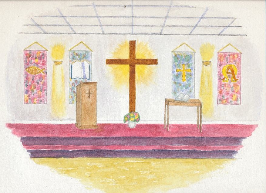
20130502 - Living Word Baptist Church

Here's a painting of the sanctuary area of my mother's church, The Living Word Baptist Church. I'll eventually do a painting of the outside of the church when they've completed some of the painting and work on the church. Enjoy!