Spent some time trying to find the "right" reference photograph for my next portrait.
I think I'll do this one "as is". No changes to the background or colors. I'll use a 9" x 12" watercolor block. If it comes out as a striking piece, then I might transfer it to a watercolor canvas panel.
By the way, this would be a good point to highlight how I chose what to paint. It's true that for now o use reference photographs. However, I often decide on a specific feature to paint. For example, my next portrait focuses on just the models face. The original photo had a lot more detail.
Part of my responsibility as the painter is to help you focus. So, part of what I find myself doing is helping you see what I see. On our recent Alaska Cruise, I found that what I see and what is actually in front of me can be completely different. When I take a picture of the scene i discover just how different the two are .. what I see and what's really there.
Our take the example of the painting from the photograph by Julia Voronova. I titled it "Elvin Girl". Again, I found that part of the photograph was visual noise. No need for that. The tighter image is more striking. Then as you note the hair structure, you note the strong parallel lines. And the illustrative painting was born.
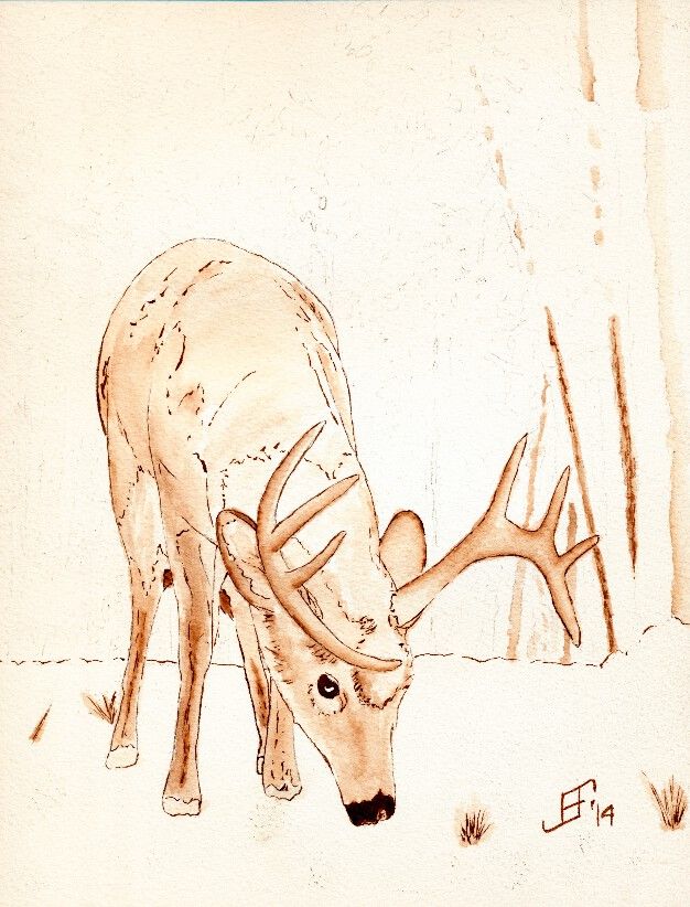
I thought you might like to see how I create the under painting using pen & ink. I've been working on the a deer feeding in winter. This is a "work in progress", so you get to see it before I add the watercolor to the painting.
As you can see, I try to outline my subject, then use a waterbrush to create the texture of the painting.
All of what you see is just pen & ink work. I am using a Noodler's Ink brush pen. The ink is Noodler's Ink Polar Brown. It's a permanent ink that binds with the cellulose in the paper and becomes quite permanent and lightfast. But by using the waterbrush it may not be as lightfast as I would like. So, the watercolor added to the painting solves any problems due to fading.
You can also see that I by using my pen & ink I tend to get an image that feels as if it comes out of an illustrator's guide, rather than a pure watercolor painting guide. But that's okay, since I am really drawn to the pen & ink work with watercolor.
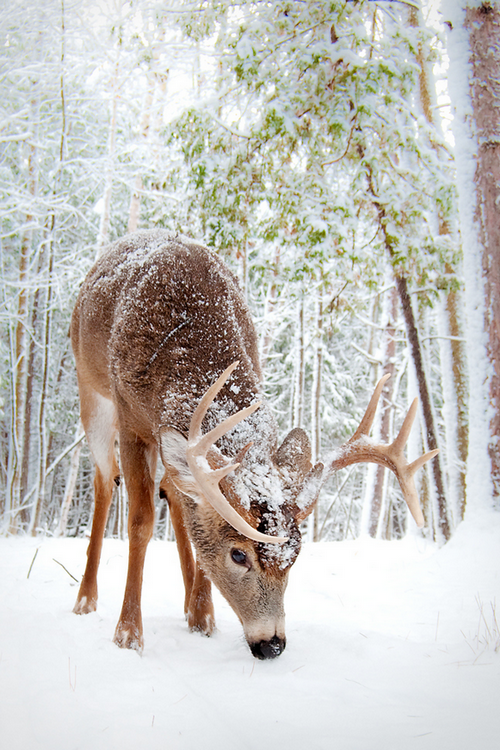
As you can see, I also provide a small copy of the reference photograph that I am using. As you can see, it's a wonderful photograph.
Hopefully you will enjoy seeing the work in process and the resulting painting.
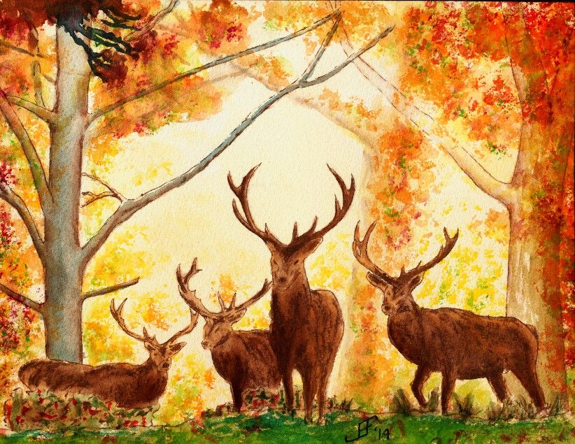
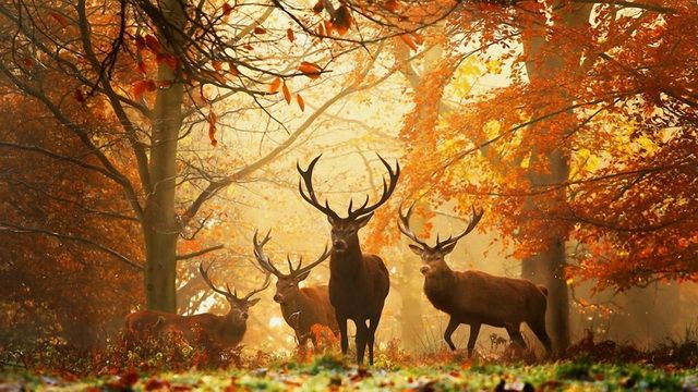
Today's painting is an autumn scene. I happened across a delightful wall paper scene of four deer at the edge of a glade beside an autumn forest. I wish I could give credit to the original photographer that took the picture of the deer. Unfortunately these free wall paper sites probably lifted the picture without giving credit or funding to the original artist. I would normally not use such a site or photograph, but it presented two unique challenges.
First, the photograph included four deer. While I've been tackling harder and harder subjects, I have not jumped into painting animals (other than the birds). So, painting for deer was a big new challenge for me.
Second, painting a misty forest scene requires several different techniques. One is that you need to paint an overall wash of the background color. Then you need to add and then immediately dab away trees and limbs in the background.
As you can see, I took the original photograph and cropped it to just the central image. This felt more interesting. Additionally, when working in watercolor, it is sometimes important to get the main object in the painting large enough to paint well. Smaller and it would be much more difficult for me to get the detail of the deer correct.
I did the deer and trees with pen & ink, using Noodler's Ink Polar Brown ink.
Those challenges made this scene an interesting lesson. I'm fairly pleased with my rendition of the original photograph. It's a warm, autumn scene.
What could be better? Well, the foreground is too dark / blue. It should be warmer (redder) and lighter in color. A yellow green would have been a better choice. I should have put more branches / limbs / twigs into the painting. Next time I try something like this I will try to use the ink for the small detailed limbs / twigs. That might feel better and attain the look that I want to see.
Anyway, I hope you enjoy this painting. It was a fun learning process.
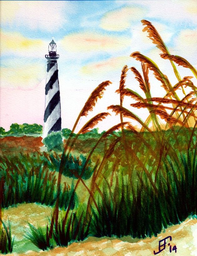
Well, today I passed another milestone in my painting "career". Isn't it an axiom that anyone that paints somehow feels compelled to paint a lighthouse? Yup. That's exactly what I did! As you can see, I decided on this beautiful day that the Hatteras Lighthouse on the NC Outerbanks would be an excellent subject.
My compliments to Dan Carmichael, who took the photograph on which this painting is based. Please note that I will NOT in anyway sell or make a profit from this rendition of his work. Instead it was intended as a teaching exercise. It's neither legal nor right to just copy the work of another and take credit and/or pay for it. In this case, since I'm only using it as a teaching exercise, it is "fair use". But all rights to the image remain with the original photographer.
While this could be better, I'm fairly pleased with this rendition. It does a pretty good job of capturing the spirit of the original. I changed the sky to make it a little more early / late in it's feel. The scan does not do justice to the subtle shading. The sea oats don't have the glitter that is in the original painting. Capturing and maintaining the highlights in the original sea oats is beyond me at this point. I might try another pass at this painting using Hot press paper and seeing if I can reserve some of the white paper to help preserve the highlights. I also need to work on the foreground vs. background a little more. Well, it's another example of how I learn by doing.
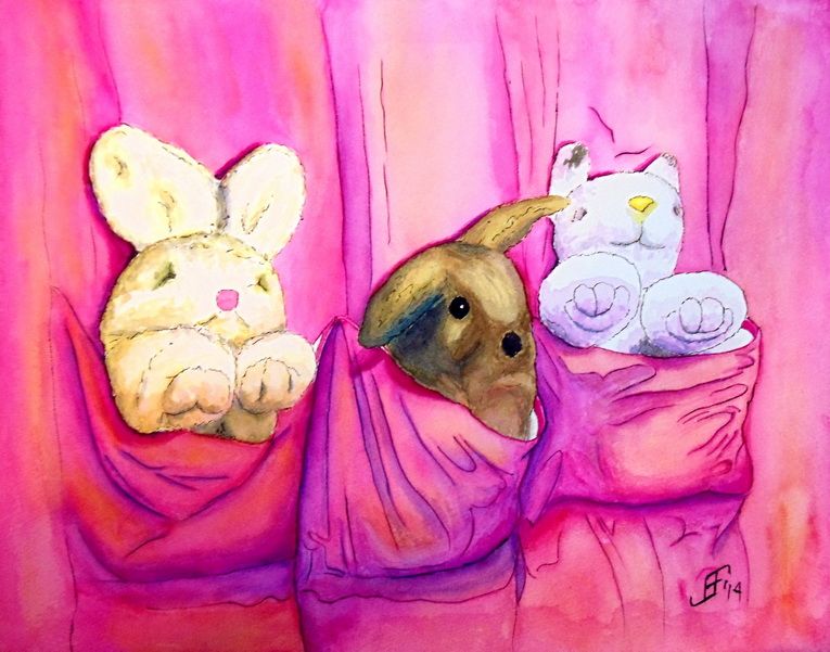
And here's the completed painting of the bunny with his two friends.
As you may know, I took input from comments Google+ and Facebook as input into this painting. I then decided to play with the three primary colors Cyan (Blue), Magenta (Red), and Yellow along with Black. You might be thinking that that's not the set of primary colors you remember from school. Isn't it Yellow, Red, and Blue? Well, you are right.
This particular set of primary colors is used by printers (both print shops and your standard inkjet or laser printers). It is also the color scheme used by some artists in an attempt to obtain very vibrant colors. This color scheme is also known as CYMK.
If you are interested in more about this color scheme, you might be interested in the following video:
It's a fun example of how YouTube can make an a subject such as color theory fun and interesting.
You might notice that each major object in the painting consists of a combination of the three major colors.
First, the curtain consists primarily of magenta (the rose color). However, highlights (where more light hits the curtain, are highlighted with yellow. The color of the shadows are deepened with blue. And of course, black is used to line the curtain folds.
Next the stuffed bunny on the left uses yellow a the primary shadow color. Then to deepen it two different shades of yellow are used. Yellow with Magenta (Red) makes a light orange color. But the deepest shadow has Yellow with Cyan (Blue). This creates several steps of color. And of course, the nose is a pink (Magenta) color.
The second stuffed animal uses a similar approach, but with magenta as the "center" color.
Finally, the bunny itself uses a mix of the three colors to work toward a gray / brown color of the rabbit fur.
How's that for color combinations. This painting only uses the following paints:
Sennieller Opera Rose - Magenta
Sennieller Yellow Light - Yellow
Sennieller Cinereous Blue - Cyan
M. Graham Raw Sienna - Light Brown
M. Graham Burnt Umber - Dark Brown
M. Graham Payne's Gray - Black
Anyway, I hope you enjoy this painting. It was a lot of fun to do. I learned a great deal going through the two studies and then doing the final painting.
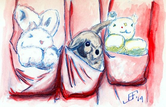
As I noted in my previous post, I decided to try using blue as the ink for the pen & ink work. This sketch is my sketchbook, rather than on watercolor paper. So, it's not quite what I would expect from the colors. But overall, I'm happier with that color.
However, I may use my water brush to apply the lines rather than a brush pen. I think the lines come out just a bit too strong (in either red or blue). In the final painting, I will use a blue/red color. A "rose" color. Also, I will probably use very light line work with brown ink on all the animals (stuffed and not). The brown of the rabbit is closer to actual brown of the rabbit. I will avoid using the ink as the under painting for this painting. (Note how the ink provides depth to the shadows on the animals. Unfortunately, with these animals it interferes with their coloring. So, in the final painting, I will only use watercolor for adding the shading.
Of course, as you can see, the shading on the stuffed animals is just a quick sketch of what's needed. The shading in the previous study was much better. I hope to attain that (or better) in the final painting.
Now to make my watercolor paper canvas as outlined in the following three posts:
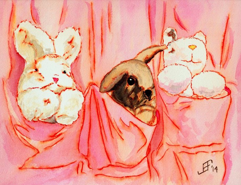
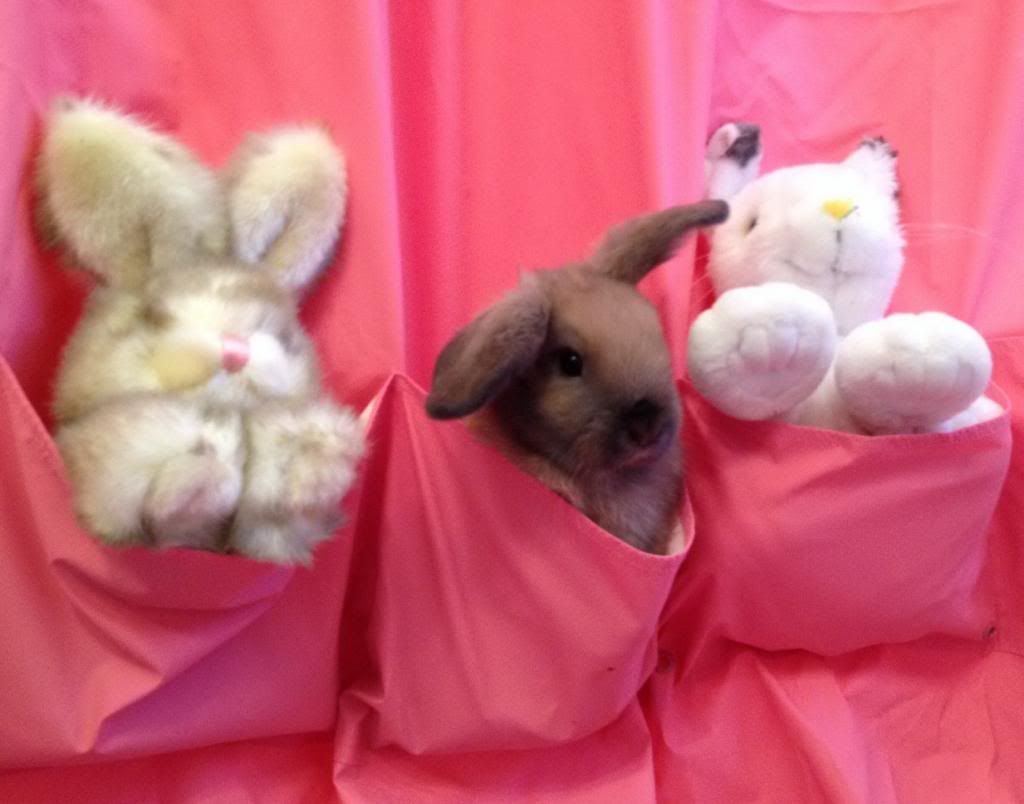
On this beautiful spring day, I decided to do a fun painting study. My sister-in-law sent me a very cute picture of her bunny in a shower curtain that has pockets (for shampoo and such). Well, as you can see, the subject is about as cute as it gets. This painting is more of a study than the actual / final painting. I hope to work on the final painting this week.
As you can see, the bunny in between the two other stuffed animals is as cute as it gets. But as I noted, this is just a study. If you are interested, here is the original photograph (cropped a bit to center the bunny).
So, let's compare the two and see how I need to improve the final painting.
First, I used a red ink for the pen and ink work. It might actually work better if I use either a black or blue ink. Perhaps blue for the curtain and the stuffed animals. But I will probably use a brown ink for the bunny in the center.
Second, the curtain pockets and folds of the curtain can use a little more depth. That will require using deeper colors a little more judiciously to increase the appearance of depth.
I am pretty pleased with how the two stuffed animals were painted. The rightmost one came out a bit better than the leftmost animal. It needed a little more definition of the shadows to increase the depth. I'll try to get that right next time.
The bunny is almost right. The switch to a brown ink for the pen & ink work will help. As will better definition of the front below the nose/mouth. However, the color needs to be improved. The rabbit's color is a little grayer than what I used. I'll try to get that right the next time around.
So, as you can see, doing a study before doing a larger painting can be a great way to try to figure out how just the right way to capture the subject. Hope you enjoy!
Well, I picked up my pen and paint brush and dashed off a few sketches this week.
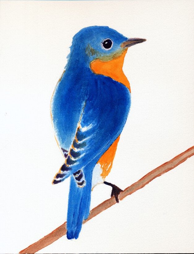
First, is an Eastern Bluebird. It is just a sketch, of which I am thinking how to finish the background. I think I'll use some Blue Ridge mountains and an early morning sky. Stay tuned for more to come!
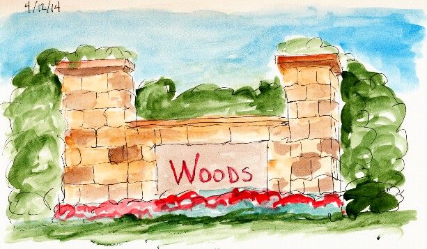
The second sketch is a representation of the small partial walls that you often see at entrances to various neighborhoods. These are not gated communities. It's just a way to show how sturdy and substantial the neighborhood is.
Nothing really spectacular. But that was not my intent. I just wanted to see if I could now better capture the look of real stone and how it varies from block to block. My brush is much looser and more impressionistic than it used to be. I make progress.
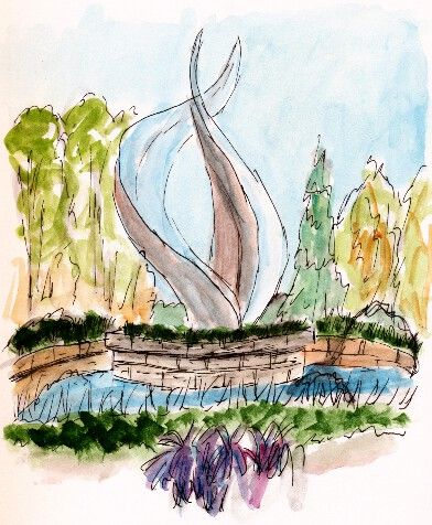
The final sketch is a quick sketch of a fountain near one of my doctor's offices. The flame-like structure is a steel sculpture in the center of the fountain.
My hope was to capture the feeling of the fountain. I think I did fairly well for a quick sketch.
Hope you enjoy and remember to keep on looking for the beauty that surrounds us.
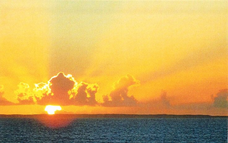
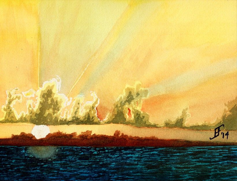
Another day, another painting. Today in my painting class we used another student's photograph (with his permission) to create a sunset picture with rays of light radiating out from the clouds that were farther in the foreground. This sunset (or sunrise) picture includes a lot of oranges and reds deep into the yellowish color. Plus, there are barrier islands an a deep turquoise sea in the foreground.
Here's the original photograph
Here's my attempt at an interpretation of the photograph.
As you can see, the clouds have a greenish cast. I've not worked much with that turquoise blue, but as you can see, a little bit goes a LONG way. It needed more red and less of that blue. Ah, well, lesson learned.
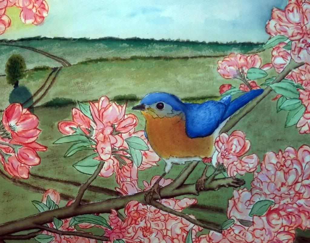
Well, as promised, I completed a larger (11 x 14 inch) painting of the bluebird. I might make a few more tweaks to the colors. But on the whole, I'm pretty pleased with this one. Unfortunately, the brilliance of the colors do note really come through on this picture. My phone (which I used to take this picture) tends to emphasize the blue more than the warmer colors. Perhaps tomorrow I will have it scanned at the copy shop.
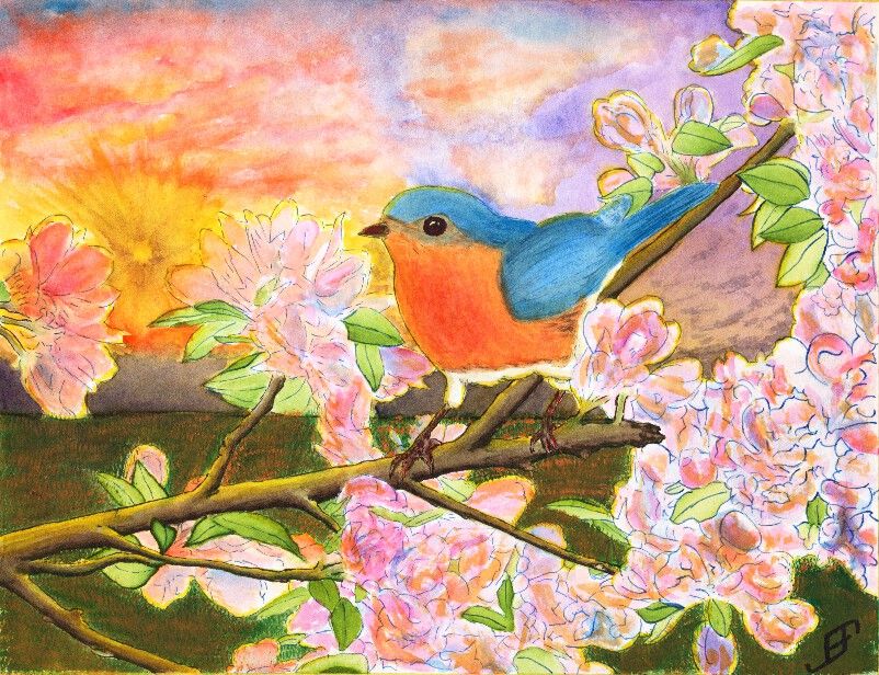
After several eventful weeks that have kept me too busy to do any painting, I decided to try to tackle something a bit more complicated than normal. Believe it or not, this Blue Bird painting is a Pen & Ink with watercolor painting. The tree, flower and foliage as well as the blue bird are done in Pen & Ink. However, the blue bird and flowers had some water color to add additional depth to the painting. The limb and foliage are exclusively done with ink.
This painting is not an ideal painting. For a very bright and busy foreground it would be better to use a simple background. While I could have painted a much simpler sky, I wanted to try some techniques. This includes the sunburst effect and a more complex cloud scene.
The sunburst effect would have been better had I used a simple spray bottle to add some dark patches headed toward the sun. Tom Jones recorded (for Jerry's Artarama) an example of how to do this. The following video shows one technique.
To create the sun burst on my painting, I would have had to use a masking fluid and paint in the background first, remove the masking fluid and then do the foreground painting. I actually did it in reverse order, since I was more interested in the foreground painting.
Unlike my previous version of a bird (gold finch) in a red bud tree, I played around with the color of the blossoms a bit by adding some orange to the blossoms. I also backlit the limbs, flowers, foliage and bird with the yellow of the setting sun. That combined with the orange tint of the flowers - which often appears toward sunset - helps set the stage for Bluebird out at sunset. And that would not be correct for bluebirds. Should I claim "Artistic License"? .. Not really. It would have been better with a simpler sky. If I needed it backlit then a early morning sky / sun would be a better choice.
Why that choice? It's both more accurate to the bird and would provide a simpler background.
Again, I should have done the background first. That would allow me to add in the detail to make it fairly convincing, yet keep it .. well .. in the background!
You will note that there is a good deal of detail in this painting. I post this in a larger format on the blog because I am fairly pleased of that. The field of mown grass feels more natural than others I've done in the past. The detail of the limbs. Shoot, even the feet of the bird have a lot of detail.
Still, it's too busy. I created an 11 x 15 inch, stretched watercolor paper canvas this past Friday. I will probably use it to paint this subject .. But this time, I will use a simpler background. I will set it as a mid-day painting.
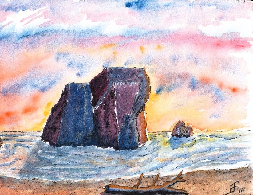
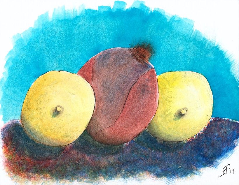
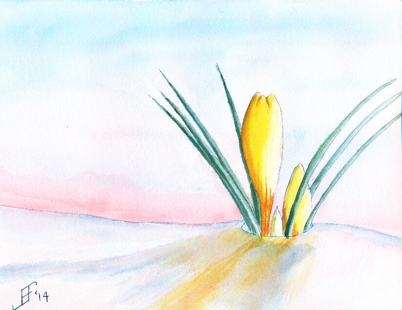
I allowed things to pile up, so this blog post has three paintings that I've done during the past three weeks in my Pen & Ink with Watercolor course. Think of these paintings more as sketches than as full blown paintings, since I spend less than three hours on each.
First, I did a painting of the Oregon Coast. It is not drawn from a specific reference photograph. Instead, this is an imagined shoreline along the Oregon Coast. The sharp rocky shoreline along with the narrow beach is shown in this painting. And of course, since I enjoy vibrant sunsets, I added a sunset. This painting used Noodler's Black ink as the ink. I used both a water brush and fountain pen to apply the ink. I then added plenty of color to deepen the shading of the painting.
The next painting is a still life of two lemons with a red onion in the middle. Of course, I happened to be sitting facing the lemons in an interesting position. As I faithfully copied the scene in front of me, the teacher pointed out that I was obviously a guy, since I was drawing the nipples first! Oops! It had not been on my mind, but sure enough that is how it looks. Of course, lemons have a "nipple" shape at the bottom of the lemon. Just goes to show that you should carefully examine your subject before beginning to paint or sketch the subject. But I tried to keep at it, regardless of the red cheeks! This painting uses Noodler's Black ink via both a waterbrush and fountain pen. The shadows are deepened with watercolor adding color into the shadow (since there is no true lack of color in nature ... unless you are in complete darkness).
Finally, we did a painting of crocus. I found a wonderful reference photograph of a yellow crocus peeking out of the snow. This painting does much better in person than as a scanned painting. The scanner just seems to miss a lot of the detail of the painting. This used Noodler's 54th Massachusetts (a blue/black) ink for the lines of the crocus and the snow. Remember that blue added to white reminds us of snow and ice. Of course, the snow should also reflect the color of the sky and the crocus.
Hopefully you enjoy these as much as I enjoyed making them.
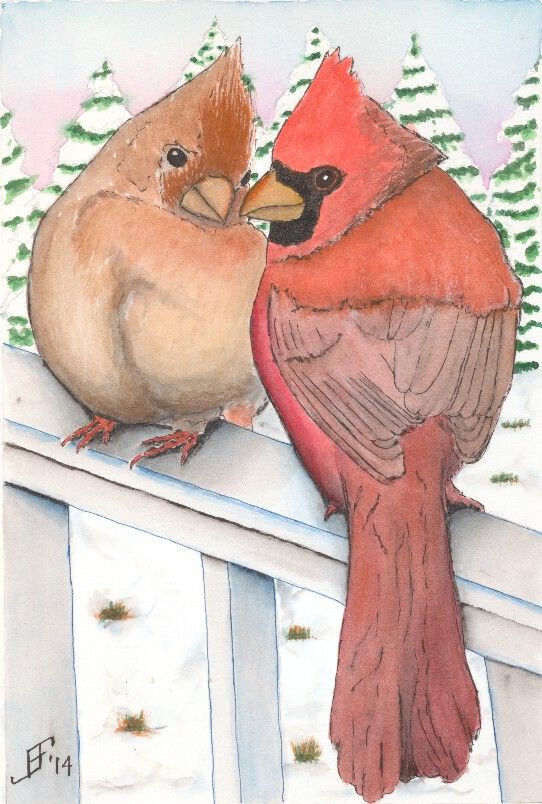
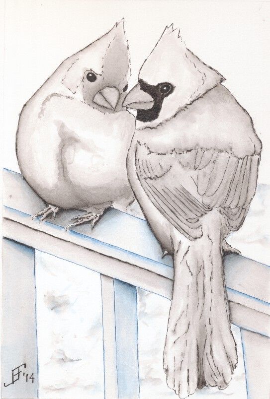
Well, painting the Cardinal Pair took much less time than I expected.
That's the advantage of snow scenes. There's less of the paper that needs to be painted.
Of course, the flip side is that you must believably cover enough of the paper to KNOW that it's a snow scene.
In effect, you have to think in an opposite direction to how we normally think. Normally we start with an empty scene in our mind and add color (including white) to create the scene. However, with watercolor painting it's necessary to create a NEGATIVE painting. I don't paint the trees. I paint the parts of the limbs NOT covered with paint and the sky above them. Do that properly and the tree suddenly pops out when you look at the painting.
In this case, making it a little more difficult is the need to provide enough detail so it is believable, but not too much. Too much detail would make the trees appear closer.
Also, by using cooler (bluer) colors it helps the trees recede. Warmer (redder) colors make objects appear closer. For example, even though the male cardinal is a bluer color, I added a orange glaze over the cooler blue-red. This helps it pop out of the painting and appear much closer.
So, here's hoping you enjoy the result. I know my wife likes it.
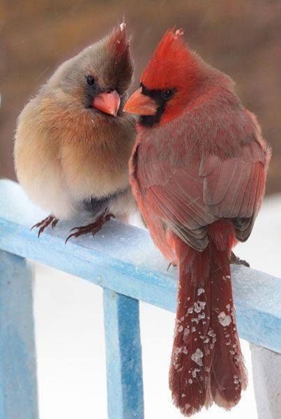
Yesterday, a friend (Sandra) posted a photo of a cardinal pair. My wife also loves cardinals. So, I decided this would be a perfect Valentine's Day present for her (in addition to what I had already gotten for her).
As you can see, it's a perfect subject (the pair of cardinals). In addition it has an interesting perspective that I enjoy painting. Plus the cardinals both have "personality".
So, I decided this would be a good pen and ink subject. For the ink work, I used Noodler's 54th Massachusetts (a blue black ink) for the railing and the snow. And of course, I used Noodler's Black ink for the birds and shadows.
A trick of color to keep in mind is that we naturally think that white is even whiter if it is tinged blue. Remember women with their slightly blue tinged hair? So, why do we associate a brighter, cleaner white if it is tinged blue? Perhaps it's because when we see ice and snow it seems to be tinged blue.
Today I will work on the coloring of this painting. I may add a bit more shading to the railing. But it's just about read to add the watercolor paint. I will probably change the background to an evergreen color to increase the contrast and interest in the cardinals.
Those of you that have followed the link to my blog know that I see my blog as a way to "learn perspective". Over the years, I learned and relearned that one of the best ways to master any skill is to take the time to teach others those skills. It reinforces what you know. And it often gives you the chance to expand your knowledge.
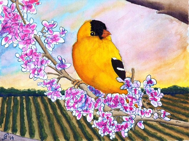
And that's just what happened when I posted my Gold Finch painting from a couple days ago. I knew it was almost there, but it just did not "feel" right. There was something jarring about the painting that I could not quite clarify.
Some people suggested that the background (the field) was too dark. That wasn't quite it. I knew the dark field at sunset was both natural and provided a startling backdrop for the bird and red bud tree.
I continued to struggle at articulating what was not quite right. I was very pleased with some of the contrasts. Light versus dark. Yellow-orange versus blue-green. Left slanting limbs versus right slanting bird and sky. Lots of interest for the eye. Still, something needed improvement.
decrease of the size of objects proportionally with distance
muting of colors with distance
decrease of the precision of details with distance
As I look at it, he is spot on. All three of those rules were not in play in my painting. I missed the fact that size of the "plants" needed to decrease with distance. I missed the fact that distance between the rows needed to decrease with distance. I missed that the detail needed to be greater closer and less pronounced further away. And finally, the problem with the background color was not that it was too dark, but rather that the color did not become more muted (greyed) with distance.
Once again, taking the time to teach others paid off for me. I learned an invaluable lesson in a way that will maximize that I will really employ it. (The greatest acceptance of knowledge comes when you are ready for the lesson. I've known about perspective. I just was not ready to internalize it with one of my own paintings. Now I see what I was missing. Lesson learned ... Now to practice what I've learned).
So, can you now see what I found this painting both a delight and jarring at the same time?
This time, I decided to try to do the Gold Finch as a traditional watercolor with pen & ink. To complete the painting, I did the painting in several stages.
First, I sketched the painting in pen & ink. I used Noodler's Black Ink on the limbs and bird. For this, I used a Noodler's Ink Brush Pen to paint the lines of the limbs and bird. This allows a varied line based on the subject. I also used Noodler's Black Ink for the black feathering of the Gold Finch. I used Noodler's 54th Massachusetts Ink (a blue black ink) for the Red Bud flowers. I used a traditional fountain pen to draw these lines. This kept the lines much lighter. However, I used a Pentel Aquash waterbrush to spread the ink to provide the blue shading in the flowers. I also used the waterbrush to create the shading of the limbs. I am pretty pleased with that overall effect. Oh, and I used Noodler's Yellow Ink to "paint" the yellow feathering of the Gold Finch.
Second, I spent a good bit of time applying masking fluid to all the exposed inked portions of the painting. This allowed me to paint over the previously inked portions and create the background for the painting. I decided to create a field heading off toward a hedge row (typically separating fields) in the background. And I wanted the sky to be a setting sun.
You will note that for the composition of this piece, I placed the Gold Finch in the center. Then the tree limbs reach from bottom right to top left. The field due to perspective switches from an up and down appearance on the left side of the painting to one that follows the tree limbs on the right hand side of the painting. And the sky runs counter to the tree. All of these thinks set eye in motion as it scans the painting, but draws the eye back toward the center.
As you might imagine, this painting took longer than my normal paintings. I hope you enjoy the results as much as I enjoyed painting this.
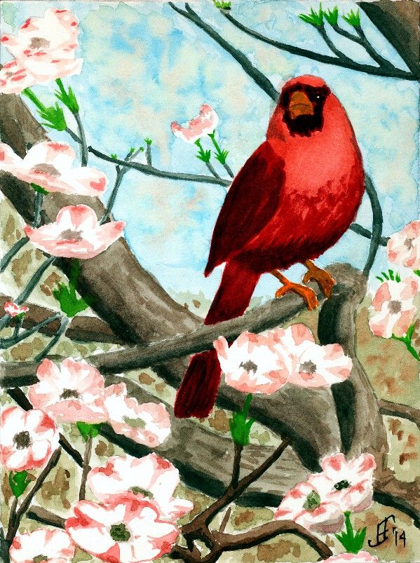
Today I decided to do a pure watercolor painting. Need to keep those skills as sharp as possible! :-) Today's subject is another cardinal. It's a good winter subject, but as you can see, this cardinal is sitting in a dogwood tree. So there's the promise of spring in the painting.
With this painting, I tried several different techniques.
First, as you can see, you can see the sky in the background. But as you know any sky through a tree has leaves and/or flowers that break up the blue of the sky. I tried to paint a mottled sky to represent that. The green and brown faded quite a bit once I added the foreground colors. So, I will need to be bolder in this technique in the future.
Second, I attempted to vary the colors of branches, with the closer objects being warmer or have more red in the color .. than objects that are farther away, which are cooler or have more blue in the color. It worked fairly well, though I see a couple branches that should have been a bit cooler in color following that pattern. I'll remember to keep it a bit more consistent.
To paint the dogwood flowers, I masked them initially with masking fluid. Once the rest of the painting was completed, I removed the masking and painted the flowers. I really only tried to suggest the flowers, rather than attempting to get all the details.
So, here's hoping this cheerful cardinal brightens your day!
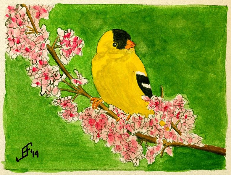
Well, I decided to try the Gold Finch on an Aquaboard. This is essentially a masonite board with a clay surface that can be painted:
It provides a smooth surface that is lightly textured, rather like hot press paper. Since it is a clay surface, it is not as absorbent as paper. But unlike paper, I found that the ink tended to not keep as sharp a line as I would prefer. As a result, I'm not as pleased with this painting as I am of the gold finch on the rice paper. It will do, but just doesn't have quite the punch without the fine lines. It will work well for more traditional watercolor painting.
An additional issue is that the surface is not as bright a white as paper. This tends to dull the painting quite a bit. Well, lessons learned. Hope you enjoy it.
As I write this, it's below freezing outside with "snow" on the ground. The snow we had last night was more like frozen mist falling from the sky. It's a couple inches thick. So, of course I'm going to paint something a bit more cheerful and warm!! :-)
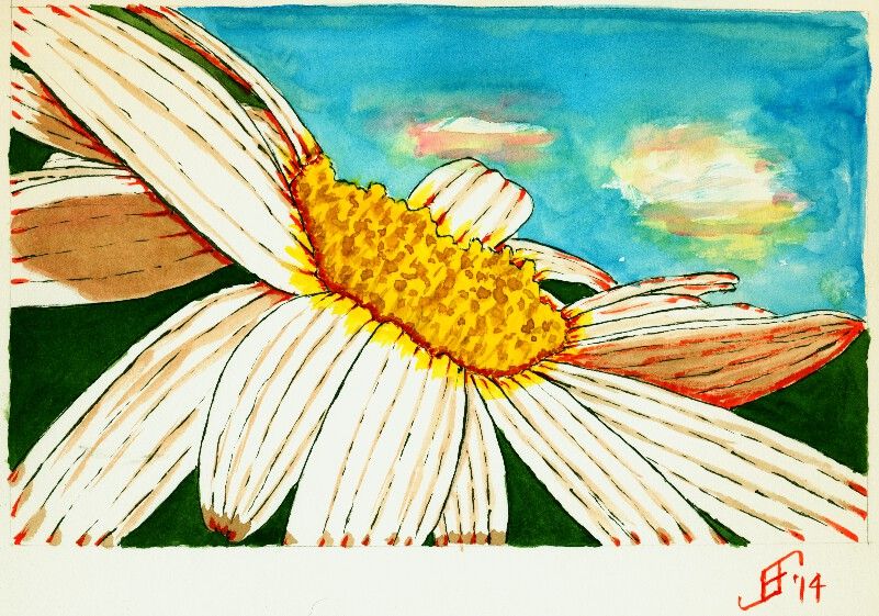
Today's painting is based on a photograph taken by Johnina Payne Young (see below). It is titled "Tilted Daisy 2". This is part of the Paint My Photo website.
As you can see, I changed some of the background colors to add to the dramatic effect. And as per my usual approach, I used pen & ink to create the outline of the daisy. I used Sennelier Blue and Yellow for the sky and center of the daisy, respectively. I used M. Graham Sap Green Permanent for the green background. I combined the Sennelier Opera Rose with green for the shadow color. And I used Noodler's Black, Yellow and Fox Red for the inks.
This did not come out as well as I hoped. But it's at least a cheerful little painting. And that's my hope for you .. that it will help brighten your day and help you smile in spite of your day.
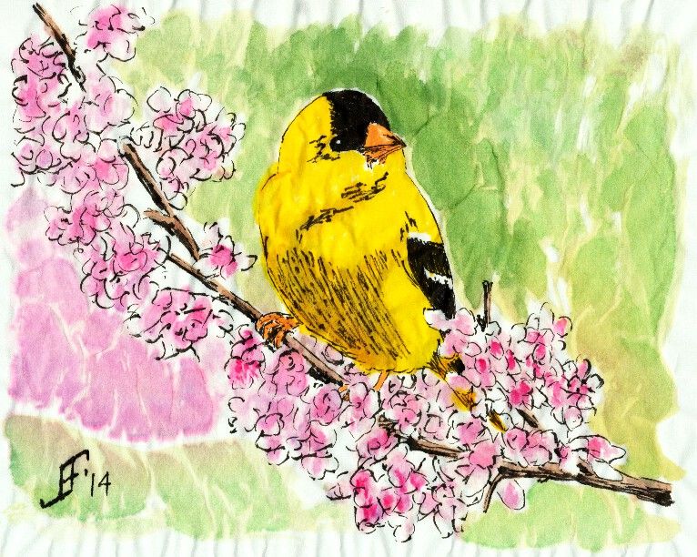
Using similar techniques as I used with the cardinal, I painted this gold finch on a branch. As we brace for winter weather, it helps to have something cheerful to brighten the day. I hope you enjoy the results.
In case you are wondering, the black in the painting is Noodler's Black Ink, which is one of the "eternal" Noodler's Inks. It does not fade, even in direct sunlight. The yellow of the gold finch is Noodler's Yellow ink. It is supposedly an "eternal" ink, but testing by others has shown that it does fade in direct sunlight. So, this painting will need to be put behind UV protecting glass or acrylic. The remaining colors are watercolors.