Sunday, September 29, 2013

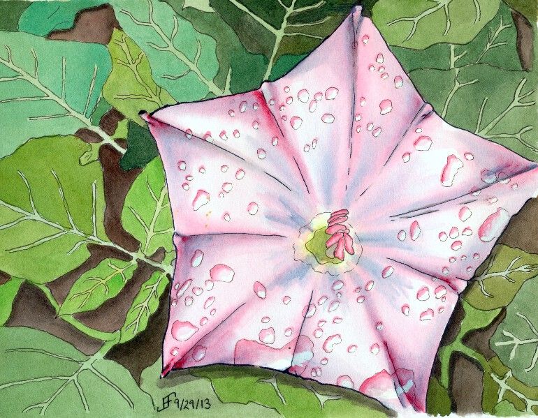
20130929 - Flower Power - Star Flower

Why not continue a great theme. Here's a pen & ink with watercolor painting that does just that. Flowers can be amazingly difficult, but also wonderful as a painting subject. Nature tends to create some very subtle (at least to our eyes) shading. Of course, if we could see in the spectrum that bees see, we would not think their shading all that subtle! By the way, see the video toward the end of this blog post for more information on that. Painting that subtle shading can be formidable. But I think I'm starting to get the hang of it. So, what do you think?

This particular flower is a rendition of a photograph that my cousin took during her travels in the US Southwest. I'm not certain the type of flower, but it was pretty remarkable. And I decided it would make a lovely painting.
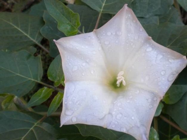
As you can see from the photograph, it's an unusual flower shape. The coloring is in fact very subtle. I decided to punch up the color a bit. I also decided to add a little trick that I've seen .. adding water drops to a painting.

You might be wondering how I did this one. Well, it starts with the pen & ink drawing of the painting. Once again, I used the blue ink to create the outline of the petals and the blue shadow areas. The leaves and water drops I created with black ink. I added the shadows with a water brush and the black ink. Then I added the color onto the flower and the background. By varying the green, I made the leaves feel "right". There is a fairly natural change of colors. Otherwise the outlining of the veins of the leaves would tend to make them appear is if they were a cartoon.

Anyway, I hope you enjoy this painting as much as I enjoyed making it.

Oh, don't forget to watch the science video:


20130929 - Flower Power Take Two

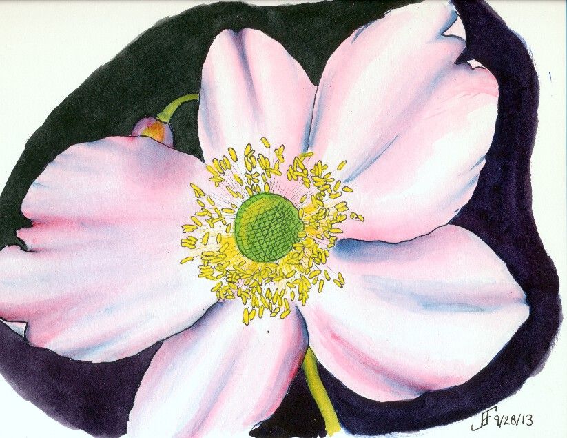
So, as I mentioned, I thought I would try another shot at that painting of a flower. This rendition of a photograph of a flower from her trip to Scotland. I think you will agree the results this time around are much clearer and more enjoyable.

This time, I decided the orientation of the flower to the sheet of paper should be flipped and it be painted in "landscape" mode. And of course, I also used a whiter paper and smoother paper (hot press). That tends to make the color transitions smoother.

I also used blue ink for the petal outline, which gave me the blue highlights within the petals. This under painting is known as a "grisaille". It provides the value of light to dark within the painting subject (though the dark background is done only with watercolor). Additionally, I used three colors of ink. The anthers (the part of the flower that contains the yellow pollen) were drawn with black ink. And the center portion (where the seeds form) the pollen is deposited was drawn with green ink. It probably did not need such differences, but it seems to have made the picture less "muddy". (The colors are more vibrant).

And of course, in keeping with my lessons learned, I used the masking fluid to block off the anthers, so that once everything else was done, I could paint them a yellow color. As you can see, this time around, the painting is closer to the photograph.

Clearly doing art is something that improves with practice. But it's rare to see someone work through what works and what does not. Hopefully you find this type of post interesting. It helps me to "talk through" my own process of learning. I'm enjoying it. I sure hope you are as well.


Saturday, September 28, 2013

20130928 - Flower Power

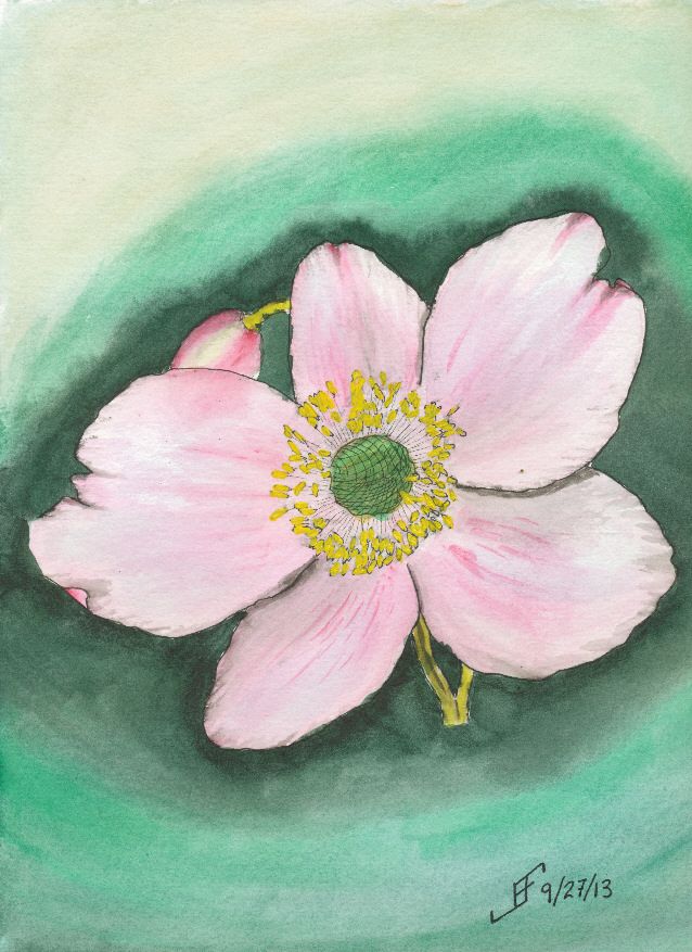
Today's subject is based on a photograph of a flower that a friend took in Scotland. This is a pen & ink with watercolor rendition of the photograph. While the flower itself is not bad, the background needs some work. I suspect it would look better if I used the three primary colors to add interest around the flower.

The color of the paper is a bit browner than some of the other watercolor paper that I have. I'll need to remember that when I do a light colored painting in the future. This is Strathmore 400 paper, which normally is fine for most of my paintings. But it does a poor job of scanning as a white paper. The Daler-Rowney The Langton Prestige and the Arches watercolor paper have a brighter white than this paper.

I also should have used masking fluid (also known as "frisket") to preserve the white of the center portion of the flower. Without it, the colors are not as true to life as I would like.

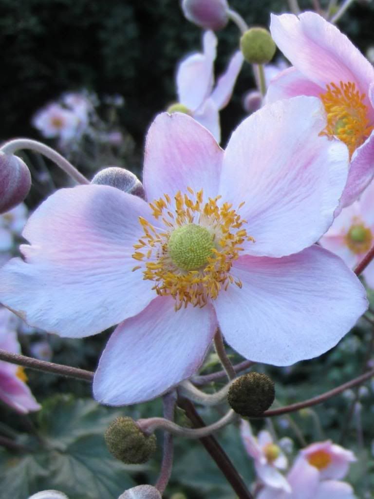
Oh, and so you can compare, here is a cropped original photograph (cropped to focus on one flower).

Once again, I hope you enjoy seeing the process I go through with each painting and what I learn from working on them. I know I find it enjoyable.

Friday, September 27, 2013

20130926 - Fall Foliage

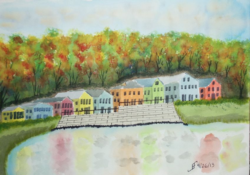
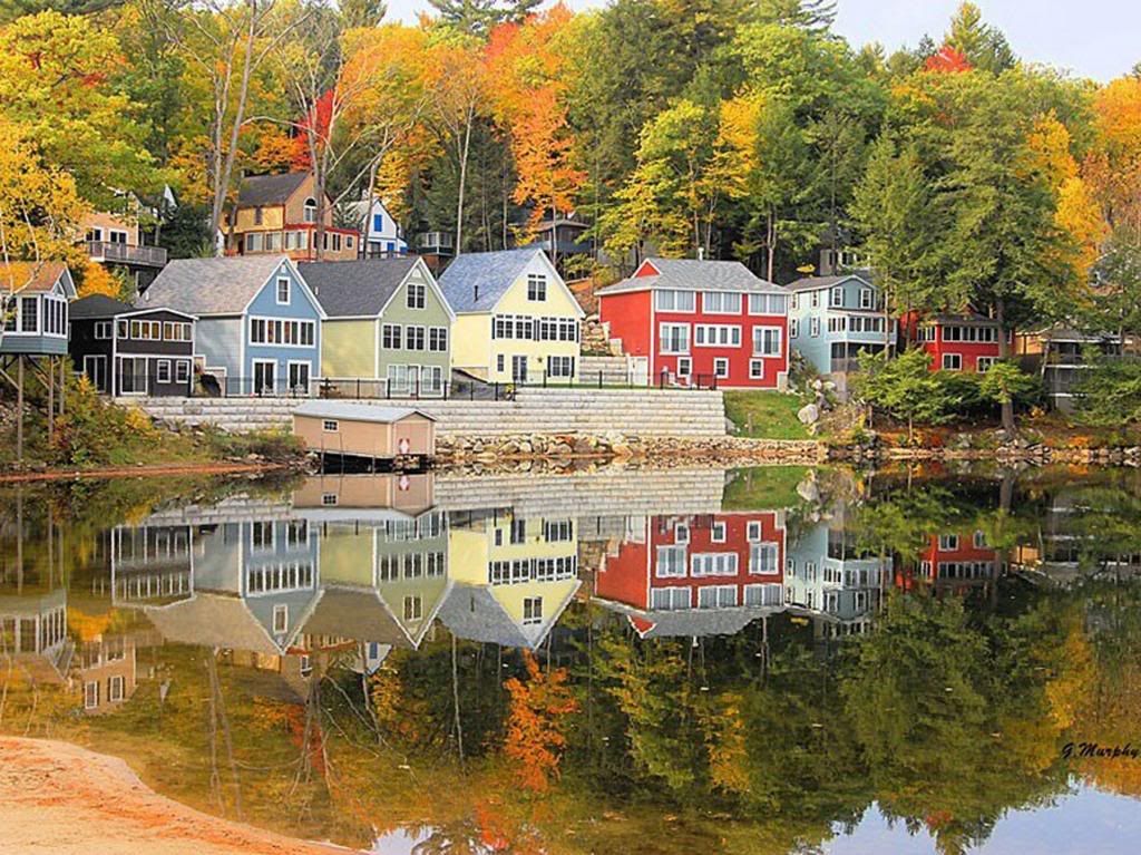
Here's a quick sketch of a fall foliage around a vacation spot in the New England area. It's roughly based on an image I saw in the news yesterday.

This one did not turn out as well as I hoped. I'm tired, so I did not put as much into this as I should have. Lesson learned.


As you can see from the original photograph, it's well worth taking time to enjoy it. And indeed, I hope you enjoy both the photograph and this sketch.


Thursday, September 26, 2013

20130926 - Garden

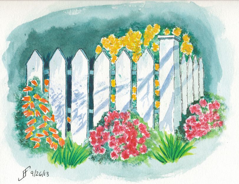
In a word ... YES!! I am very happy with this painting. I have been looking at courses offered during the Art of the Carolinas show. One of the instructors is Tom Lynch, an internationally known watercolorist. One of his courses is titled "The Magic of Leaving White Paper". The sample photo (which you can see below) intrigued me and made me want to try something along that line. I know I'm not as good at watercolor painting as he is, so I simplified the painting quite a bit. And I added some flowers behind the picket fence. And Voilà!


For the first time, I feel as if I've crossed the boundary from primitive watercolor painting to more artistic watercolor painting. Not that I could (since it's a copy of Tom's painting), but for the first time, I would not be embarrassed to sell this painting.

Hopefully you enjoy this adventure as much as I enjoy the process.


20130925 - NC Farm House Take Two!

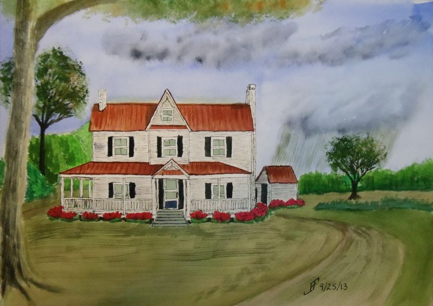
Sometimes it takes more than one time before you get it "right". I'm not all the way "there" yet. But I am definitely learning what works for me and my own personal style of painting. This afternoon, I decided to give another shot to the North Carolina Farm House theme.

As you can see, it's not the same as the previous farm house. In fact, this is more of a run down mansion compared to many farm steads in North Carolina.

As with my previous painting, I decided to try something different with this painting. I decided to have a rain cloud off in the distance. There are great swaths of the state where .. if you can see beyond the tree line .. you can see such rain clouds. So, here we have a cloudy sky with rain in the distance. This mutes all the normal colors that I would tend to choose.

The trees are getting better. The grass is not quite so crass. And the shrubs look as if they might have Knights who say "Nee" looking for them:


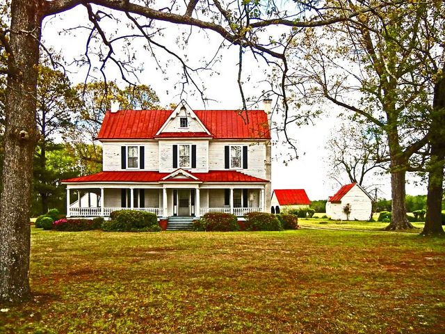
By the way, here's the original photograph I used as a reference.


Oh, if you were wondering, since I use this only as a painting exercise and not to create a painting to sell, I can copy use a photograph like this.

Well, I hope you enjoy this. I definitely enjoyed working on it. But it's getting late and I need to crash for the night. Enjoy!