Friday, January 3, 2014

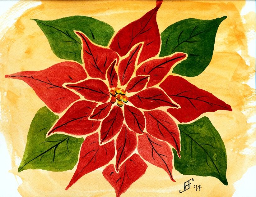
20130103 - Poinsettia

My painting for the day (though I may do another in a little bit) is an attempt at a new technique (at least new for me). Essentially, I am taking a graphic artists slant on drawing a poinsettia. Though I can (and did) paint a poinsettia to be more realistic, I wanted to blend my love of pen & ink with a graphic design. I've seen others add the blank border around the petals of flowers. I like that approach. So I attempted it. Overall, I find the result fairly pleasing. No doubt I'll try this approach again in the future.

Hopefully you enjoy my noodling around with my painting. And here's hoping that this flower helps brighten your day .. as so much of the country is locked in very cold weather. There's something fundamentally cheerful about poinsettias. So, here's hoping you enjoy!


Thursday, January 2, 2014

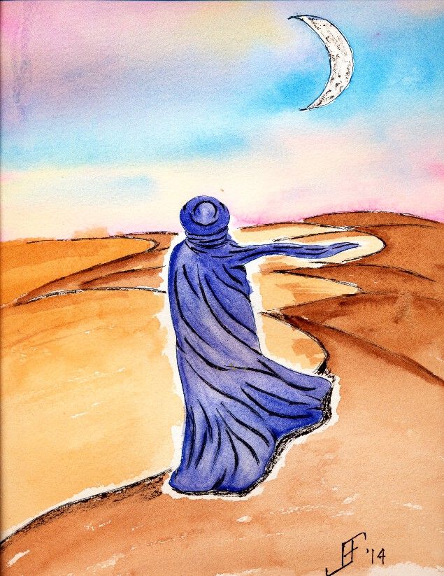
20140102 - Tuareg

Based on a painting that I saw by Elisabeth Morin, I decided to do my own rendition of the Tuareg People. Think of the Fremen of Dune. These are nomadic people who live in the Sahara desert.

While this type of lonely picture could be depressing, I prefer to think of it as looking out over the trials and tribulations of life .. dreaming where we will go and of the eventual goal. Perhaps lonely. But dreaming of the future is always a lonely endeavor. Yet, it is not depressing, since it holds the promise of a future reward. Dream on!

With this painting, I continue using the Sennelier watercolor paints for the sky in this painting. To this, I used my M. Graham Raw Sienna and Burnt Umber for the sand dunes and Phthalocyanine Blue Red Shade for the cloth.

As you can see, I had some problems with bleeding at the horizon line. Since I never intended to make this a permanent painting, I tried to use quick sketching techniques to capture my vision. But I will do this one again to see if I can capture it without those problems.

As you know, this is my first painting of the year. With it, I decided to attempt to frequently paint. More than that, I decided to work my way up toward painting people by doing projects like this. I'll get comfortable painting the silhouette of people and clothing. That will allow me to built up the skills needed to do watercolor portraits of people.

Here's hoping you goals for 2014 are rewarding and achievable!

Monday, December 30, 2013

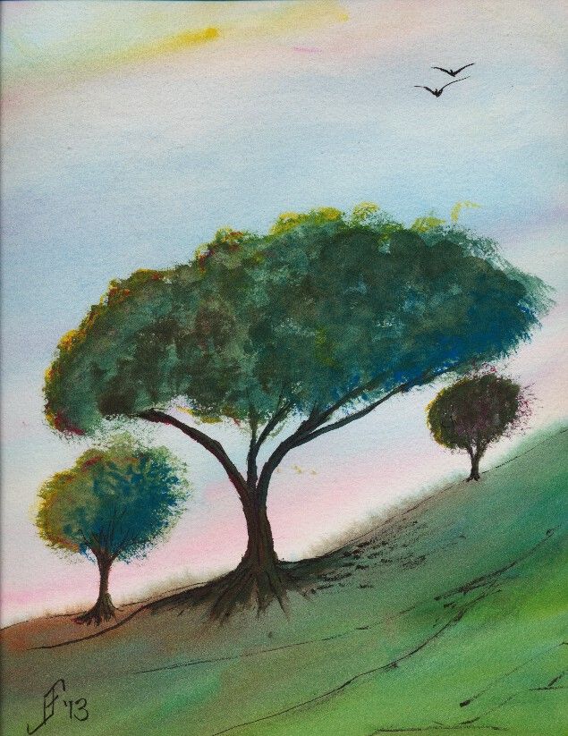
20131229 - Tree

Well, it's time to get back to painting. As I may have mentioned, I had a partial vitreous detachment in my one good eye. Though it's not a problem and did not lead to a retina detachment, as I first worried, it did leave a "big honkin' floater" (per the senior ophthalmologist, who examined me) in the MIDDLE of my field of vision. But they are right. Eventually your brain mostly ignores it. And after several weeks of playing various computer games, I mostly don't notice it, or can rather automatically flick my eye to move it out of my way.

So, let the paintings begin. I went to the Art of the Carolinas during the beginning of November. While there I received a sample of Sennelier watercolor paint. Like my M. Graham watercolor paint, it uses honey as one of the binders. This allows the paint to retain a moist quality. Surprisingly, the prices are similar to the M. Graham. And the colors are wonderfully vibrant. I might add some of them to my palette. I'm happy. I now have two paint lines from which I can get the type of watercolor paint that I like.

This 10" x 14" painting is done on a Daler-Rowney The Langston Prestige watercolor block. I only used three paints to create this painting. It includes a yellow, red and blue. The yellow is Sennelier Yellow Light. The red is Opera Rose. And the blue is Cinereous Blue.

The yellow and red are transparent watercolor paints. But the blue is opaque. So, I laid down the sky before anything else. Likewise with the green (blue and yellow), I assumed (correctly) that it would cover any other paint.

Unlike most of my pen & ink paintings, I added the ink to this painting after painting the subject. I usually add it before as an underpainting. There were two reasons I did not do it this time. First, and foremost, I wanted to try this paint without the confinement of the pen & ink underpainting. Second, I decided that just a touch of details to the landscape and trees would help.

This painting is not based on any reference photograph. It's solely pulled from my imagination. My intent is to portray a bit of a windswept hill in the area of transition between grassland and woodland areas. The time of year is early summer. It is past the yellow/green of spring, but not into the deep greens and dried browns of summer. Additionally, this is an early morning or early evening sky, with the sun just starting to set and casting a pink and yellow glow. I've seen a few of those sunrise / sunsets to know that when that happens it tends to dramatically increase the color vibrancy. It's almost as if we suddenly see a new color in the world.

Here's hoping this painting helps brighten your day, offering both warmth and hope for your day.
Thursday, November 14, 2013

20131114 - Airplane

Today I decided to try something different. I decided to try a pen & ink drawing with watercolor of an airplane. I've tried buildings. I've tried flowers. I've tried landscapes. But this is my first shot at painting a vehicle. I am pretty pleased with the results. I hope you enjoy it as much as I enjoyed trying too paint it.

Monday, November 4, 2013

20131104 - Sunflower

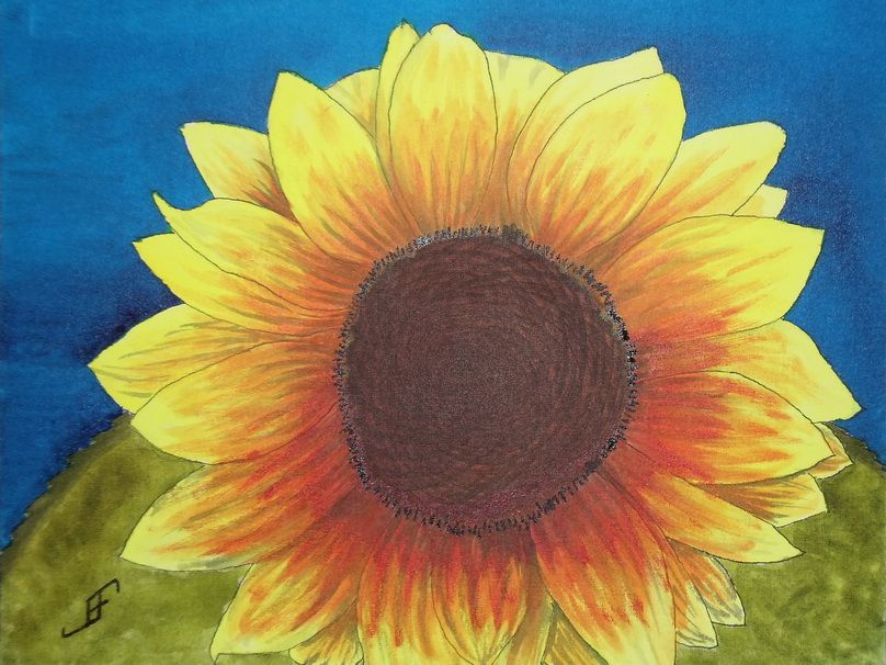
Well, another day, another painting! As promised in yesterday's post, I completed the Sunflower. Most of it was complete last night, but this morning, I added a few finishing touches. Hopefully you will enjoy this rendition of my friend's photograph.

The camera added a bit of reflective light to the mix. So, the center and the detail around the center appears a bit lighter than they appear in person.

Since I don't have a scanner that can handle larger images, I use a camera. While it does well, it does need to use the flash to get a good photograph of the painting. And then of course, I need to do some photo editing to eliminate perspective distortions to the photograph (to bring it back to an 11x14 sized image).

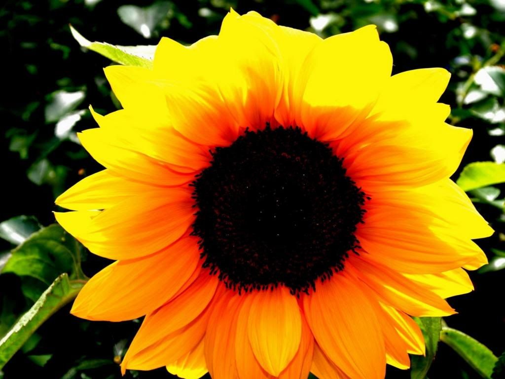
And of course, for your reference, here is my friend's photograph of the back lit sunflower. As you can see, getting the intense yellow is a fairly difficult proposition. Next time, I will probably try a slightly redder yellow (Hansa Yellow Deep). However, in my defense, the yellow in person is much more intense.

Anyway, hopefully this cheerful sunflower will brighten your day.

Sunday, November 3, 2013

20131103 - Sunflower with a Different Perspective

I enjoy finding interesting photographs and subjects within them. A friend recently gave me explicit permission to paint his photographs. This photograph he made of this sunflower with the sun behind it, lighting it from behind. It will make an interesting subject.

When rendering it in watercolor, I think I will shoot for complimentary and split complimentary colors (using the CMY, or Cyan, Magenta, Yellow color wheel). Thus, the compliment of yellow is blue (on the CMY color wheel). I will paint the green leaves toward the bottom where there is more of an orange coloring of the sunflower. This will yield the split complimentary colors to the complimentary color of blue.

But first, I will use pen & ink to create the value sketch (of the shading) of the painting. It will act as the under painting for the finished work. I will use an 11x14 inch Fedrix Watercolor Canvas Board. Unlike a conventional canvas with Gesso, watercolor (and other wet liquids, such as ink) does adhere to the surface. However, unlike watercolor paper, the watercolor and ink doe not fully absorb into the canvas. Thus, it is possible to lift color rather easily. Where this works well is when you do NOT intend to paint one color over another in added glazes. Though it can be done (and I did it with the bee in the Thistle with Bee painting), you must be very careful about adding color onto an area that already has color.

So, here's hoping you will enjoy the final painting.